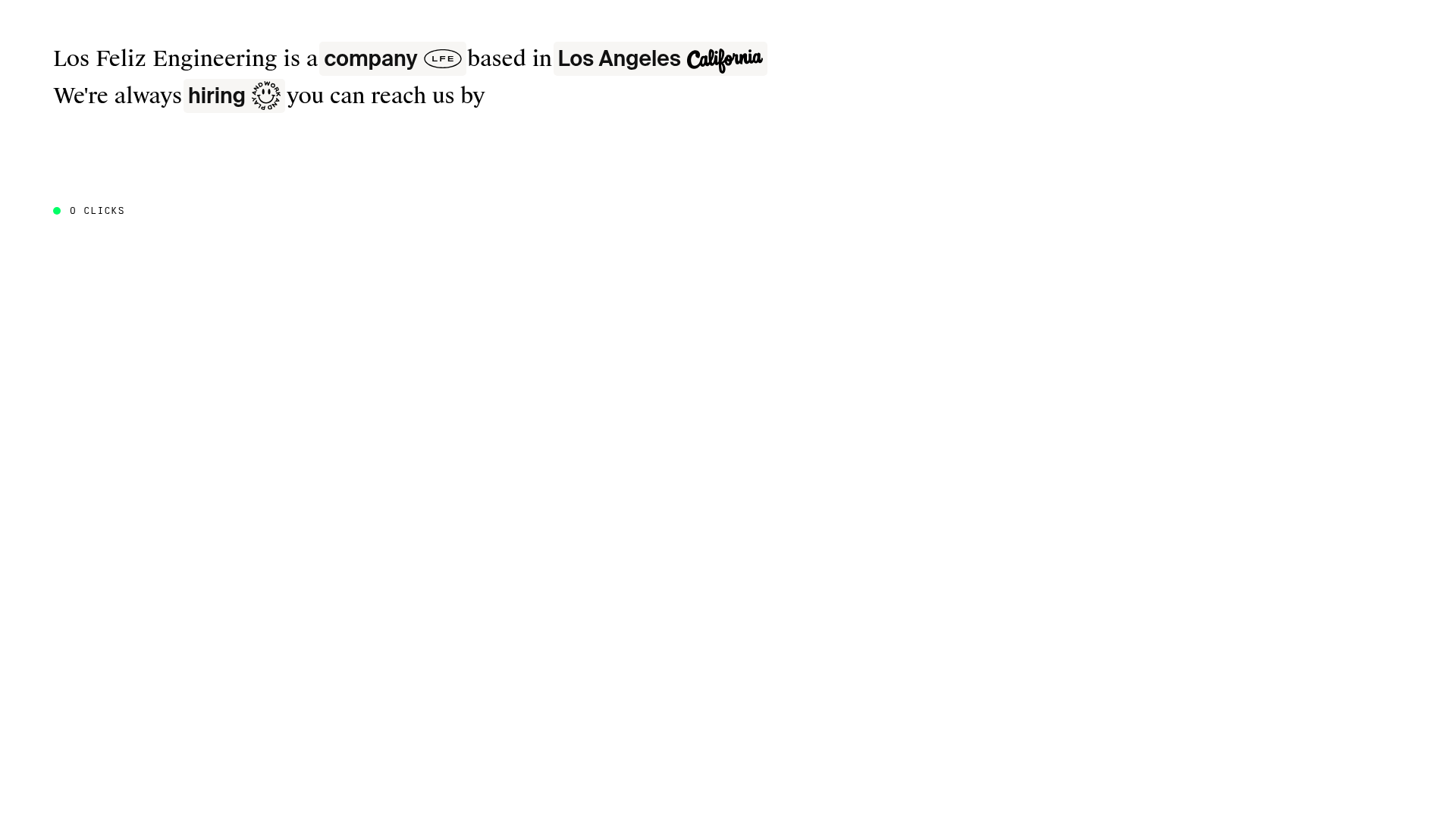
Los Feliz Engineering Interactive Narrative
A minimalist, text-first landing page featuring interactive inline buttons, dynamic word-background reveals, and custom SVG iconography within a flowing sentence layout.
Overview
This website is a minimalist, interactive landing page that presents a company narrative through a "mad-libs" style text interface. It is an exceptional reference for developers looking to build non-linear, text-heavy storytelling experiences where users uncover information through clicks rather than scrolling. The design demonstrates how to turn a simple paragraph into an engaging discovery tool through state management and dynamic inline reveals.
Design System
- Color Palette & Visual Hierarchy: A strictly monochrome foundation (black text on a white background) is used to maintain a high-contrast, document-like feel. Visual hierarchy is established through custom backgrounds—some words feature a light gray rounded background (
#f5f5f5) to signify they are interactive "nodes." - Typography: The site uses a high-quality serif typeface for the body text, evoking editorial design. Specific keywords use a bold sans-serif or a decorative script font (e.g., "California") to create visual texture and brand personality within the sentence flow.
- Page Structure & Section Flow: Unlike traditional vertical-scrolling sites, the page is contained within a single
section.text-container. The content is structured as a series of spans and buttons that behave like a fluid paragraph. As users click interactive words (buttons), hidden spans with matchingdata-stateattributes are revealed, expanding the narrative horizontally and vertically. - Reusable Components:
- Interactive Word-Buttons: Components with
data-linkanddata-iconattributes that act as triggers for state changes. - SVG Iconography: Minimalist inline SVGs (like the 'LFE' oval or the 'smiley' wheel) represent brand pillars.
- Dynamic Reveal Spans: The
word-innerandword-backgroundstructure allows for seamless text injection without breaking line-height or flow.
- Interactive Word-Buttons: Components with
- Interaction & Motion: The core mechanic is a state-based reveal system. The HTML shows a
typedclass, implying a sequential reveal effect. A "0 CLICKS" counter in the bottom left serves as a micro-interaction to gamify the exploration. - Implementation Clues: The site uses a custom state-management system identified by
data-stateanddata-linkattributes. Each button "unlocks" a specific state ID, toggling the visibility of corresponding text fragments.
Use Cases
- Who should clone this: Creative agencies, independent developers, or boutique hardware/software studios wanting a "mysterious" or high-signal, low-noise digital presence.
- Effective Remixes: This pattern can be adapted for digital CVs, interactive project case studies, or "About Us" pages where a standard list of facts feels too generic.
- Practical Directions:
- Brand Swap: Replace the serif font with a monospace font for a more "hacker/terminal" aesthetic.
- Functional Remix: Adapt the logic so each "revealed" section includes a small image or video tooltip instead of just more text.
- Scope: A full-page clone is ideal for this concept, as the value lies in the cohesive navigation logic. However, the inline button style with background-pill reveals can be reused as a standalone UI pattern for glossaries or footnotes.
Related Inspirations
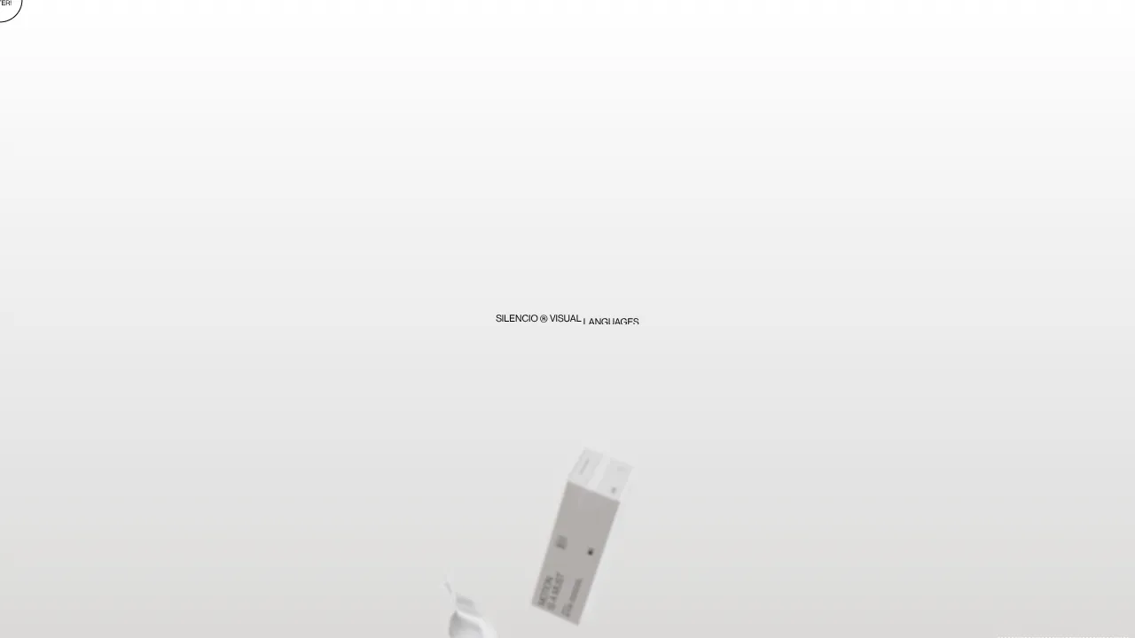
Silencio Studio Minimalist Design Portfolio
A clean, high-concept portfolio featuring a centered text hero, dynamic falling 3D elements, and a high-contrast monochromatic layout for creative brand showcases.
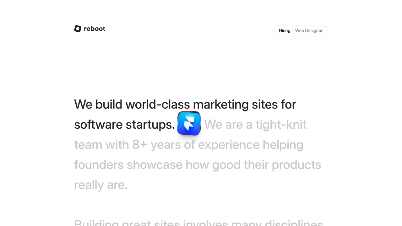
Reboot Minimalist Typography Agency Landing
A scroll-driven text experience featuring animated word-level opacity transitions, inline floating assets, and interactive hover-reveal card stacks for design agencies.

Christopher Doyle Agency Portfolio Layout
A minimalist, typography-led portfolio featuring a wide-margin grid system, smooth fade-in animations, and simple image-focused project cards.

NewTab Studio Minimalist Portfolio Landing Page
A clean, typography-focused landing page featuring an oversized SVG/canvas hero title, a top-aligned navigation bar, and a minimalist footer layout.
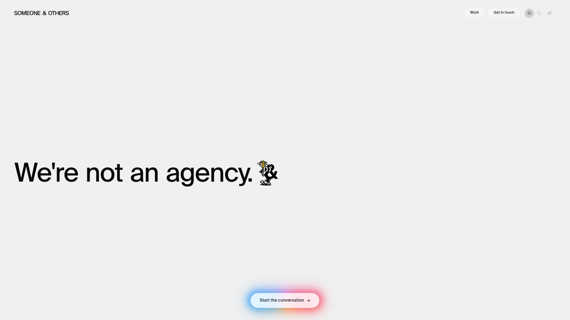
Someone & Others Studio Landing Page
A minimalist studio portfolio featuring scroll-reveal typography, overlapping sticky case study cards, and a vibrant glassmorphism CTA with animated glow rings.

Play Studio Minimalist Portfolio Landing
A high-impact agency layout featuring a oversized typography header, a full-width integrated Vimeo video background, and a unique expandable accordion list for industry showcases.
