Someone & Others Studio Landing Page
A minimalist studio portfolio featuring scroll-reveal typography, overlapping sticky case study cards, and a vibrant glassmorphism CTA with animated glow rings.
Overview
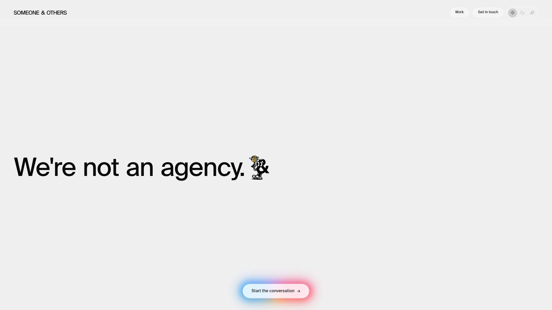
Someone & Others is a high-end studio portfolio that utilizes a ultra-minimalist aesthetic to prioritize copy-driven storytelling. It is an excellent clone reference for its sophisticated use of white space, scroll-triggered text reveals, and a distinctive "glow-ring" call-to-action that anchors the user experience.
Design System
- Color Palette & Visual Hierarchy: The site uses a neutral monochromatic base (off-white backgrounds and deep charcoal text) accented by highly saturated, vibrant gradients. Movement and hierarchy are created through the contrast between massive typography and a floating, multi-colored glow in the central CTA button.
- Typography System: The system relies on a bold, sans-serif Grotesk typeface. Headlines use a
large-typeclass with substantial tracking and line-height. Hierarchy is established through size rather than font variation, with small utility text in caps for navigation and pill-shaped tags for metadata. - Page Structure & Section Flow:
- Dynamic Hero: Features a scroll-triggered text reveal where words transition from semi-transparent to opaque as the user scrolls.
- Text-Heavy Manifesto: Large-scale paragraphs that continue building the brand voice.
- Sticky Case Study Stack: A vertical container (
case-stack) where full-bleed project cards overlap one another usingposition: stickylogic. - Floating Footer CTA: A persistent glassmorphism button with concentric animated glow rings.
- Reusable Components:
- Scroll-Reveal Text: The
reveal-textsystem splits paragraphs into individual<span>word units for granular scroll-tracking. - Glassmorphism Buttons: Rounded pill shapes with a
.glass-shineoverlay effect and subtle arrow transitions. - Glow-Ring CTA: A complex CSS component (
glow-ring-soft) that uses blurs and gradients to create a breathing light effect.
- Scroll-Reveal Text: The
- Interaction & Motion: Text "lights up" based on scroll position (
data-visible-words). The floating CTA includes a subtle "bounce-float" animation on icons and a persistent rotating or pulsing glow effect. - Implementation Clues: Use of CSS custom properties for spacing (
--space-xl,--page-pad) suggests a highly structured design system. The DOM reveals a modular approach to case studies where cards are stacked within a container targeted for scroll-jacking or sticky positioning.
Use Cases
- Creative Agency/Designer Portfolios: Ideal for practitioners who want to emphasize their philosophy and thinking over just visual thumbnails.
- Premium Product Landers: The sticky card stack is perfect for showcasing product features or different pricing tiers without cluttering the screen.
- Remix Directions:
- Brand Swap: Replace the monochromatic base with a dark mode theme; the colorful glow rings will pop even more effectively.
- Simplified Hero: Clone the
reveal-textlogic for a powerful entry statement while keeping the rest of the site standard. - Hybrid Cards: Turn the sticky project cards into a vertical accordion for mobile devices to prevent excessive scroll fatigue.
- Clone Scope: A full-page clone is recommended to capture the seamless transition between the text-reveal intro and the sticky card sections, as these two systems work in tandem to create the site's rhythm.
Related Inspirations
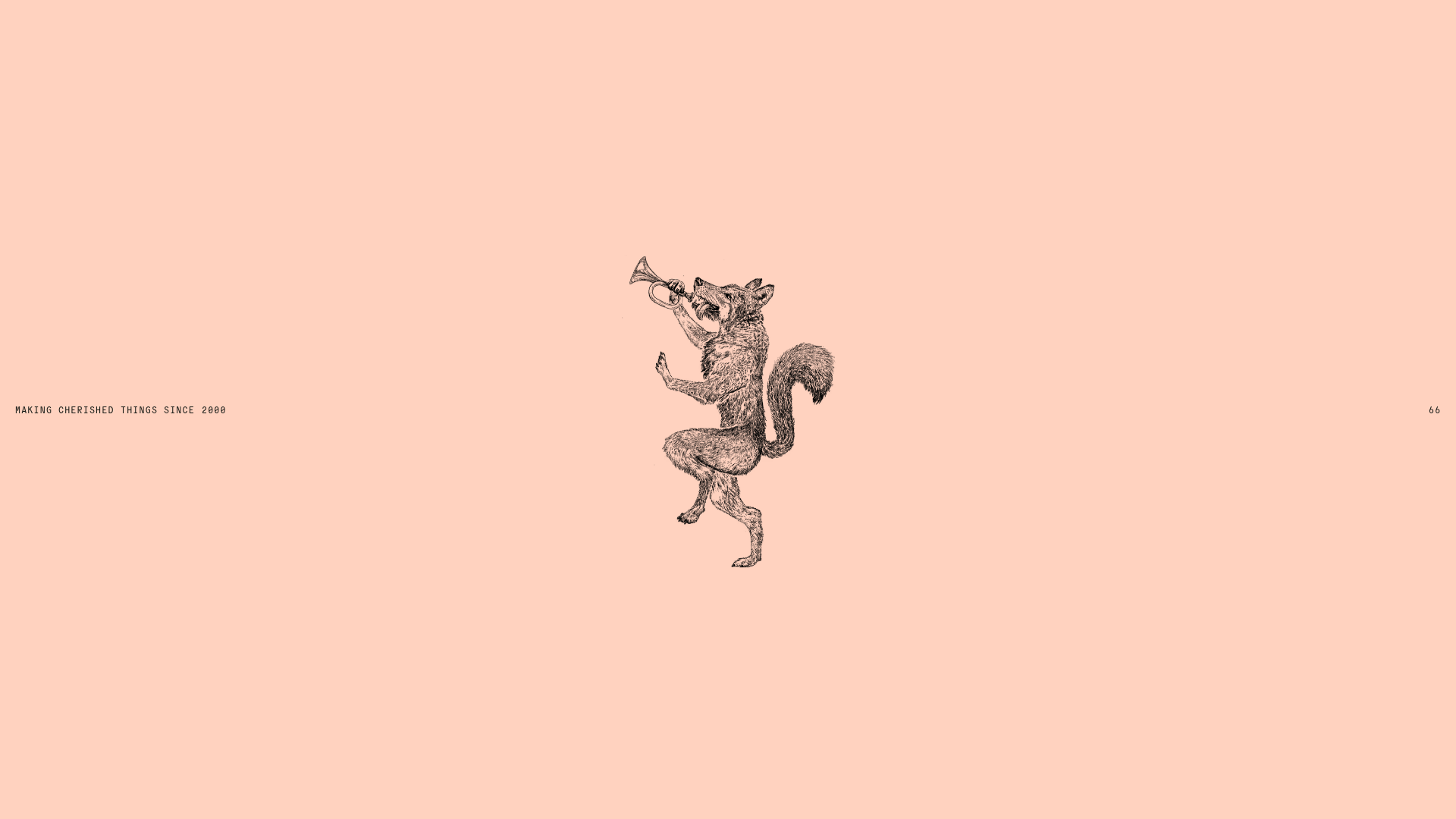
Smiling Wolf Minimalist Portfolio Landing
A refined, ultra-minimalist layout featuring a centered vintage illustration, subtle typography, and a spacious monochromatic aesthetic ideal for a high-end brand splash page.
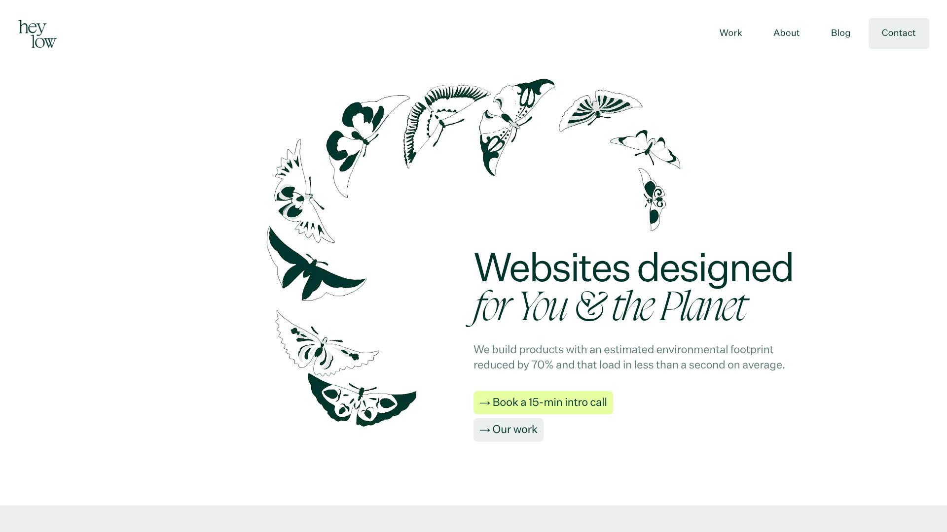
Heylow Portfolio Landing Page
A minimalist, eco-conscious portfolio featuring an animated butterfly hero section, Bento-style feature grid, and project cards with carbon rating and speed metrics.
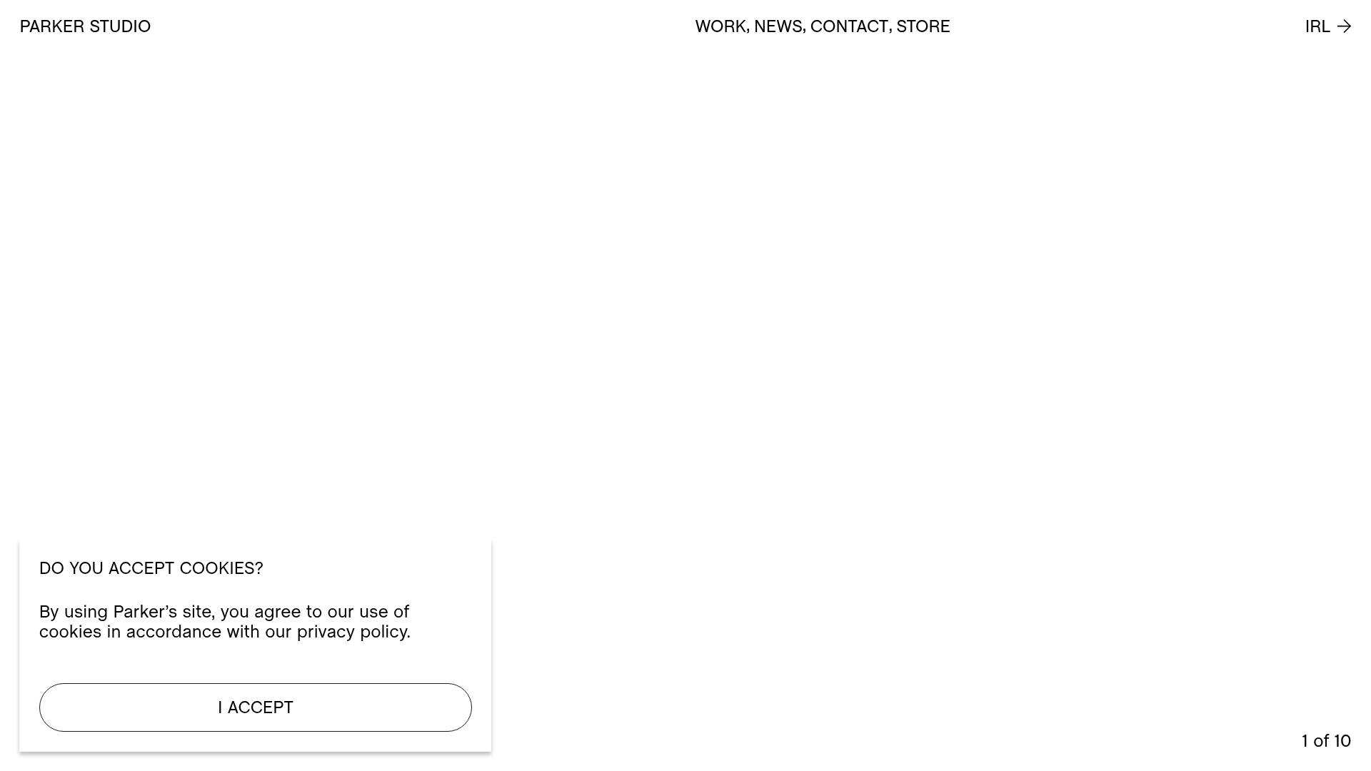
Parker Studio Minimalist Design Portfolio
A high-end creative portfolio featuring a full-screen video slideshow hero, masonry-style project grid, draggable news carousel, and modular layout with clean typography.

Christopher Doyle Agency Portfolio Layout
A minimalist, typography-led portfolio featuring a wide-margin grid system, smooth fade-in animations, and simple image-focused project cards.

NewTab Studio Minimalist Portfolio Landing Page
A clean, typography-focused landing page featuring an oversized SVG/canvas hero title, a top-aligned navigation bar, and a minimalist footer layout.
The Fascination Editorial Product Hub
A refined content marketplace layout featuring a minimalist bento-style grid, custom category filters, and modern hovering card interactions for brand reviews.
