Christopher Doyle Agency Portfolio Layout
A minimalist, typography-led portfolio featuring a wide-margin grid system, smooth fade-in animations, and simple image-focused project cards.
Overview
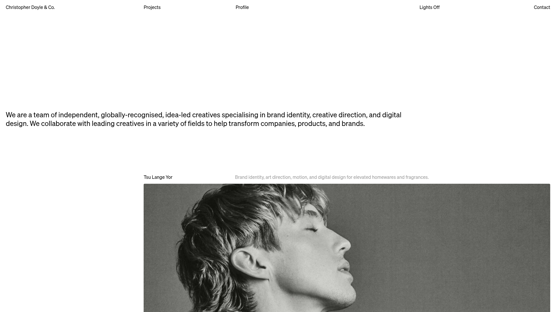
This website is a sophisticated, minimalist portfolio for a high-end creative agency. It utilizes an expansive white-space-driven grid and ultra-modern typography to let high-quality imagery take center stage, making it an excellent reference for builders wanting a "less is more" aesthetic. Its strength lies in its precise layout and smooth reveal animations that create a premium, editorial feel.
Design System
- Color Palette & Visual Hierarchy: A stark monochrome theme (black text on white background) provides maximum contrast. The hierarchy is established through spatial distribution rather than color, using wide layout gaps to separate messaging from project visuals.
- Typography: The site uses a clean, sans-serif neo-grotesque font. The scale is relatively large for the introductory "About" statement (
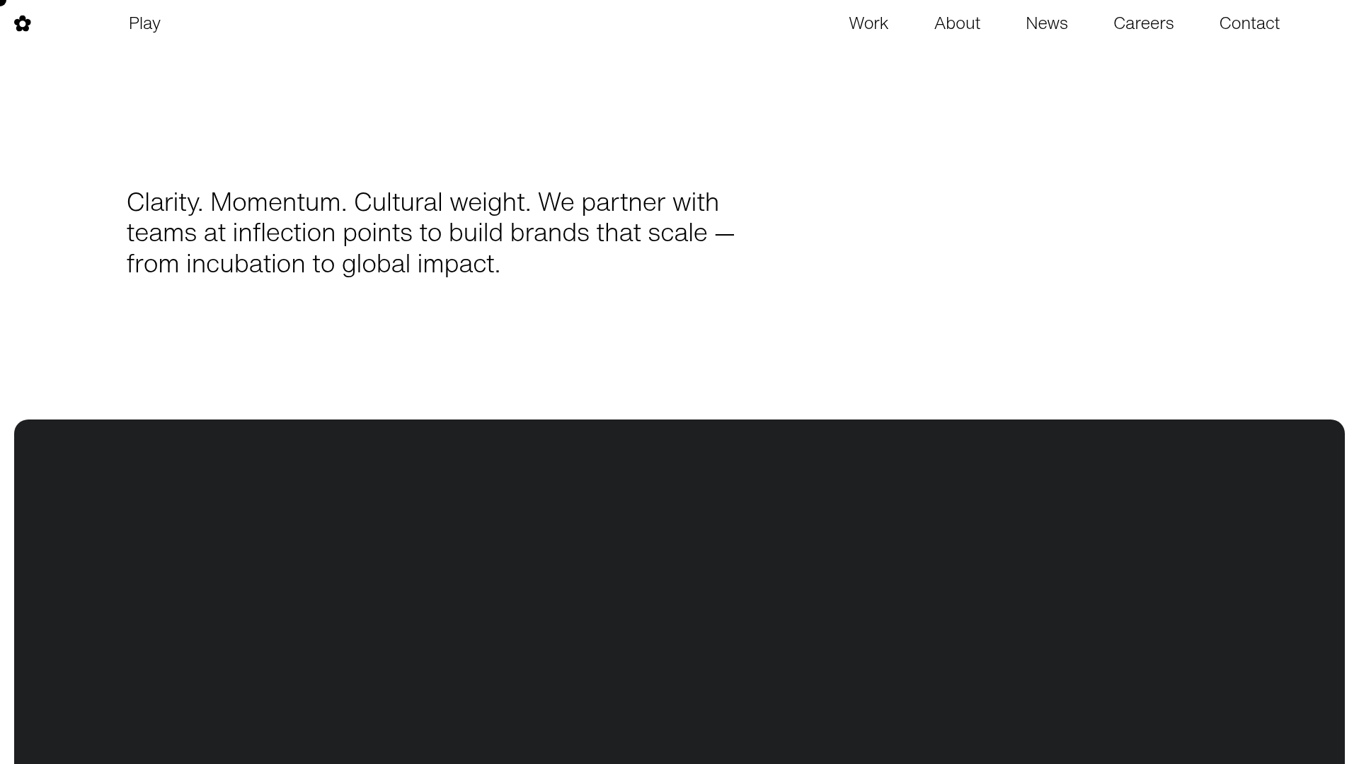
body--large), while navigation and labels use smaller, uniform sizing for a utilitarian look. - Page Structure: The layout follows a top-down flow: a top-aligned global navigation bar, a massive hero white space followed by an introductory text block, and a vertically stacked list of large-format project cards featuring 4:3 aspect ratios.
- Reusable Components:
- Grid-Aligned Nav: A distributed top-row navigation system that pins links to specific grid columns.
- Project Cards: Large, rounded-corner image containers with subtle hover opacity transitions.
- Fade-in-up Text: Reusable animation classes for staggering title entries.
- Interaction and Motion: The site uses Alpine.js (
x-intersect) and standard CSS animations (animate-fade-in-up) to trigger sections as they scroll into view. The HTML reveals apage-transition-fadeimplementation via Swup for seamless internal navigation. - Responsive Behavior: The design transitions from a single-column stack on mobile to a sophisticated offset grid on desktop, where projects shift to start at specific columns (e.g.,
laptop:col-start-4) to create asymmetrical balance. - Implementation Clues: Built using Tailwind CSS for utility-first styling (
col-span-full,aspect-[4/3]) and Alpine.js for scroll-based interactions.
Use Cases
- Who should clone this: Creative directors, independent designers, and boutique architecture or branding agencies looking for an "elevated" digital presence.
- Remixing direction: This layout is ideal for any visual-first business. A remix could involve keeping the typography-led header while swapping the 4:3 project images for full-width parallax sections or a horizontal slider.
- Practical Remixes: Effectively swap the brand voice by changing the typeface to a serif variant for a more traditional luxury feel, or use the footer-like navigation at the top for a distinct tech-startup aesthetic.
- Clone Scope: For a fast build, clone the navigation and the
body--largehero section to establish immediate brand authority. A full-page clone is recommended to maintain the specific grid-rhythm of the staggered project list.
Related Inspirations
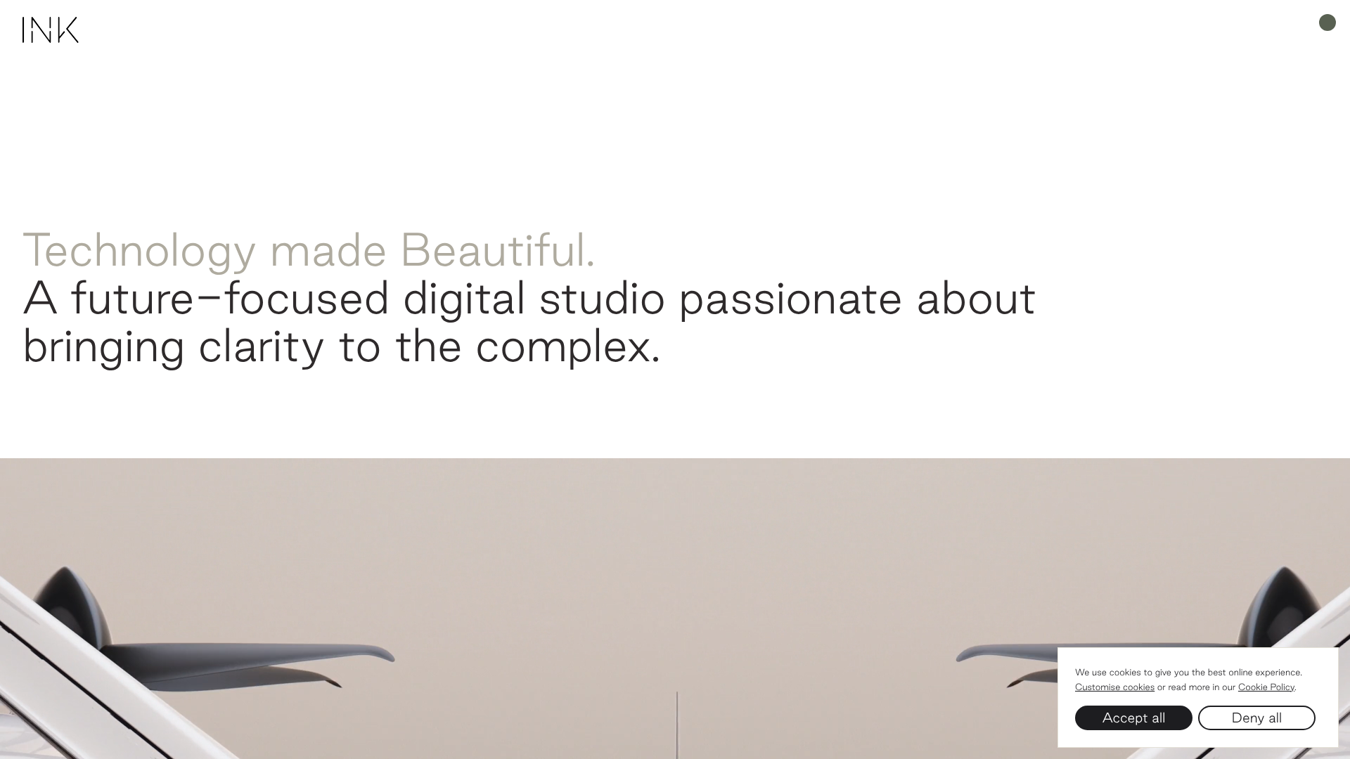
INK Digital Studio Portfolio Site
A high-end portfolio featuring an animated text hero, a full-bleed video slideshow with progress counters, and a masonry grid of project thumbnails with color-coded transition overlays.
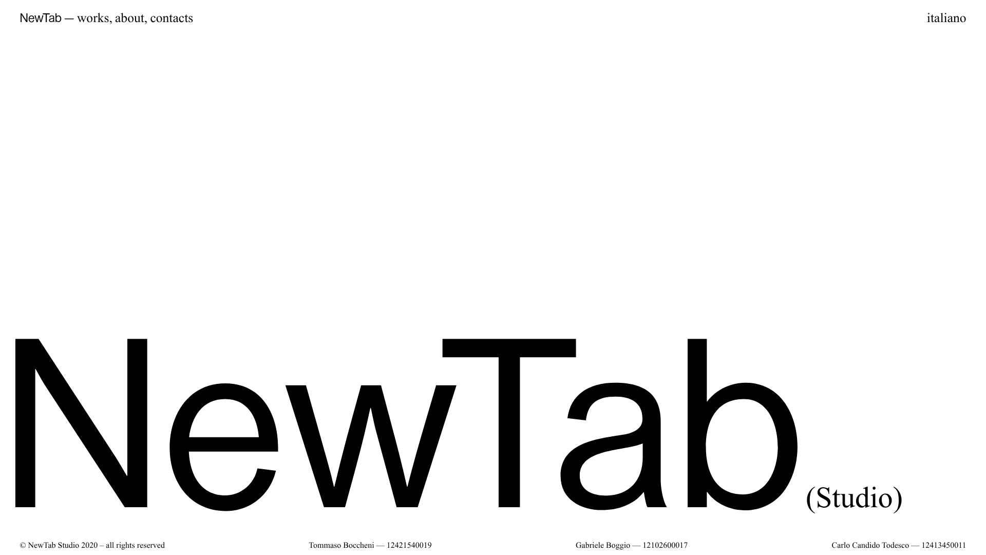
NewTab Studio Minimalist Portfolio Landing Page
A clean, typography-focused landing page featuring an oversized SVG/canvas hero title, a top-aligned navigation bar, and a minimalist footer layout.

Clase Agency Branding Portfolio
A minimalist design agency portfolio featuring a typographic hero section, full-width image articles, sticky title bars, and integrated scrolling text marquees for a clean editorial layout.
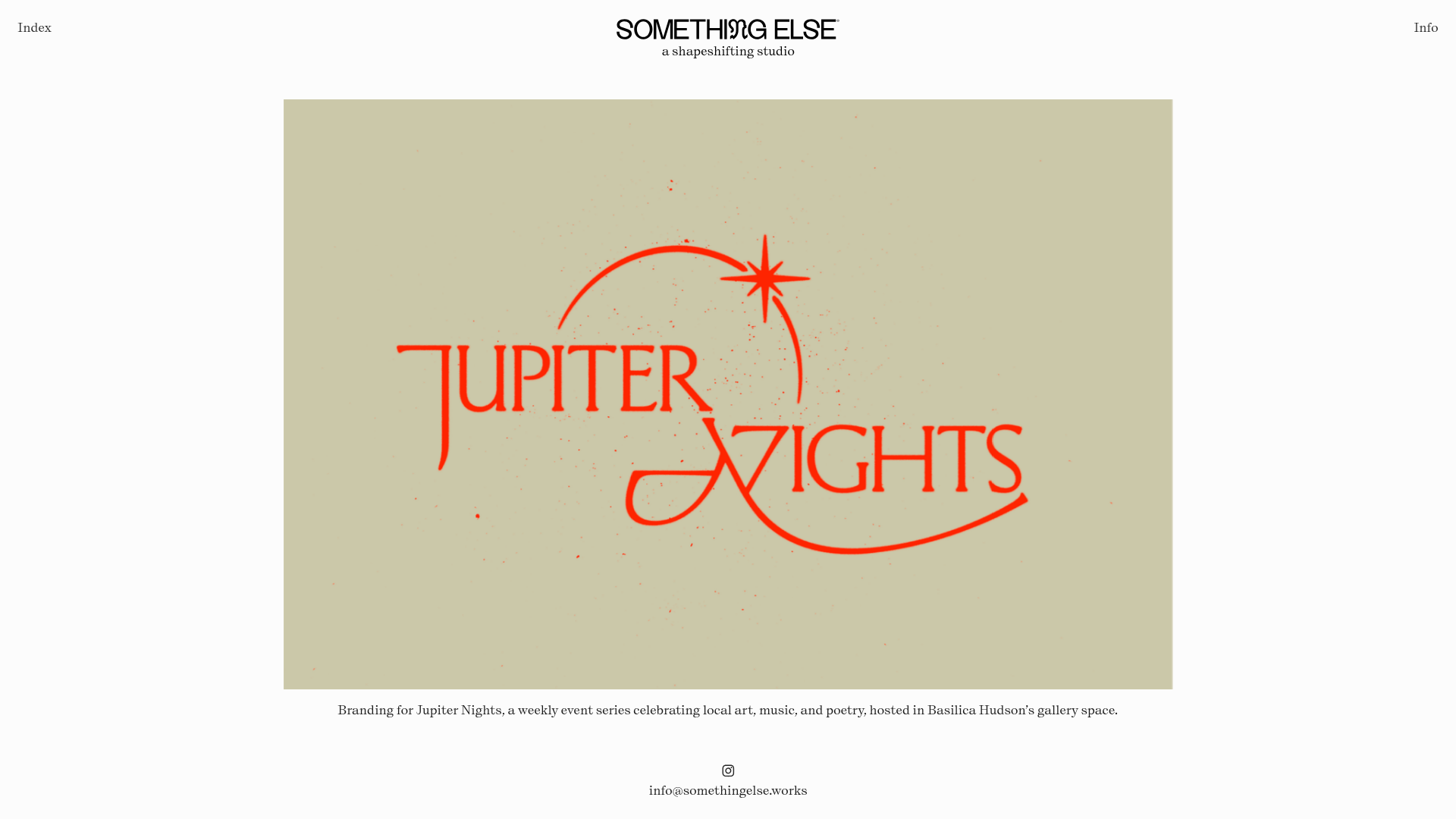
Something Else Portfolio Slideshow
A minimalist design studio portfolio featuring a full-width image and video slideshow with large-scale typography, sticky navigation, and centered captions.
Play Studio Minimalist Portfolio Landing
A high-impact agency layout featuring a oversized typography header, a full-width integrated Vimeo video background, and a unique expandable accordion list for industry showcases.

Vita Architecture Portfolio Landing Page
A minimalist, high-end architecture portfolio featuring a custom canvas-based image gallery, split-text animations, and a project slider with dynamic image masks.
