Map Project Office Portfolio Homepage
A minimalist studio site featuring a full-screen landing animation, sticky multi-part logo navigation, and a staggered asynchronous project grid with lazy-loaded imagery.
Overview
Map Project Office's portfolio is a high-end minimalist studio site that uses horizontal and vertical space to create a premium feel. It is an excellent reference for builders wanting to master sophisticated reveal animations and layout-shifting navigation that transforms from a hero element to a functional menu.
Design System
- Color Palette & Visual Hierarchy: A high-contrast monochrome palette (pure white background, black text) focuses attention entirely on project imagery. Visual hierarchy is established through extreme whitespace and large, bold typography followed by small-scale metadata.
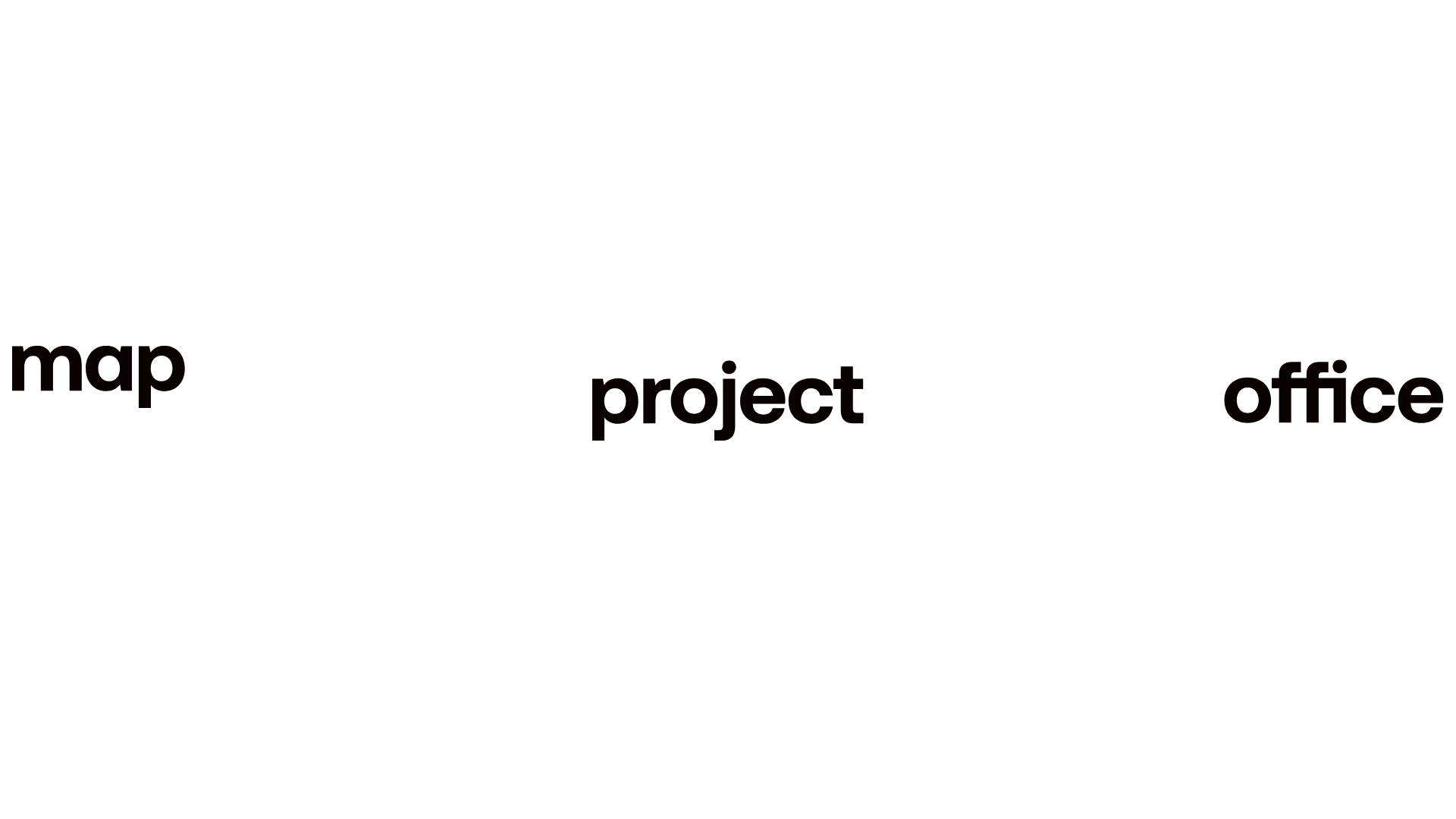
- Typography: The site uses a geometric sans-serif (resembling Helvetica or Inter) in all-lowercase for branding and project credits. Bold weights are used for the primary logo elements (
map,project,office), while body text and captions use thin or medium weights with wide letter-spacing. - Page Structure:
- Landing Panel: A minimal splash screen with three logo components spread across the viewport.
- Showreel Panel: A full-bleed Vimeo background video with simple play/pause/mute controls.
- Staggered Project Grid: A series of project rows (
.project-row) that alternate betweenleft-align,centre-align, andright-alignwith varying column widths (col-7-12_lgvscol-5-12_lg).
- Reusable Components:
- The Tri-part Logo: Three separate SVG logo wraps that converge or stick during scroll.
- Asynchronous Grid Cards: Project thumbnails with a standard title-wrap containing a credit, title, a custom 'plus' toggle, and a short caption.
- Custom Video UI: Minimal text-based controls (
.video-module-play-pause) instead of standard player chrome.
- Interaction Patterns: The site relies on GSAP-style scroll-triggering (seen in
id="smooth-wrapper") for staggered entry of images and a 'sticky' logo transition where the "map" SVG locks to the top left as the user scrolls past the landing panel. - Implementation Clues: Built with a Barba.js wrapper for seamless page transitions and GSAP (GreenSock) for smooth scrolling and pinning logic. Images use lazy-loading classes (
lazy full-bleed-image) with small base64 or thumbnail placeholders to optimize initial load.
Use Cases
- Design & Industrial Studios: Perfect for agencies showcasing physically high-quality products where large, uncrowded imagery is essential.
- Curated Portfolios: Content-light, quality-heavy portfolios for architects, photographers, or innovative hardware startups.
- Practical Remix Directions: Swap the monochromatic scheme for a brand-specific primary color; adapt the tri-part logo logic for sites with long, three-word titles; or repurpose the staggered grid for a blog index to break away from traditional card layouts.
- Suggested Clone Scope: Start with the Landing Panel to Sticky Nav transition, as this is the site's most distinct UX feature. The Staggered Project Rows can be cloned easily into a Flexbox or CSS Grid component for any gallery-style page.
Related Inspirations

CLOU Architects Design Studio Portfolio
A high-end architectural portfolio featuring a minimal B&W grid, parallax image galleries, accordion-style office listings, and a robust project filter system.
Studio Lathe Minimalist Portfolio List
A high-contrast, minimalist portfolio layout featuring a dense list-based project index with flexible category labeling and a full-screen yellow background.

Niklas Rosén Designer Portfolio Index
A minimalist, responsive grid-based portfolio index featuring a clean 16-column layout, typographic list components, and a custom dark mode transition.

Clase Agency Branding Portfolio
A minimalist design agency portfolio featuring a typographic hero section, full-width image articles, sticky title bars, and integrated scrolling text marquees for a clean editorial layout.

Lundqvist & Dallyn Studio Portfolio
Minimalist design studio portfolio featuring a custom video loader, world clock navigation, and a fluid masonry-style grid for high-quality photography and type design showcases.

Baubauwerk Minimal Agency Portfolio Homepage
A clean studio site featuring a centered text hero, scatter-plot filterable project gallery, and full-bleed image sections for case studies.
