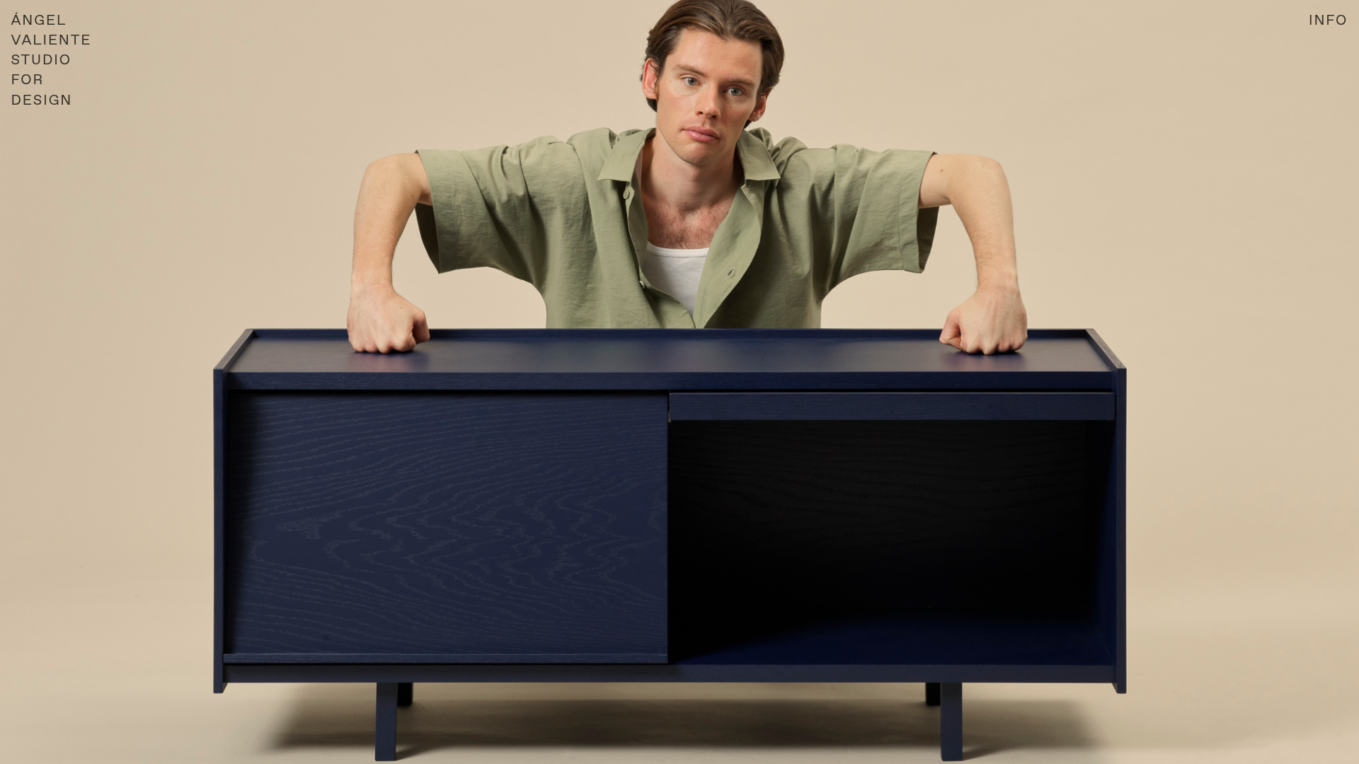
Ángel Valiente Design Portfolio
A minimalist design portfolio featuring a full-bleed hero slider, a bento-style product grid with randomized image rotations, and a clean two-column industrial layout.
Overview
This portfolio for industrial designer Ángel Valiente is a premier example of high-end minimalist Brutalism. It balances massive, full-bleed imagery with a rigid grid system and playful CSS transformations, providing an ideal template for creators whose work serves as the primary visual driver.
Design System
- Color Palette & Visual Hierarchy: The site uses a neutral, clay-like background (
#E6DCC9) which allows high-contrast product photography—like the deep blue sideboard in the hero—to pop. The hierarchy is extremely flat; text is secondary to the object. - Typography System: A clean, all-caps sans-serif (resembling Helvetica or similar grotesque faces) is used for all navigation and headers. It utilizes a mono-spaced aesthetic for metadata (e.g., 'INFO' and 'STUDIO FOR DESIGN') to reinforce the industrial theme.
- Page Structure:
- Full-Bleed Hero Slider: A
slick-sliderimplementation that centers large-scale product photography. - Bento Grid Gallery: A multi-column image grid featuring 'jumbled' layout logic.
- Contact/About Footer: A two-column split using large
H1headers for categories andH2for body details.
- Full-Bleed Hero Slider: A
- Reusable Components:
- The Rotating Card: Each
.gallery_cardin the grid uses inline styles (e.g.,transform: rotate(2.5deg);) to create a physical "scattered print" effect. - Pinned Navigation: A minimal header with a logo/name on the left and 'INFO' (which scrolls to the footer) on the right.
- The Rotating Card: Each
- Interaction & Motion: The gallery uses randomized rotations (alternating between
2.5degand-2.5deg) to break the digital rigidity. The hero slider uses a0.5s ease-in-outopacity transition for smooth image cycling. - Implementation Clues: Built on the Cargo Collective engine, the site utilizes a
main_containerwrap with acontent_paddingclass that ensures the rigid grid maintains its margins even on mobile, where the grid automatically stacks to simplified columns (mobile_datawithcolumns: 2in the JSON-LD attributes).
Use Cases
- Who should clone this: Photographers, furniture designers, architects, or fashion labels who have high-fidelity project images and want a site that feels curated rather than templated.
- What to remix: The 'jumbled' grid is the most unique asset; swapping the rigid 2.5-degree rotation for more organic or less aggressive angles can change the mood from 'playful' to 'clinical.'
- Practical Directions: Reuse the Footer layout for simple service-based businesses. The two-column layout under the
grid-rowhandles text density well while maintaining whitespace. - Clone Scope: A quick section clone of the rotating grid is highly effective for any landing page; a full-page clone is best for those needing a comprehensive single-page portfolio with a high-impact arrival experience.
Related Inspirations
Patrick Miller Photography Portfolio Template
A minimalist, full-bleed photography portfolio featuring a split-screen grid, scroll-triggered section transitions, and integrated Swiper.js image carousels for project galleries.
Taiki Murayama Portfolio Bento Grid
A minimalist designer portfolio featuring a dynamic bento-style layout for project imagery, integrated accordion project lists, and high-contrast typography.
MA Quilts Textile Portfolio Site
A vibrant portfolio layout featuring a two-column animated hero, horizontal marquee text, and dynamic CMS-driven grid galleries for showcasing artistic products and blog posts.

Clase Agency Branding Portfolio
A minimalist design agency portfolio featuring a typographic hero section, full-width image articles, sticky title bars, and integrated scrolling text marquees for a clean editorial layout.

Ayaka B. Ito Creative Portfolio
A minimalist design portfolio featuring an immersive full-screen hero image, clean typographic navigation, and a structured layout for showcasing branding and editorial projects.

Caserne Design Studio Portfolio
A minimalist, high-impact portfolio featuring a dynamic masonry grid of project thumbnails with overlay text and a clean, oversized typography-driven footer.
