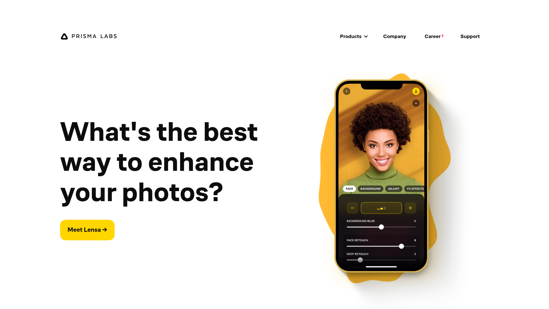
Prisma Labs App Showcase Landing
A clean SaaS landing page layout featuring large typography, magnetic hover buttons, and high-fidelity mobile app mockups with animated video blob backgrounds.
Overview
This landing page is a masterclass in high-impact simplicity, designed to showcase mobile applications through bold typography and dynamic visual layering. It is a strong clone reference for developers who want to replace static screenshots with interactive, layered mockups that use video backdrops to create depth and movement.
Design System
- Color Palette & Visual Hierarchy: The design uses a clean white background with high-contrast black typography. Vibrant accent colors (Sunburst Yellow and Sky Blue) are used for Call-to-Action (CTA) buttons and the animated "video blobs" that sit behind device mockups to draw the eye.
- Typography: The system relies on a bold, geometric sans-serif (reminiscent of Montserrat or Inter). Headers use a large scale with tight tracking and leading for a modern feel. Utility text (navigation) is smaller and uppercase to maintain hierarchy.
- Page Structure: The layout follows an alternating zig-zag pattern. The hero section features left-aligned text with a right-aligned mockup; subsequent sections reverse this layout to maintain visual rhythm during vertical scrolling.
- Reusable Components:
- Magnetic Buttons: The
cta-a-containerandmoveclasses suggest a "magnetic" hover effect where the button follows the cursor slightly. - Interactive Mockups: The
iphone-wrappercontains multiple layered images (before,iphone,before-pen) and a video tag, designed to swap states or animate elements upon interaction. - Responsive Layout: The use of
grid56andgrid44classes indicates a proportional column-based grid system (56% and 44% widths) that stacks vertically on mobile.
- Magnetic Buttons: The
- Interaction & Motion: The presence of
will-change: transformandopacity: 0on specific image layers indicates sophisticated entrance animations or hover-triggered "Before/After" reveals. Background motion is provided by looped MP4 "blobs" constrained within a circular mask.
Use Cases
- Who should clone this: App developers, SaaS founders, and UI/UX designers looking to build a high-converting "Features" page that feels premium and active rather than static.
- Effective Remixes: This pattern works perfectly for any mobile-first product. A developer could swap the
video-blobbackground from orange to a brand-specific gradient or replace the iPhone mockup with a browser frame for Web Apps. - Remix Directions: Reuse the alternating section grid for service pages, or isolate the
iphone-wrappercomponent to create a standalone product hero section. The magnetic button container is a great micro-interaction to lift from the code for any CTA. - Clone Scope: A quick section clone is ideal if you only need a hero section; however, cloning the full page is recommended to capture the layout transitions and the cohesive "blob" animation ecosystem.
Related Inspirations

Finn Pet Supplements Landing Page
An e-commerce landing page featuring high-contrast typography, a sticky brand logo banner, parallax scroll effects on product headers, and a clean product grid.
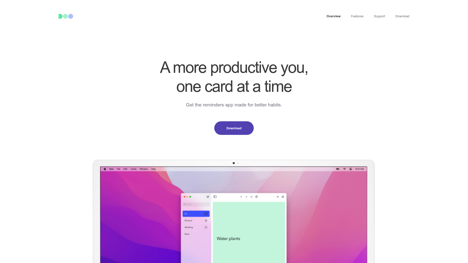
Doo App Minimalist Product Landing Page
A clean, centered product showcase featuring a parallax hero image, icon-based feature checklists, horizontal gesture illustrations, and stacked section layouts with ample whitespace.
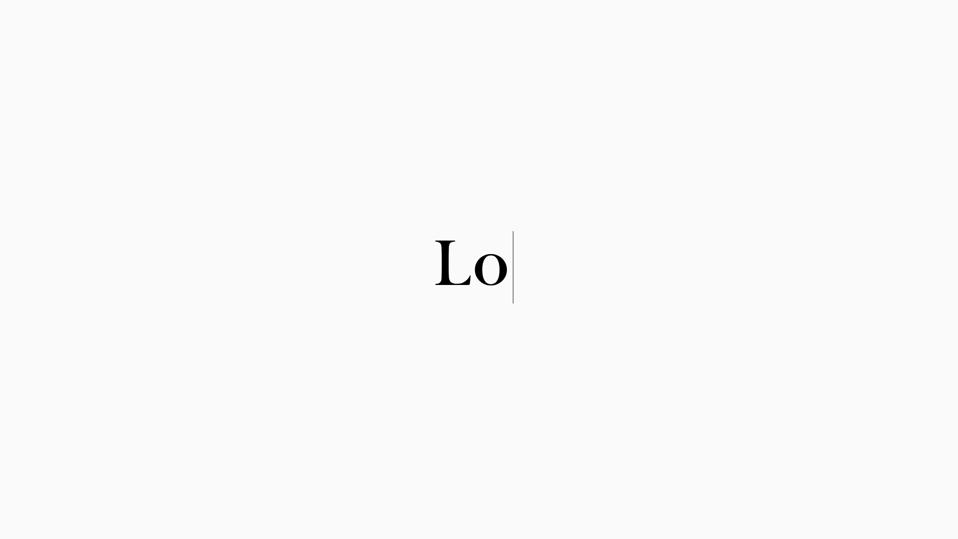
LoveFrom Minimalist Animated Wordmark Landing
A minimalist landing page featuring a center-aligned animated wordmark, a hidden info panel, and a decorative bear animation overlay.
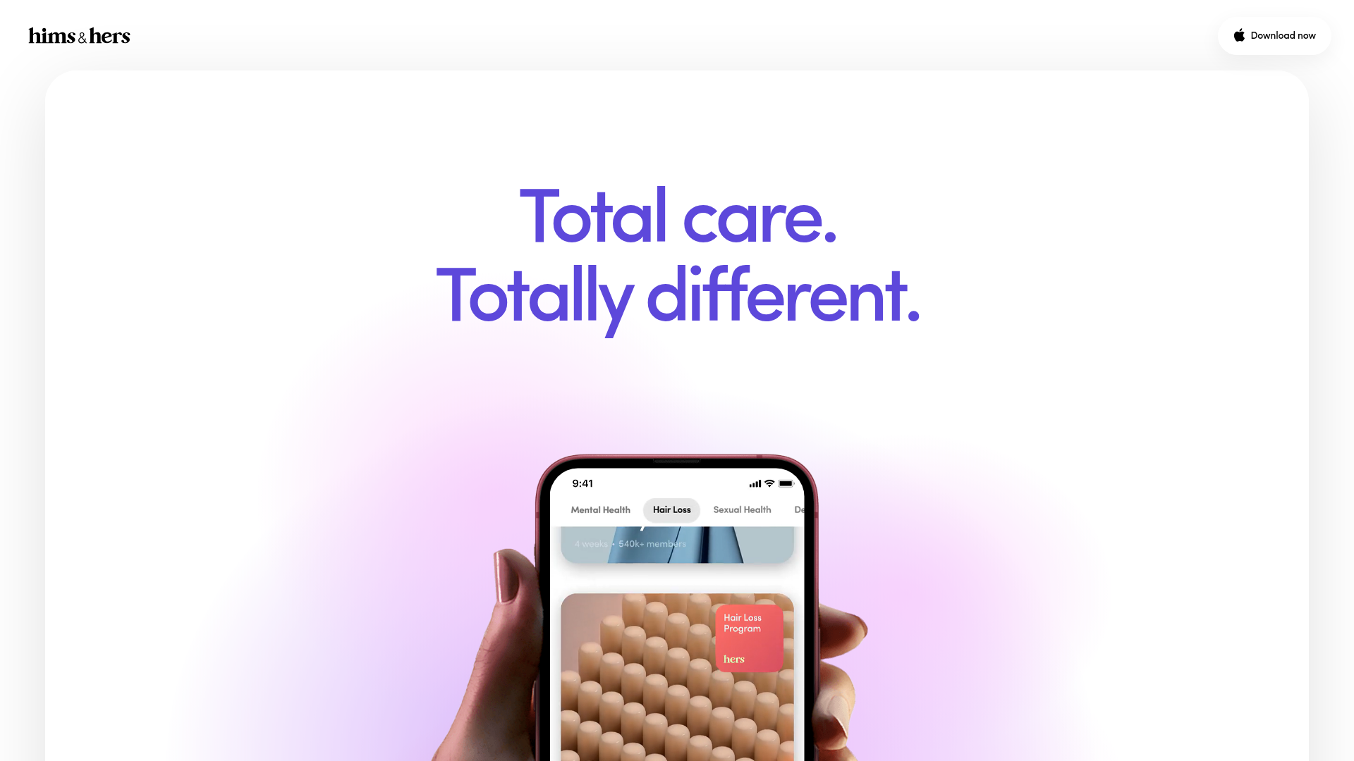
Hims & Hers App Landing Page
A clean health-tech landing page featuring high-contrast typography, sticky phone mockups with scroll-triggered animations, and sleek card-based content sections.
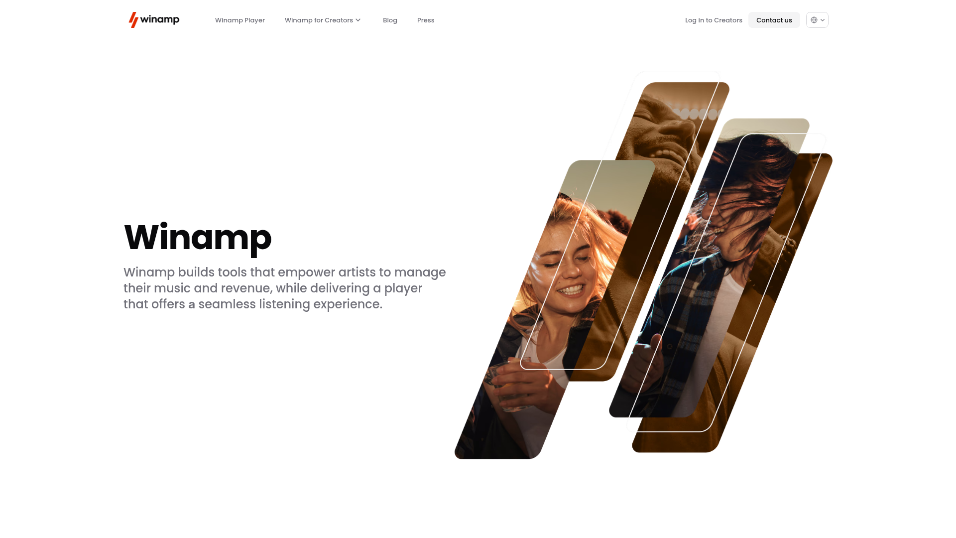
Winamp Modern Media Landing Page
A minimalist hero section featuring a split-screen layout with an offset diagonal image gallery, clean typography, and a sticky navigation menu.
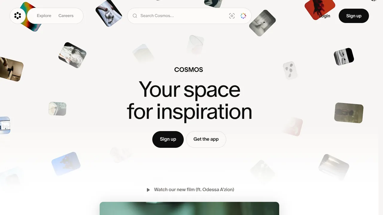
Cosmos Visual Inspiration Landing Page
Features a floating image hero with canvas animations, a centered search bar integration, and multi-column scroll reveals for showcasing visual assets.
