404 HTTP Error Landing Page
A minimal, text-only placeholder page showing a standard server-side 'Not Found' error message for a missing directory.
Overview
This is a fundamental example of a standard HTTP 404 "Not Found" server-side landing page. It serves as a raw, functional baseline for web developers who need to implement a default error state before applying custom branding or enhanced user experiences.
Design System
- Color Palette and Visual Hierarchy: The design follows a strict high-contrast monochromatic scheme, utilizing pure black (#000000) text on a pure white (#FFFFFF) background. Hierarchy is established purely through font weight and size, with the error title being the primary focal point.
- Typography System: Uses default system serif fonts (likely Times New Roman). The header employs a large, bold
<h1>for immediate identification, while the explanatory text uses a standard paragraph size for secondary information. - Page Structure and Section Flow: The layout is extremely minimalist and top-aligned. It consists of two vertical elements: a primary header indicating the error type, followed by a clarifying sentence containing the variable URL path (in this case, "/en").
- Reusable Components: The core component is the error message container. While functionally basic, it provides a clean slate for developers to inject a custom "Back to Home" button or a site-wide search bar.
- Interaction and responsive behavior: The page is static with no motion or hover effects. It is inherently responsive, as the text wraps naturally within the viewport on mobile devices without the need for complex media queries.
- Implementation Clues: The HTML structure is ultra-lightweight, using semantic tags (
<h1>and<p>). There is no evidence of external CSS frameworks or JavaScript, indicating a direct server-rendered response.
Use Cases
- Who should clone this: Backend developers setting up default error handling for Apache or Nginx servers who require a placeholder until a UI/UX-designed page is ready.
- What products can remix it: Any web application needing a lightweight error fallback. It can be effectively remixed into a more helpful landing page by adding brand-consistent styling.
- Practical remix directions: Swap the default serif fonts for a brand-specific sans-serif, center the content both vertically and horizontally for better visual balance, and add a call-to-action (CTA) like "Return Home" or a search field to reduce bounce rates.
- Suggested clone scope: A quick full-page clone for use as a template file in a development environment.
Related Inspirations

Google Holiday 100 Curator Landing Page
A minimalist e-commerce showcase featuring a wide hero section, clean search integration, and a bold typography-driven header designed for trending product collections.

Finn Pet Supplements Landing Page
An e-commerce landing page featuring high-contrast typography, a sticky brand logo banner, parallax scroll effects on product headers, and a clean product grid.
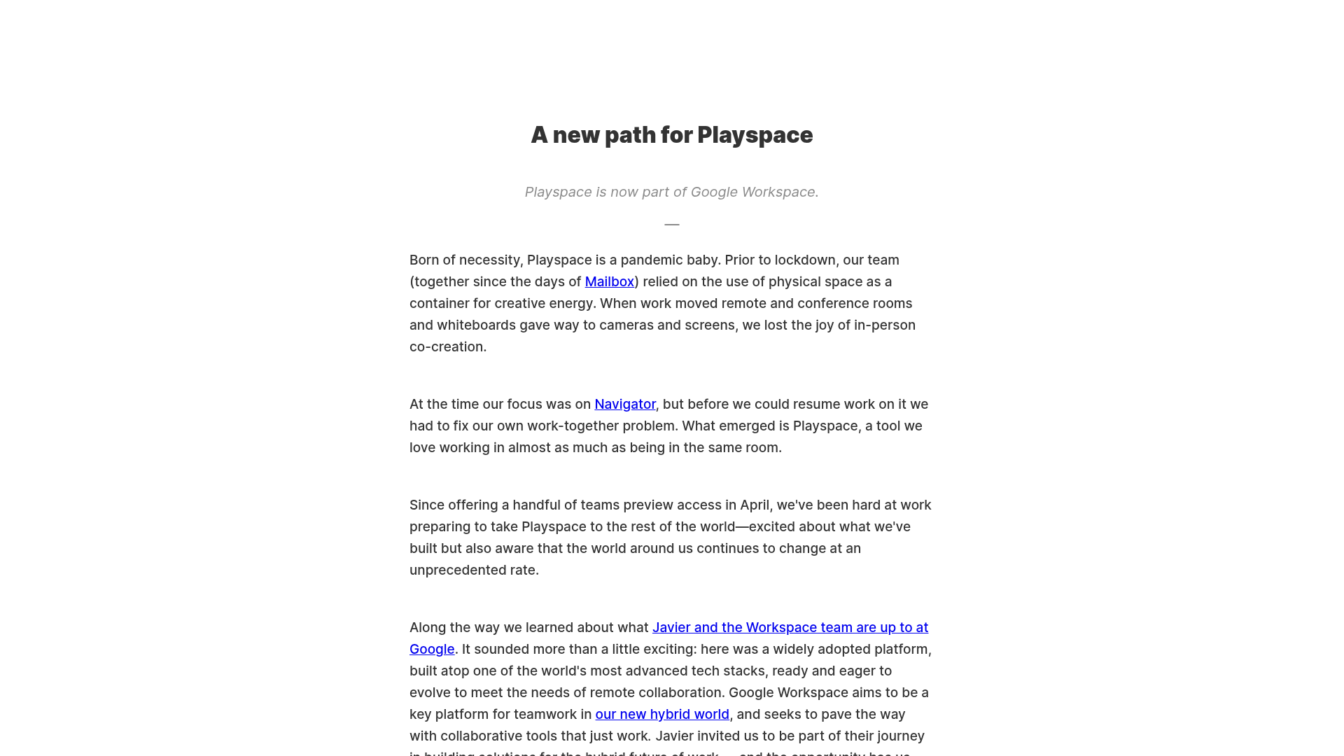
Playspace Acquisition Announcement Minimalist Layout
A clean, center-aligned announcement template featuring a vertical stack of rich text content and linked text elements on a neutral background.
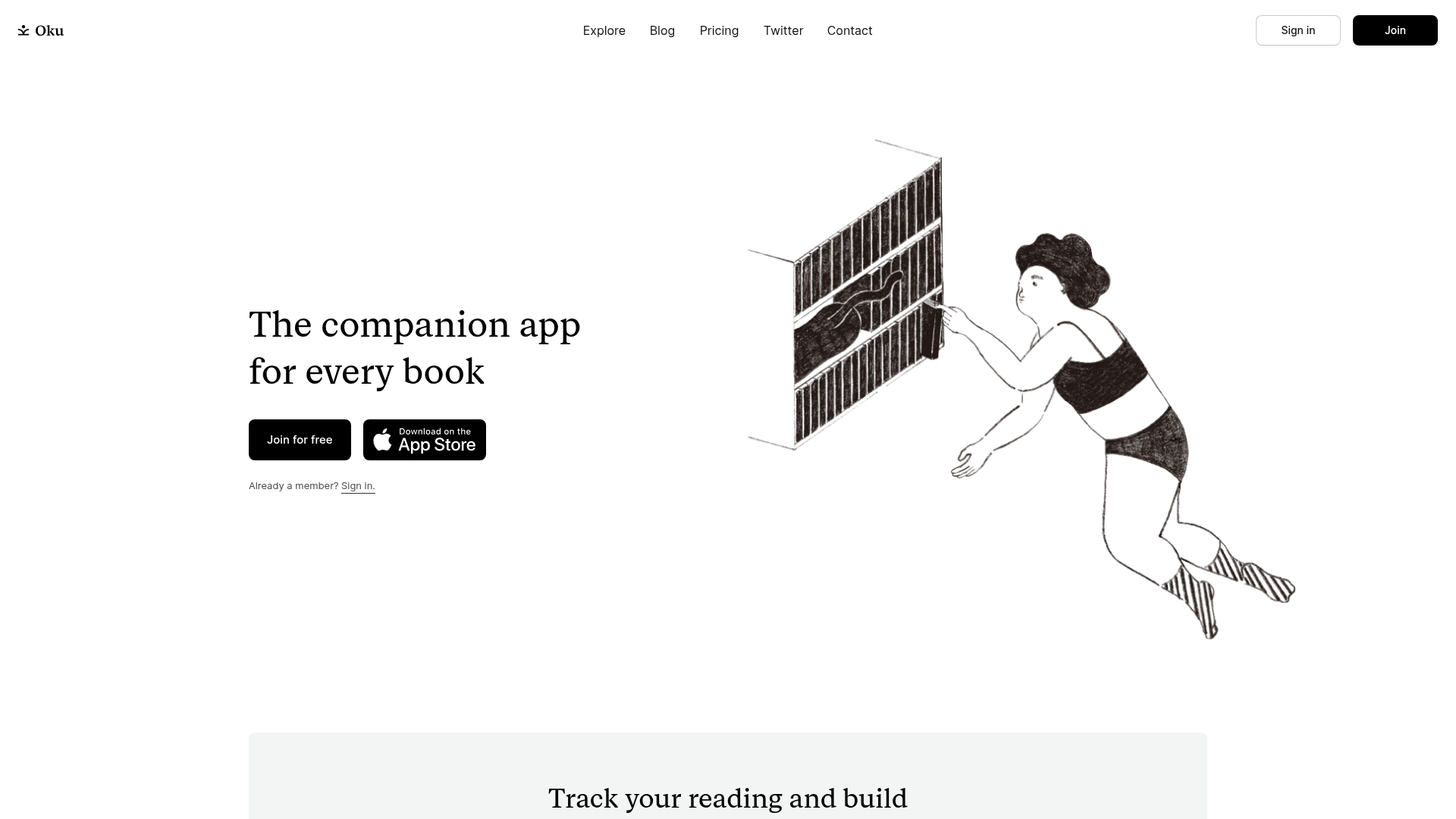
Oku Minimalist Book Tracking Landing Page
A clean, typography-focused landing page featuring a minimalist header, illustrated hero section, and clear call-to-action buttons for app downloads.

OpenWeb B2B Service Landing Page
A professional landing page layout featuring a central animated hero area, data visualization counters, a client logo grid, testimonial slider, and tabbed lead generation forms.

Slite SaaS Knowledge Base Landing Page
A clean SaaS hero section with a conversational headline, secondary call-to-action buttons, and a structured software interface preview featuring user testimonials.
