OpenWeb B2B Service Landing Page
A professional landing page layout featuring a central animated hero area, data visualization counters, a client logo grid, testimonial slider, and tabbed lead generation forms.
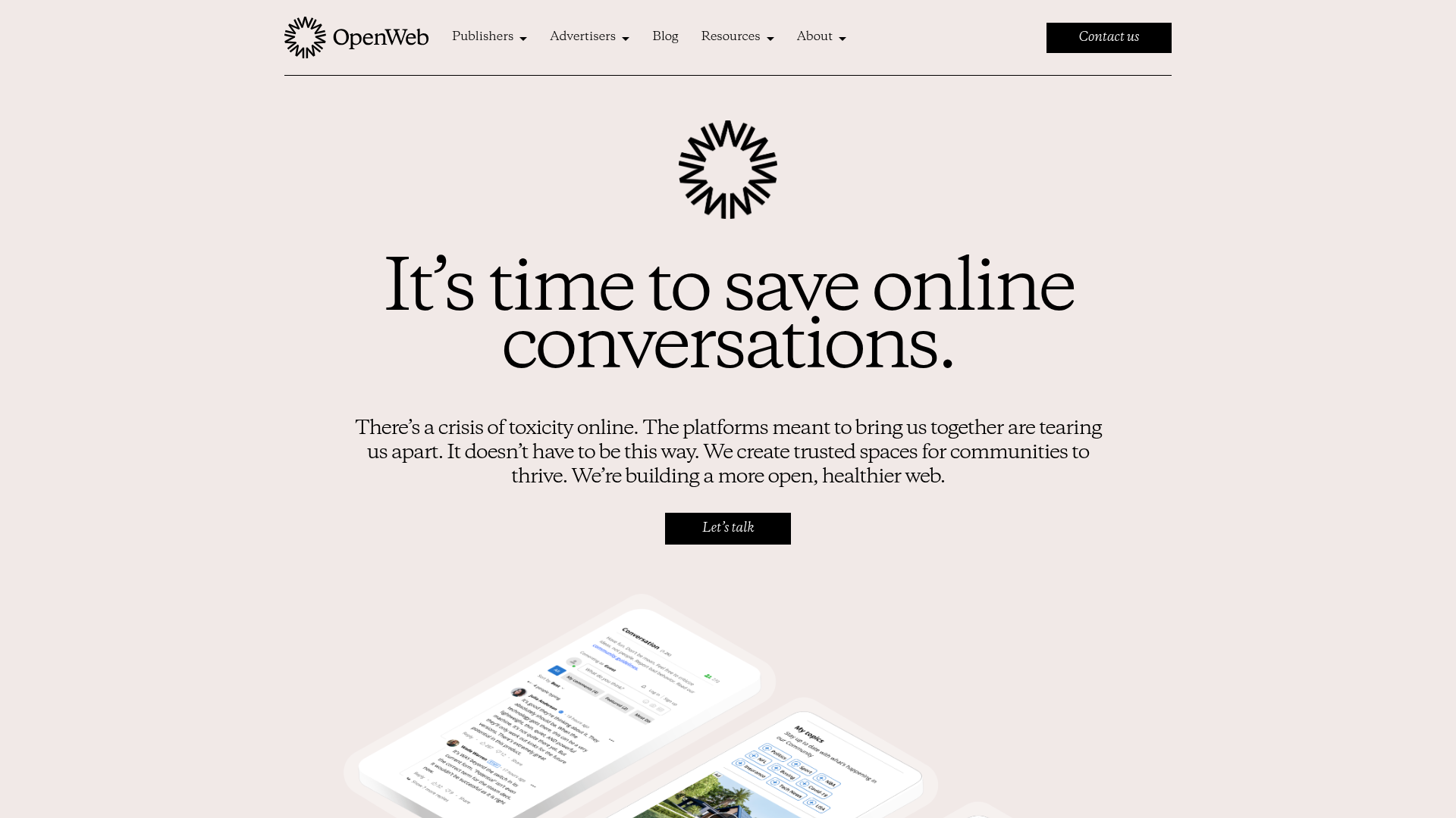
Overview
OpenWeb's landing page is a sophisticated B2B SaaS example that balances technical authority with humanitarian messaging. It is a strong reference for builders because it masterfully uses high-contrast serif typography and minimalist layouts to present complex data-driven features as simple, value-oriented solutions.
Design System
- Color Palette & Visual Hierarchy: The site uses a warm, off-white background (
#F4EFEAvibe) as a neutral base, creating a premium feel compared to standard white. Dark black is used for primary text and call-to-action buttons, while an electric blue and forest green appear as functional accents for highlights and data metrics. - Typography: The hierarchy is driven by a high-contrast serif typeface for headlines (e.g., "It’s time to save online conversations") to convey heritage and trust. Body text and labels utilize a clean sans-serif for legibility. Large-scale headings featuring wide tracking (letter spacing) are used as section dividers.
- Page Structure:
- Minimalist Top Nav: Logo, dropdown menus, and a prominent "Contact us" button.
- Central Hero: Icon-led layout with a clear mission statement and single CTA.
- Data Grid: A multi-column section showcasing performance metrics ("3x more time on site") using green arrow iconography.
- Trust Bar: A large numerical social proof section ("5.5B Users") followed by a grayscale logo grid.
- Testimonial Slider: A carousel featuring brand logos, quotes, and author portraits.
- Tabbed Lead Gen: A unique bottom-section form that switches between "Publisher" and "Advertiser" personas.
- Reusable Components: The grayscale logo grid, the stylized data counters with arrow accents, and the tabbed HubSpot-integrated contact form are prime candidates for immediate reuse.
- Implementation Clues: The HTML reveals a WordPress-based build utilizing the Kadence blocks framework (
kb-row-layout,kt-adv-heading), with Slick Slider powering the testimonials and HubSpot for form management. The layout relies on a standard 12-column grid system (small-12,medium-8).
Use Cases
- Who should clone this: Small to mid-sized B2B startups in the AI, moderation, or publishing space who want to move away from the "generic SaaS" blue-and-white look towards a more established, editorial brand identity.
- Remix Directions: Developers can reuse the tabbed form logic to handle multiple buyer personas on a single landing page without clutter. The Performance Metrics section can be easily adapted for case study pages by swapping labels and percentages.
- Suggested Scope: This is ideal for a full-page clone if the goal is to establish a premium brand presence. For quicker wins, the hero area and the data grid provide a high-impact responsive layout that can be dropped into any existing service page.
Related Inspirations
403 Forbidden Access Page
A minimalist, centered HTTP 403 error status page layout suitable for clean and simple server-side response templates.
Minimal Animated Success Landing Page
A clean, centered confirmation screen featuring a large green icon, a bold heading, and smooth fade-in entry animations.

Nonymous Coming Soon Placeholder Page
A minimalist blank landing page featuring a simple 'Coming soon' text layout suitable for basic domain parking or initial placeholder deployment.
Firebase Hosting Site Not Found
A minimal placeholder layout for 404 error states including a centered logo, numbered troubleshooting guide, and linked utility text.
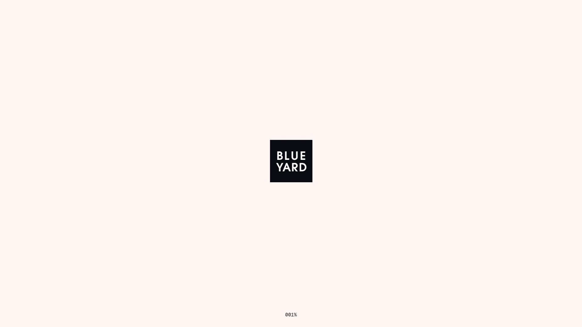
BlueYard Minimal Logo Splash Page
A terminal-style minimalist loading screen featuring a centered logo block and a discreet bottom-aligned percentage progress indicator for high-end landing pages.
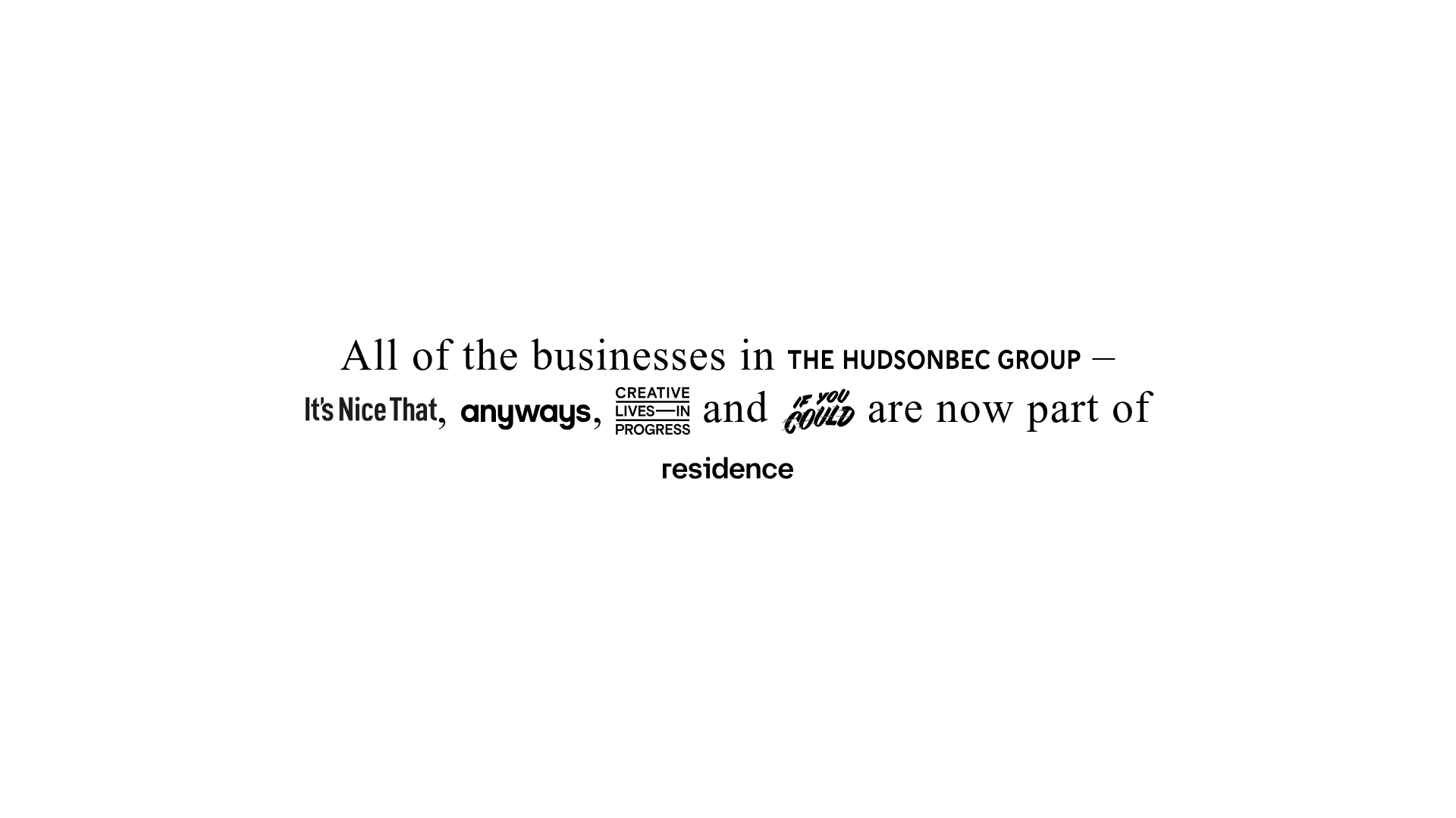
HudsonBEC Group acquisition landing page
A minimalist, typography-driven announcement landing page featuring a centered text hero and embedded brand logo SVG links.
