Bastien Allard Minimalist Portfolio Gallery
A clean, horizontal marquee-based portfolio featuring a sticky header/footer layout, digital clock integration, and responsive bilingual text columns for minimalist art director showcases.
Overview
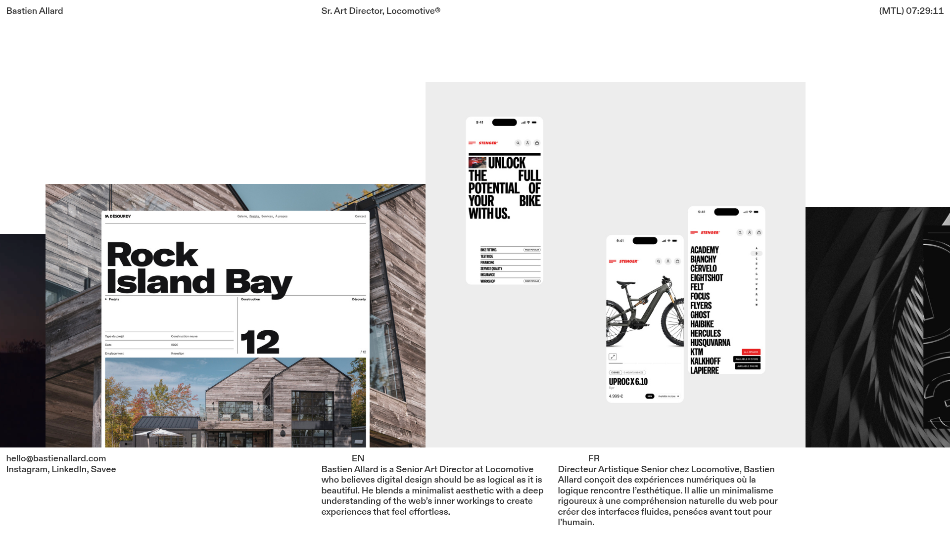
This minimalist portfolio website for a Senior Art Director uses a sleek, horizontal marquee-based layout to showcase high-fidelity design work. It is an excellent reference for builders wanting to implement a "sticky frame" UI where content slides horizontally between a fixed header and footer. The site balances professional authority with creative flair through its bilingual presentation and integrated digital clock.
Design System
- Color Palette & Visual Hierarchy: The design follows a strict high-contrast monochrome palette (pure white background, black text) that allows the colorful project imagery to serve as the focal point. Visual hierarchy is established through extreme shifts in type scale rather than color.
- Typography: The system uses a clean, grotesque sans-serif. The header and footer use small, functional sizes (approx. 14px), while the project titles within the marquee content feature massive, bold typography to create a high-impact editorial feel.
- Page Structure: The site utilizes a three-tier vertical layout: a sticky top header for branding and the clock, a fluid central marquee area for the image gallery, and a sticky bottom footer for contact info and bios.
- Reusable Components:
- Interactive Marquee: A friction-based horizontal slider that supports both static images and auto-playing muted video clips.
- Bilingual Bio Blocks: A perfectly balanced column-set for dual-language introductions (EN/FR).
- Utility Header: A minimal navigation bar featuring a functional
<digital-clock>component and location stamp (MTL).
- Interaction Patterns: The marquee employs a specific
frictionandspeedvariable in the HTML, suggesting a smooth, inertia-based scrolling experience. Media items include a "zoomable" state for closer inspection. - Responsive Behavior: The HTML structure reveals a
mobile-stack="true"attribute on the footer's column-set, ensuring the side-by-side bilingual text stacks vertically on smaller screens while maintaining the fixed-padding frame layout.
Use Cases
- Who should clone this: Creative professionals (designers, photographers, art directors) who have a few high-quality visual projects and want to move away from traditional vertical scrolling grids.
- Effective Remixes: This pattern works exceptionally well for luxury brand lookbooks, architectural portfolios, or digital agency landing pages where visual impact is prioritized over long-form copy.
- Practical Remix Directions: Builders can swap the monochrome background for a brand-specific neutral tone, replace the marquee with a draggable carousel, or adapt the bilingual columns to show "Services" vs. "Awards."
- Suggested Clone Scope: A full-page clone is recommended to maintain the integrity of the "fixed frame" aesthetic, though the bilingual footer columns are a highly reusable snippet for international business sites.
Related Inspirations
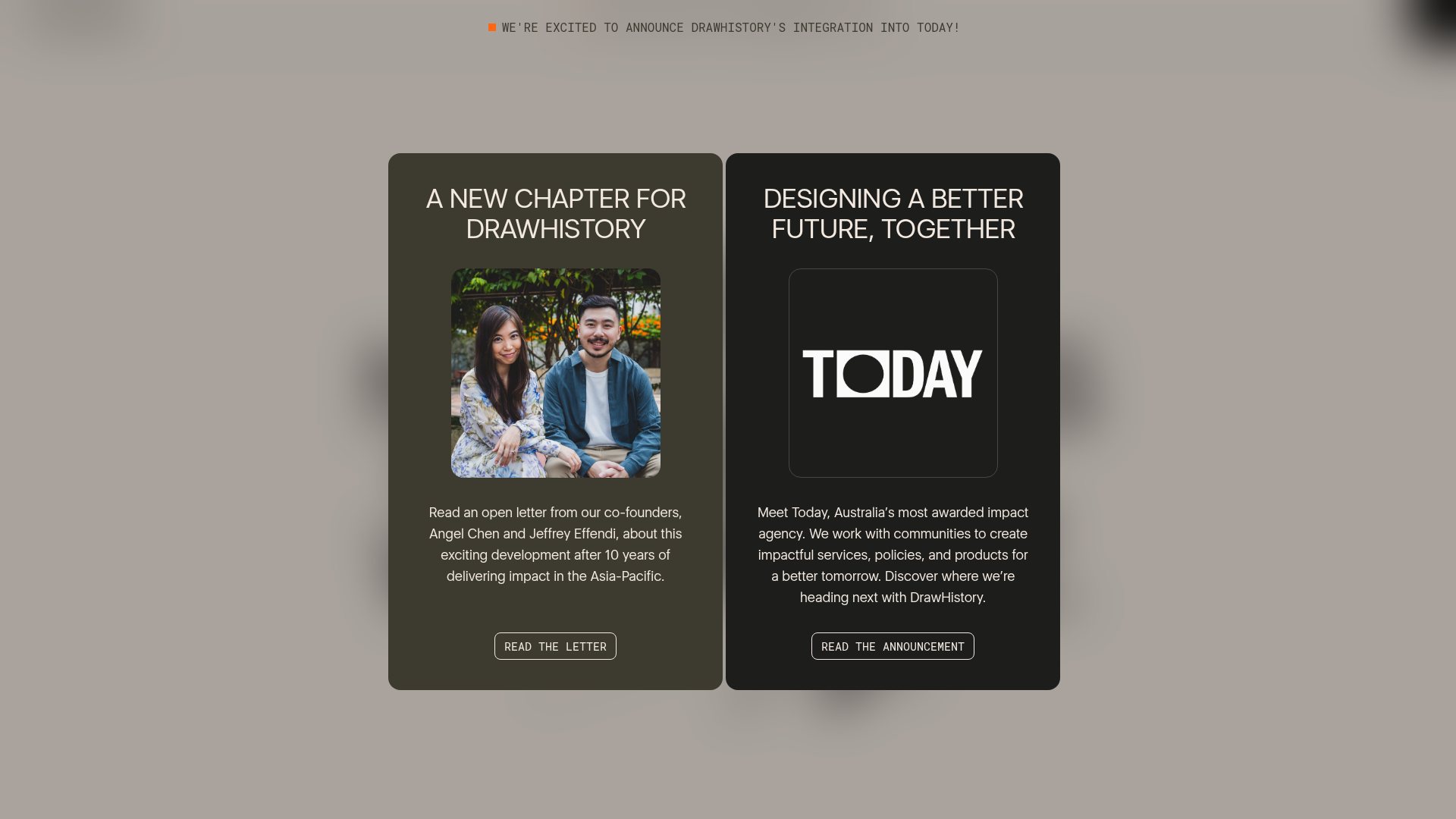
DrawHistory Social Impact Agency Portal
A split-layout announcement page featuring high-contrast cards, typography-driven hero sections, vertical border treatments, and touch-responsive case study carousels.
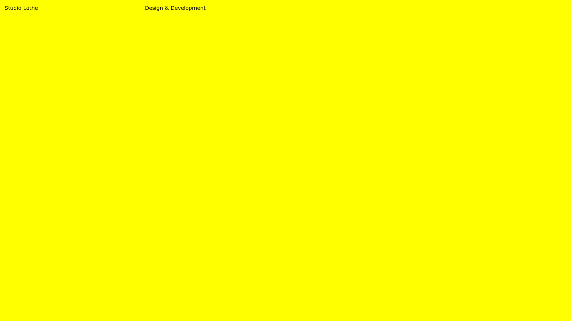
Studio Lathe Minimalist Portfolio List
A high-contrast, minimalist portfolio layout featuring a dense list-based project index with flexible category labeling and a full-screen yellow background.

Niklas Rosén Designer Portfolio Index
A minimalist, responsive grid-based portfolio index featuring a clean 16-column layout, typographic list components, and a custom dark mode transition.

Clase Agency Branding Portfolio
A minimalist design agency portfolio featuring a typographic hero section, full-width image articles, sticky title bars, and integrated scrolling text marquees for a clean editorial layout.

Lundqvist & Dallyn Studio Portfolio
Minimalist design studio portfolio featuring a custom video loader, world clock navigation, and a fluid masonry-style grid for high-quality photography and type design showcases.

Baubauwerk Minimal Agency Portfolio Homepage
A clean studio site featuring a centered text hero, scatter-plot filterable project gallery, and full-bleed image sections for case studies.
