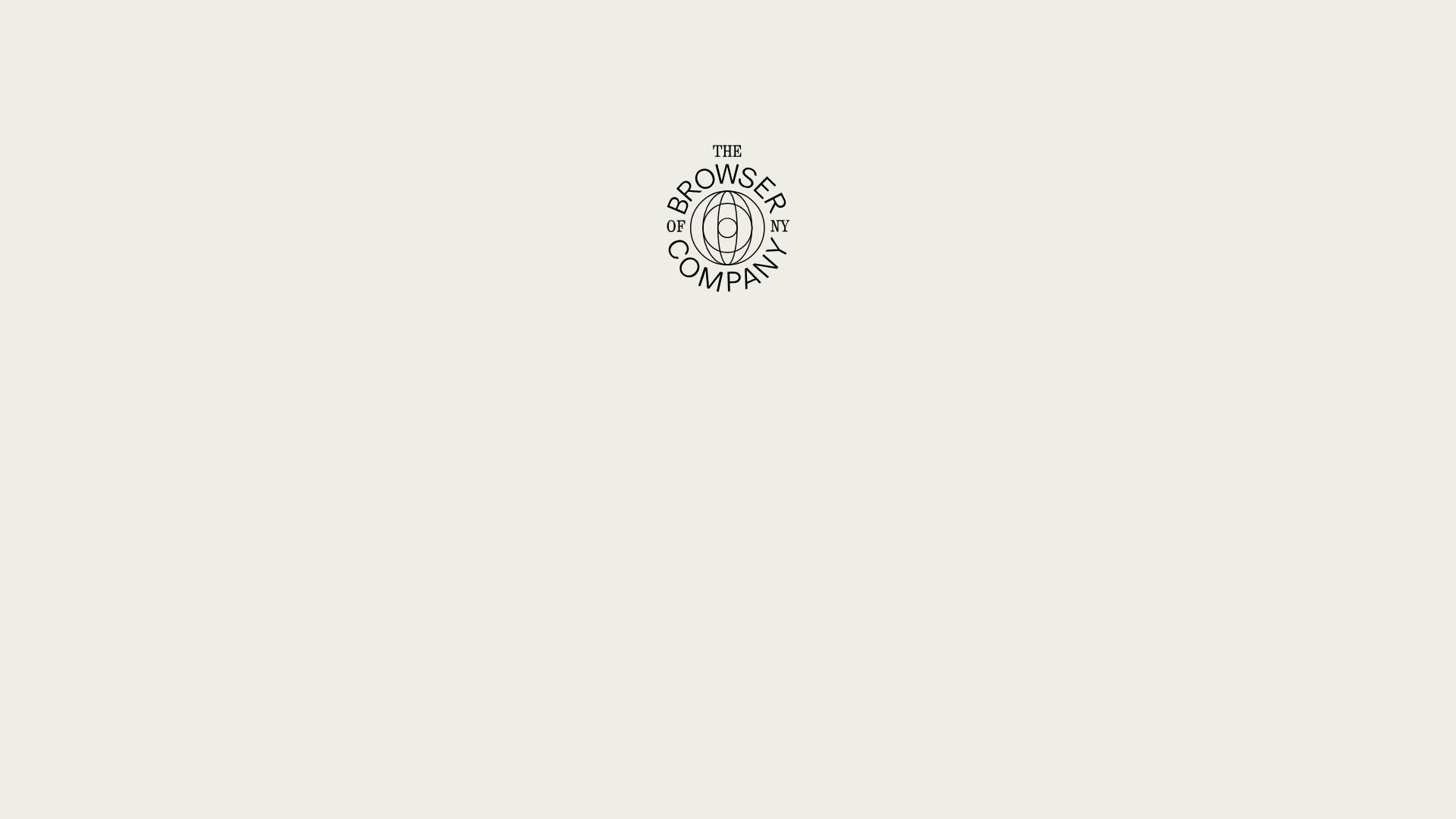
The Browser Company Minimal Portal
A minimalist corporate landing page featuring a centralized circular brand mark, subtle canvas animations, and clean monochrome typography in a high-contrast layout.
Overview
This site serves as a minimalist entryway and portal for The Browser Company, utilizing a stark, high-contrast aesthetic to establish a premium corporate identity. It is an excellent reference for builders wanting to master 'less is more' design, focusing on centrist branding and subtle canvas-based texture to create a sophisticated digital atmosphere.
Design System
- Color Palette & Visual Hierarchy: The design uses a monochrome, high-contrast scheme featuring an off-white/beige background and deep black ink-like elements. A singular 'blue' accent is used for a pulse animation (signaling live users), but the dominant hierarchy is driven by the central logo mark and generous white space.
- Typography: The system relies on a mix of serif and monospace fonts. The body text uses an italicized serif heading (
heading italic rich-text) to create a literary, editorial feel. Smaller UI elements, such as the "Online" status and navigation buttons, use a monospace font (mono) to imply a technical, digital-native foundation. - Page Structure: The layout follows a strictly centralized vertical stack. It begins with a complex circular logo mark, followed by a wide-spaced heading, two primary CTA buttons in a horizontal row, and a footer containing a sequence of low-opacity icons/logos.
- Reusable Components:
- Central Brand Mark: A detailed vector badge that serves as the visual anchor.
- Mono-Link Buttons: Simple text-based buttons (
button-link) that rely on padding and alignment rather than heavy borders or fills. - Status Indicator: A fixed-position pulse component (
animate-pulse) for real-time engagement metrics.
- Interaction & Motion: The site uses a
canvaslayer for a pixelated film grain or noise texture, adding depth to the flat background. Elements utilizeopacitytransitions andsite-easedurations for soft fade-ins upon loading. - Responsive Behavior: The 1000px breakpoint toggles fixed status elements. On smaller screens, the layout shifts from horizontal flex rows for navigation and footer links into a vertical stack, ensuring the central message remains the focal point.
- Implementation Clues: Built using Next.js (
__nextID) and Tailwind CSS (utility classes likefixed,inset-0,flex-col,gap-20). The layout heavily uses flexbox for absolute centering (items-center,justify-center).
Use Cases
- Who should clone this: Studios, founders launching a dual-product suite, or developers wanting a 'Coming Soon' page that feels intentional rather than unfinished.
- Effective Remixes: This pattern is ideal for portfolio landing pages or directory sites where the branding needs to precede the content.
- Remix Directions: Swap the serif italic for a bold sans-serif to shift from 'editorial' to 'modern tech'; adapt the footer icon row into a tech stack or partner showcase; or replace the canvas noise with a subtle gradient mesh.
- Suggested Clone Scope: Start with the full-page layout clone to capture the centering and typography scale. The canvas overlay and monospace status indicator are the most valuable logic-based components to reuse in other projects.
Related Inspirations
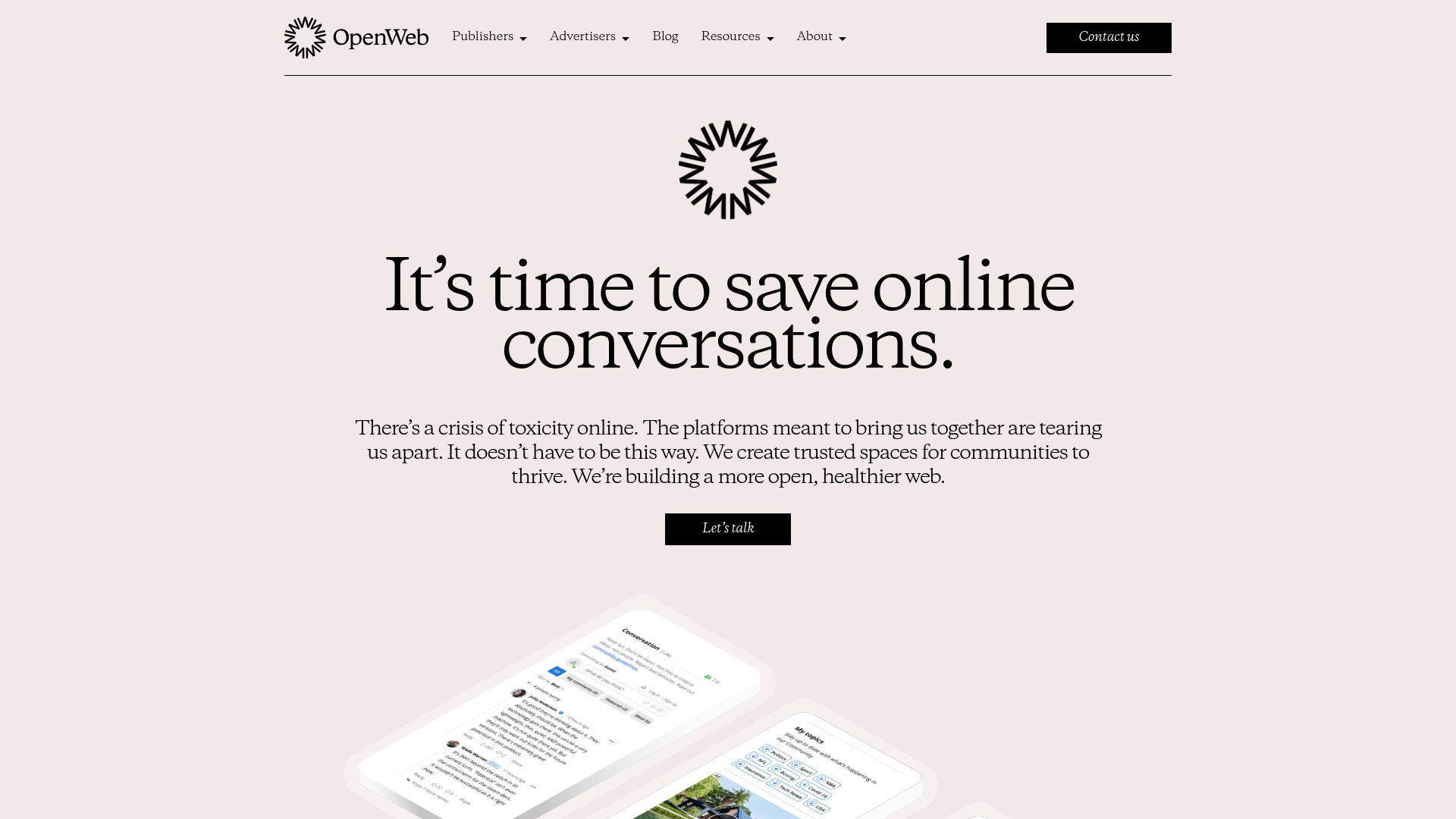
OpenWeb B2B Service Landing Page
A professional landing page layout featuring a central animated hero area, data visualization counters, a client logo grid, testimonial slider, and tabbed lead generation forms.
403 Forbidden Access Page
A minimalist, centered HTTP 403 error status page layout suitable for clean and simple server-side response templates.
Minimal Animated Success Landing Page
A clean, centered confirmation screen featuring a large green icon, a bold heading, and smooth fade-in entry animations.
Nonymous Coming Soon Placeholder Page
A minimalist blank landing page featuring a simple 'Coming soon' text layout suitable for basic domain parking or initial placeholder deployment.
Firebase Hosting Site Not Found
A minimal placeholder layout for 404 error states including a centered logo, numbered troubleshooting guide, and linked utility text.
BlueYard Minimal Logo Splash Page
A terminal-style minimalist loading screen featuring a centered logo block and a discreet bottom-aligned percentage progress indicator for high-end landing pages.
