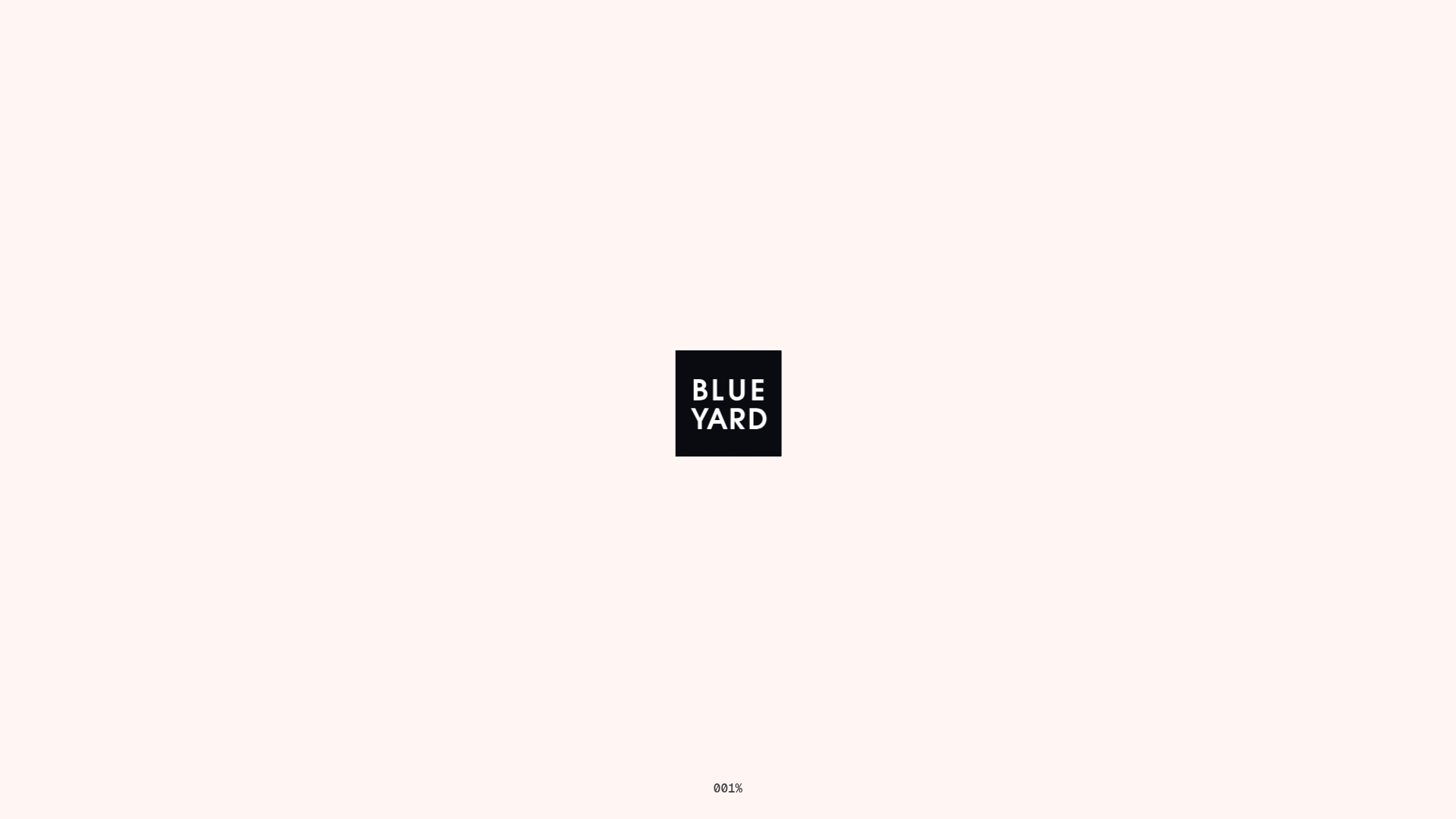
BlueYard Minimal Logo Splash Page
A terminal-style minimalist loading screen featuring a centered logo block and a discreet bottom-aligned percentage progress indicator for high-end landing pages.
Overview
This is a hyper-minimalist splash screen or loading state featuring a stark, centered logo and a mono-spaced progress counter. It serves as a sophisticated gatekeeper for high-end landing pages, establishing a tech-forward or architectural brand identity through intentional use of negative space.
Design System
- Color Palette & Visual Hierarchy: The design uses a high-contrast, two-tone schema. The background is an off-white/cream (#FAF5F2) which reduces ocular strain compared to pure white. The primary focus is a centered black square container with white text, creating a powerful focal point.
- Typography System: The branding uses a clean, geometric sans-serif (all-caps) within the logo block. The progress indicator at the bottom employs a monospaced font ("001%") to evoke a terminal or system-loading aesthetic, emphasizing precision and data-driven design.
- Page Structure: The layout is a classic viewport-centered flex or grid container. Elements are distributed along the vertical axis with extreme padding: the logo sits at the mathematical center, while the status indicator is pinned to the bottom margin (roughly 5-10% from the edge).
- Reusable Components: The core component to clone is the
loader-wrapper. This includes the centered logo div and the absolute-positioned status element. Builders should focus on the CSS transition logic that likely handles the fade-out once the progress reaches 100%. - Interaction & Motion: Based on the "001%" indicator, the expected motion pattern is a numerical increment. The simplicity of the layout suggests a smooth opacity transition once the site assets are fully cached.
- Implementation Clues: The HTML structure indicates a single-purpose wrapper designed to overlay the main site content (
<body>container), likely controlled by a simple JavaScript counter or window-load event listener.
Use Cases
- Who should clone this: Portfolio sites for architects, high-end venture capital firms, or creative agencies wanting to build anticipation during asset-heavy page loads.
- Effective Remixes: Swap the cream background for a deep charcoal or navy to create a "dark mode" version. The central square can be replaced with an SVG animation or a circular element for a softer brand feel.
- Remix Directions: Integrate the progress indicator into a site-wide transition system. Instead of the "001%" text, use the bottom slot for a marquee of core values or current status updates.
- Clone Scope: This is an ideal "Quick Section Clone." It is a utility component that can be added to the top of any existing project's DOM to instantly elevate the professional polish of the initial user experience.
Related Inspirations

OpenWeb B2B Service Landing Page
A professional landing page layout featuring a central animated hero area, data visualization counters, a client logo grid, testimonial slider, and tabbed lead generation forms.
403 Forbidden Access Page
A minimalist, centered HTTP 403 error status page layout suitable for clean and simple server-side response templates.
Minimal Animated Success Landing Page
A clean, centered confirmation screen featuring a large green icon, a bold heading, and smooth fade-in entry animations.

Nonymous Coming Soon Placeholder Page
A minimalist blank landing page featuring a simple 'Coming soon' text layout suitable for basic domain parking or initial placeholder deployment.
Firebase Hosting Site Not Found
A minimal placeholder layout for 404 error states including a centered logo, numbered troubleshooting guide, and linked utility text.
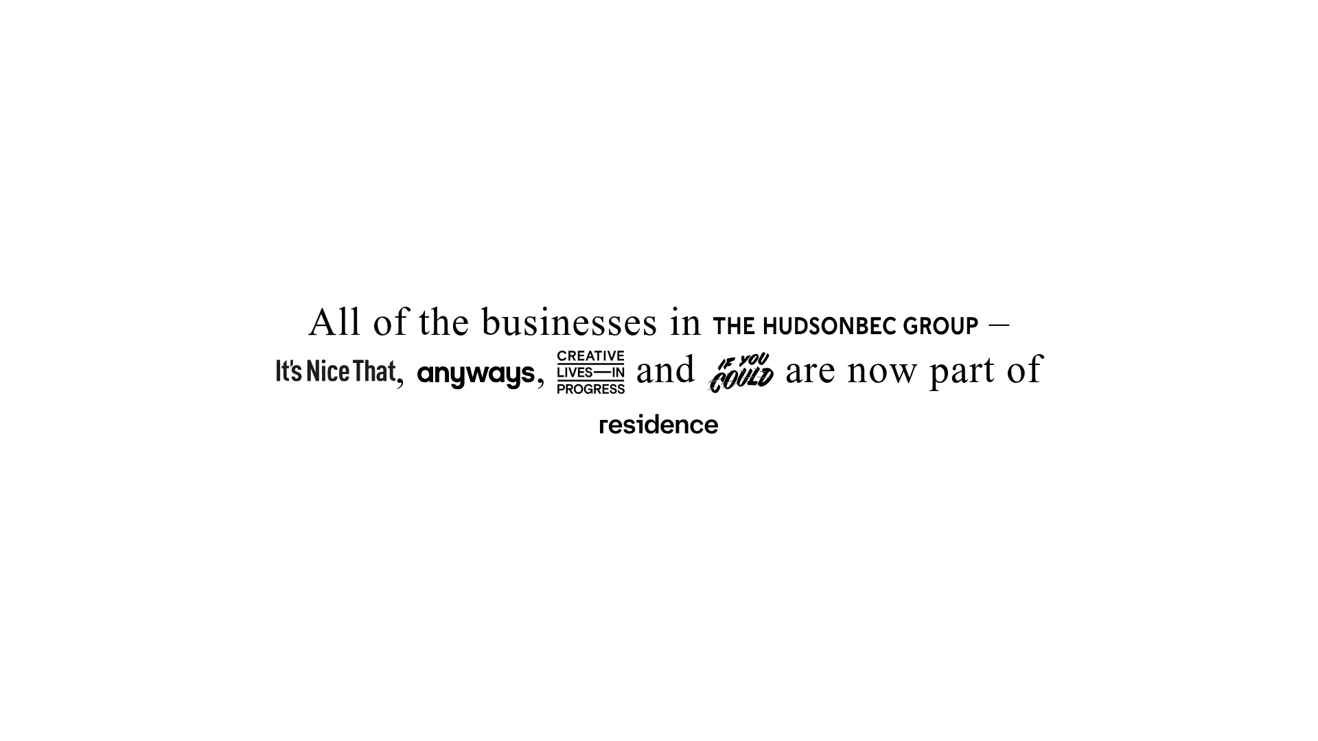
HudsonBEC Group acquisition landing page
A minimalist, typography-driven announcement landing page featuring a centered text hero and embedded brand logo SVG links.
