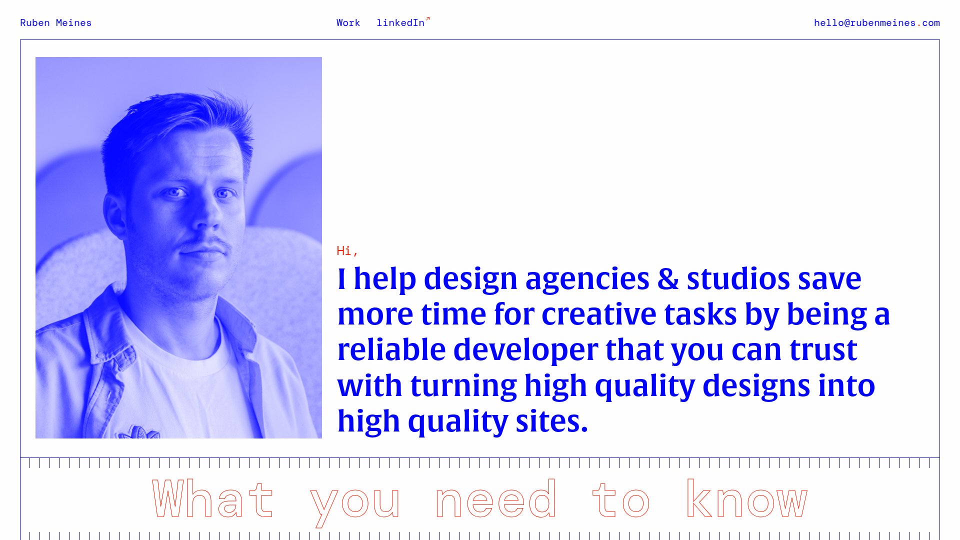
Ruben Meines Minimalist Developer Portfolio
A clean typography-focused layout featuring a duotone hero image, a decorative CSS grid border system, and a structured service list with outlined custom typography.
Overview
This portfolio for Ruben Meines is a masterclass in high-contrast, typography-driven design that prioritizes clarity and personality. It serves as an excellent reference for builders looking to create a professional service-based landing page that uses a minimalist CSS-grid aesthetic rather than heavy imagery.
Design System
- Color Palette & Visual Hierarchy: The design uses a high-contrast primary palette of Cobalt Blue (#0000FF) and White, with subtle Red accents for punctuation (e.g., the dot in the email and the 'Hi' greeting). The hierarchy is established through extreme font weight and color contrast rather than shadows or depth.
- Typography: The system utilizes a mix of a bold, high-contrast serif for main headings (Intro and USP titles) and a technical monospaced font for the navigation and utility links. The section header "What you need to know" features a large, outlined variable font style that adds a brutalist touch.
- Page Structure: The layout follows a linear narrative: a hero section with a duotone image paired with a value proposition, followed by a 'USP' (Unique Selling Point) grid, and concluding with a call-to-action (CTA) footer.
- Reusable Components:
- Duotone Image Container: A simple container applying a blue color filter to a greyscale headshot.
- Grid Dividers: A decorative border system composed of vertical blue lines that create a "blueprint" or architectural feel.
- USP List: A clean grid of four items featuring custom icons, bold serif headers, and sans-serif body text.
- Responsive Behavior: The HTML structure (
header-mobile) indicates a dedicated mobile navigation system with a hamburger menu that replaces the top-bar links on smaller viewports, while themain-boxuses a CSS grid system (grid-item--1-3) to stack content vertically.
Use Cases
- Who should clone this: Freelance developers, copywriters, or brand designers who want a site that feels "engineered" and professional without needing a full gallery of visual work.
- Effective Remixes: This pattern works exceptionally well for technical consultants or boutique agencies. The outlined text and vertical grid lines can be adapted to corporate branding by softening the blue to a navy or charcoal color.
- Practical Directions:
- Swap Brand Style: Changing the Cobalt Blue to a brand-specific hexadecimal transforms the entire site's mood instantly.
- Info Architecture: Use the USP section to list service packages or core technologies instead of personality traits.
- Selective Reuse: The decorative vertical-line dividers are a standout UI element that can be extracted to wrap any standard content section to give it a more "designer" feel.
- Clone Scope: A full-page clone is recommended to maintain the rhythmic spacing and thematic consistency of the grid-line borders and monospaced accents.
Related Inspirations
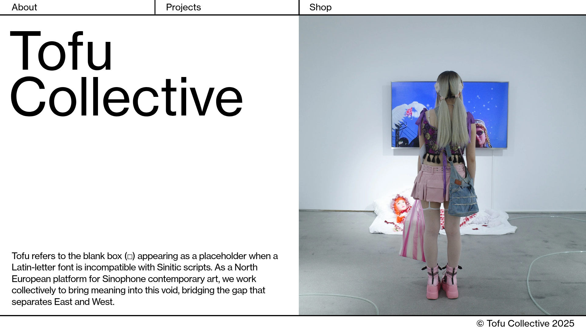
Tofu Collective Minimalist Art Gallery
A clean, split-screen landing page layout featuring a large-typography hero section, sticky grid navigation, and an integrated full-height image slideshow component.

Clase Agency Branding Portfolio
A minimalist design agency portfolio featuring a typographic hero section, full-width image articles, sticky title bars, and integrated scrolling text marquees for a clean editorial layout.

Ayaka B. Ito Creative Portfolio
A minimalist design portfolio featuring an immersive full-screen hero image, clean typographic navigation, and a structured layout for showcasing branding and editorial projects.
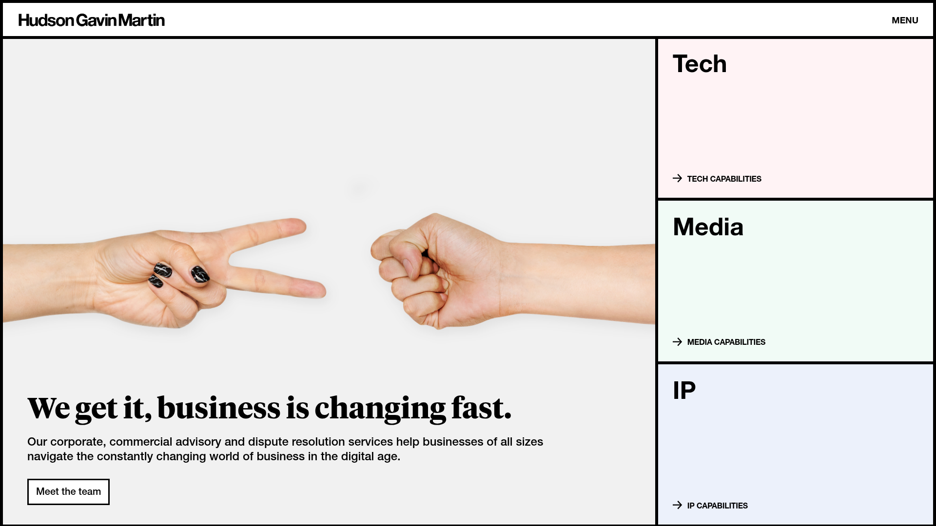
Hudson Gavin Martin Corporate Law Landing
A professional service homepage featuring a minimalist grid-based hero, color-themed navigation blocks, and a bento-style insights feed with subtle hover interactions.
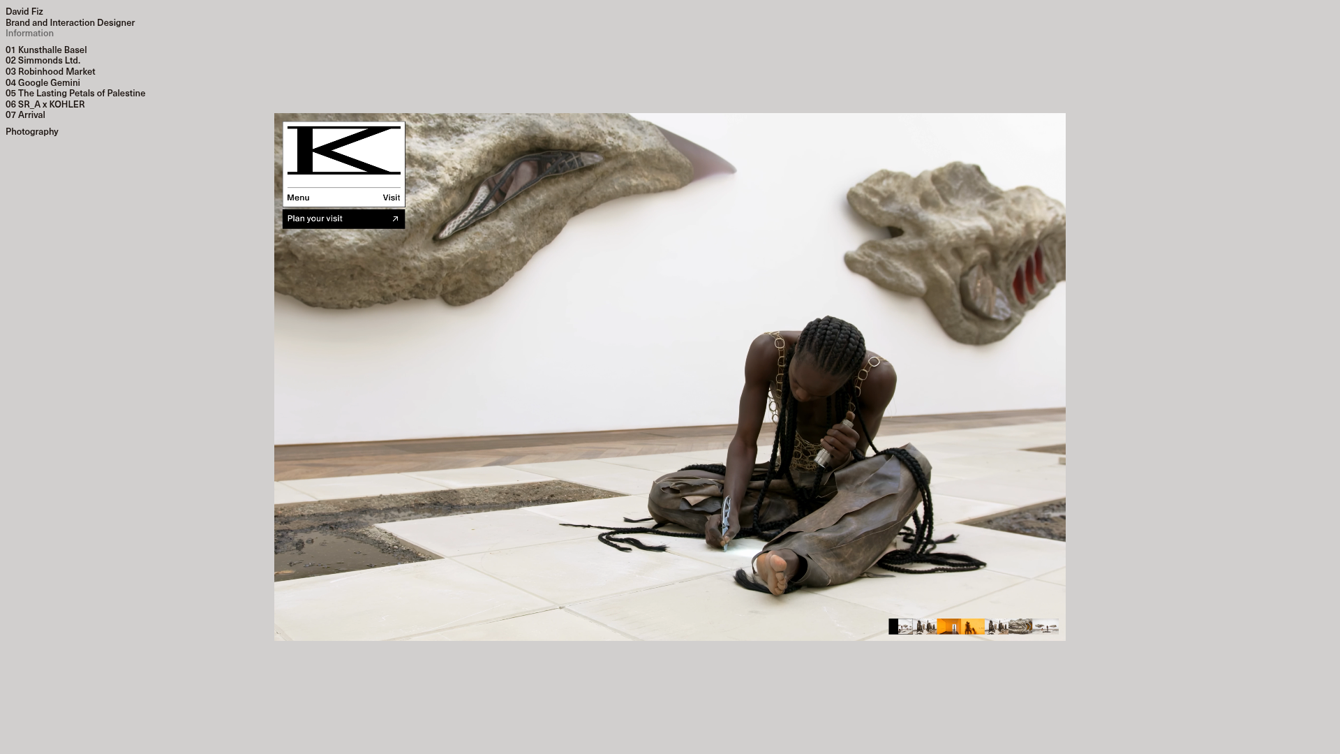
David Fiz Visual Design Portfolio
A minimalist portfolio featuring a fixed sidebar navigation paired with an immersive, full-screen media showcase and interactive project-specific image carousels.
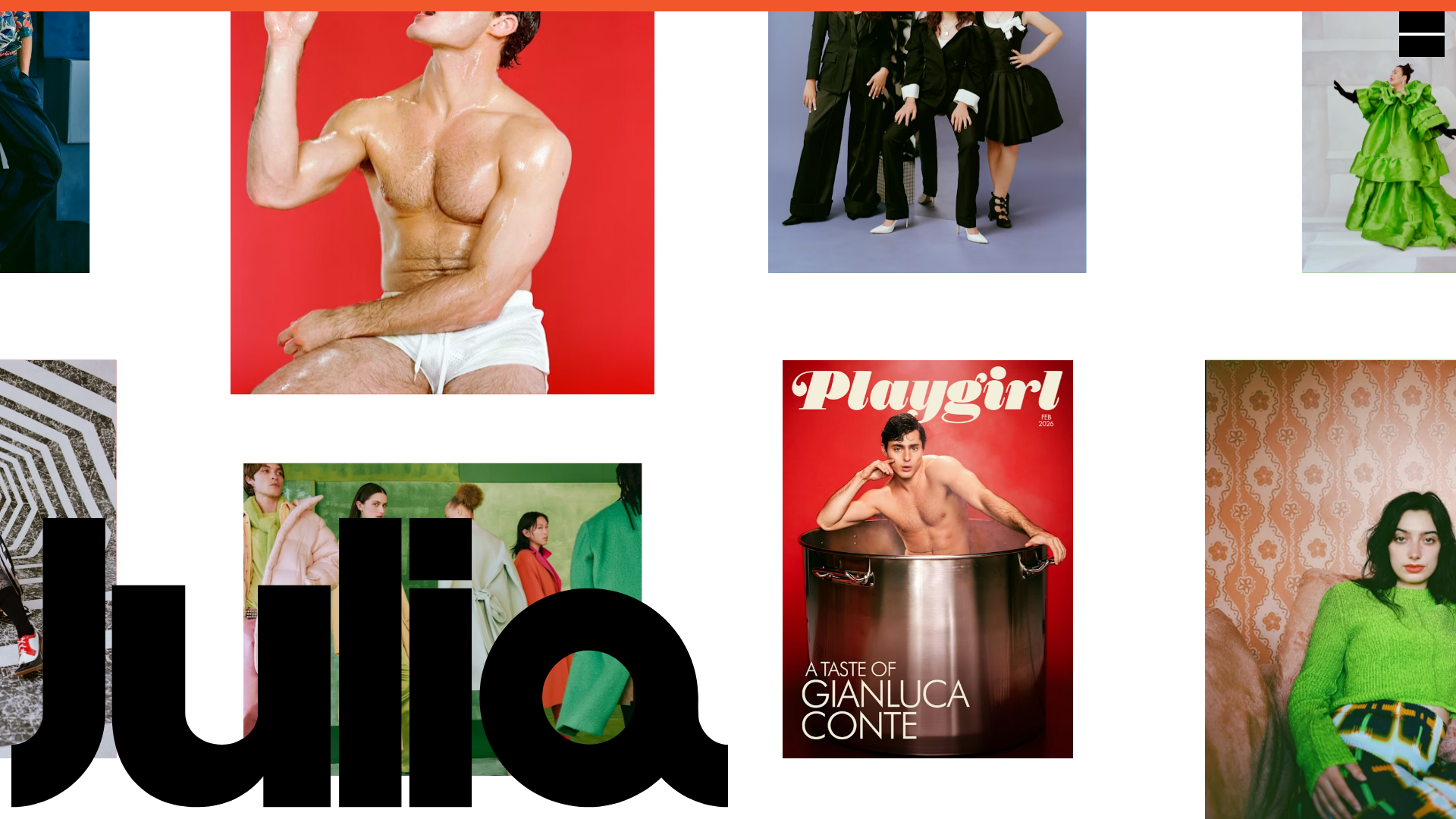
Julia Johnson Photography Portfolio Website
A creative portfolio featuring a masonry-style image grid, overlapping oversized typography, and a minimalist full-screen navigation overlay.
