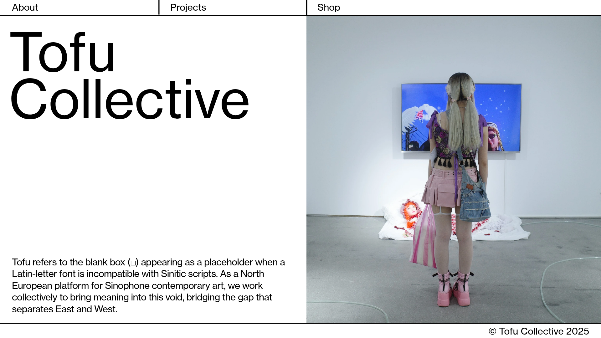
Tofu Collective Minimalist Art Gallery
A clean, split-screen landing page layout featuring a large-typography hero section, sticky grid navigation, and an integrated full-height image slideshow component.
Overview
Tofu Collective is a high-contrast, minimalist art gallery landing page that uses a strict grid-based layout to bridge the gap between digital interface and physical exhibition space. It is an excellent clone reference for building sophisticated portfolio or gallery sites that require a balance between bold typography and immersive visual media.
Design System
- Color Palette & Visual Hierarchy: The design utilizes a monochrome base (#FFFFFF and #000000) to ensure high legibility and allow photography to provide the primary source of color. Visual hierarchy is established through extreme scale, with massive headers juxtaposed against fine-line grid borders.
- Typography System: The site uses a clean sans-serif (font-family: 'wtqc') with varied weights. Headlines are set at a massive scale (90px) with tight line-height (87px), while body text and navigation use a consistent 16px size for a functional, editorial feel.
- Page Structure & Flow: The layout is built on a split-screen vertical axis. The left side serves as a high-density information zone with the hero title and an explanatory paragraph. The right side is dedicated to a full-bleed, vertically-centered slideshow (
widget-slideshow). Sticky borders define the perimeter and internal divisions. - Reusable Components:
- Sticky Grid Navigation: Fixed top and bottom bars with vertical separators that remain static while content scrolls.
- Split-Screen Layout: A flexible 50/50 container system that separates static text from dynamic media.
- Image Slideshow: A centered responsive container that swaps large-format images with no visible controls, prioritizing the visual experience.
- Interactions & Motion: The HTML indicates a horizontal viewer type with
fade-intransitions andpolyfill-stickypositioning for the grid lines. Hover states on navigation links use classic underline or color shifts typical of minimal art sites. - Implementation Clues: The DOM structure reveals a widget-based architecture (using
rmwidgetclasses) with absolute positioning and hardware-accelerated scrolling (accelerated-scroll). This suggests a highly controlled, fixed-canvas approach to web design rather than a traditional flow-based layout.
Use Cases
- Who should clone this pattern: Independent artists, curators, fashion brands, or design studios looking for a digital presence that feels like a physical gallery brochure.
- Products for Remixing: High-end watch or jewelry catalogs, architectural portfolios, and editorial lookbooks for modern apparel.
- Practical Remix Directions:
- Branding: Swap the monochrome palette for muted earth tones or neon accents while maintaining the grid.
- Architecture: Convert the right-side slideshow into a video player for cinematic portfolios.
- Scope: Reusing the sticky grid layout and split-screen hero section offers the highest ROI for a quick project upgrade without needing to clone the full multi-page magazine structure.
Related Inspirations
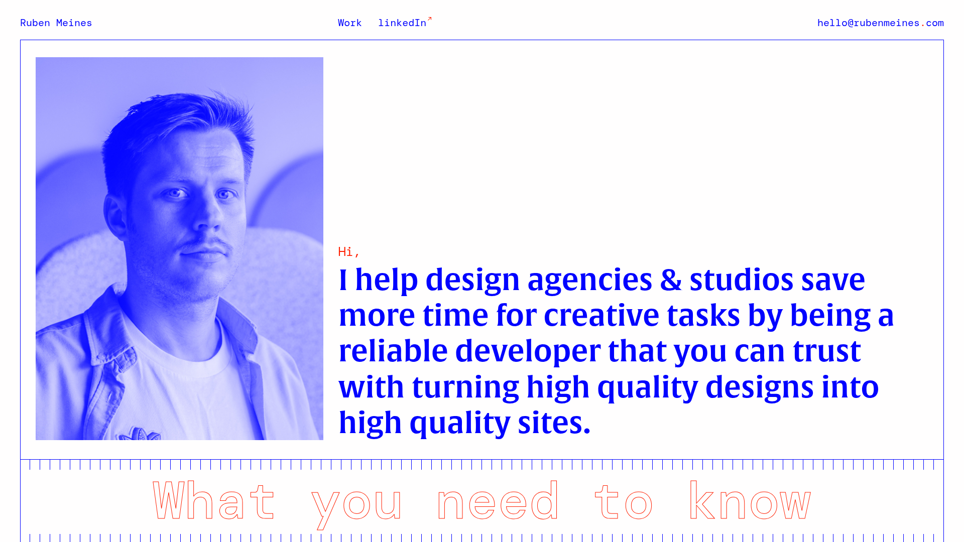
Ruben Meines Minimalist Developer Portfolio
A clean typography-focused layout featuring a duotone hero image, a decorative CSS grid border system, and a structured service list with outlined custom typography.

Clase Agency Branding Portfolio
A minimalist design agency portfolio featuring a typographic hero section, full-width image articles, sticky title bars, and integrated scrolling text marquees for a clean editorial layout.

Ayaka B. Ito Creative Portfolio
A minimalist design portfolio featuring an immersive full-screen hero image, clean typographic navigation, and a structured layout for showcasing branding and editorial projects.
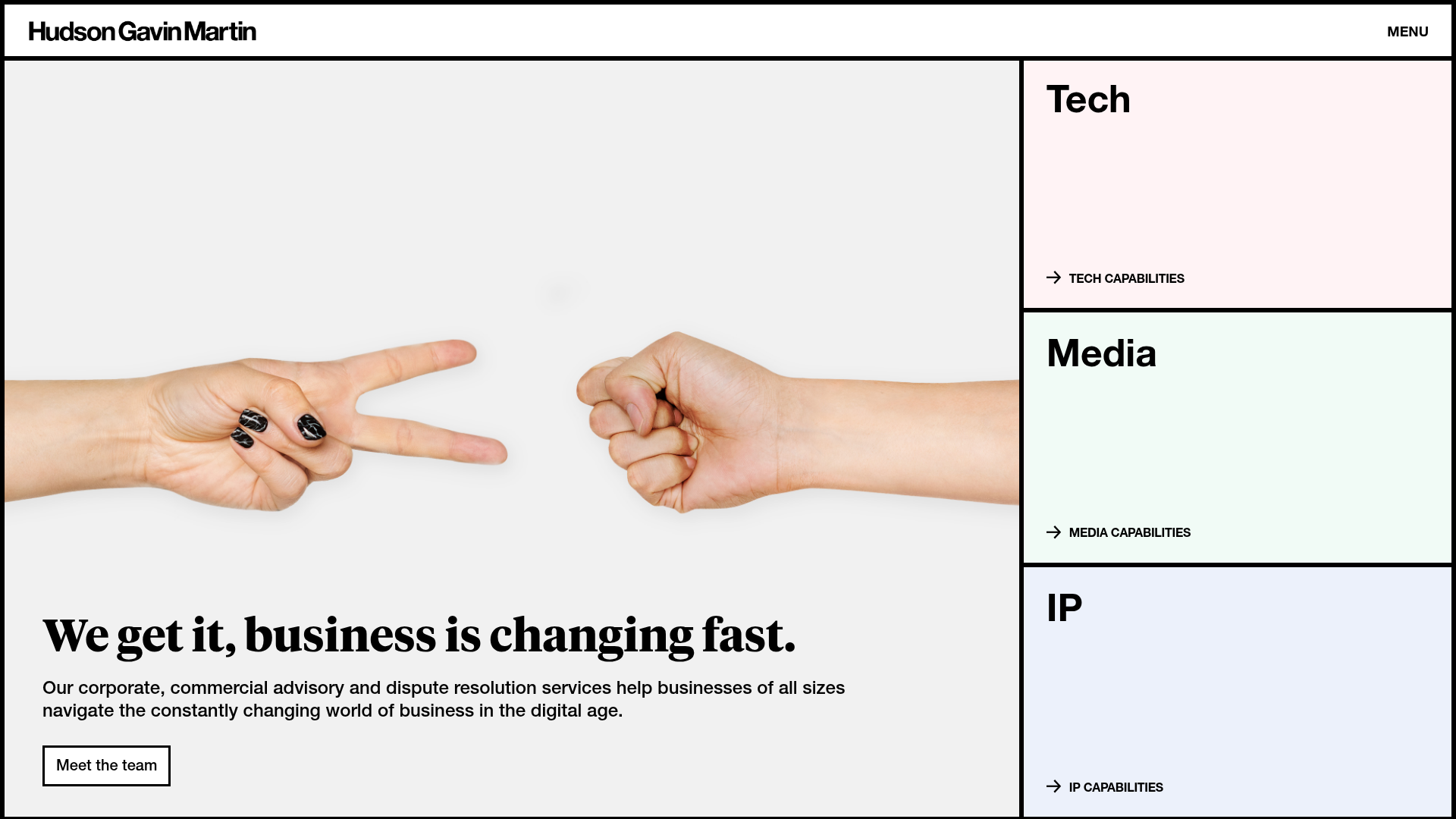
Hudson Gavin Martin Corporate Law Landing
A professional service homepage featuring a minimalist grid-based hero, color-themed navigation blocks, and a bento-style insights feed with subtle hover interactions.
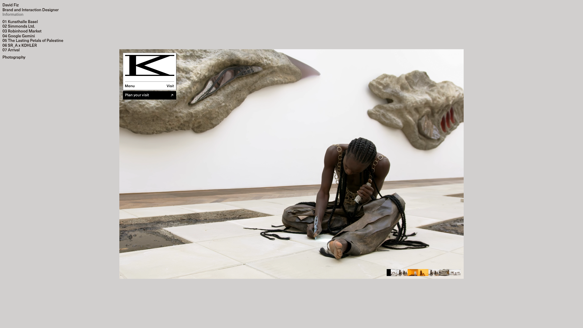
David Fiz Visual Design Portfolio
A minimalist portfolio featuring a fixed sidebar navigation paired with an immersive, full-screen media showcase and interactive project-specific image carousels.
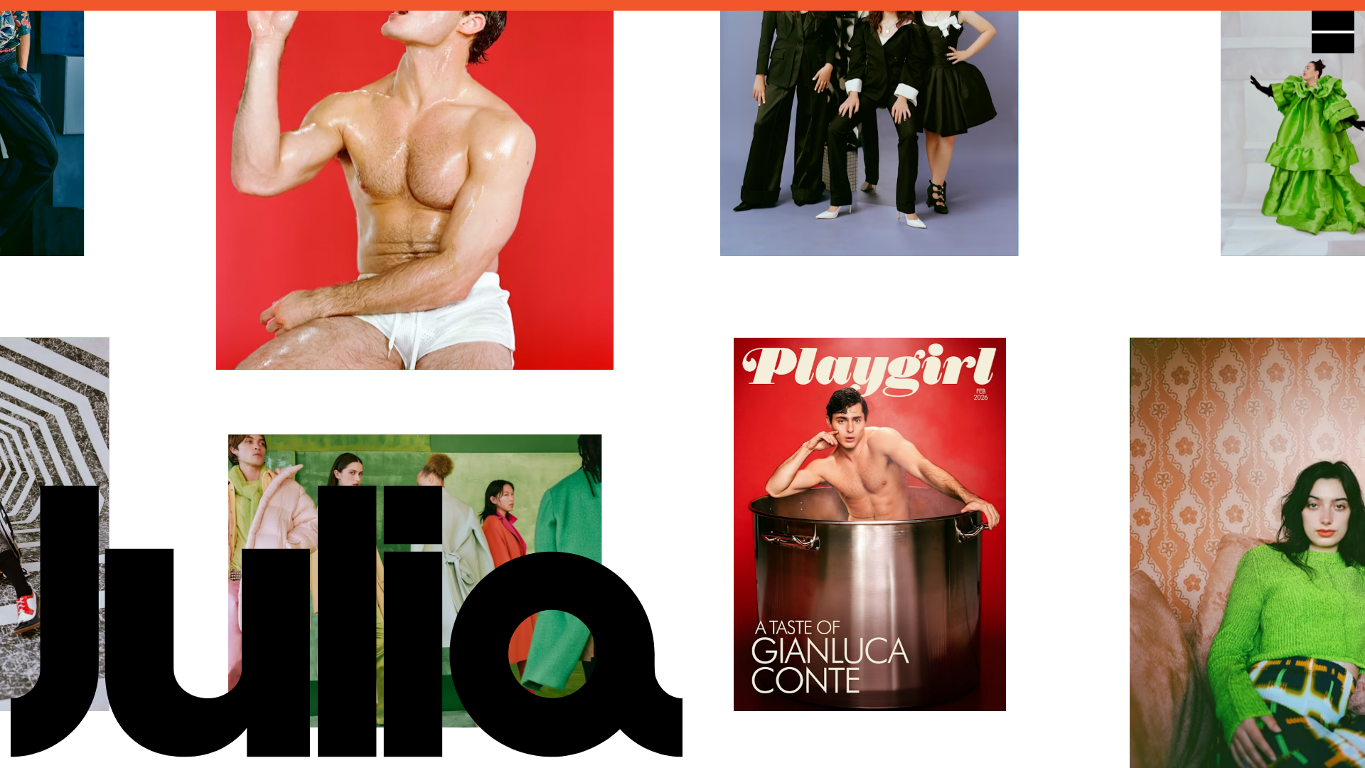
Julia Johnson Photography Portfolio Website
A creative portfolio featuring a masonry-style image grid, overlapping oversized typography, and a minimalist full-screen navigation overlay.
