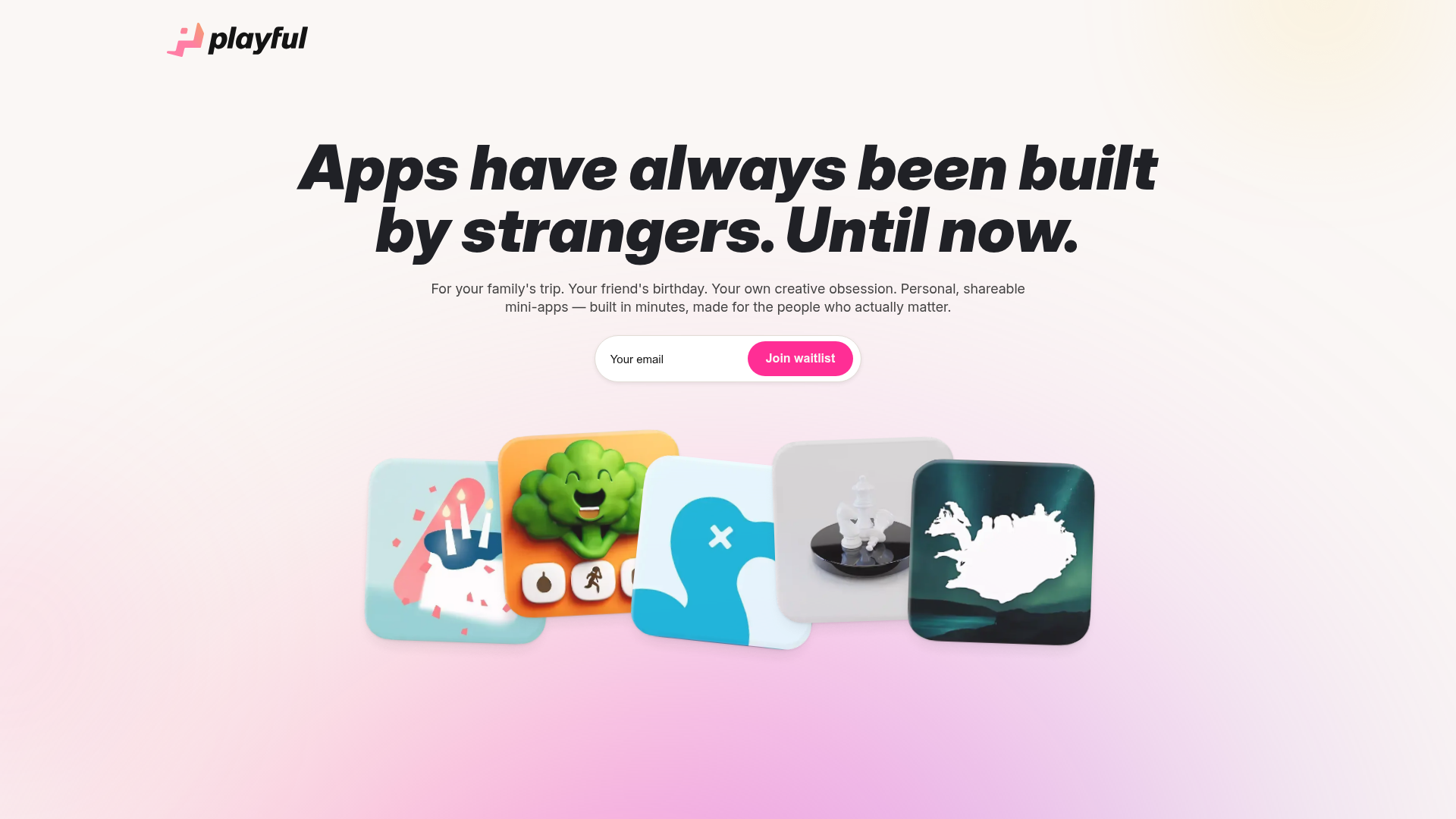
Playful Waitlist Landing Page
A minimalist landing page featuring an interactive magnetic hero image gallery, a marquee text slider, and a scroll-triggered blurred text reveal animation.
Overview
This landing page is a high-impact waitlist template designed for early-stage products focusing on creativity and personal utility. It features a sophisticated blend of minimalist aesthetics and advanced motion design, making it an excellent reference for builders who want to create a premium, "boutique" feel with high interactive engagement.
Design System
- Color Palette & Visual Hierarchy: The design uses a soft, off-white background with subtle radial gradients (light pink/purple) to create depth. The primary accent is a vibrant 'Playful Pink' (
#ff3399) used for the main Call-to-Action (CTA) and logo. The hierarchy is clean, leading the eye from the bold black hero statement to the centered newsletter input. - Typography System: The site uses a bold, sans-serif heading font with tight kerning for the hero section, set in a slight italic/oblique style for a sense of motion. Body text is a legible sans-serif with generous line height. Emphasis is created using bold spans and occasional italicized highlights within larger text blocks.
- Page Structure & Flow:
- Hero Section: Centered headline, sub-headline, and an integrated email capture field.
- Magnetic Gallery: A cluster of five floating, rounded-corner "app icons" that respond to mouse movement.
- Marquee Slider: A horizontal scrolling text track featuring rapid-fire use cases.
- Product Showcase: A 3D-stacked device slider showcasing the app interface via video and images.
- Scroll-Reveal Text: A large-scale paragraph where words fade from a blurred, low-opacity state to sharp black as the user scrolls.
- FAQ Accordion: A standard two-column layout with a text header on the left and interactive questions on the right.
- Reusable Components:
- Waitlist Input: A unified pill-shaped container holding a transparent input and a solid-colored button.
- Magnetic Icons: The
.magnetic_heroclass implements cards with CSS variables (--offsetX,--offsetY) for spatial tracking. - Accordion Items: Standard
.faq-itemstructure with a toggle-able.faq-body.
- Interaction and Motion: The site relies heavily on GSAP-style animations. Key patterns include the magnetic hover effect on the hero icons, a 3D "fan" transition for the device mockup slider, and the blur-to-focus scroll trigger on the founder's statement.
Use Cases
- Who should clone this: Founders launching a consumer mobile app, creative tool, or social platform that requires a "waitlist" phase with high visual polish.
- Effective Remixes: This pattern works well for portfolio sites where the "app icons" represent project thumbnails, or for SaaS tools that need to simplify a complex value proposition into a few bold statements.
- Practical Directions:
- Style Swap: Change the pastel gradients to dark mode with neon accents for a developer-centric tool.
- Info Architecture: Keep the top hero and waitlist form but replace the device slider with a simple grid of features if video assets aren't available.
- Clone Scope: The hero section and waitlist input are ideal for a "quick section clone." The entire page provides a robust foundation for a full-scale product launch site.
Related Inspirations
Clyde Insurance Landing Page with Animated Hero
A dark-themed landing page featuring a prominent serif headline, a product-focused animated blob hero, and a clean minimalist navigation bar.
Coco Social Selling Landing Page
A clean Webflow-based landing page featuring a centered video hero section and alternating feature-rich cards with integrated mobile app mockups.

Tatem Minimalist Productivity Landing Page
A refined SaaS landing page featuring a sticky scroll-based UI, 3D CSS transforms in the hero, and clean feature sections with interactive UI component demos.

Vercel AI Cloud Landing Page
A modern landing page featuring a minimalist dark-themed navbar, a grid-overlay hero section with radial color gradients, and high-contrast typography for customer success stories.
Stripe Modern SaaS Landing Page
A high-conversion landing page featuring a complex mesh-gradient hero, sticky navigation, and a horizontal logo wall for brand social proof.
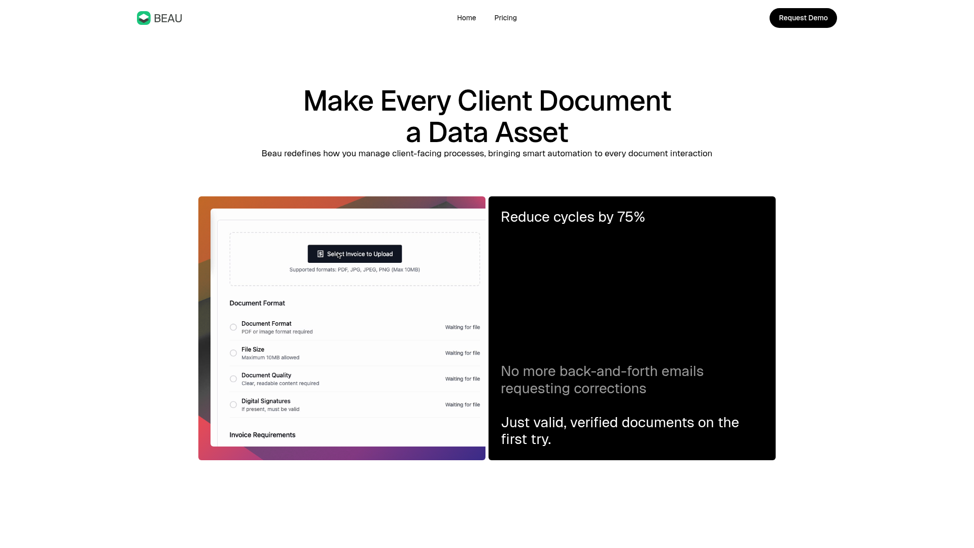
Beau Document Automation Landing Page
A modern software landing page featuring a bento-grid layout, split-screen hero assets with animated checkmarks, a step-by-step process guide, and a clean two-tier pricing table.
