Something Else Portfolio Slideshow
A minimalist design studio portfolio featuring a full-width image and video slideshow with large-scale typography, sticky navigation, and centered captions.
Overview
This portfolio for Something Else is a masterclass in minimalist, high-impact design for creative studios. It uses a centered, full-width media slideshow that seamlessly integrates static imagery and auto-playing video to showcase a diverse body of branding and design work. Builders should reference this for its elegant handling of captions and its distinct, airy typography that makes a small amount of content feel like a premium experience.
Design System
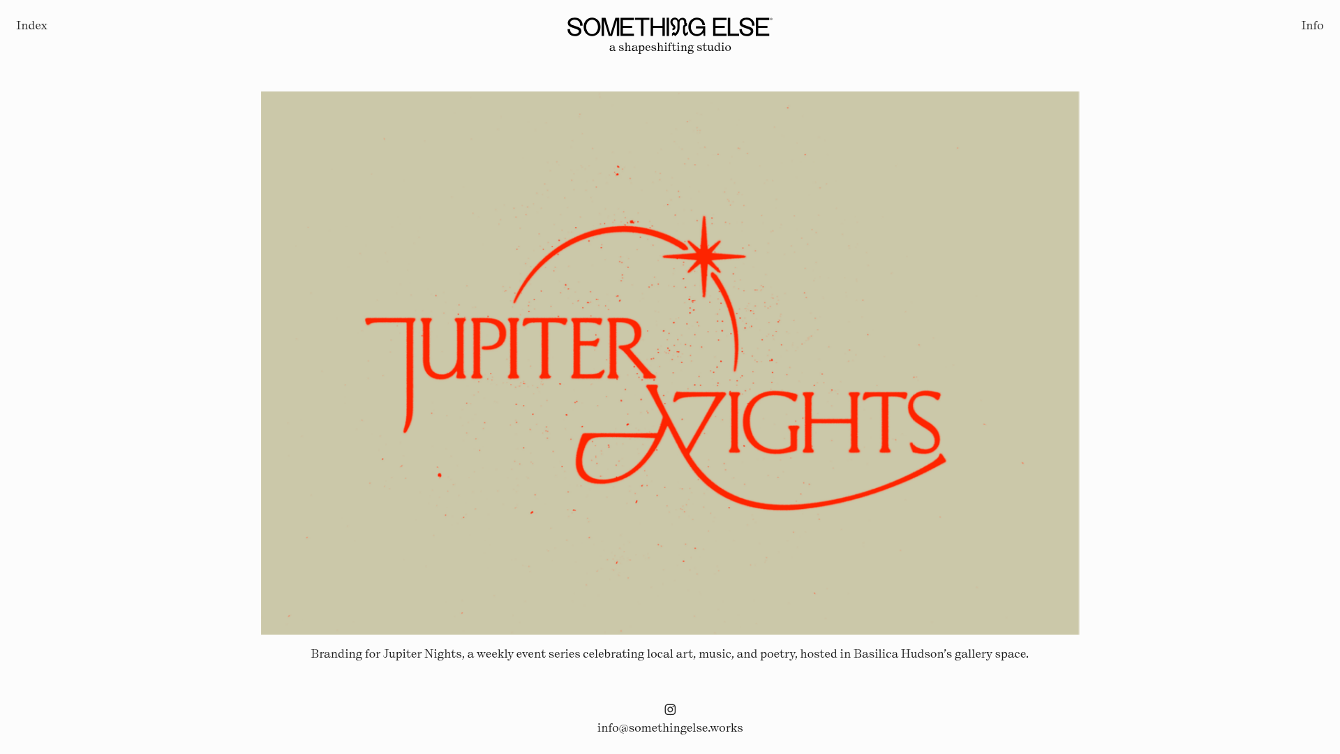
- Color Palette & Visual Hierarchy: The site uses a neutral, slightly off-white background that allows the vibrant project content—like the bright orange "Jupiter Nights" logo—to command attention. The visual hierarchy is extremely flat, with the project media being the primary focal point, followed by centered secondary text.
- Typography System: The brand identity uses a high-contrast, modern serif with unique ligatures (seen in the 'SOMETHING ELSE' logo). Body text stays consistent in a clean, small-scale serif, emphasizing readability and a classic editorial feel. Captions are centered beneath images, adding a balanced, symmetrical weight to the layout.
- Page Structure: The layout relies on a sticky header containing the logo and site-wide navigation (Index/Info), a middle ground occupied entirely by a
gallery-slideshowcomponent, and a fixed footer containing social links and a mailto contact. - Reusable Components: The core component to clone is the custom
gallery-slideshowwhich supportsmedia-itemslots for both<img>and<video>tags. Each slide includes a nested<figcaption>for contextual project info. The header uses a simple two-column flex layout for the Index/Info links, pushing them to the viewport edges while keeping the logo centered. - Interaction & Motion: The slideshow utilizes horizontal transitions with a
transition-speedof 0.9s and apause-on-hoverattribute. Video elements are set toautoplay,loop, andmutedto provide ambient motion without user intervention. Navigation is handled via hidden or low-profile overlay arrows (previous/next buttons). - Implementation Clues: The HTML structure uses custom elements like
<gallery-slideshow>,<column-set>, and<media-item>, suggesting a component-based layout engine (likely Cargo Collective). It utilizes CSS variables for dynamic padding and sizing (e.g.,--pin-padding-top).
Use Cases
- Who should clone this: Independent designers, branding agencies, and high-end boutique studios who want their work to speak louder than their UI.
- Effective Remixes: A photographer could remix this by removing the footer links to create a distraction-free digital gallery. An architect could use the video autoplay feature to show site walkthroughs while keeping the minimal text descriptions for technical specs.
- Remix Directions: Swap the serif font for a bold, technical grotesque to shift the vibe from "classic studio" to "digital product house." The
gallery-slideshowcan be limited to a specific height to allow more scrolling content below for long-form case studies. - Suggested Clone Scope: A full-page clone is recommended to maintain the specific balance of the sticky header and fixed footer, which frames the central media perfectly.
Related Inspirations

Christopher Doyle Agency Portfolio Layout
A minimalist, typography-led portfolio featuring a wide-margin grid system, smooth fade-in animations, and simple image-focused project cards.

Clase Agency Branding Portfolio
A minimalist design agency portfolio featuring a typographic hero section, full-width image articles, sticky title bars, and integrated scrolling text marquees for a clean editorial layout.

Lundqvist & Dallyn Studio Portfolio
Minimalist design studio portfolio featuring a custom video loader, world clock navigation, and a fluid masonry-style grid for high-quality photography and type design showcases.

AcolorBright Design Agency Portfolio
Minimalist bento-style portfolio layout featuring numerical section headers, horizontally scrolling project teasers, and a clean grayscale client logo grid.
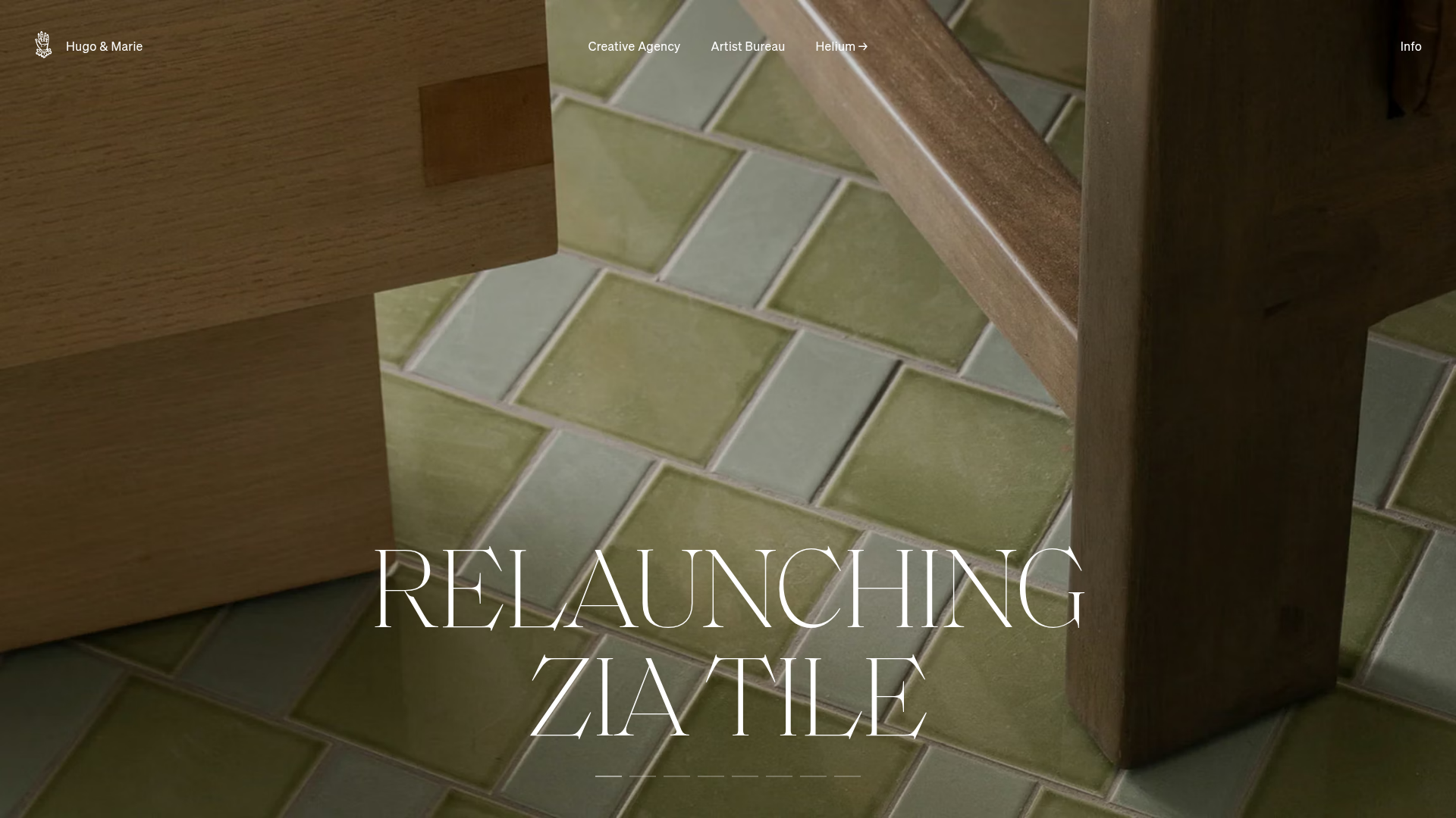
Hugo & Marie Agency Landing Page
Features a full-screen auto-playing media carousel with elegant serif typography overlays and a cleanly structured three-column services layout.
Manna Architects Minimalist Portfolio Grid
A clean, single-page architecture portfolio featuring a centered intro, a varied multi-column image gallery with captions, and a detailed project service breakdown.
