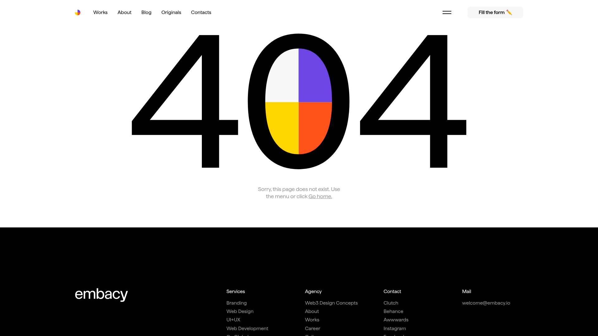
Embacy Design Agency 404 Error Page
A minimalist 404 error page featuring a bold geometric graphic, sticky navigation with a dedicated 'Fill the form' CTA, and a high-contrast dark footer with categorized links.
Overview
This 404 error page from Embacy demonstrates how to turn a negative user experience into a brand-aligned lead generation opportunity. It combines a high-impact geometric center-piece with a clean, sticky navigation and a bottom-weighted lead capture form hidden behind a modal trigger. It is a strong reference for designers seeking to maintain professional polish even on technical error states.
Design System
- Color Palette & Visual Hierarchy: The page uses a high-contrast foundation of pure white (#FFFFFF) and deep black (#000000). The central focal point is a multi-colored geometric 404 graphic using bright purple, yellow, and orange quadrants. This "pop" of color draws the eye immediately to the error status before guiding it to the navigation.
- Typography System: The design utilizes a clean sans-serif typeface (likely Inter or similar). The primary messaging is localized in a small, centered block (
body__18) underneath the main graphic to maintain a minimalist aesthetic, while the footer uses a structured grid of smaller labels (capt) for categorization. - Page Structure: The layout follows a classic vertical stack: a sticky top navigation bar, a hero section containing the large 404 SVG, a brief instructional text block with a "Go home" link, and a comprehensive black-background footer.
- Reusable Components:
- Sticky Nav: A translucent/white bar containing simple text links and a distinct "Fill the form ✏️" CTA button.
- Lead Capture Modal: The HTML reveals a sophisticated
cta-pop-upcontaining a multi-field form with custom checkboxes for services (Branding, Web Design, UI/UX) and budget ranges. - Information Footer: A four-column black footer that organizes internal links (Services, Agency, Contact, Mail) for easy site re-entry.
- Implementation Clues: Built on Webflow, the page uses a standard container-based grid (
container _404). The form uses specific data attributes (data-name="CTA") and custom checkbox inputs for a bespoke UI feel rather than native browser defaults.
Use Cases
- Who should clone this: Digital agencies, SaaS platforms, and design portfolios that want a professional, "no-dead-ends" error page.
- Remixing the Design: The central 404 graphic is the most obvious candidate for a brand swap; a 3D asset or a brand-specific illustration could easily replace the geometric SVG. The large footer is ideal for sites with deep information architecture that need to help lost users find specific services quickly.
- Practical Directions: Builders can clone the sticky navigation and the hidden CTA modal logic to use across their entire site, not just the 404 page. For a quick win, the footer structure can be repurposed as a global component to improve SEO and site navigation.
- Clone Scope: A full-page clone is recommended to capture the transition between the airy, minimalist top half and the grounded, information-dense dark footer.
Related Inspirations

Niklas Rosén Designer Portfolio Index
A minimalist, responsive grid-based portfolio index featuring a clean 16-column layout, typographic list components, and a custom dark mode transition.
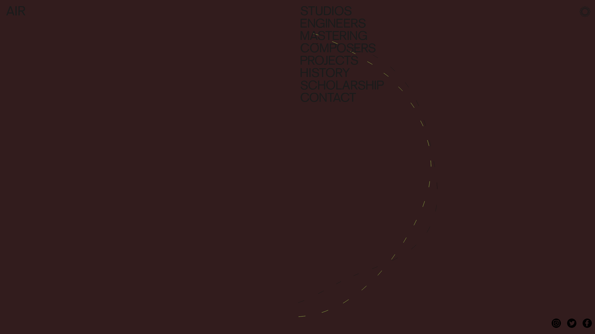
AIR Studios Minimalist Navigation Landing
A dark, minimalist layout featuring a vertical text-based navigation menu, a full-screen background video wrapper, and a dynamic canvas-based interactive drawing layer.

Break Maiden Agency Portfolio Hero
A high-impact dark mode hero section featuring oversized typography with inline GIF icons and a responsive grid for display-heavy case studies.
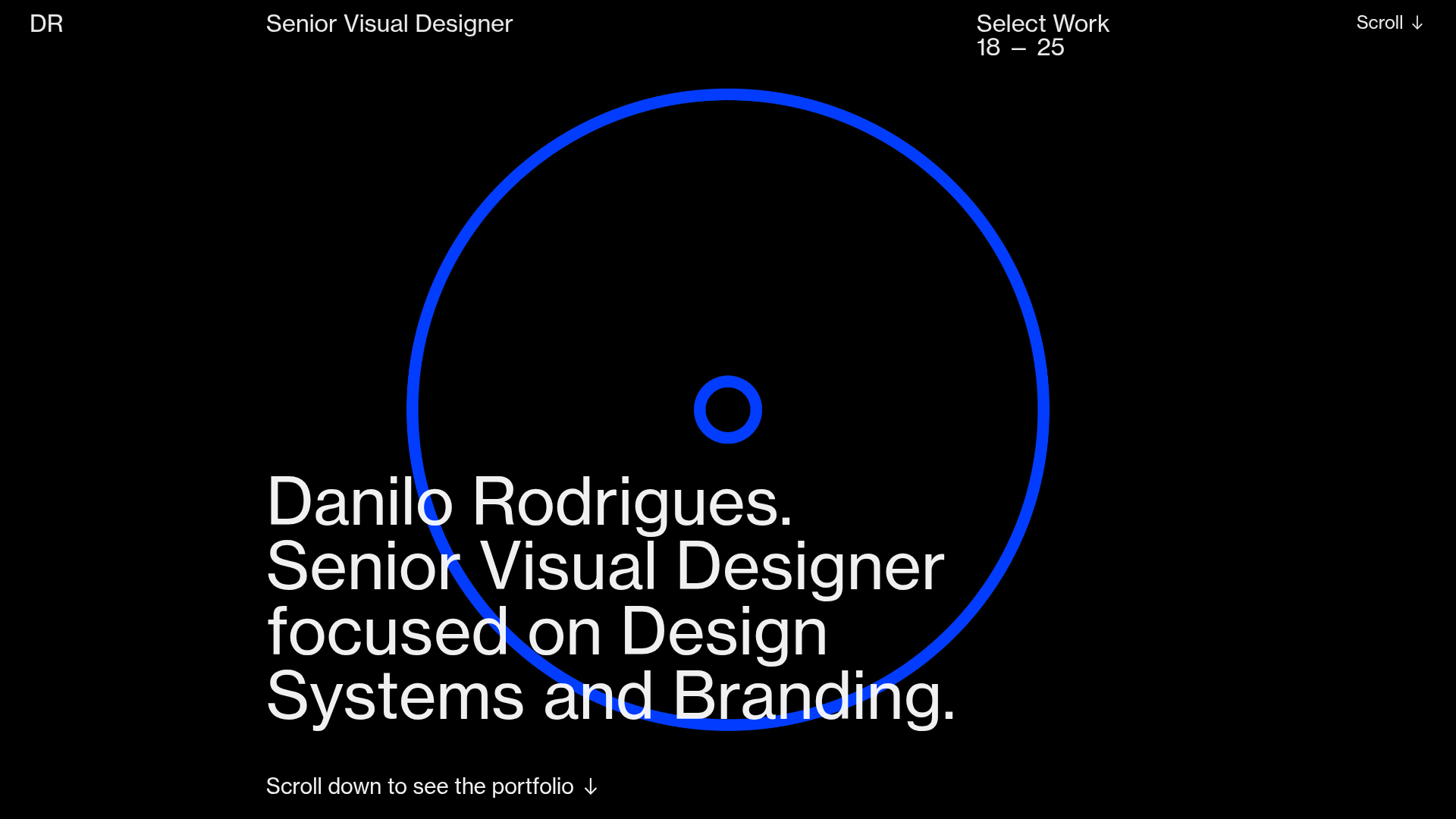
Danilo Rodrigues Designer Portfolio Landing
A minimalist, high-impact design portfolio featuring a full-screen image carousel hero, fluid typography, large scroll-triggered key visuals, and a clean grid-based case study layout.
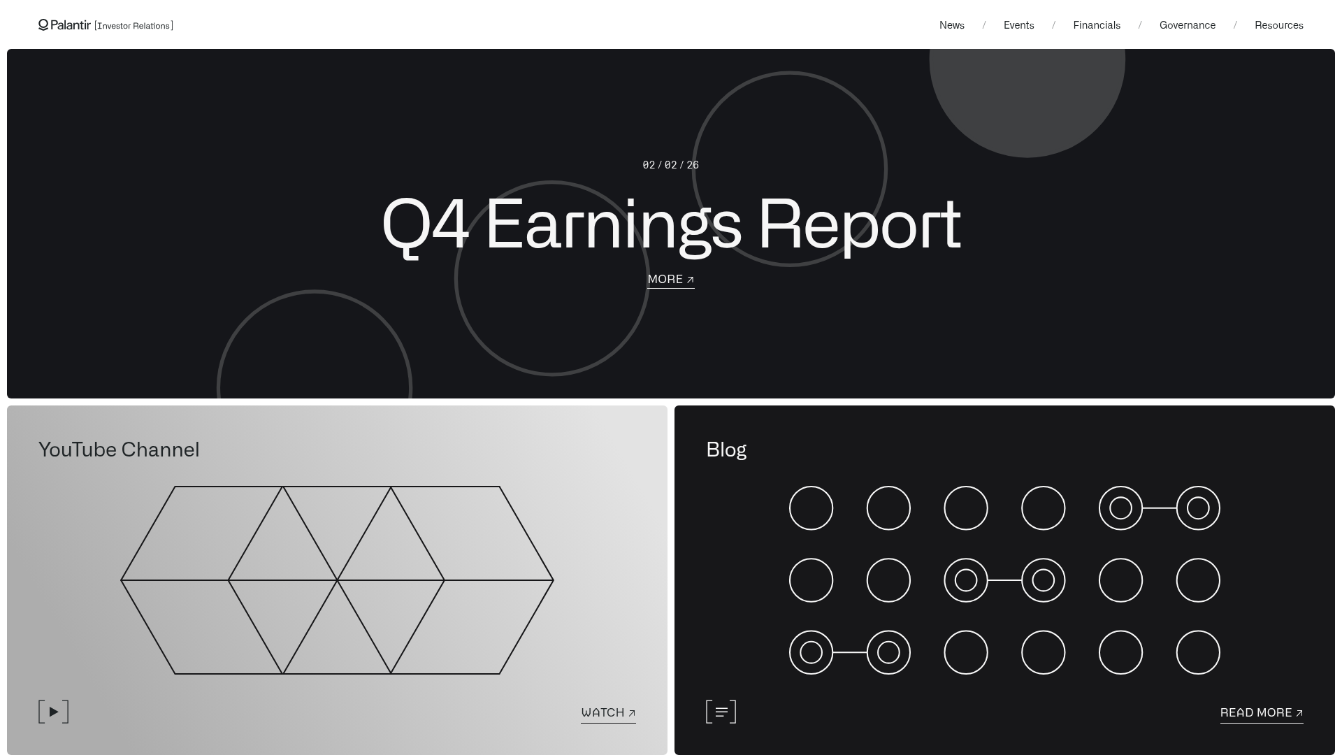
Palantir Investor Relations Minimal Portal
A high-contrast dark-mode layout featuring a full-width hero carousel over a geometric bento grid with external links and abstract SVG motifs.
PostNew Moving Image Portfolio Gallery
A minimalist dark-themed portfolio featuring a full-screen vertical scroll layout, video-based grid sections, and blur-effect navigation components.
