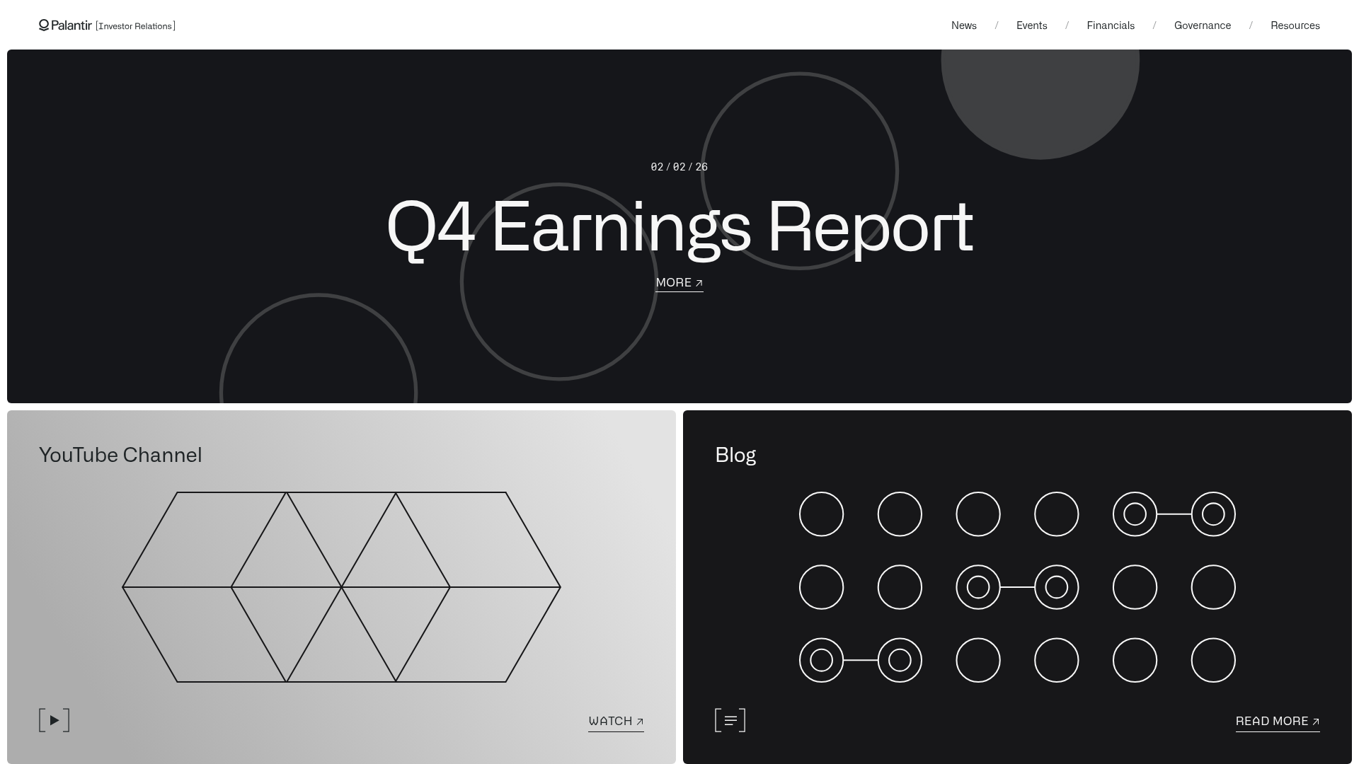
Palantir Investor Relations Minimal Portal
A high-contrast dark-mode layout featuring a full-width hero carousel over a geometric bento grid with external links and abstract SVG motifs.
Overview
This portal is a masterclass in minimalist corporate communication, using a stark monochrome palette and high-contrast layout to convey institutional authority. It is an excellent reference for builders wanting to combine high-level announcements with a modern, bento-grid approach to resource navigation.
Design System
- Color Palette & Visual Hierarchy: A strict black, white, and slate-gray palette. The hierarchy is established by the massive scale of the hero text against a deep black background, while secondary grid modules use a charcoal-gray or light-gray variant to differentiate thematic areas.
- Typography: Uses a clean, geometric sans-serif (resembling Inter or Haas Grotesk). The scale is extreme: very large font sizes for the main title (Q4 Earnings) and medium weight for navigation. Dates and auxiliary links use all-caps or monospace-inspired spacing for a technical, data-driven feel.
- Page Structure: The layout follows a top-down priority flow starting with a full-width
.carouselhero section, followed by a.gridcontaining specific portal gateways (YouTube, Blog). - Reusable Components:
- Hero Carousel: A full-bleed container using absolute-positioned text overlays and circular SVG masks.
- Bento Utility Cards: Uniform grid items featuring a title at the top left, an abstract SVG icon centerpiece, and a bottom-aligned utility bar with external link icons.
- Arrow Indicators: Consistent use of the north-east arrow (↗) for all external outbound actions.
- Interaction Patterns: The HTML suggests an
inview-upanimation class, indicating that components slide or fade into view upon scrolling. Buttons feature hover transitions where underlined text or arrows shift slightly to signal clickability. - Implementation Clues: The structure uses a standard
rootwrapper with semantic classes like.grid-itemand.container-inside. It relies heavily on background images and SVG motifs to create visual interest without high-resolution photography.
Use Cases
- Who should clone this: FinTech startups, investor relations departments, or open-source software foundations looking for a "documentation-first" yet premium aesthetic.
- Remix Directions: Swap the abstract circles/hexagons for product-specific SVG line art. The background colors can be adjusted to brand primaries (e.g., deep navy) while maintaining the high-contrast white text for readability.
- Scope: Start by cloning the Bento Grid module; it is the most versatile part of the layout for creating a "links" or "resources" page. The hero section is ideal for single-product landing pages with high-impact feature reveals.
Related Inspirations

Niklas Rosén Designer Portfolio Index
A minimalist, responsive grid-based portfolio index featuring a clean 16-column layout, typographic list components, and a custom dark mode transition.
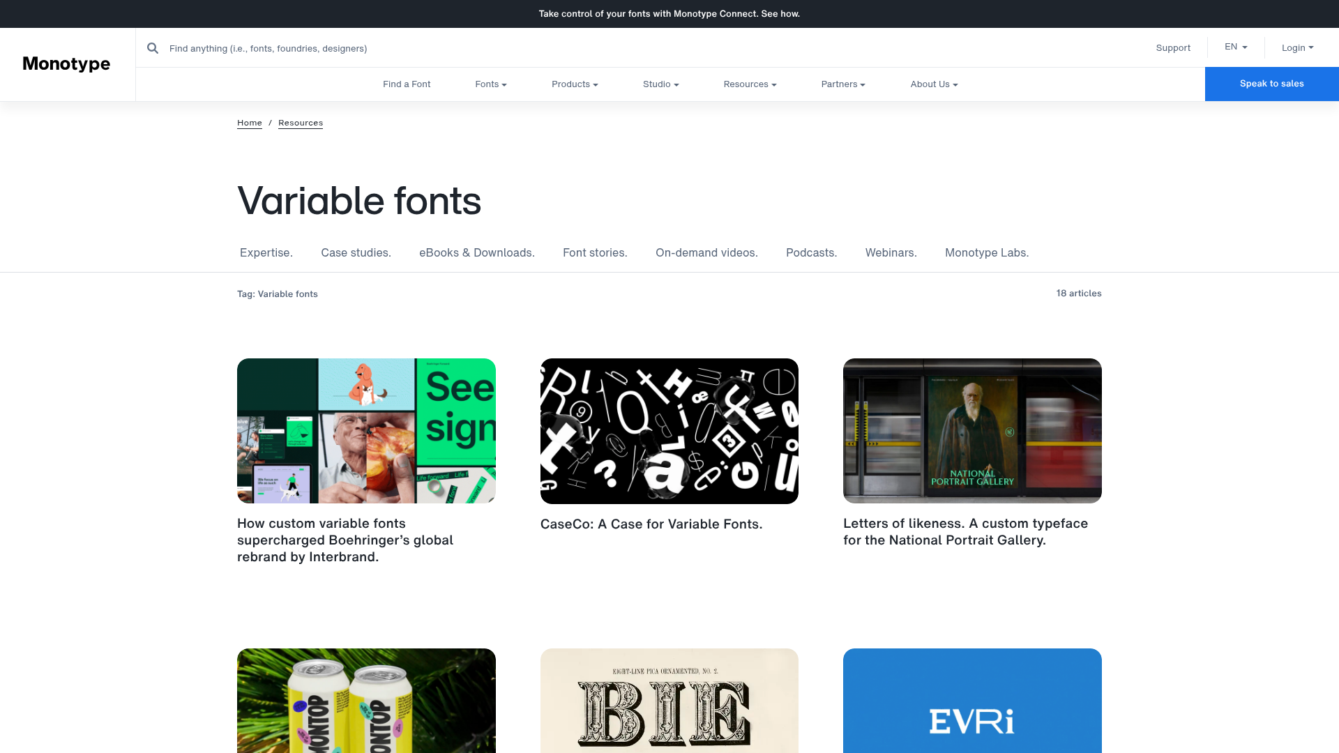
Monotype Variable Fonts Resource Gallery
A clean masonry grid layout featuring content cards with hover-state overlays, category filtering, and responsive image scaling for a media-rich resource center.
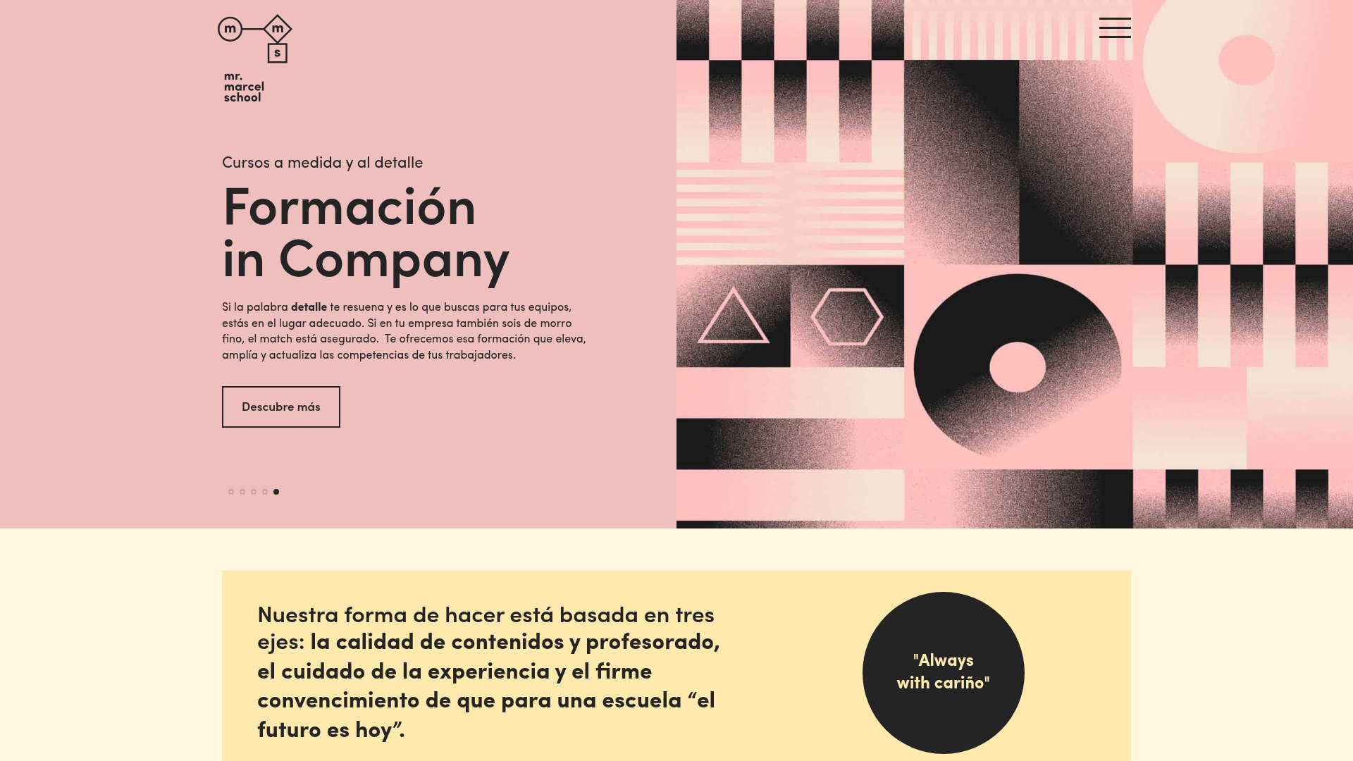
Mr. Marcel School Design Portfolio
A creative education site featuring artistic geometric headers, card-based course layouts, slider-driven testimonial sections, and a structured calendar for academic scheduling.
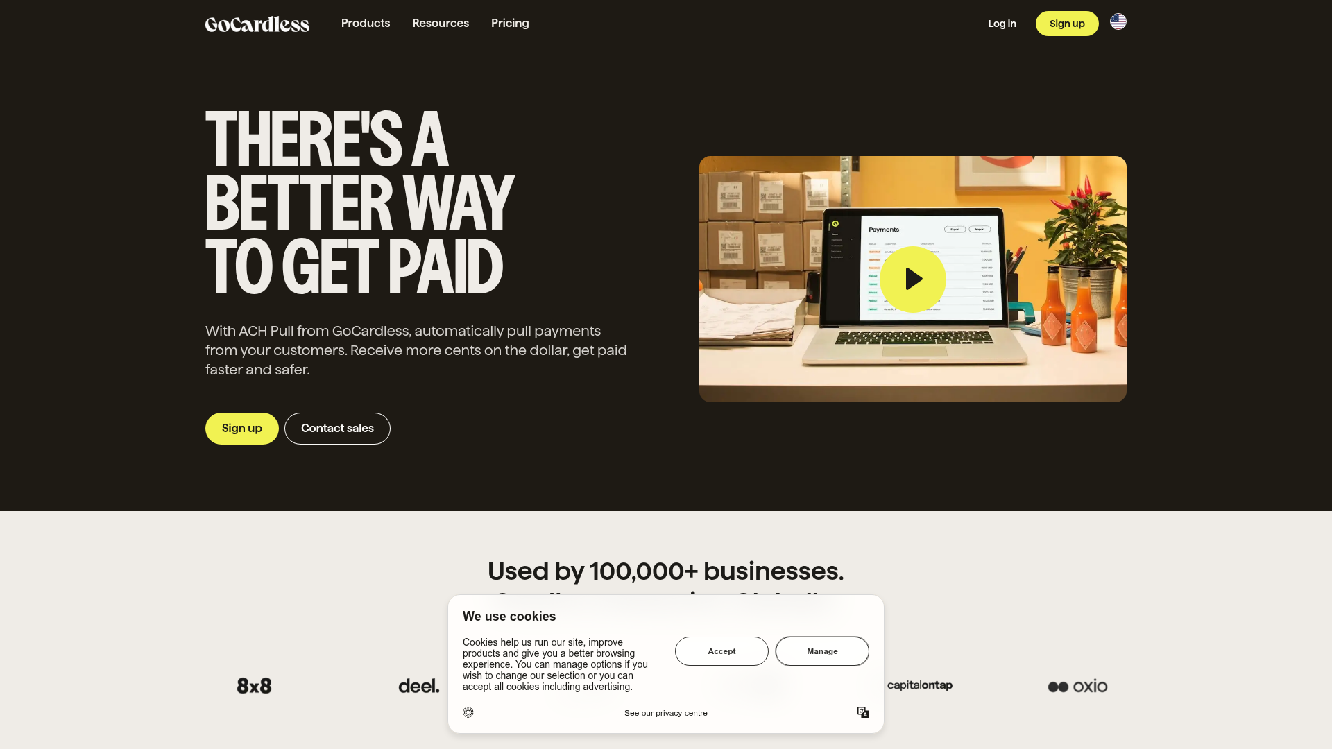
GoCardless Payments Platform Landing Page
A dark-themed fintech landing page featuring a split-screen video hero, bento-style feature cards, a horizontal logo slider, and step-by-step accordion guides.
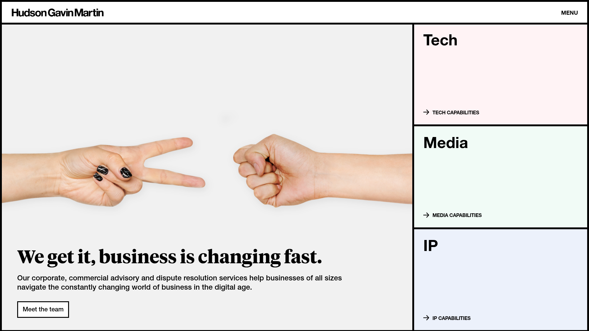
Hudson Gavin Martin Corporate Law Landing
A professional service homepage featuring a minimalist grid-based hero, color-themed navigation blocks, and a bento-style insights feed with subtle hover interactions.
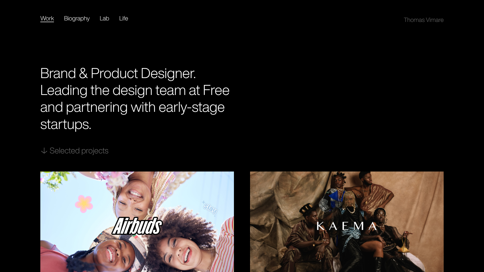
Minimalist Dark Designer Portfolio Grid
A clean, dark-themed portfolio featuring a bold typography hero section and a staggered two-column image grid with subtle entrance animations.
