Application Error Placeholder Page
A minimal, centered Next.js client-side error layout useful for basic exception handling and system messaging.
Overview
This page represents a standard Next.js client-side error boundary template, designed to gracefully handle application crashes. It serves as an essential reference for developers needing a minimal, functional fallback to prevent users from seeing a broken or blank interface during runtime exceptions.
Design System
- Color Palette & Visual Hierarchy: The design is monochromatic and minimalist, featuring soft black text (
#000000) on a stark white background (#FFFFFF). The hierarchy is flat, focusing entirely on a single line of status text centered in the viewport. - Typography System: Uses a comprehensive system font stack (
system-ui,Segoe UI,Roboto,Helvetica,Arial) to ensure zero-latency rendering without external font dependencies. The text is set at14pxwith a400font weight and a28pxline height for maximum legibility. - Page Structure & Section Flow: The layout utilizes CSS Flexbox centering (
display: flex,align-items: center,justify-content: center) within a container set to100vh. This ensures the message remains perfectly centered regardless of screen dimensions. - Reusable Components: The primary cloneable asset is the
Error Container, a robust centering wrapper that can be adapted for maintenance pages, 404 screens, or loading states. - Implementation Clues: The HTML confirms a Next.js framework implementation using inline styles for layout stability and a
next-route-announcerfor accessibility (screen reader support) during client-side transitions.
Use Cases
- Who should clone this pattern: Developers building React or Next.js applications who need a standard "fail-safe" UI for their Global Error boundaries or error.js files.
- What products can remix it effectively: Any web application requiring a non-intrusive, system-level messaging page that needs to load even when primary assets (like CSS files or custom fonts) fail to initialize.
- Practical remix directions: Add a "Reload Page" button with high-contrast styling, incorporate a brand logo above the text, or add a link to a status page for better user recovery.
- Suggested clone scope: Quick section clone. Reuse the Flexbox centering logic and the system-ui font stack for a lightweight, accessible utility page.
Related Inspirations
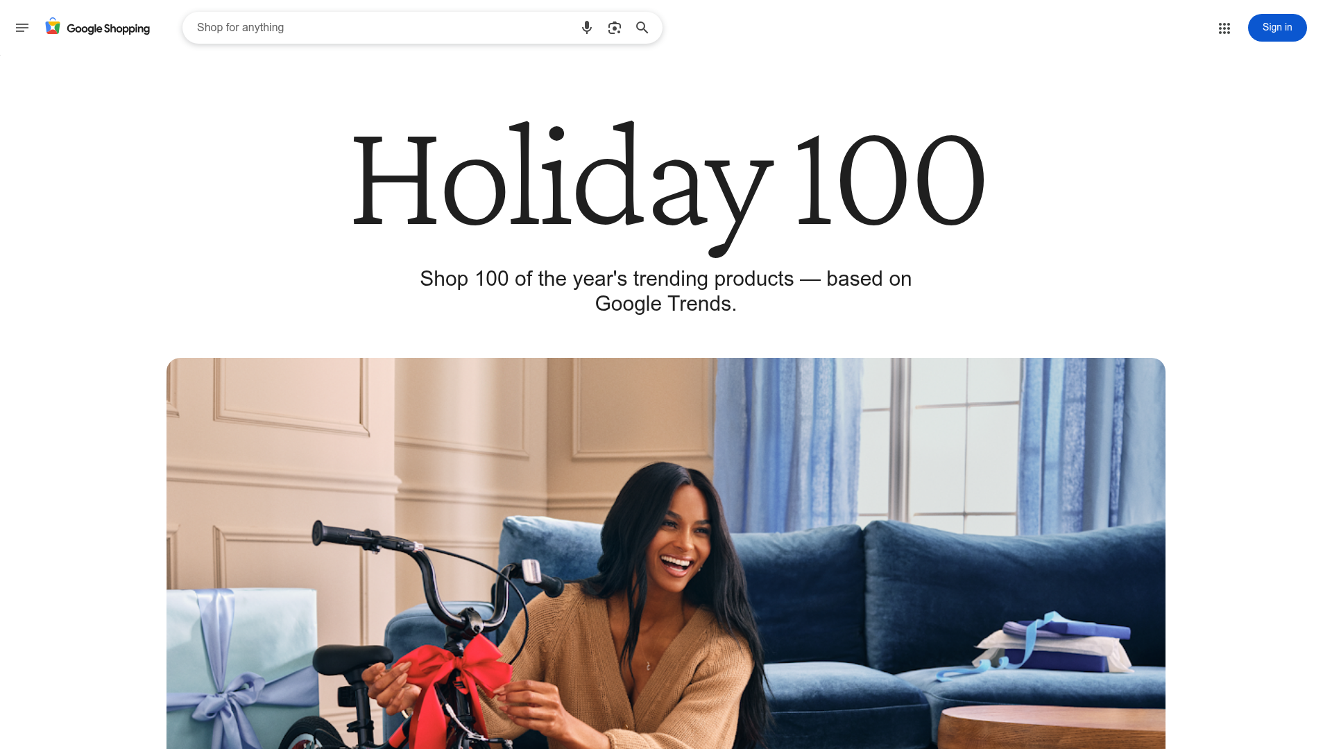
Google Holiday 100 Curator Landing Page
A minimalist e-commerce showcase featuring a wide hero section, clean search integration, and a bold typography-driven header designed for trending product collections.

Finn Pet Supplements Landing Page
An e-commerce landing page featuring high-contrast typography, a sticky brand logo banner, parallax scroll effects on product headers, and a clean product grid.
Playspace Acquisition Announcement Minimalist Layout
A clean, center-aligned announcement template featuring a vertical stack of rich text content and linked text elements on a neutral background.
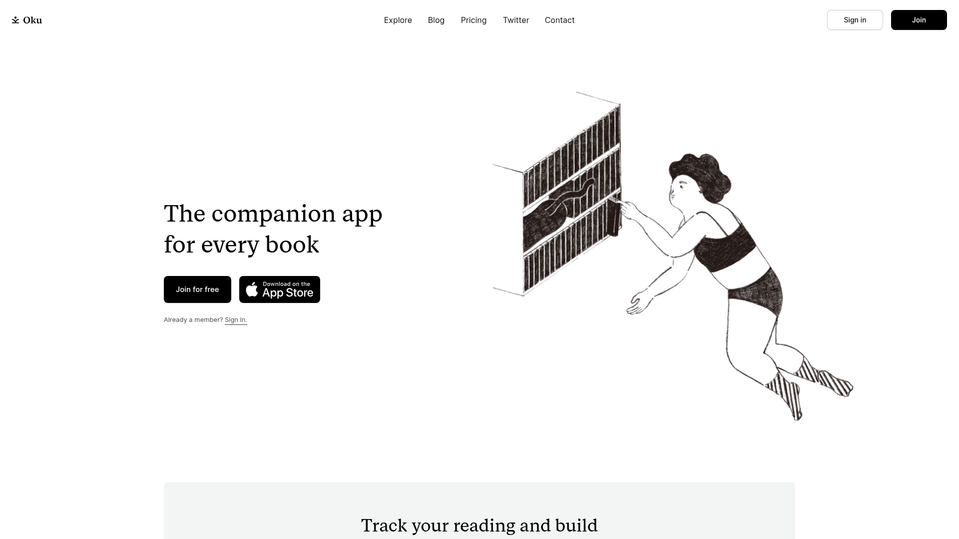
Oku Minimalist Book Tracking Landing Page
A clean, typography-focused landing page featuring a minimalist header, illustrated hero section, and clear call-to-action buttons for app downloads.
OpenWeb B2B Service Landing Page
A professional landing page layout featuring a central animated hero area, data visualization counters, a client logo grid, testimonial slider, and tabbed lead generation forms.

Slite SaaS Knowledge Base Landing Page
A clean SaaS hero section with a conversational headline, secondary call-to-action buttons, and a structured software interface preview featuring user testimonials.
