Lorenzo Dal Dosso Portfolio Homepage
A minimalist brutalist portfolio featuring high-contrast pixel typography, a custom horizontal slider for services, and a themed light/dark mode switcher.
Overview
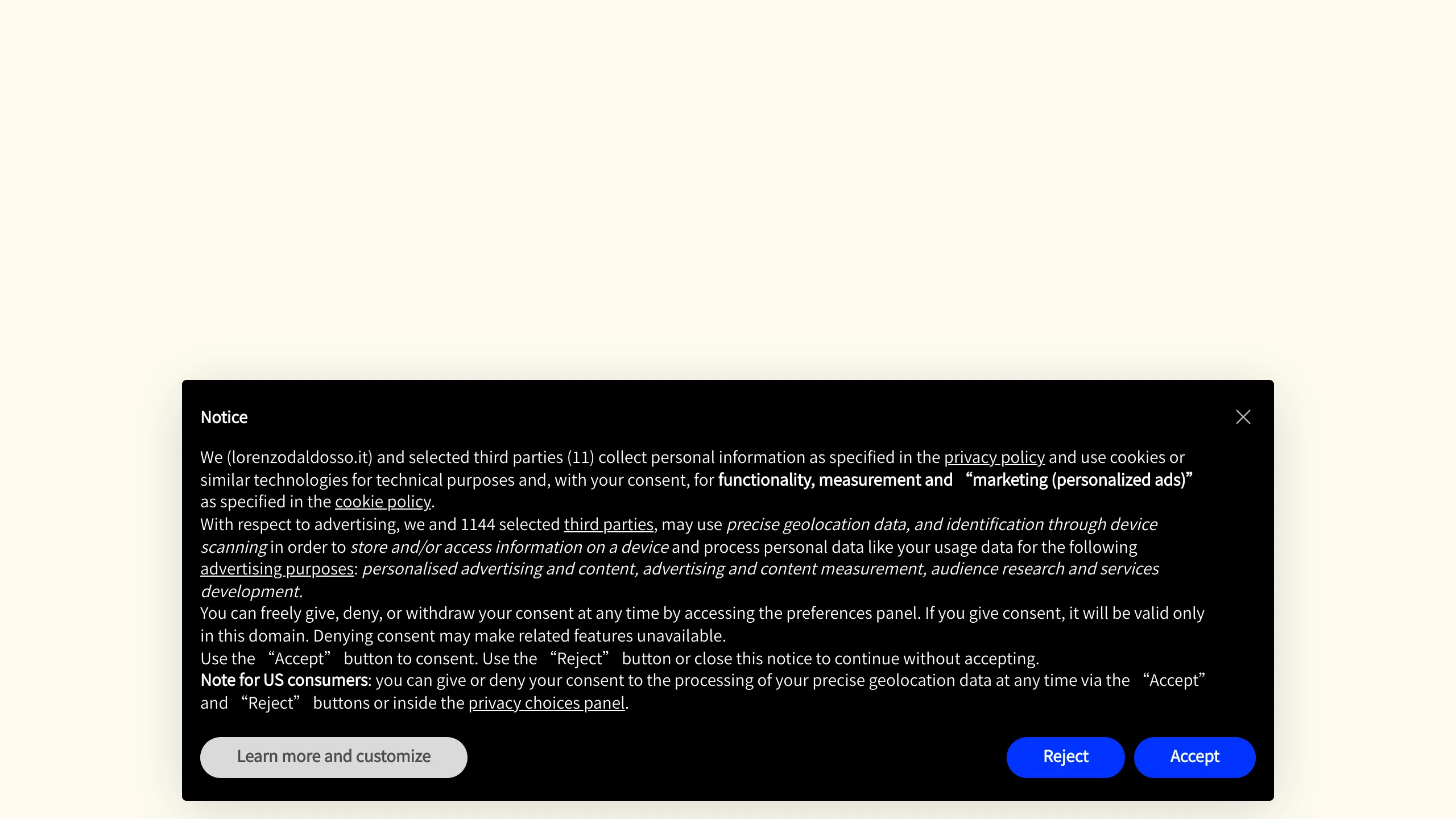
Lorenzo Dal Dosso’s portfolio is a high-impact, minimalist site that blends brutalist aesthetics with professional IT signaling. It is an excellent reference for builders who want to communicate high personality through typography and motion without relying on imagery or complex layouts.
Design System
- Color Palette & Visual Hierarchy: The site uses a high-contrast, two-tone palette centering on an off-white/cream background (
#F9F9F4) and deep black text. A vibrant electric blue is used as a functional secondary color for primary actions within overlays. The hierarchy is established through extreme scale variations rather than color shifts. - Typography System: A custom pixel-art display typeface (
ff-ldd) is used for primary branding and headers, creating a technical, retro-digital feel. This is paired with a clean, sans-serif base font for secondary text. Font scaling is aggressive, using classes likefs-xlarge-gfor hero text andfs-xsmallfor informative micro-copy. - Page Structure & Section Flow: The homepage utilizes a structured grid layout divided by horizontal rules (
<div class="row">). It begins with a hero header, followed by a middle "Status Bar" row containing a progress indicator and small welcome text, and concludes with a horizontal slider (.swiper-wrapper) showcasing service categories. - Reusable Components:
- Themed Nav: A minimalist top navigation bar with a distinct "White Version" mode switcher.
- Horizontal Service Slider: A Swiper.js-based implementation that slides large typographic links (e.g., "Backup & Security", "Network Management") horizontally.
- Numeric Progress Indicators: Animated counters (
01to04) that track the scrolling or sliding progress.
- Interaction and Motion Patterns: The site relies on subtle but sophisticated motion, including localized translations (
translateY) for text entry, a custom cursor wrapper (.cursor-wrapper), and smooth theme transitions (transition: color 2s ease-out). - Implementation Clues: Built with Nuxt.js (
id="__nuxt"), the site leverages Swiper for sliding functionality and likely uses transition hooks for the smooth theme switching between "white" and "dark" modes.
Use Cases
- Who should clone this pattern: Creative developers, cybersecurity consultants, or niche IT specialists who want a "hacker-aesthetic" professional presence that stands out from standard corporate templates.
- What products can remix it effectively: Technical documentation landing pages, boutique digital agency portfolios, or launch sites for SaaS tools focusing on infrastructure and security.
- Practical remix directions: Swap the pixel typeface for a monospaced font to maintain the technical vibe while increasing readability, or adapt the horizontal slider row into a vertical marquee for a more traditional scrolling experience.
- Suggested clone scope: Reusing the central typographic grid and the horizontal Swiper.js services section provides the most immediate value for a quick-turnaround portfolio project.
Related Inspirations
Magda Reyman Designer Portfolio
A minimalist portfolio layout featuring a fixed hero intro, absolute-positioned mobile UI mockups, and a distinctive high-contrast footer with rounded interaction buttons.
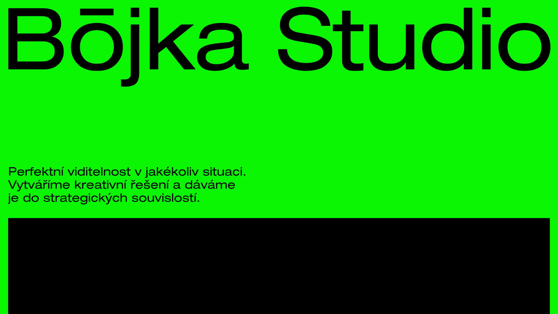
Bōjka Studio Minimalist Portfolio Landing
A bold, high-contrast design featuring a vibrant green hero section, large-scale typography, a crossfade image slideshow, and a fixed navigation footer.
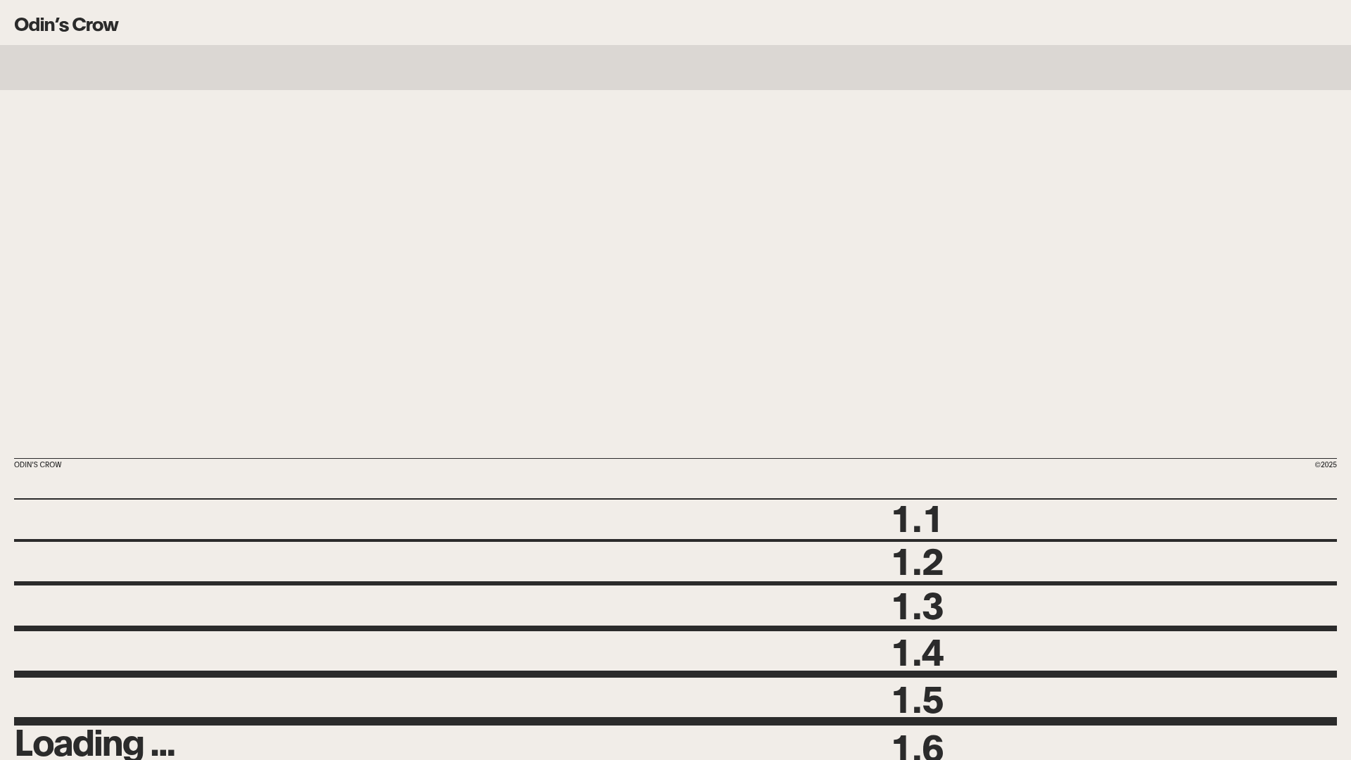
Odin’s Crow Modern Business Portfolio
A minimalist investment site featuring a horizontal line-based layout, split-text character animations, sticky scroll sections, and comparison card components.
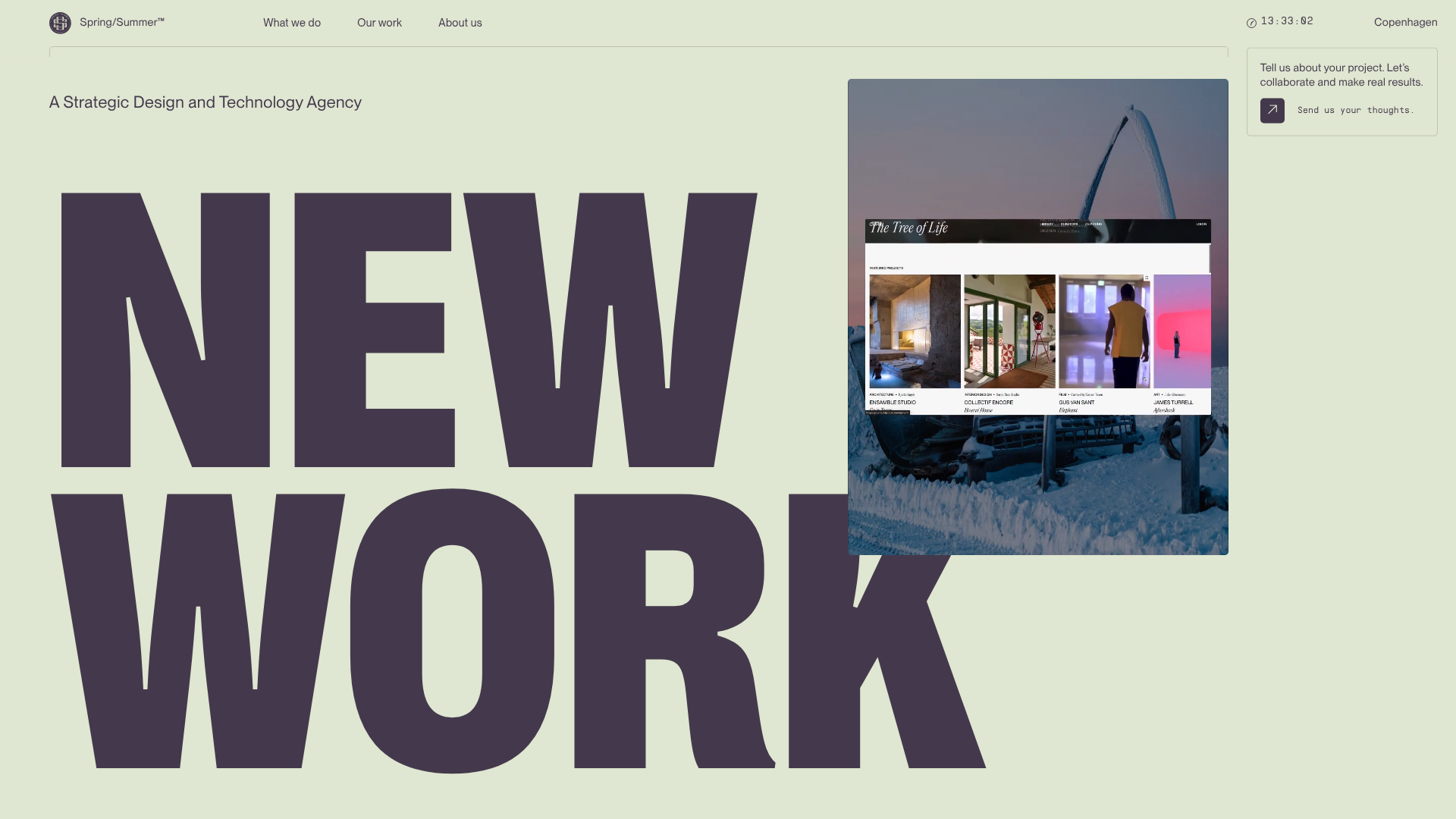
Spring/Summer Design Agency Landing Page
A high-impact agency site featuring a massive 'Big Bang' typography hero, parallax video overlays, a horizonal case study carousel, and a floating contact widget.
Field Day Sound Portfolio Marquee
A minimalist portfolio layout featuring a custom interactive cursor and a horizontal marquee-style project slider with text-splitting animations.

Egstad Minimalist Design Portfolio
A refined Nuxt.js portfolio featuring bold variable typography, interactive canvas elements, and a clean grid-based layout for showcasing design work.
