Odin’s Crow Modern Business Portfolio
A minimalist investment site featuring a horizontal line-based layout, split-text character animations, sticky scroll sections, and comparison card components.
Overview
Odin’s Crow is a high-end minimalist business portfolio for an investment firm, characterized by a unique horizontal line-based aesthetic and a numbered index navigation. It serves as an excellent clone reference for building sophisticated, text-heavy landing pages that require a sense of precision, authority, and modern editorial flair.
Design System
- Color Palette & Visual Hierarchy: The site uses a muted, sophisticated palette of bone-white backgrounds (
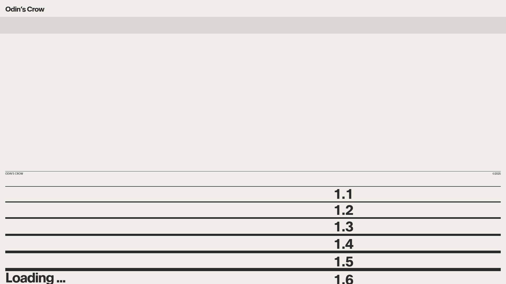
bg-color4), soft grays (bg-color5), and deep charcoal for typography. Visual interest is maintained through broad blocks of color that create a rhythmic 'stacked' appearance rather than floating elements. - Typography: The system relies on bold, high-contrast sans-serif fonts with tight letter spacing (
tracking-tighter). Large, oversized text is used for section headers and intro videos, while body text remains compact and highly readable. A distinct numbering system (1.1, 1.2, etc.) provides a structural taxonomy for the content. - Page Structure: The flow follows a structured chronological index. It transitions from a preloader-focused intro to a large hero video ('Poster' section), followed by alternating content blocks that use horizontal rules to separate distinct ideas like 'What we do,' 'Working with us,' and 'Portfolio.'
- Reusable Components:
- The Comparison Block: The 'Working with us' section featuring triple-column lists with distinct icon markers and background color shifts.
- Timeline Cards: The 'Simplicity at our core' block (
time-blocks) uses uniform rectangular containers to display speed-of-service stats. - Horizontal Lines: Procedural
lines__lineelements that scale and frame every section, creating a consistent architectural scaffolding.
- Interaction & Motion: The HTML reveals a heavy reliance on
split-textcharacter animations anddata-scroll-sectionattributes, indicating a smooth, momentum-based scrolling experience (Locomotive Scroll style). Elements utilizemix-blend-multiplyon imagery and videos to integrate them seamlessly into the background color. - Responsive Behavior: The mobile menu switches to a full-screen overlay with simplified navigation links and a prominent 'Get in touch' CTA. Content blocks like 'The Portfolio' transition from a sticky horizontal display to a vertically stacked layout on smaller screens.
Use Cases
- Who should clone this: Agency founders, venture capital firms, consultants, and luxury service providers who want a website that feels like a premium physical dossier or financial report.
- Effective Remixes: This pattern works exceptionally well for SaaS landing pages focused on 'Process' or 'Roadmap' where clarity and timeline are essential. It can also be adapted for architecture portfolios where the grid-like lines complement structural imagery.
- Remix Directions: Swap the investment content for a project case study. The numbered navigation can be repurposed into a 'Steps to Success' guide. Designers should consider keeping the horizontal line logic but experimenting with a dark mode (black background, neon accents) for a high-tech studio look.
- Suggested Clone Scope: Start by cloning the 'Working with us' (1.3) benefit comparison grid as a standalone section for any service page before attempting the full-page scroll-jacking architecture.
Related Inspirations
Bastien Allard Minimalist Portfolio Gallery
A clean, horizontal marquee-based portfolio featuring a sticky header/footer layout, digital clock integration, and responsive bilingual text columns for minimalist art director showcases.
Magda Reyman Designer Portfolio
A minimalist portfolio layout featuring a fixed hero intro, absolute-positioned mobile UI mockups, and a distinctive high-contrast footer with rounded interaction buttons.
Jun Works Portfolio Landing Page
Minimalist graphic design portfolio featuring a text-heavy layout with image-on-hover tooltips, a pill-shaped marquee contact card, and a categorized hashtag tag cloud for project navigation.
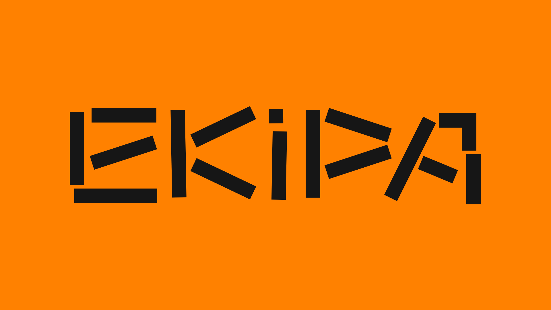
Ekipa Agency Artist Roster Site
A minimalist agency portfolio featuring a dynamic block-based logo, colorful background transitions, and a hover-activated image preview grid for an artist roster.
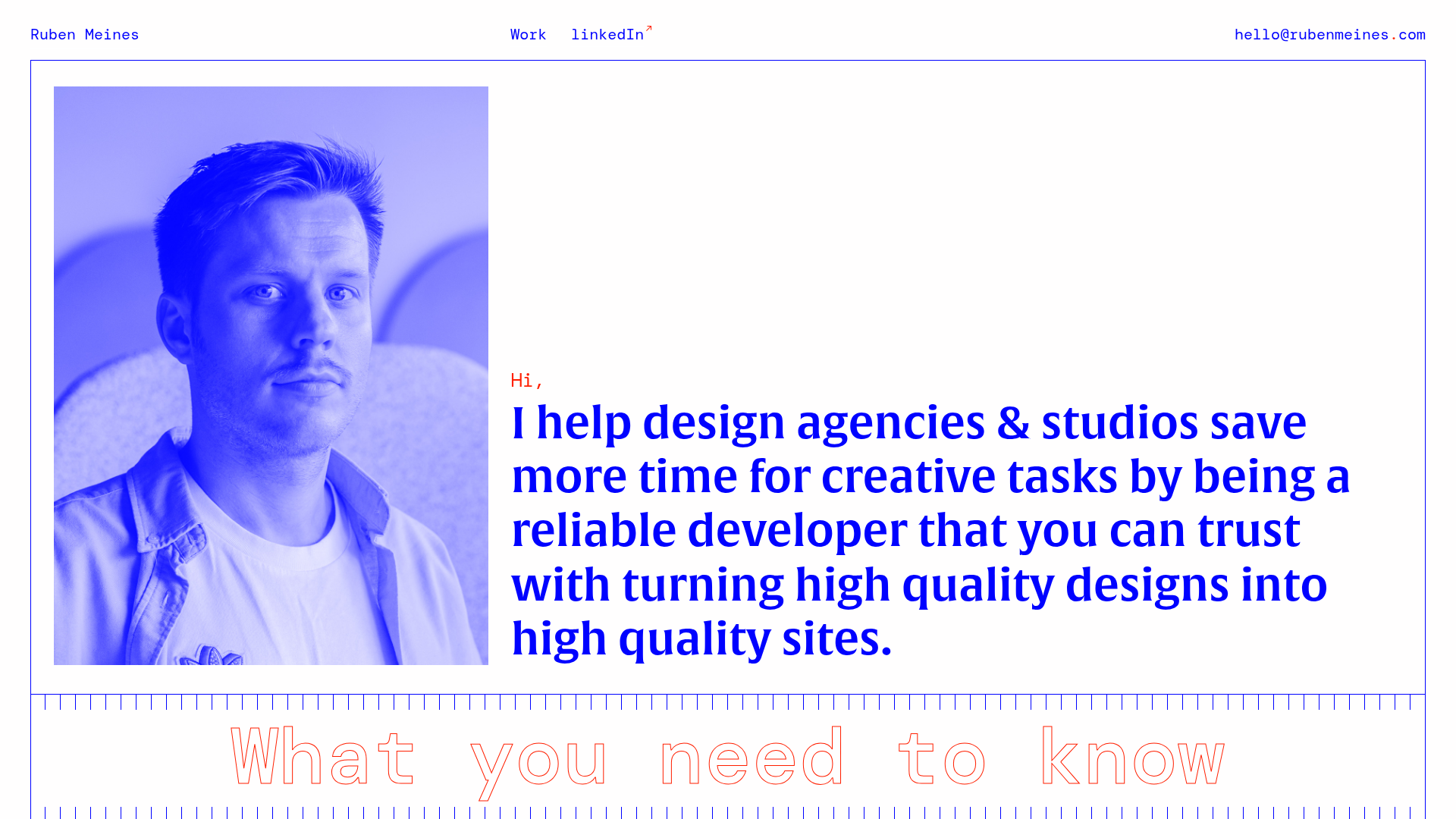
Ruben Meines Minimalist Developer Portfolio
A clean typography-focused layout featuring a duotone hero image, a decorative CSS grid border system, and a structured service list with outlined custom typography.
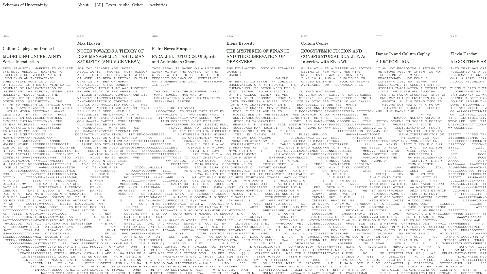
Schemas of Uncertainty Monogram Grid
A brutalist multi-column layout for text-heavy content featuring high-contrast typography, minimalist navigation, and a rhythmic vertical grid of essays.
