HudsonBEC Group acquisition landing page
A minimalist, typography-driven announcement landing page featuring a centered text hero and embedded brand logo SVG links.
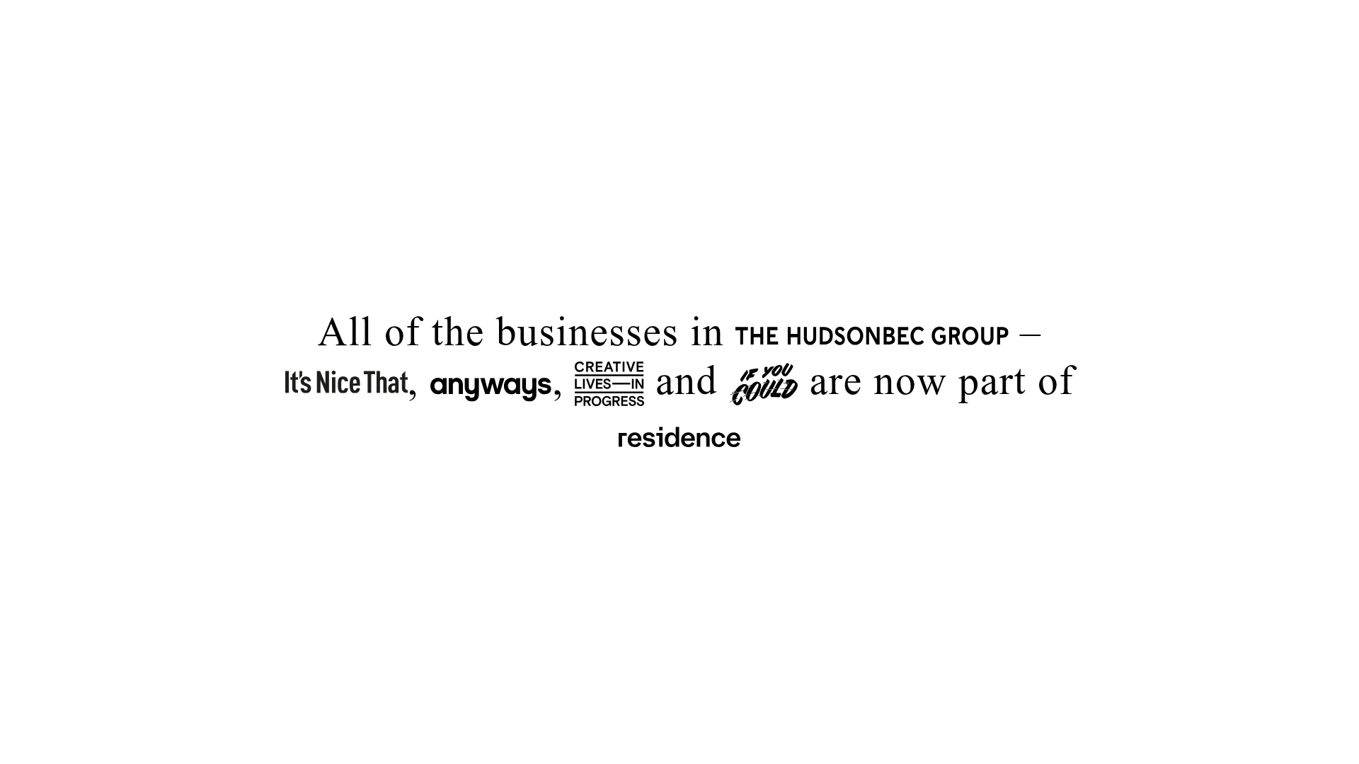
Overview
This is a minimalist, typography-led announcement landing page designed to communicate a corporate acquisition or transition. It is a powerful reference for builders because it demonstrates how to integrate multiple distinct brand identities into a single, cohesive narrative sentence using responsive SVG placement.
Design System
- Color Palette & Visual Hierarchy: The design uses a high-contrast, black-and-white monochrome palette. It prioritizes information hierarchy by embedding logos directly into a text block, making the brands the focal point while maintaining a clean, academic aesthetic.
- Typography: The text uses a sophisticated Serif typeface for the connective prose, creating a classic "editorial" feel. Specific words like "businesses" use italic styling for emphasis, while the logos provide rhythmic visual breaks in the sentence flow.
- Layout Structure: The page is built as a single-section layout (
class="intro"). The content is centered both vertically and horizontally within a large container (f-xl container), ensuring the message is unavoidable on any screen size. - Reusable Components: The core reusable pattern is the "Inline Logo-Link Linkage." Each brand is wrapped in an
<a>tag with a specific class (intro-logo), allowing for precise control over the scaling and alignment of disparate logo shapes within a line of text. - Interaction & Motion: The implementation uses standard link cursors for the logos. Designers can easily add hover transitions (like opacity shifts or color changes) to the SVG paths to enhance interactivity.
- Implementation Clues: The HTML uses clean, semantic structure where logos are treated as inline-block elements. The use of custom IDs for each SVG (e.g.,
#itsnicethat-logo) suggests a CSS system specifically tuned to normalize heights and widths so different logos feel balanced within the line height.
Use Cases
- Who should clone this: Small agencies, creative groups, or venture capital firms that need to showcase a portfolio of brands concisely without the clutter of a standard grid.
- Appropriate Products: Brand identity reveals, studio mergers, partner pages, or "supported by" footer sections.
- Remix Directions:
- Brand Swap: Replace the existing SVGs with your own portfolio logos.
- Stylistic Adaption: Change the background color and serif font to a bold sans-serif and vibrant background for a more modern, tech-focused "Coming Soon" page.
- Functional Extension: Add a simple fade-in animation for the text to create a more cinematic entrance.
- Clone Scope: This is ideal for a full-page clone when a singular, high-impact message is needed, or a section clone for a "Trusted By" component within a larger marketing site.
Related Inspirations

OpenWeb B2B Service Landing Page
A professional landing page layout featuring a central animated hero area, data visualization counters, a client logo grid, testimonial slider, and tabbed lead generation forms.
403 Forbidden Access Page
A minimalist, centered HTTP 403 error status page layout suitable for clean and simple server-side response templates.
Minimal Animated Success Landing Page
A clean, centered confirmation screen featuring a large green icon, a bold heading, and smooth fade-in entry animations.

Nonymous Coming Soon Placeholder Page
A minimalist blank landing page featuring a simple 'Coming soon' text layout suitable for basic domain parking or initial placeholder deployment.
Firebase Hosting Site Not Found
A minimal placeholder layout for 404 error states including a centered logo, numbered troubleshooting guide, and linked utility text.
BlueYard Minimal Logo Splash Page
A terminal-style minimalist loading screen featuring a centered logo block and a discreet bottom-aligned percentage progress indicator for high-end landing pages.
