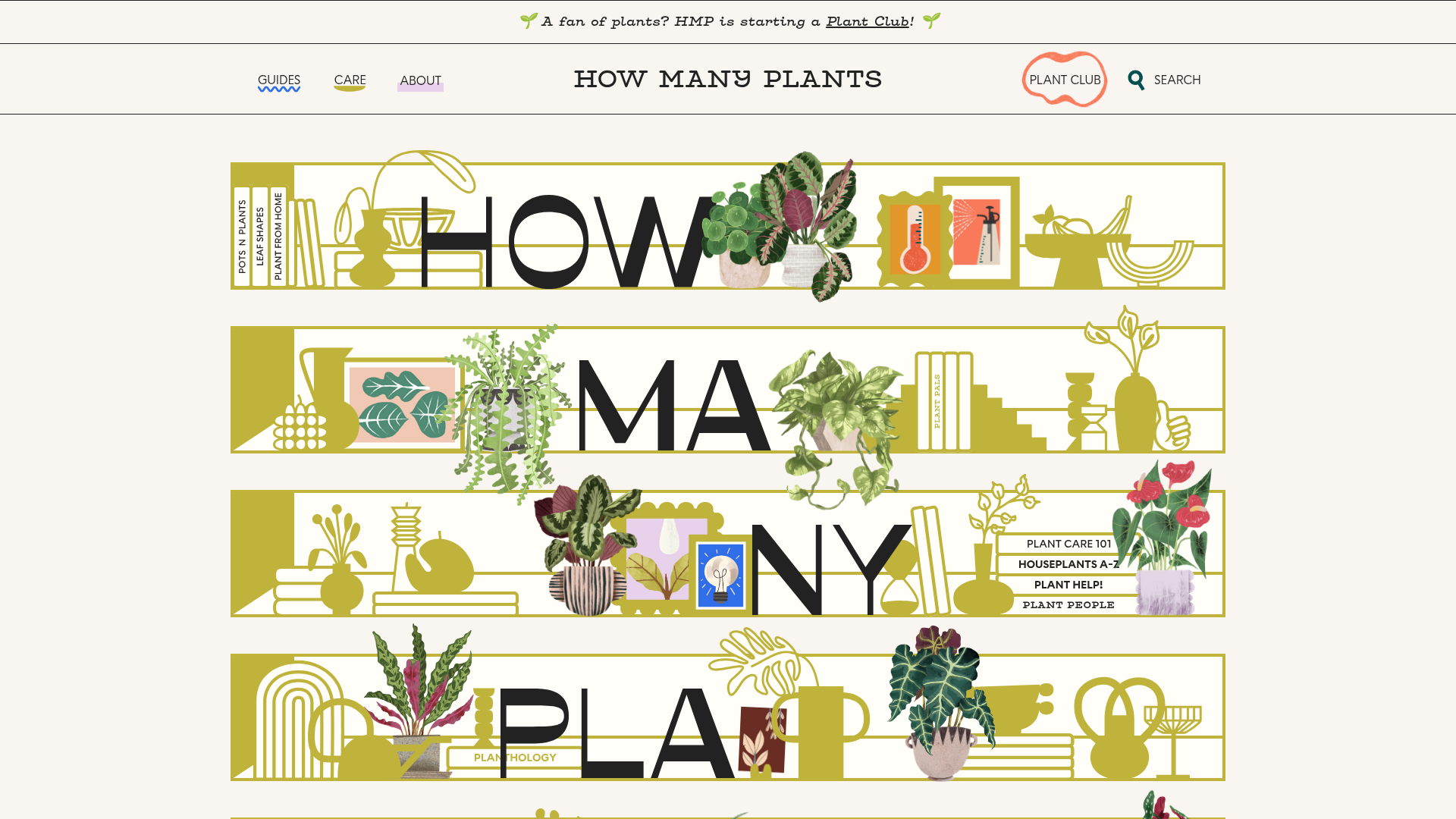
How Many Plants Illustrated Hero
A unique houseplant resource featuring layered SVG shelf layouts with hover-triggered animations, interactive image masks, and alternating content sections for educational guides.
Overview
How Many Plants is a highly creative, illustrative houseplant resource that uses a unique "shelf" motif to present an educational brand identity. It serves as an excellent clone reference for building visually-driven landing pages that transition seamlessly from artistic hero sections to structured content grids.
Design System
- Color Palette & Visual Hierarchy: The site uses a muted, natural palette featuring an off-white background (#FAF9F6), mossy olive greens for decorative SVG elements, and high-contrast black for typography. Vibrancy is reserved for the realistic plant illustrations, creating a clear hierarchy where the subject matter (plants) pops against the stylistic shelving.
- Typography System: The design features a bold, sans-serif headline face for large letters integrated into the hero shelving ("HOW MANY PLANTS"). Body text utilizes a clean, legible sans-serif with generous leading, while secondary headers use a smaller, bold serif style to differentiate sections.
- Page Structure & Section Flow: The layout begins with a vertical stack of interactive shelf containers (
home-page-shelf), followed by alternating two-column grids (home-page-content-grid). These sections flip the image/text orientation (Section A vs. Section B) to maintain rhythm and engagement during scrolling. - Reusable Components: Key components include the
.home-page-shelfcontainer which manages complex absolute positioning, the.hover-animateplant wrappers that separate pots from foliage, and the persistent sub-navigation links styled as simple, underlined text in thePlant Help!block. - Interaction & Motion: The site leans heavily on hover-triggered animations (
.animateand.animate-smallclasses). Specifically, plant assets are split into two layers (pot and plant), allowing the foliage to sway or scale slightly on hover while the base remains static. The navigation uses a playful squiggle underline effect. - Implementation Clues: The HTML confirms a Webflow-based structure, utilizing
w-layout-gridfor content sections and heavy use of both SVGs for vector shelf lines and transparent PNGs for detailed botanical illustration.
Use Cases
- Creative Portfolios & Educational Blogs: Designers or educators can clone the "shelf" concept to display projects or categories as physical objects on a digital display.
- E-commerce Collections: A boutique shop can remix this by replacing plant illustrations with products (shoes, pottery, books) while keeping the interactive shelving to showcase a curated aesthetic.
- Remix Directions: Developers should reuse the alternating content grid structure for standard SEO-friendly text but can swap the botanical SVGs for more corporate line art or abstract shapes to drastically change the brand vibe.
- Suggested Clone Scope: A quick section clone of the
home-page-shelf-areais highly recommended for builders looking for a unique alternative to standard hero sliders, while thehome-page-section-a/bclasses provide a solid template for responsive content alternating.
Related Inspirations

Pa’lais Plant-Based Product Homepage
A food product landing page featuring an animated video hero, a recipe carousel with filtering icons, organic blob-shaped layout containers, and a parallax-scrolling decorative element system.
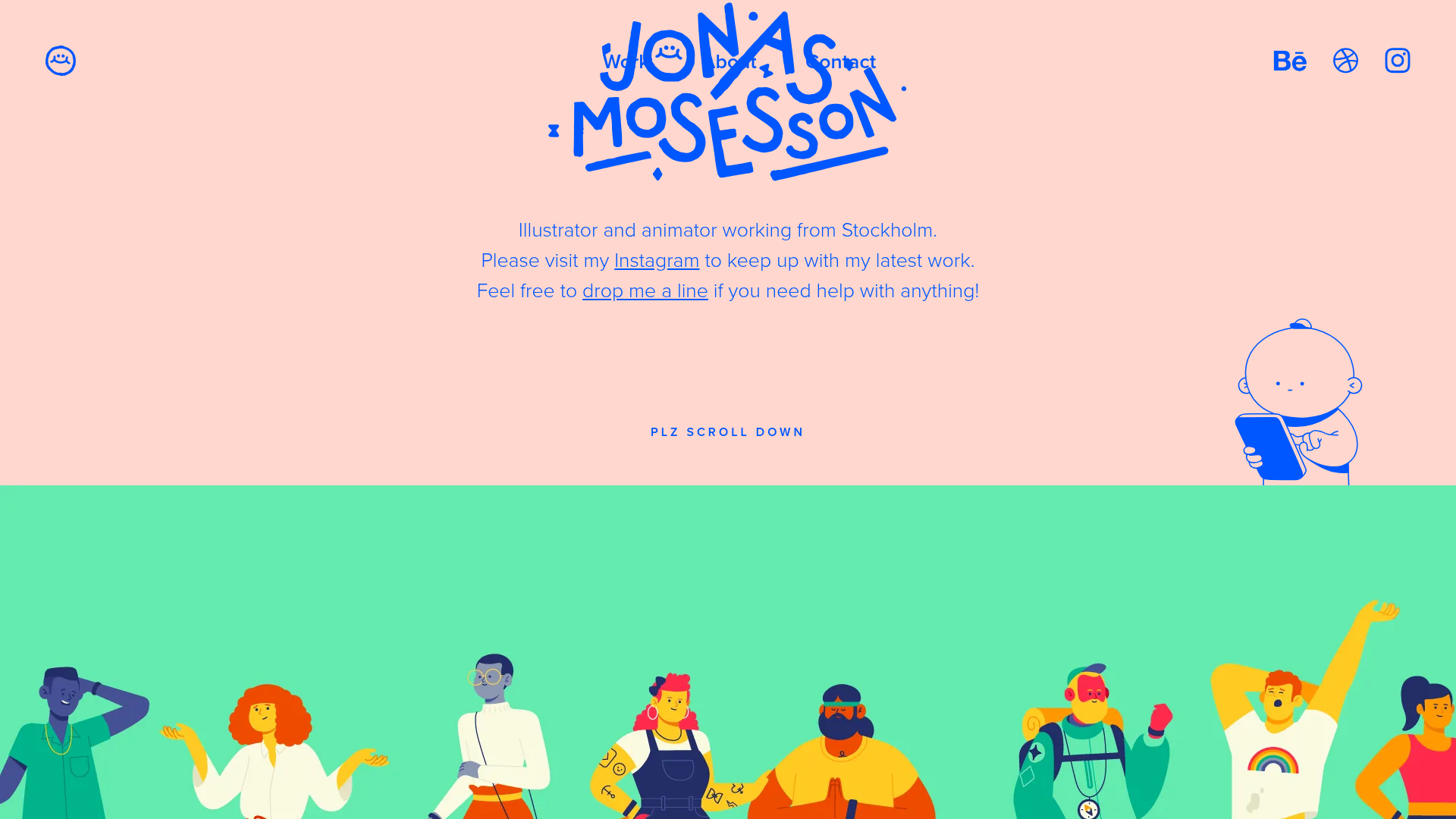
Jonas Mosesson Illustrator Portfolio Layout
A playful portfolio featuring a custom-animated logo header, a responsive multi-column project grid with hover-revealed details, and a distinct minimalist sectioned about page.
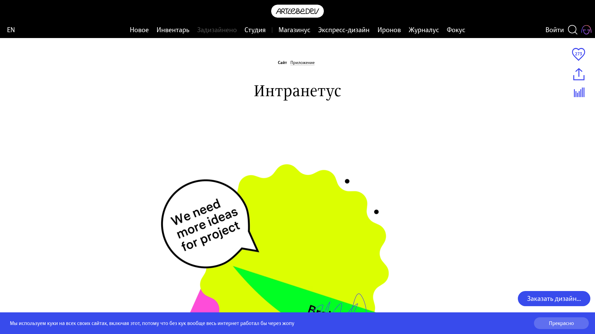
Intranetus Project Showcase Landing Page
A high-concept portfolio page featuring a large-scale video hero, Lottie animations, layered parallax transition effects, and a vertical grid of browser-mockup feature cards.
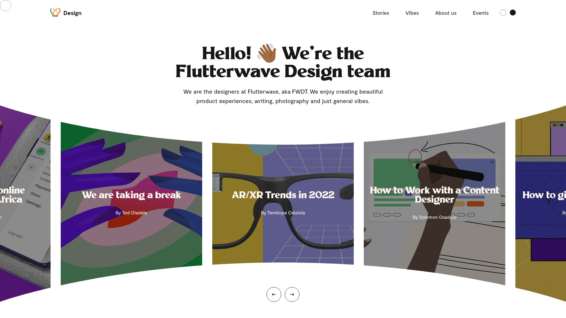
Flutterwave Design Team Portfolio Blog
A design team showcase featuring a curved fisheye-style hero carousel, custom cursor tracking, and a clean grid layout for articles and visual 'vibes'.
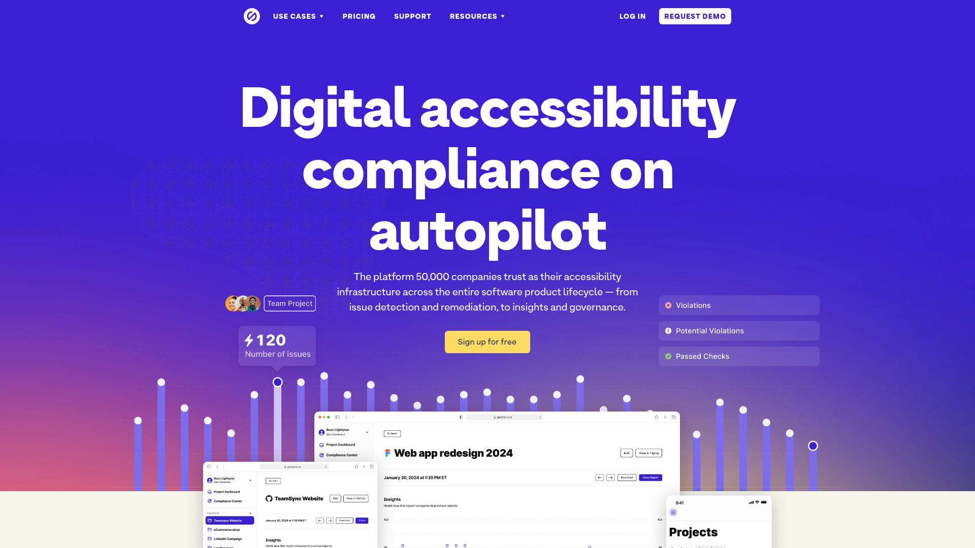
Stark Accessibility Software SaaS Landing Page
A vibrant SaaS landing page featuring a purple gradient hero, layered dashboard mockups, grid-based feature highlights, and segmented user-persona navigation.
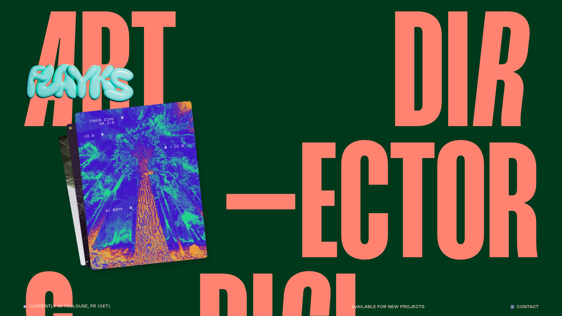
Flayks Digital Portfolio with Floating Cards
A high-end creative portfolio featuring an overlapping card stack hero, complex typography animations, and modular project showcase sections with Svelte-based interactive components.
