Pa’lais Plant-Based Product Homepage
A food product landing page featuring an animated video hero, a recipe carousel with filtering icons, organic blob-shaped layout containers, and a parallax-scrolling decorative element system.

Overview
This homepage for Pa’lais is a masterclass in organic, playful UI design for CPG (Consumer Packaged Goods) brands. It effectively combines high-bitrate video backgrounds, fluid asymmetrical layouts, and decorative parallax elements to create a premium yet approachable brand experience. Builders should clone this to learn how to break out of rigid grid systems while maintaining a structured content flow.
Design System
- Color Palette & Visual Hierarchy: The palette is dominated by soft, earth-toned pastels (creams, muted browns, soft blues, and pinks) that emphasize its natural and plant-based origins. Hierarchy is established through large, high-contrast serif typography paired with bright call-to-action (CTA) buttons that pop against organic background shapes.
- Typography: The system uses a bold, high-character serif for primary headings (
h1,h2) to convey a "botanical" yet sophisticated feel. Body copy uses a sans-serif for readability. Scale is dramatic, with many headlines spaning the full width of their containers to drive attention. - Page Structure & Section Flow:
- Hero: Full-screen video background with organic "blob" masking and a dot-styled page indicator.
- Intro: Minimalist text block with parallax decorative elements (nuts/crumbs) to introduce brand values.
- Recipe Carousel: A horizontal
swiper-slidesection featuring recipe cards with integrated metadata icons (cooking time, difficulty, allergens). - Product Range: A dual-column layout showcasing product photography with contrasting wave-shaped section dividers.
- Community/Social: A grid integration of Instagram posts titled "You are Pa'lais."
- Conversion/Newsletter: A wave-themed footer featuring an email capture form and "speech bubble" graphics.
- Reusable Components:
- Magnetic CTAs: Buttons labeled with classes like
cta-border magneticimply custom movement on hover. - Recipe Cards: These contain sophisticated overlays for cooking stats and dietary icons (
lactose-free,vegan, etc.). - Section Dividers: Custom SVG "waves" that transition one background color to the next without a straight edge.
- Magnetic CTAs: Buttons labeled with classes like
- Interaction & Motion Patterns: The HTML reveals heavy use of
rellaxfor parallax scrolling on decorative background items. Significant use of Swiper.js for responsive carousels and custom page transitions (defined inwaves-page-transition-container). - Implementation Clues: The site is built with WordPress, utilizing custom CSS for grid layouts (
t-col-16 l-col-22naming convention) and the Swiper library for touch-ready slider interactions.
Use Cases
- Who should clone this pattern: Food and beverage startups, organic skincare lines, or lifestyle brands looking to project a "natural" but high-end aesthetic.
- What products can remix it effectively: Any direct-to-consumer brand that relies heavily on recipe-based marketing or visual storytelling through video.
- Practical remix directions:
- Architecture Remix: Extract the Recipe Swiper section to use as a dynamic product gallery for an e-commerce site.
- Style Remix: Swap the botanical colors for high-contrast neons and sharp edges for a modern tech landing page, keeping the parallax layer structure.
- Functional Remix: Use the Organic Wave Dividers and Blob Masks to add visual interest to a standard SaaS homepage.
- Suggested Clone Scope: A full-page clone is recommended for those wanting to master complex parallax layering and non-linear layout compositions. For a faster build, the Recipe Swiper and Product Range sections serve as excellent stand-alone modules.
Related Inspirations
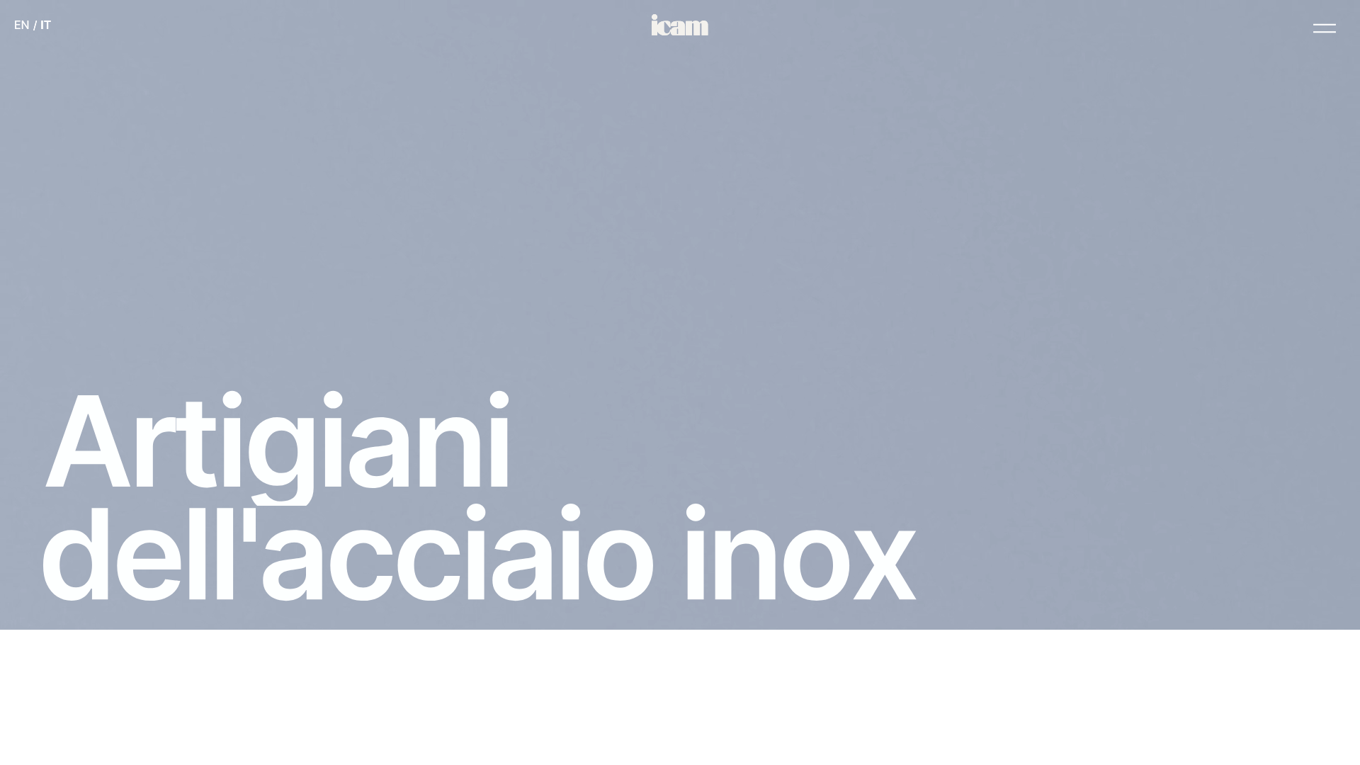
ICAM Inox Industrial Portfolio Landing
A high-impact landing page featuring an animated video hero, smooth scroll-triggered Lottie interactions, a rounded bento-style product grid, and full-bleed image sections.
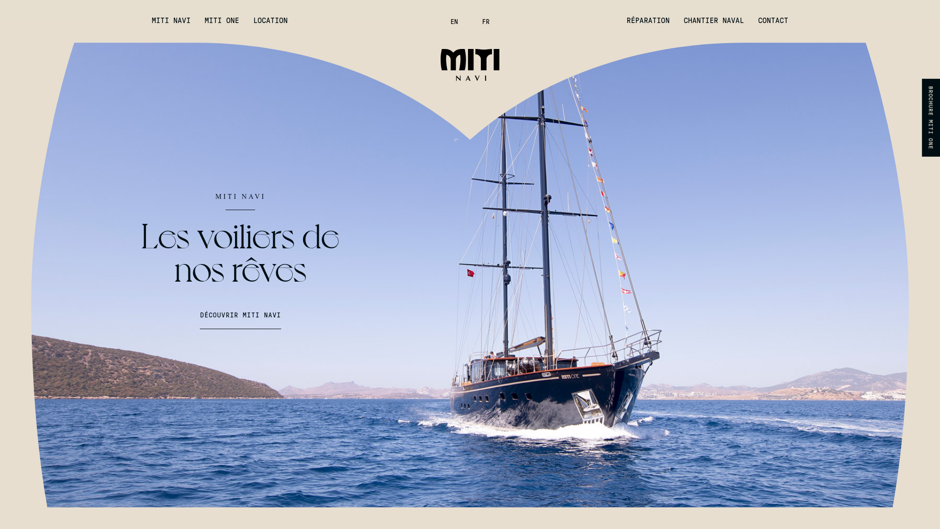
Miti Navi Luxury Nautical Portfolio
A high-end landing page featuring a curved hero mask, smooth parallax scroll effects, card-based service layouts, and sophisticated serif typography for a premium brand feel.
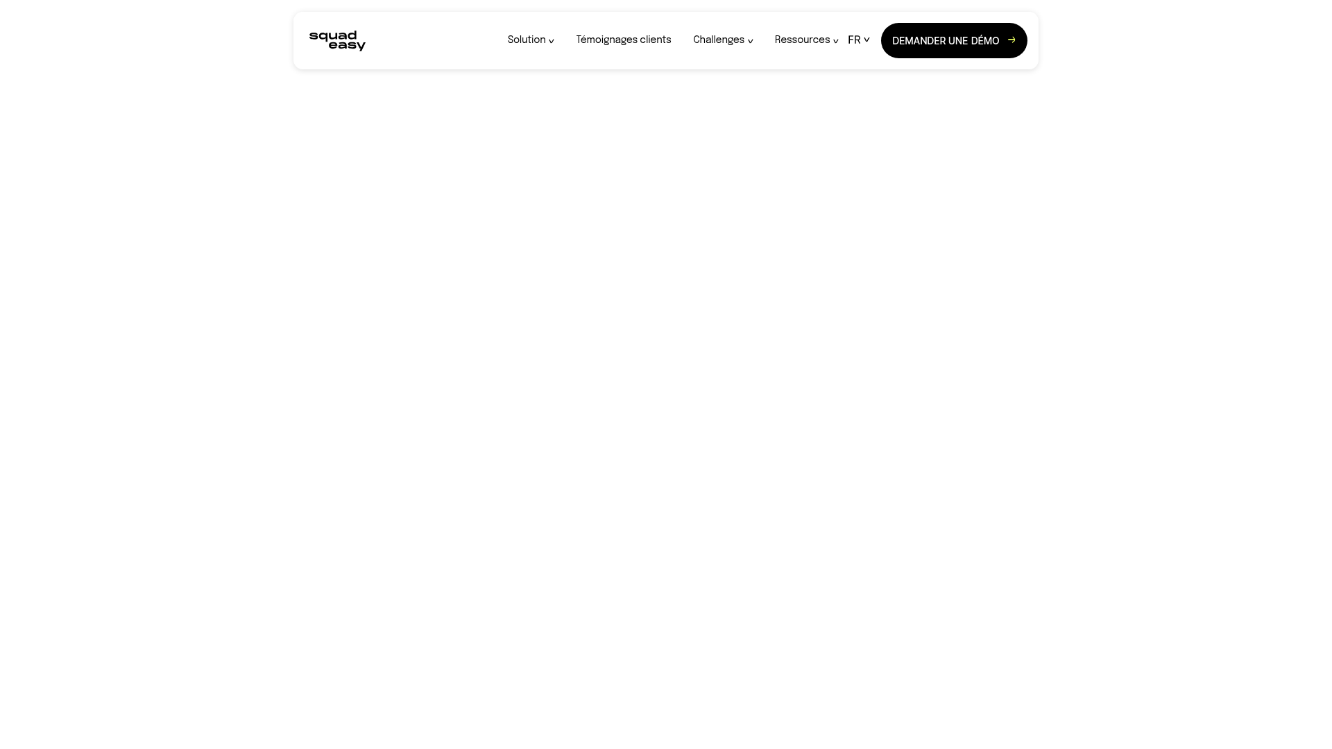
Squadeasy Employee Engagement SaaS Landing Page
A vibrant wellness platform layout featuring a sticky navigation bar, modular high-contrast sections, interactive testimonials slider, and animated data counting components.
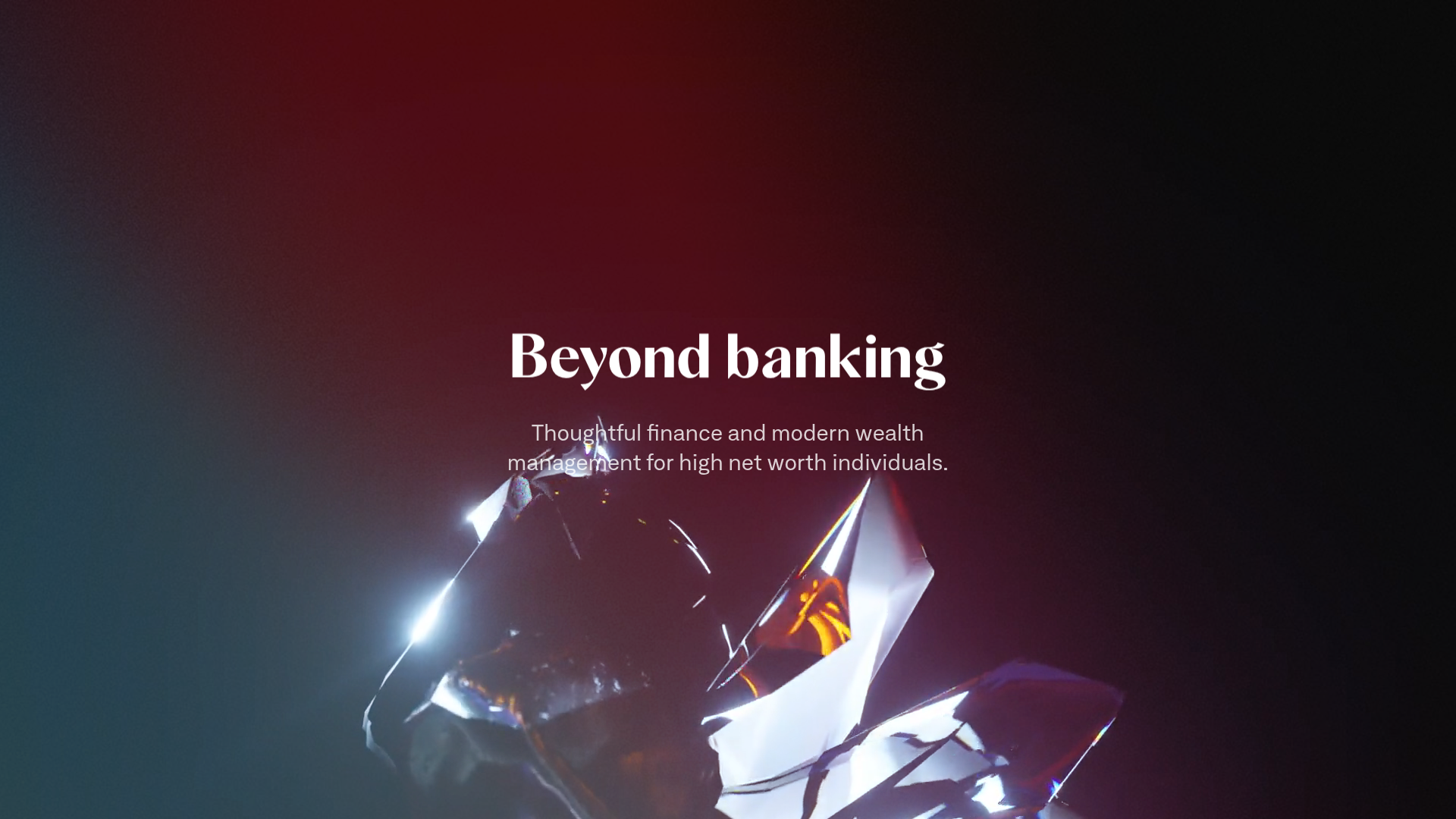
Letter Private Banking Landing Page
Features a high-impact dark hero section with video backgrounds, elegant typography, and a staggered grid of service panels using varied color themes and video assets.
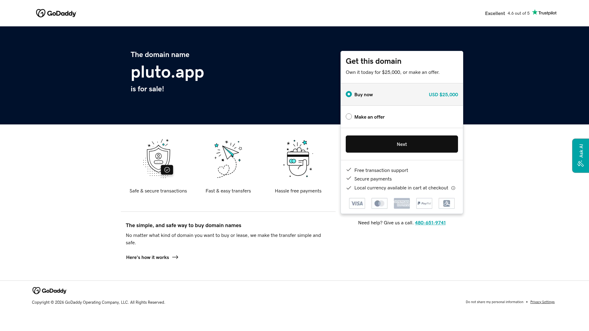
GoDaddy Domain Sales Landing Page
A clean domain aftermarket layout featuring a hero section with purchase/offer selectors, trust signals, payment icons, and a three-column feature grid.
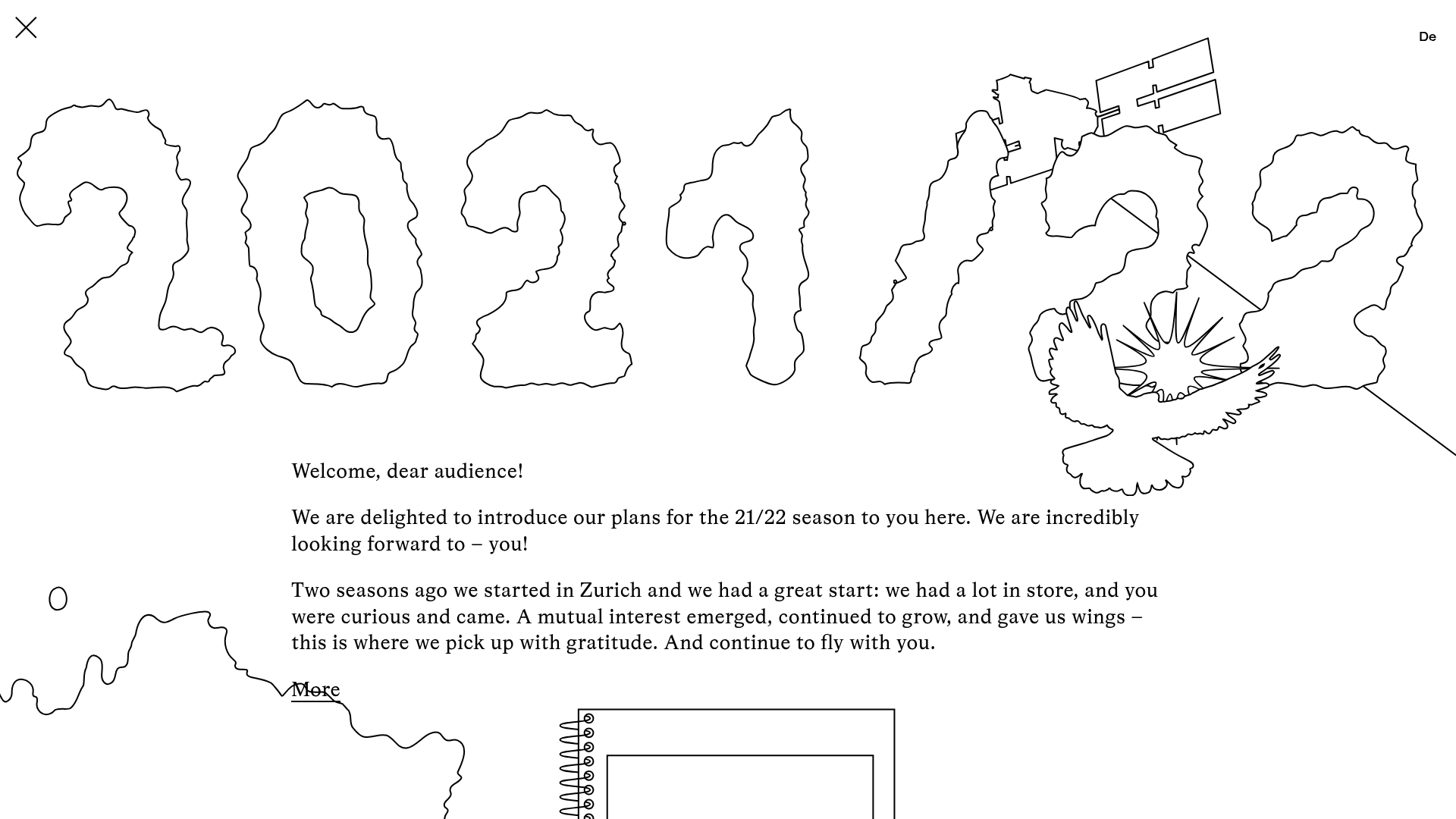
Schauspielhaus Zurich Saison Interactive Preview
An artistic landing page featuring parallax scrolling SVG illustrations, a unique hand-drawn aesthetic, and a horizontal carousel for showcasing seasonal event premieres.
