Tom Parkes Portfolio Design Gallery
A minimalist portfolio layout featuring a typography-focused hero section with inline icons, full-width video scroll reveals, and a dense masonry grid for visual assets.
Overview
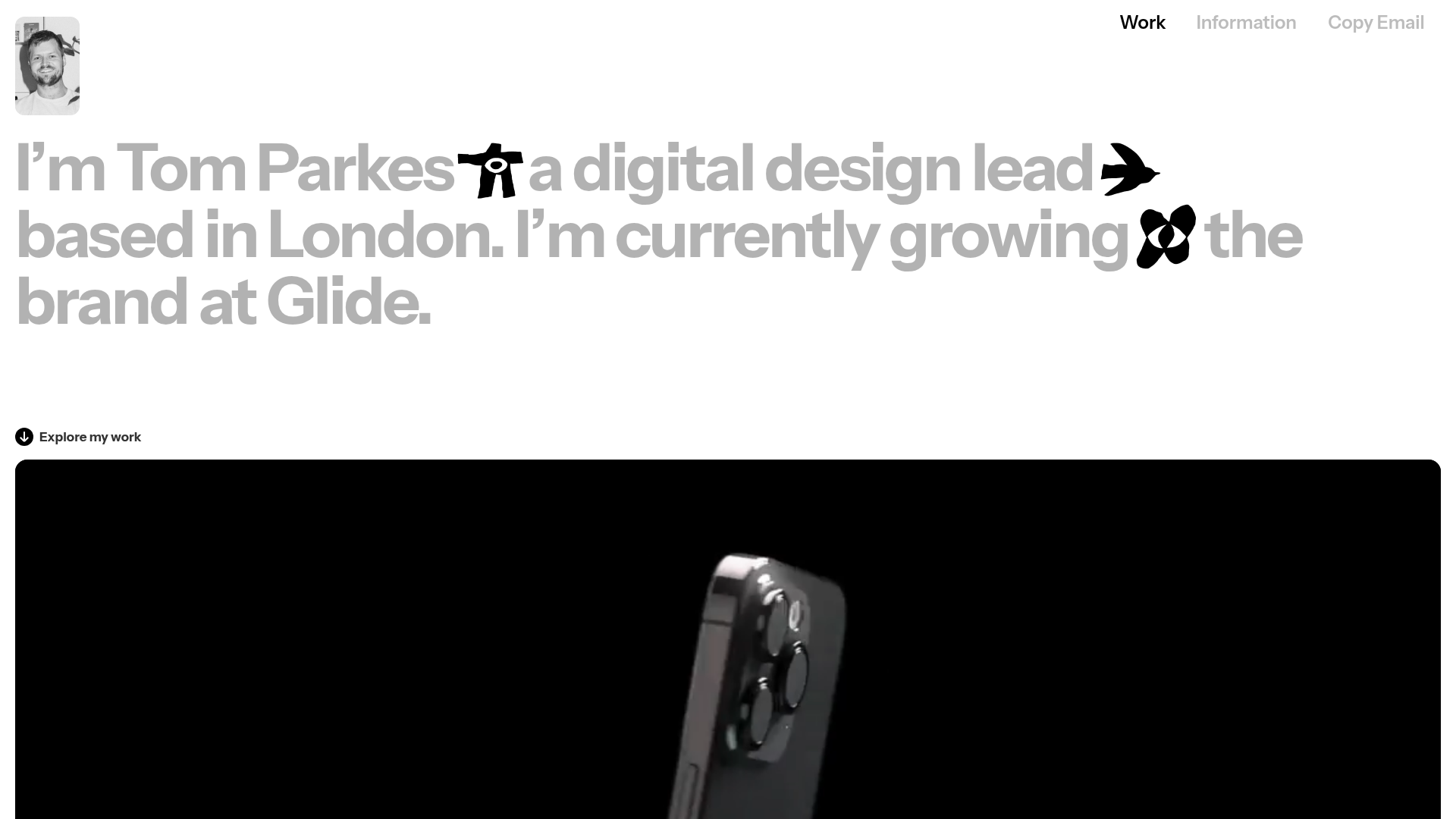
This portfolio is a masterclass in high-impact, minimalist digital design, leveraging bold typography and integrated motion to create a premium feel. It serves as an excellent reference for builders wanting to showcase creative work through a mix of large-scale display text and immersive full-width video backgrounds.
Design System
- Color Palette & Visual Hierarchy: A strictly monochromatic base (white background, black and grey text) allows high-fidelity project images and videos to provide the primary visual interest. Hierarchy is established through extreme contrast in text sizes rather than color.
- Typography: The site uses a heavy sans-serif typeface for display headings (
xl-display). Scale is used dramatically, with hero text occupying nearly the entire viewport width. Inline icons (man, bird, eye) are treated as characters within the text flow to add personality. - Page Structure: The layout follows a linear narrative: a bold typographic hero, followed by alternating project sections. Larger projects use full-width background videos, while others utilize a split-grid layout to balance imagery with descriptive text and metadata.
- Reusable Components:
- Typographic Hero: A container that mixes text blocks and inline images for a magazine-style intro.
- Scroll-Reveal Video Blocks: Full-width sections using
w-background-videowith overlay titles. - Dense Masonry Grid: The "Visual Feed" section uses a multi-column grid (
row-a) for smaller assets, experiments, and GIFs, perfect for a "scratchpad" or secondary work showcase.
- Interaction & Motion: The portfolio utilizes opacity-based scroll reveals (seen in
data-w-idandstyle="opacity: 0;"attributes) that fade elements into view as the user scrolls. Hover states on the profile image reveal a hidden information card (bg-info-card). - Implementation Clues: Built with Webflow, as evidenced by classes like
w-layout-grid,w-background-video-atom, andw-container. The use ofdata-w-idindicates the use of Webflow Interactions for the entrance animations.
Use Cases
- Who should clone this: Senior designers, creative directors, or motion studios who want a site that feels "designed" without being overly decorative.
- Effective Remixes: This pattern works exceptionally well for high-end boutique agencies or product landing pages where the "story" is told through a few key case studies.
- Remix Directions: Replace the inline icons in the hero section with brand-specific symbols or SVGs; adapt the "Visual Feed" grid into a client logo wall or a team gallery.
- Clone Scope: A full-page clone is recommended to maintain the specific rhythmic transition between the massive hero text and the immersive video sections, though the Masonry Grid section is a perfect quick-clone for any asset-heavy page.
Related Inspirations
Tobias Ahlin Portfolio Design Portfolio
A layout-driven portfolio featuring a geometric animated hero, custom SVG typography transitions, and a responsive grid of card-based blog posts and project highlights.
NotReal Design Agency Portfolio
An asymmetrical masonry grid layout featuring video-on-hover thumbnails, minimal minimalist typography, and a scrolling marquee footer.
O0 Cloud Design Agency Portfolio
A high-end studio layout featuring an immersive video hero, a logo carousel, and a dynamic CMS project grid with award tag nesting and category filtering.
Studio Lathe Minimalist Portfolio List
A high-contrast, minimalist portfolio layout featuring a dense list-based project index with flexible category labeling and a full-screen yellow background.

Niklas Rosén Designer Portfolio Index
A minimalist, responsive grid-based portfolio index featuring a clean 16-column layout, typographic list components, and a custom dark mode transition.

Clase Agency Branding Portfolio
A minimalist design agency portfolio featuring a typographic hero section, full-width image articles, sticky title bars, and integrated scrolling text marquees for a clean editorial layout.
