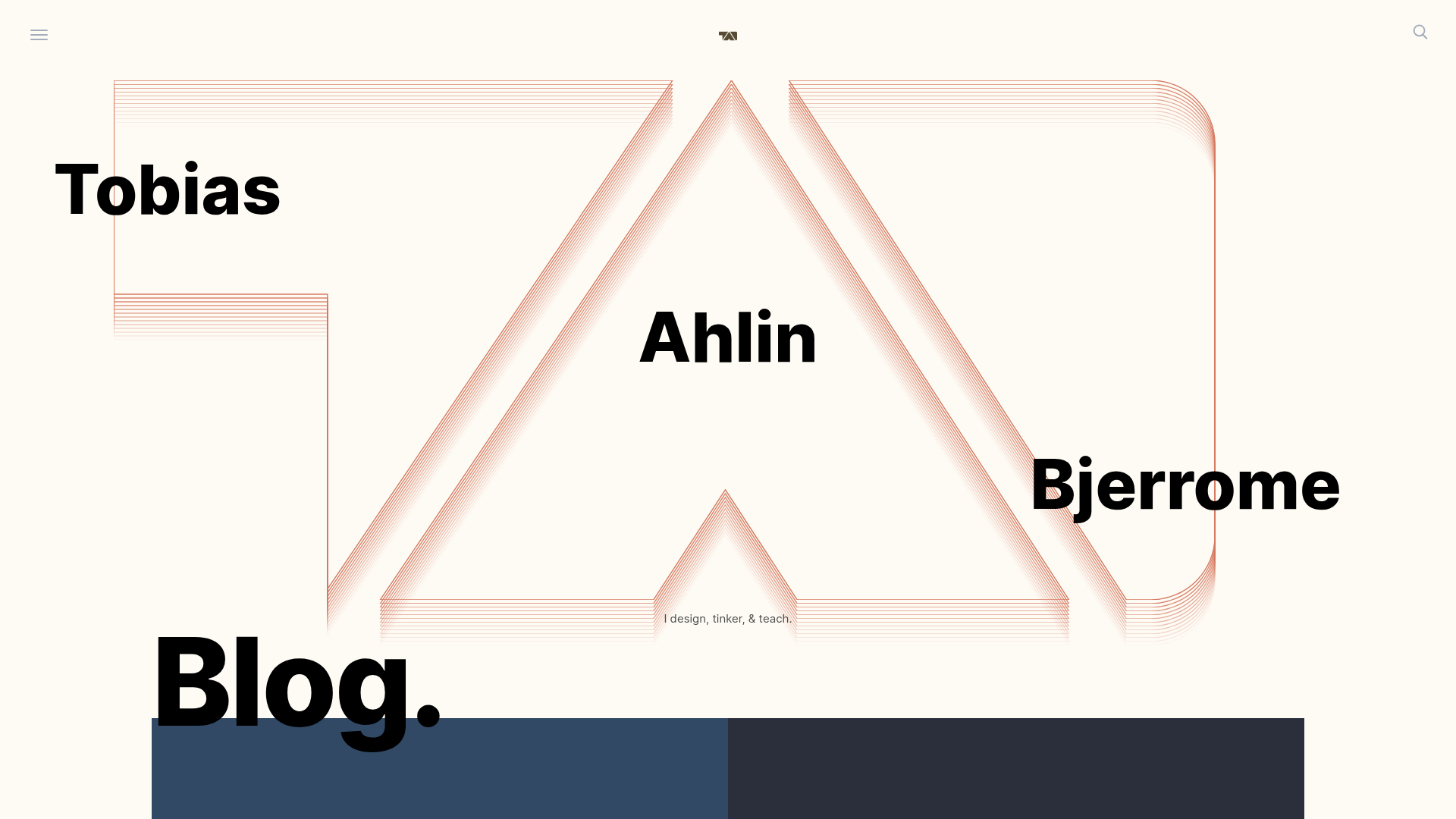
Tobias Ahlin Portfolio Design Portfolio
A layout-driven portfolio featuring a geometric animated hero, custom SVG typography transitions, and a responsive grid of card-based blog posts and project highlights.
Overview
This website is the professional portfolio of Tobias Ahlin, a Design Engineer at GitHub. It serves as a premier reference for layout-driven design, featuring a high-impact geometric hero section and a sophisticated grid system that blends editorial typography with interactive UI cards. It is an ideal clone candidate for developers wanting to master SVG-based animations and fluid, responsive CSS grids.
Design System
- Color Palette & Visual Hierarchy: The base is a sophisticated off-white (
#FDF0ECor similar) creating a minimal, high-end feel. The hierarchy is established through massive black typography and high-contrast content cards that use distinct accent colors (e.g.,#314964for CSS,#8E5EA2for animations) to categorize different content types. - Typography System: The site uses a bold, geometric sans-serif (Inter or similar) with massive scale variations. The hero section uses overlapping text, while section headers like "Blog." and "Projects." utilize large font sizes and heavy weights for clear structural anchoring.
- Page Structure & Section Flow: The flow starts with an animated SVG hero featuring the name, followed by a "Blog" grid using varied card sizes. This transitions into a "Projects" section with tall cards, a "Work" section with full-width highlights (GitHub, Spotify), and ends with a personal "Say hi" contact section.
- Reusable Components:
- Interactive Cards: The portfolio uses a
grid-itempattern—highly reusable containers that handle different shapes (tall, wide, standard) and backgrounds (solid colors vs. images). - Overlay Navigation: A full-screen canvas-based navigation system accessible via a hamburger menu.
- Floating Search UI: A minimalist search overlay triggered by a magnifying glass icon.
- Interactive Cards: The portfolio uses a
- Interaction and Motion: The site is heavy on motion, including a canvas-based background for the nav, CSS-animated loading spinners (SpinKit), and SVG-based typography transitions. Cards utilize subtle scale or translate effects on hover.
- Responsive Behavior: The system uses a CSS Grid (
grid-items) that collapses from a multi-column mosaic into a single column on mobile, maintaining legible type scales through fluid CSS utilities (clamp()). - Implementation Clues: The HTML reveals a custom-built structure using vanilla JavaScript and
anime.jsfor typography. It heavily leverages modern CSS features like:has()and:emptyfor state management without excessive classes.
Use Cases
- Who should clone this: Creative developers, motion designers, and UI engineers who want a portfolio that feels like a high-end design tool rather than a standard template.
- Effective Remixes: This pattern is perfect for engineering blogs, design agency landing pages, or digital showrooms where visual rhythm and motion are as important as the content itself.
- Practical Remix Directions:
- Brand Swap: Replace the geometric hero SVG with a signature 3D model or a video loop.
- IA Adaptation: The 2x2 grid can be easily converted into a purely project-based gallery or a product feature grid.
- Sectional Reuse: The "Say hi" contact card is a standalone, compact layout that works perfectly as a footer component for any personal site.
- Suggested Clone Scope: A full-page clone is best to understand the interplay between the navigation canvas and the grid layout, but cloning the
grid-itemsystem alone provides a robust foundation for building any modern card-based interface.
Related Inspirations
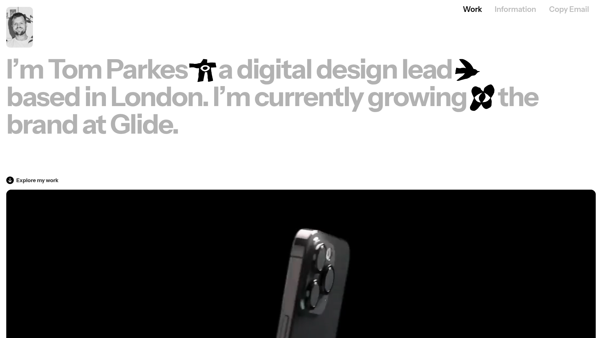
Tom Parkes Portfolio Design Gallery
A minimalist portfolio layout featuring a typography-focused hero section with inline icons, full-width video scroll reveals, and a dense masonry grid for visual assets.

Industrial Designer Studio Portfolio Page
A minimalist portfolio layout featuring a full-screen canvas hero, integrated image carousel, and a clean grid for showcasing industrial design projects and career highlights.
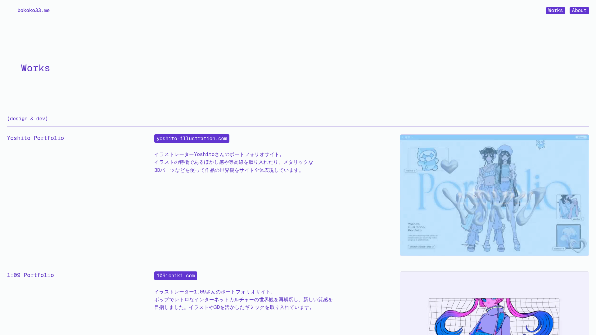
Bokoko Creative Portfolio and Project Showcase
A minimalist portfolio featuring a custom Three.js background, horizontal grid layout, and video-based hover thumbnails for interactive project displays.
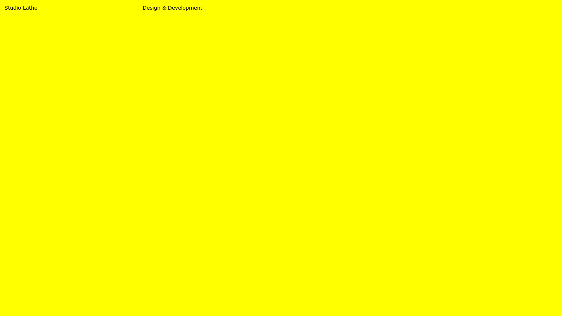
Studio Lathe Minimalist Portfolio List
A high-contrast, minimalist portfolio layout featuring a dense list-based project index with flexible category labeling and a full-screen yellow background.

Egstad Minimalist Design Portfolio
A refined Nuxt.js portfolio featuring bold variable typography, interactive canvas elements, and a clean grid-based layout for showcasing design work.
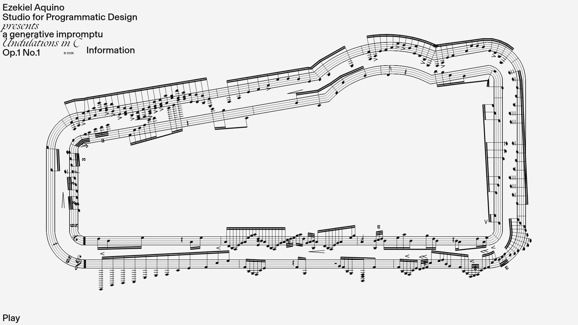
Generative Music Visualization Portfolio Canvas
A creative coding project featuring a generative musical score on a dynamic canvas with a play/pause interaction and custom notation rendering.
