Panic Animation Studio Portfolio Showcase
A creative portfolio featuring a large-scale animated hero section, asymmetric storytelling layout, and sophisticated video-based grid components for displaying motion design works.
Overview
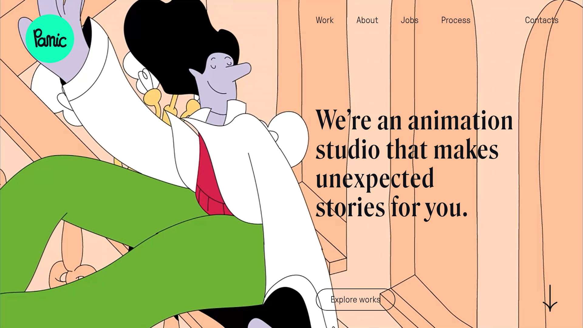
Panic Animation Studio's website is a high-impact portfolio that blends cinematic video backgrounds with a minimalist, high-contrast typography layer. It serves as an excellent reference for creators needing to showcase motion work through a non-traditional, asymmetrical layout that breaks the standard "square grid" mold.
Design System
- Color Palette & Visual Hierarchy: The site uses a warm, neutral base (peach/cream tones seen in the hero) juxtaposed with stark black typography and a vibrant mint-green brand accent (
#00ffa2approx.) for the logo. The hierarchy is driven by massive scale—the hero text and video assets dominate, while navigation and labels remain secondary in thin, spaced-out strokes. - Typography: The design uses a sophisticated mix. A high-contrast, elegant serif is used for the primary "We're an animation studio" headline, creating a premium feel. The navigation and secondary UI labels use a geometric sans-serif (likely for legibility) with wide letter-spacing.
- Page Structure & Flow: The layout follows a layered stack:
- Full-screen Hero: Multi-video slider background with centered typography and an "Explore works" pill button.
- Alternating Grid: A series of containers (
.sc-ffmr80-1) that flip between single wide video showcases and split-column layouts where video and text are offset. - Logo Ticker: A continuous horizontal scroll feature (
#name-drops-logos) for client social proof. - Complex Footer: A multi-column contact section categorized by geographic region and inquiry type.
- Reusable Components:
- Hero Video Slider: The HTML shows multiple
videotags withopacityandtransformlogic for transitions. - Offset Project Cards: Asymmetric containers that mix
videoandimgtags with project descriptions positioned in the white space. - Pill Buttons: Rounded outline buttons with internal hover states for "Explore works."
- Hero Video Slider: The HTML shows multiple
- Interaction Patterns: The design relies on scroll-triggered movement. Specifically, the
.hero-backgroundelements in the HTML usetranslate3dfor subtle parallax or entrance effects. There is also a vertical arrow indicator in the bottom right to guide user flow. - Implementation Clues: Built using Next.js (indicated by
__nextanddata-reactroot) with Styled Components (thesc-prefixed class names), suggesting a highly modular, CSS-in-JS architecture optimized for performance.
Use Cases
- Creative Agencies: Perfect for studios specializing in 3D, motion graphics, or video production that want their work to feel immersive rather than categorical.
- High-End Fashion & Lifestyle Brands: Companies with high-budget visual assets can remix the hero section to create an atmospheric landing page.
- Remix Directions: Replace the illustrated characters with high-resolution product photography to transform the site into a luxury brand lookbook. Alternatively, reuse the "offset grid" logic for a blog layout to make text-heavy content feel more dynamic.
- Clone Scope: Start with the Hero Section to master the overlay of high-contrast serif typography on video. The Footer/Contact Section is also a great clone candidate for businesses with complex global representatives.
Related Inspirations
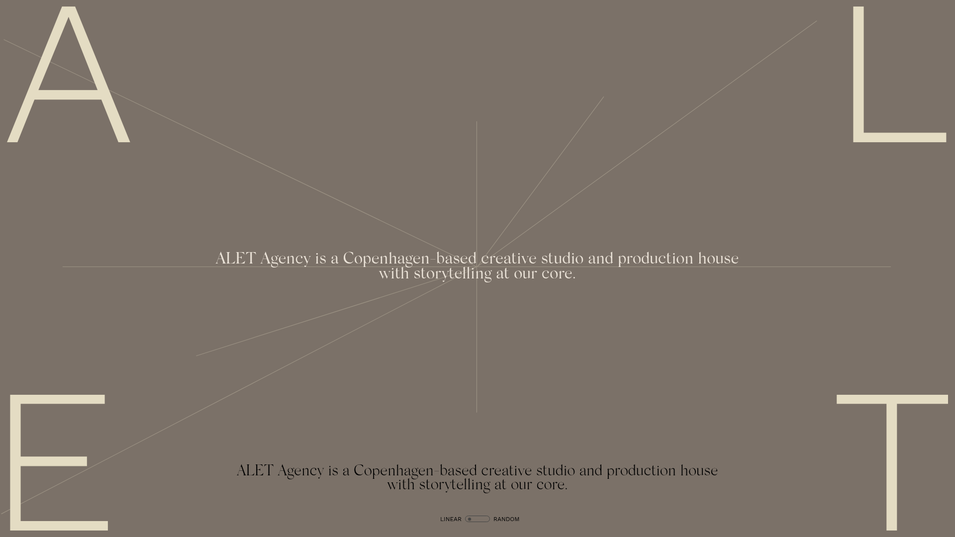
ALET Agency Creative Portfolio Hero
A minimalist immersive landing page featuring a full-viewport mouse-parallax image grid, centered typography, and large-scale decorative characters in the viewport corners.
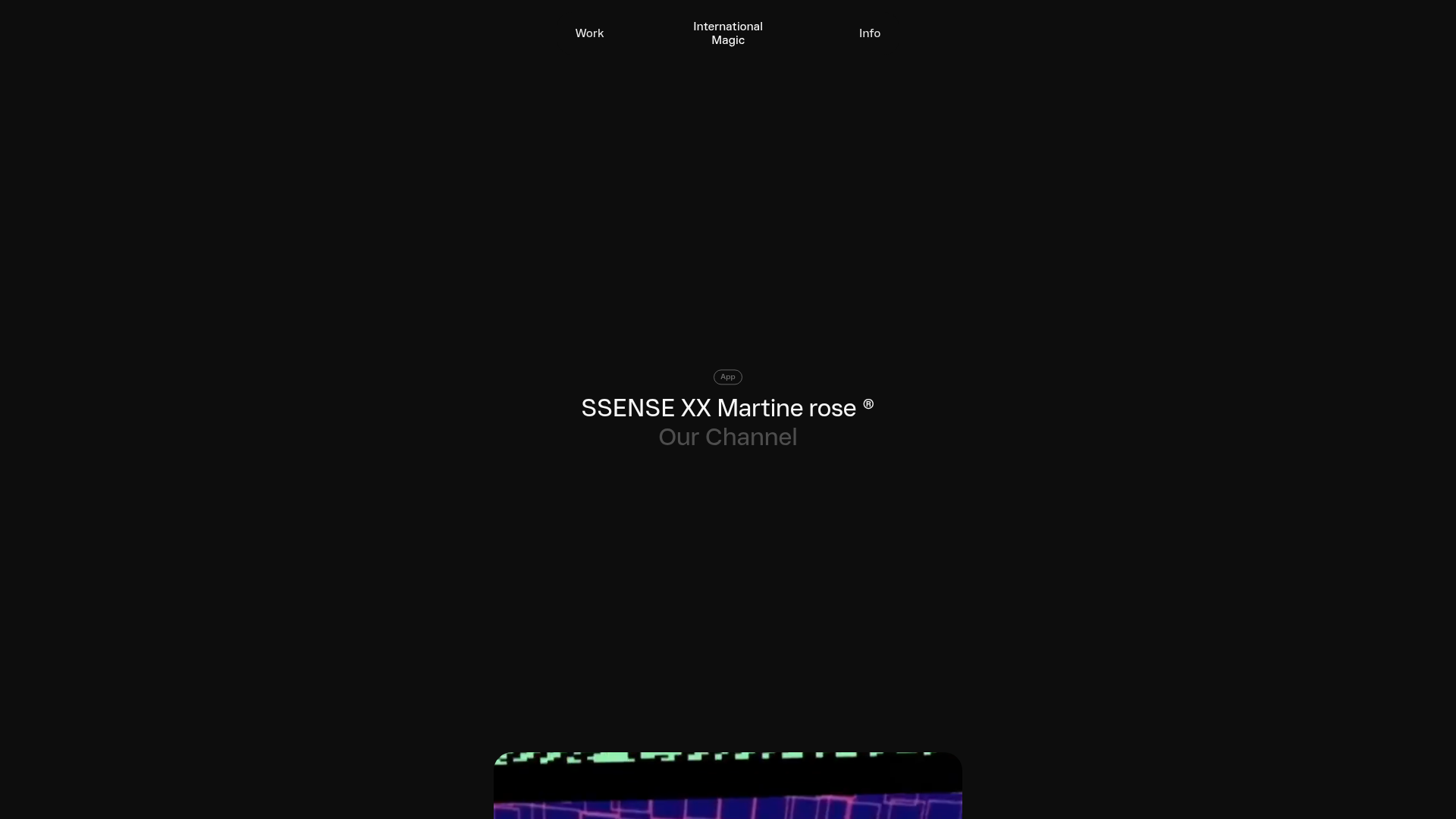
International Magic Immersive Portfolio Feed
A minimalist, dark-mode portfolio featuring a scroll-triggered grid layout with sticky video teasers and badge-categorized project headers.
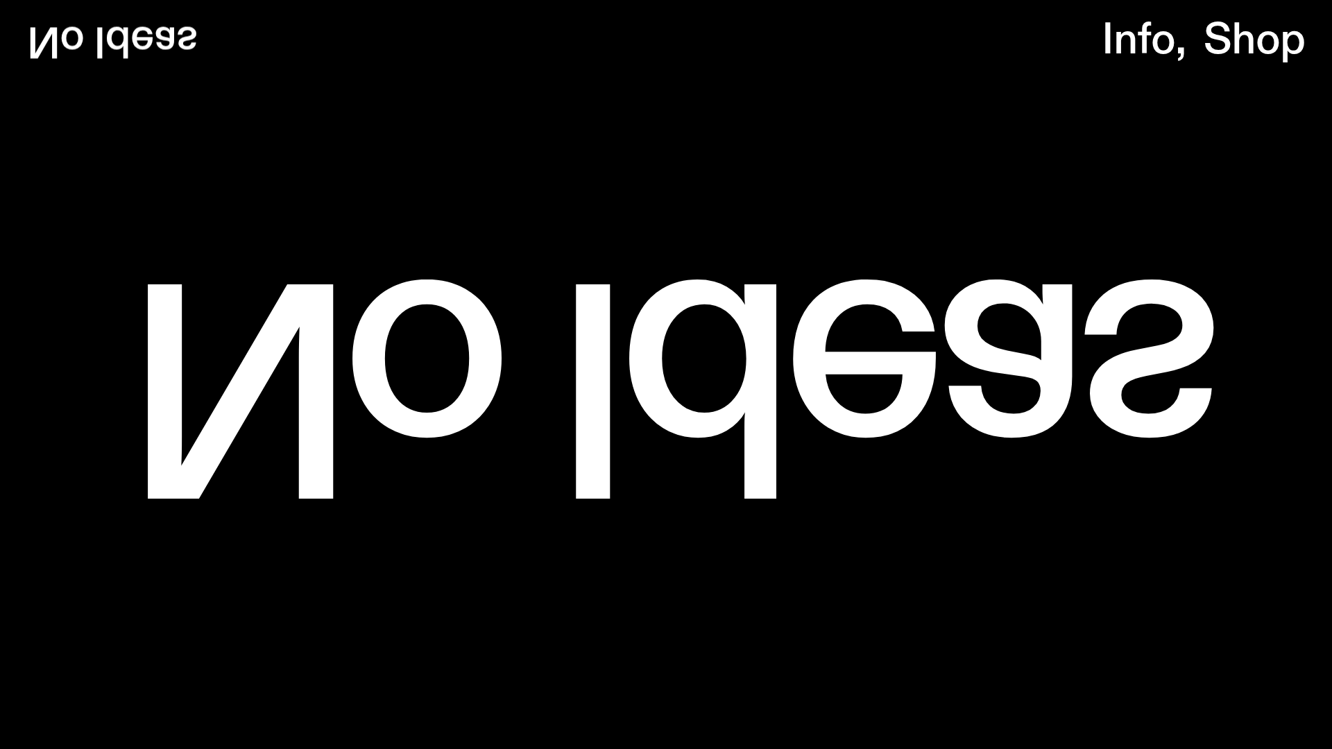
No Ideas Design Portfolio Carousel
A minimalist, full-screen portfolio featuring a high-impact typography hero and a large-scale Bootstrap carousel with video and image support.
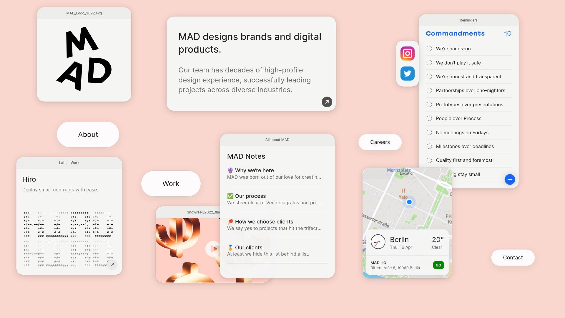
MAD Agency Interactive Dashboard Portfolio
A creative workspace-style layout featuring draggable OS-like applets, including interactive notes, a map widget with live weather, and a custom task checklist.
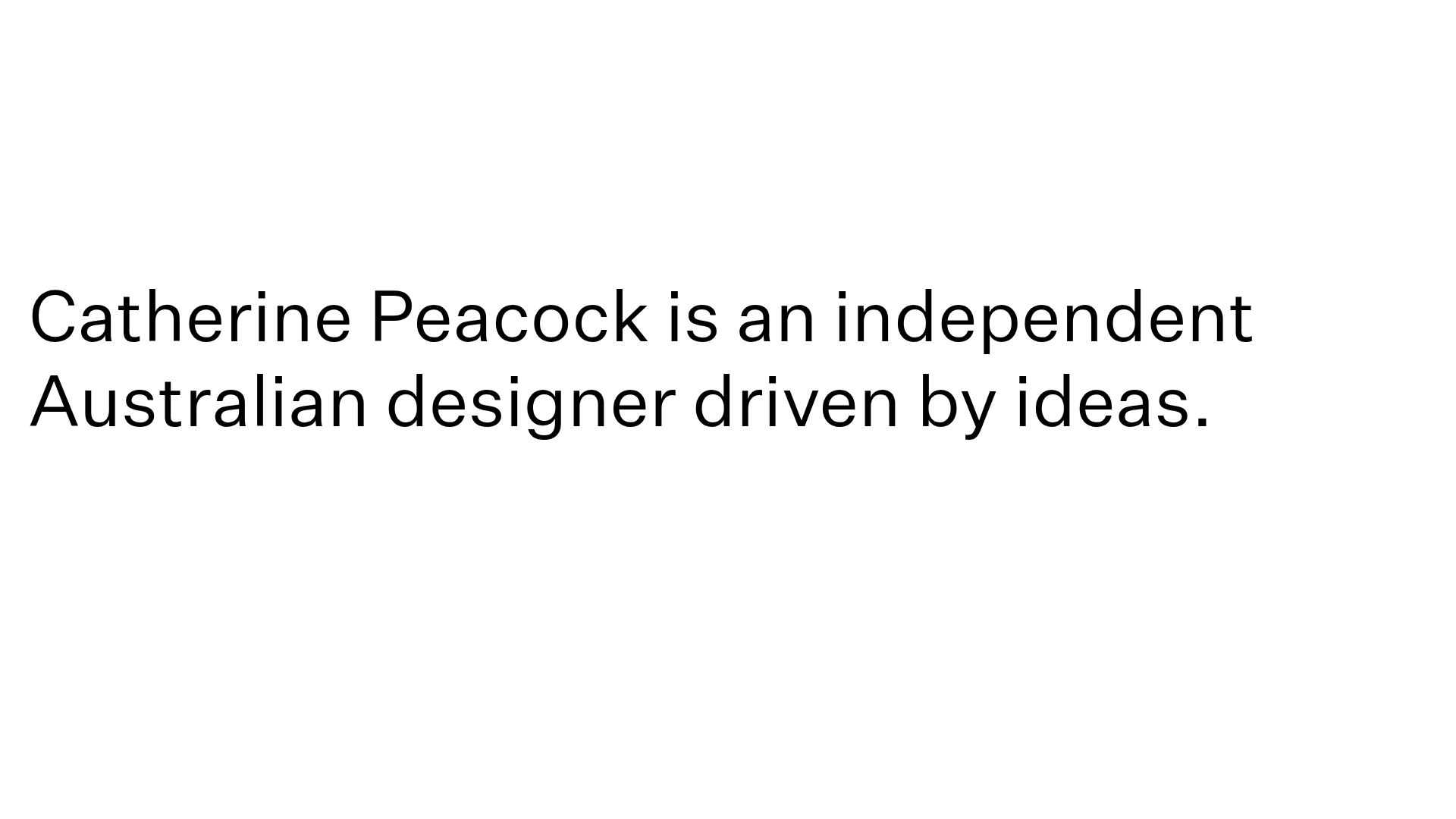
Catherine Peacock Designer Portfolio Home
A minimalist portfolio layout featuring a vertically stacked masonry project grid, sticky navigation with animated icons, and offset typography.
PostNew Moving Image Portfolio Gallery
A minimalist dark-themed portfolio featuring a full-screen vertical scroll layout, video-based grid sections, and blur-effect navigation components.
