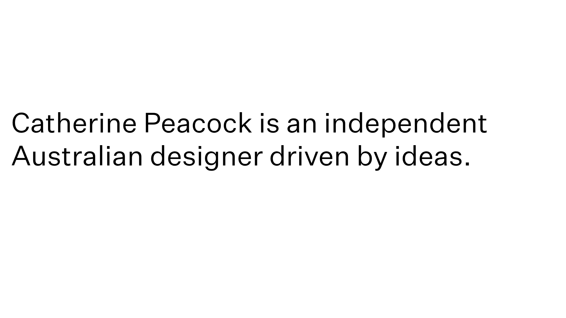
Catherine Peacock Designer Portfolio Home
A minimalist portfolio layout featuring a vertically stacked masonry project grid, sticky navigation with animated icons, and offset typography.
Overview
This website is a highly minimalist portfolio that uses white space and offset typography to create an editorial, high-end design feel. It serves as an excellent clone reference for creatives who want to showcase work through a non-traditional, asymmetrical grid that prioritizes breathing room over content density.
Design System
- Color Palette & Visual Hierarchy: The design uses a sophisticated neutral palette, featuring a light beige/bone background (
#dcd7d0) and high-contrast black typography. The hierarchy is extremely flat, using large, single-column text to command initial attention before transitioning into the project grid. - Typography: The system relies on a clean sans-serif font (identified as
custom_35137in the HTML). Headings are large (approx. 50px) with standard weights, while navigation and secondary labels use a smaller scale (16px to 28px) with generous letter-pacing (0.1px) to maintain legibility and an open feel. - Page Structure: The layout begins with a high-impact typographic hero statement. This is followed by a vertical, staggered project grid where images and color-blocked interactive shapes are offset horizontally, creating a rhythmic masonry effect as the user scrolls through a container that spans over 12,000px in height.
- Reusable Components:
- Sticky Nav Icons: A minimalist logo ('CP') and custom-shaped navigation icons that remain fixed during the scroll.
- Hover-Triggered Project Blocks: The DOM reveals
animation-containerelements that housewidget-shapeoverlays, providing color-fill transitions and animated indicators upon interaction. - Directional Lines: Vertical and horizontal thin lines (24px height widgets) are used as structural anchors to separate content zones.
- Motion & Interactions: The site uses
polyfill-stickyfor persistent elements and complexoffset-pathCSS animations for entry transitions. Project thumbnails utilizeonhover-animationtriggers that likely reveal project titles or scale the imagery. - Implementation Clue: The code indicates a strictly absolute-positioned layout within a
content-boundswrapper, suggesting a desk-top first, highly controlled spatial design rather than a standard flow-based CSS framework.
Use Cases
- Who should clone this: Independent designers, architects, and photographers who have a small but high-quality selection of works that benefit from individual spotlighting rather than a dense gallery.
- Effective Remixes: This pattern works well for luxury brand lookbooks or high-concept studios where the brand statement is as important as the portfolio items.
- Remix Directions: Swap the beige background for a dark mode palette (charcoal/silver) to shift the mood from editorial to tech-heavy. Developers can remix the info architecture by replacing the absolute layout with a modern CSS Grid implementation to improve responsiveness while keeping the staggered visual rhythm.
- Clone Scope: A quick section clone of the typographic hero and the first three staggered project blocks is sufficient to capture the core aesthetic without needing the full 19-page depth of the original site.
Related Inspirations
Bruno Arizio Designer Portfolio Website
A minimalist creative director portfolio featuring a clean typographic layout, side-aligned image previews, and high-contrast spacing patterns suitable for luxury or design showcases.

Christopher Doyle Agency Portfolio Layout
A minimalist, typography-led portfolio featuring a wide-margin grid system, smooth fade-in animations, and simple image-focused project cards.
NewTab Studio Minimalist Portfolio Landing Page
A clean, typography-focused landing page featuring an oversized SVG/canvas hero title, a top-aligned navigation bar, and a minimalist footer layout.
Play Studio Minimalist Portfolio Landing
A high-impact agency layout featuring a oversized typography header, a full-width integrated Vimeo video background, and a unique expandable accordion list for industry showcases.
Vita Architecture Portfolio Landing Page
A minimalist, high-end architecture portfolio featuring a custom canvas-based image gallery, split-text animations, and a project slider with dynamic image masks.

Baubauwerk Minimal Agency Portfolio Homepage
A clean studio site featuring a centered text hero, scatter-plot filterable project gallery, and full-bleed image sections for case studies.
