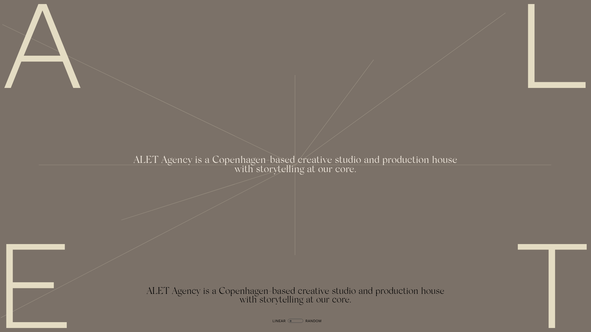
ALET Agency Creative Portfolio Hero
A minimalist immersive landing page featuring a full-viewport mouse-parallax image grid, centered typography, and large-scale decorative characters in the viewport corners.
Overview
This project is a high-end creative portfolio hero section that utilizes a full-viewport mouse-parallax image grid and a minimal 'sandstone' aesthetic. It is a powerful clone reference for designers wanting to showcase a large volume of visual work in a non-traditional, immersive layout that avoids standard scrolling containers.
Design System
- Color Palette & Visual Hierarchy: The primary background uses a warm, muted neutral (
rgb(162, 160, 147)/#A2A093), creating a sophisticated, high-fashion atmosphere. Typography alternates between black and off-white (creme) for high legibility against the low-saturation backdrop. - Typography: The system focuses on two extremes: oversized decorative characters ('A', 'L', 'E', 'T') anchored in the viewport corners for branding, and refined centered serif text (
.t30,.t27-sm) for the agency's mission statement. - Page Structure: The layout is built around a fixed viewport. A central primary heading and a bottom-aligned 'Linear/Random' toggle sit on top of a massive
canvaselement (127vmaxby355vmax) containing an irregular grid of images. - Reusable Components:
- Mouse-Parallax Grid: A system of image wrappers (
.grid-image-element) with varyingz-indexvalues and CSStransform3doffsets that respond to pointer movement. - Toggle Switch: A minimal custom UI element (
#randomlinear) for shifting between layout states. - Corner Anchors: CSS-absolute positioned SVG characters that maintain visual balance regardless of the central content.
- Mouse-Parallax Grid: A system of image wrappers (
- Interaction and Motion: The core experience is the parallax effect, where images shift at different speeds (depth layers) relative to the mouse position. The preloader transition uses vertical offsets (
translate3d) to slide elements into position. - Implementation Clues: Built using Nuxt, the site utilizes absolute positioning and
vmaxunits to ensure the image grid feels expansive on all screen sizes. It usestransform: scale(1.2)on images to ensure they have 'bleed' room for the parallax movement.
Use Cases
- Who should clone this: Creative directors, photographers, and independent production houses looking for a 'digital-first' landing page that feels like an art installation.
- Remix Directions: Swap the agency mission statement for a product launch tagline; adapt the image grid into a 'Mood Board' for a brand guidelines site; or reuse the corner-lettering technique for an editorial-style blog landing page.
- Suggested Clone Scope: The image grid logic and the absolute-center typography container are the most valuable parts for a quick section clone. The preloader and landscape/portrait warning overlays are perfect for developers building immersive mobile-first experiences.
Related Inspirations
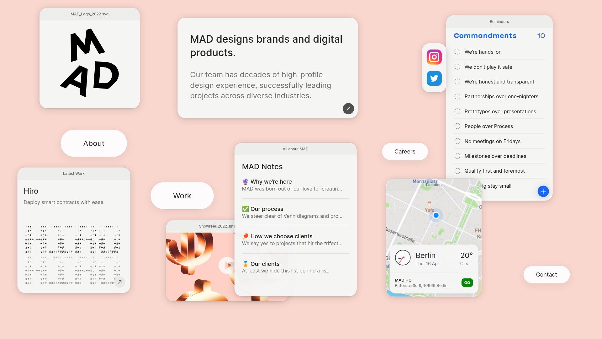
MAD Agency Interactive Dashboard Portfolio
A creative workspace-style layout featuring draggable OS-like applets, including interactive notes, a map widget with live weather, and a custom task checklist.
Catherine Peacock Designer Portfolio Home
A minimalist portfolio layout featuring a vertically stacked masonry project grid, sticky navigation with animated icons, and offset typography.
PostNew Moving Image Portfolio Gallery
A minimalist dark-themed portfolio featuring a full-screen vertical scroll layout, video-based grid sections, and blur-effect navigation components.
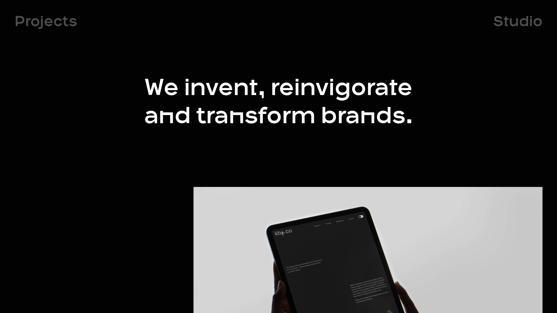
OPX Studio Agency Portfolio
A minimalist dark-themed portfolio featuring a staggered masonry project grid, cinematic video embeds, and a responsive oversized typography hero section.
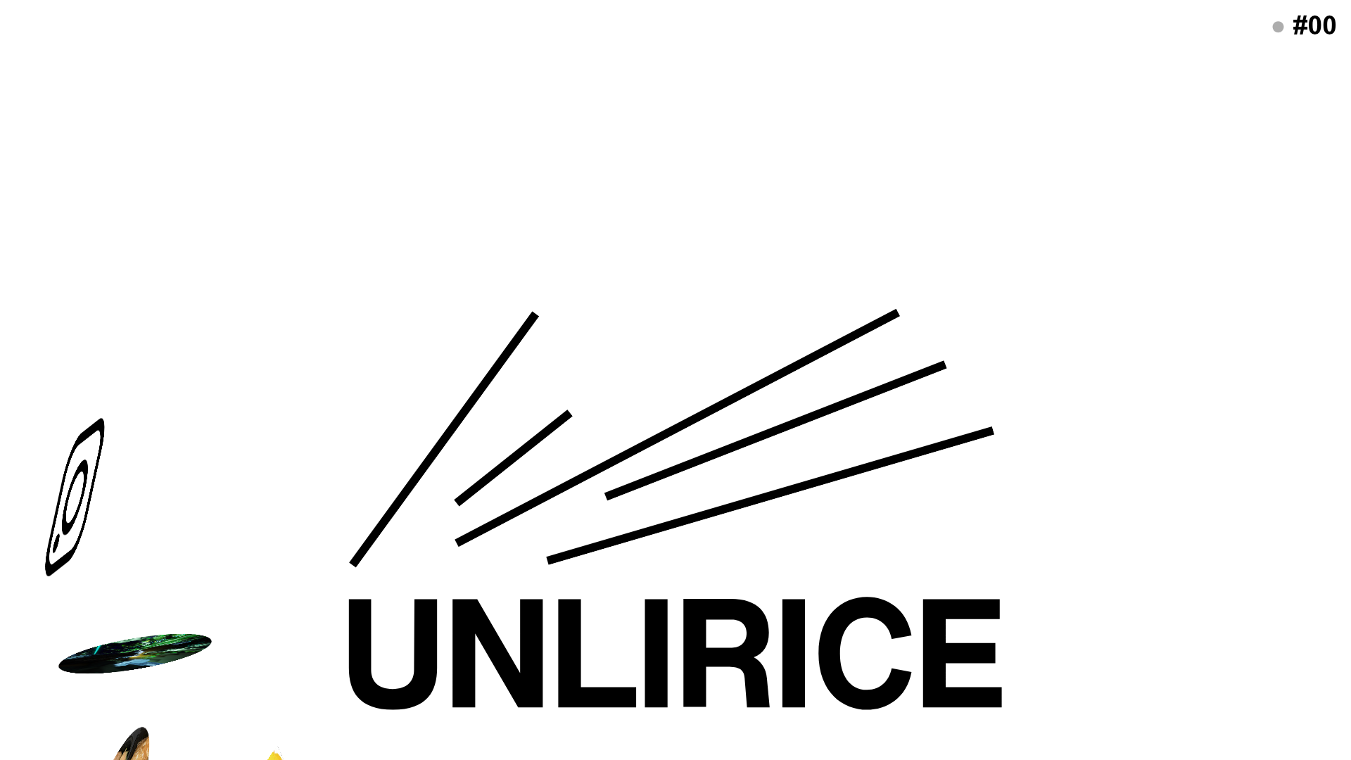
UNLIRICE Minimalist Floating Gallery Landing
A creative landing page featuring a central logo with randomized floating image components, CSS rotation animations, and an overlay-style link system.
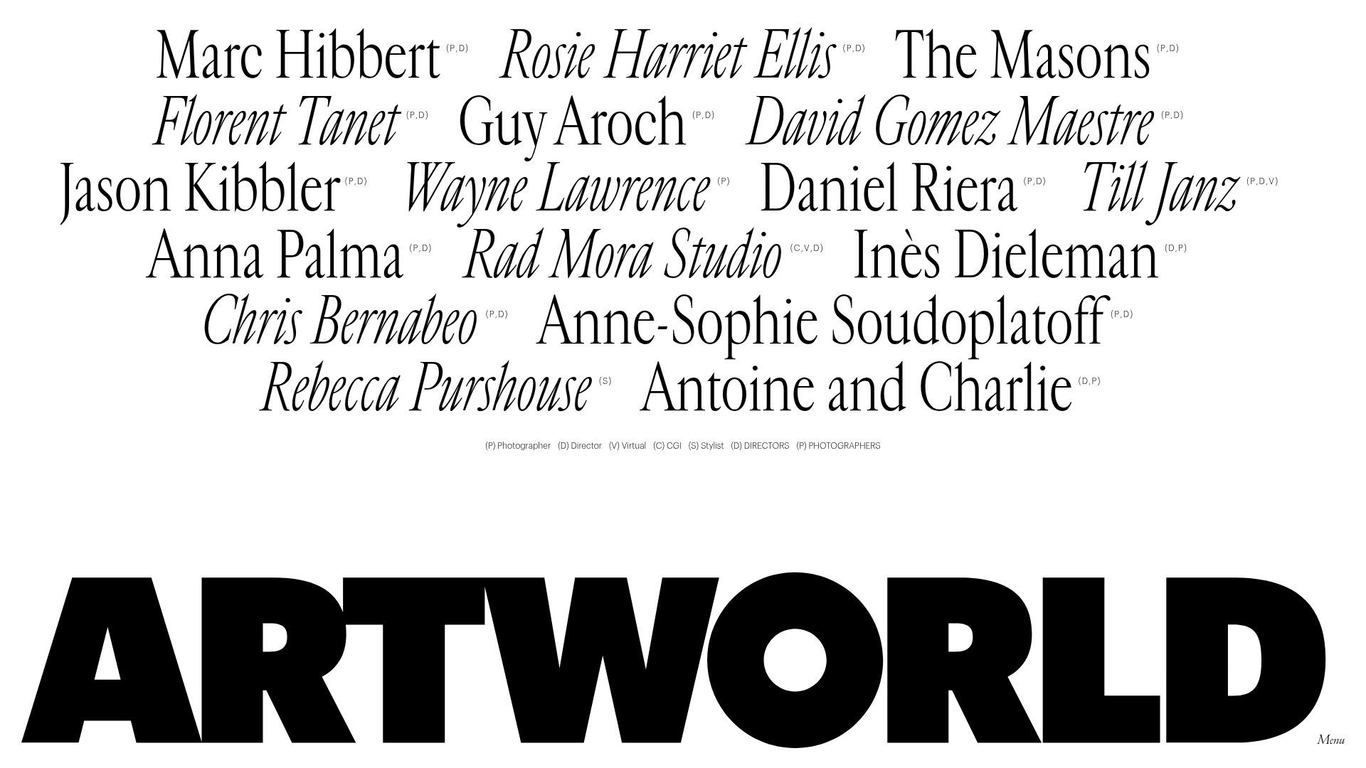
Artworld Agency Artist Portfolio Directory
A minimalist creative agency landing page featuring a typographic artist cloud, interactive category filtering, and image-on-hover card reveals in a clean, high-contrast layout.
