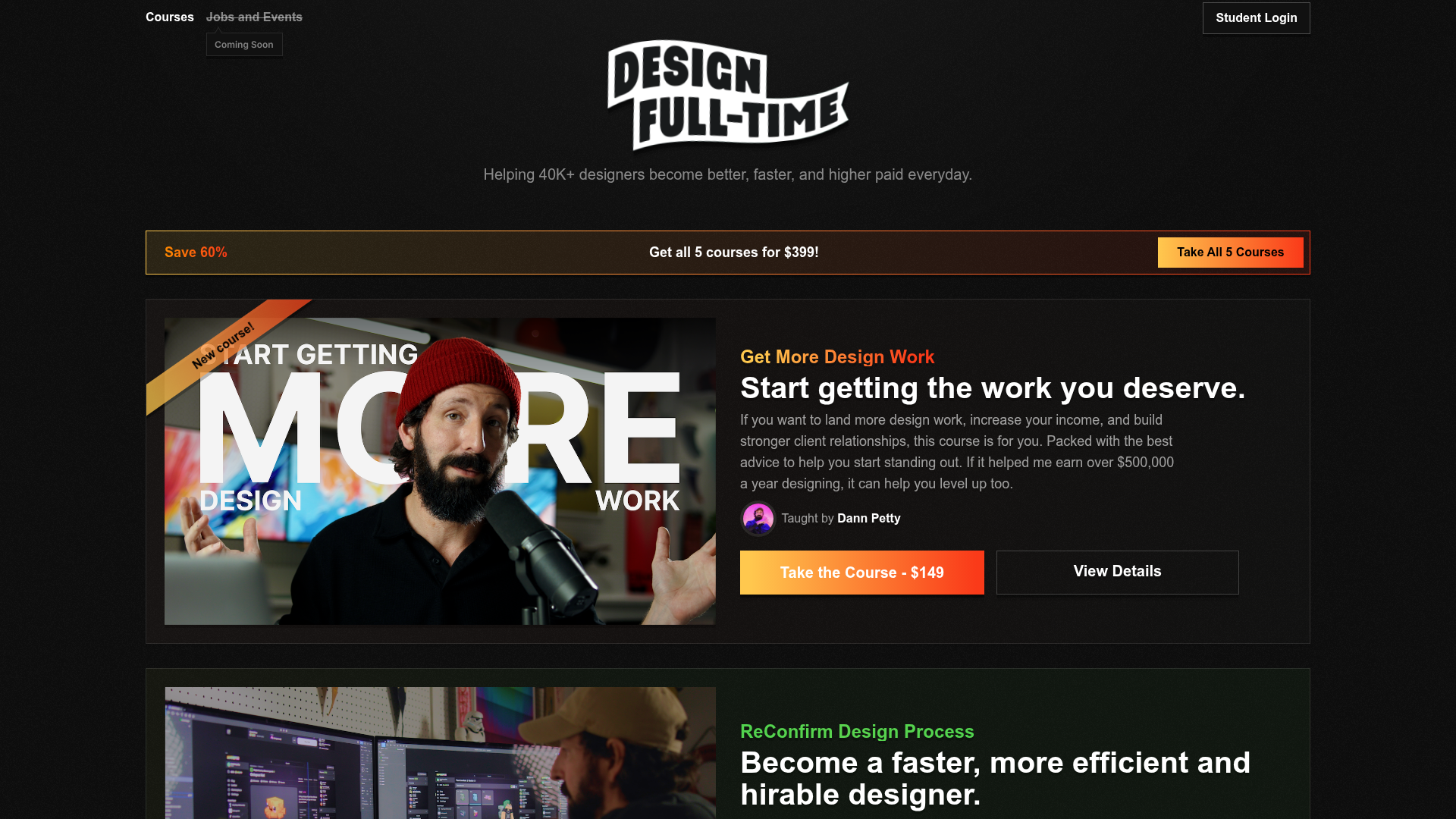
Design Full-Time Course Landing Page
A dark-themed educational site featuring a promotional banner, vertically stacked course cards with gradient borders, a video lesson grid, and integrated pricing buttons.
Overview
Design Full-Time is a premium course landing page designed with a high-contrast, dark-mode aesthetic that emphasizes conversion through visual impact and clear pricing. It serves as an excellent reference for creators selling digital products, featuring a sophisticated layout that balances large-scale product imagery with structured course details and social proof.
Design System
- Color Palette & Visual Hierarchy: The site uses a deep black background (#000000) with a subtle grain/noise overlay texture to avoid a flat look. Visual hierarchy is established through vibrant accent gradients (oranges, greens, and pinks) that differentiate distinct course units. High-contrast white is used for primary headings, while muted white (60% opacity) handles secondary body text.
- Typography: The system uses a bold, sans-serif font stack. Headings use large, heavy weights to command attention (e.g.,
text-2xlandfont-bold), while body text maintains readability attext-baseortext-lg. Emphasis is often created using custom gradient text classes (e.g.,gradient-text) to highlight course titles. - Page Structure & Flow: The layout follows a logical sales funnel: a global promo banner is fixed at the top, followed by a bold brand logo and intro statement. The core content consists of vertically stacked, wide cards showcasing individual courses, followed by a "Free Lessons" grid, and concluding with a "Coming Soon" placeholder and a simple footer.
- Reusable Components:
- Course Cards: Complex containers (
item) featuring overlaid ribbon tags (“New course!”), left-aligned media thumbnails, and a details pane with nested pricing buttons. - Offer Banner: A horizontal call-to-action (
offerBanner) with a dual-tone layout—text on the left/center and a primary action button on the right. - Dual Action Buttons: Two-button sets where the primary action uses a
gradient-borderwith a solid background and the secondary is a transparentdetails-buttonwith a subtle white border.
- Course Cards: Complex containers (
- Responsive Behavior: The site utilizes Tailwind CSS-style breakpoints (hidden
md:flex, items switching fromflex-coltosm:flex-row). On mobile, the offer banner collapses into a stacked vertical layout, and course cards shrink imagery to prioritize the purchase buttons. - Technical Clues: The HTML uses Vue.js (
data-v-attributes) and utility-first CSS. Layouts rely heavily on Flexbox and CSS Grids for the lesson gallery (sm:grid-cols-2).
Use Cases
- Who should clone this: Educators, independent creators, and SaaS startups looking to build a high-conversion sales page for a suite of related digital products or services.
- Effective Remixes: This pattern works well for a "Masterclass-style" library, a premium portfolio for a design agency, or a software pricing landing page.
- Remix Directions: Swap the grain texture for a clean solid background for a more corporate look. Adapt the course cards into "Feature Cards" by replacing the teacher avatar with feature icons. Reuse the "Free Video Lessons" grid as a testimonial or blog post section.
- Clone Scope: A quick section clone of the
offerBanneror the individual course card component is highly efficient for existing sites. A full-page clone is ideal for those launching a brand-new educational product line.
Related Inspirations

Vercel AI Cloud Landing Page
A modern landing page featuring a minimalist dark-themed navbar, a grid-overlay hero section with radial color gradients, and high-contrast typography for customer success stories.
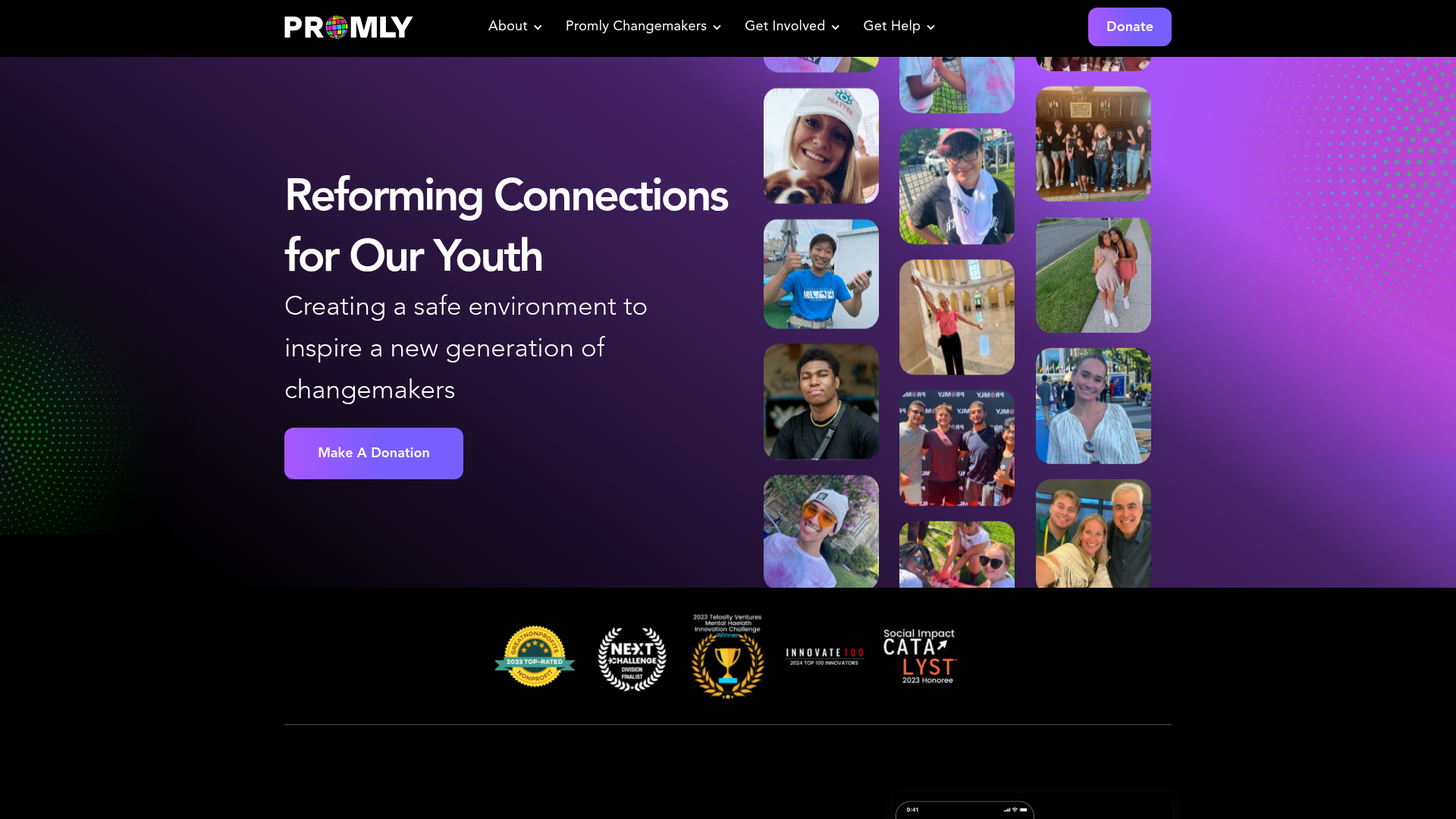
Promly Youth Platform Landing Page
A vibrant dark-mode layout featuring a vertical image marquee, bento-style reward cards, and a press-worthy horizontal slider for community-focused organizations.
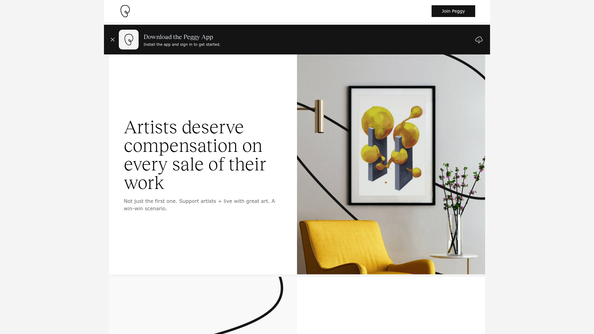
Peggy Art Royalties Pitch Page
A clean storytelling layout featuring alternating image-text sections, a three-column testimonial grid with circular avatars, and a icon-based feature grid for brand values.
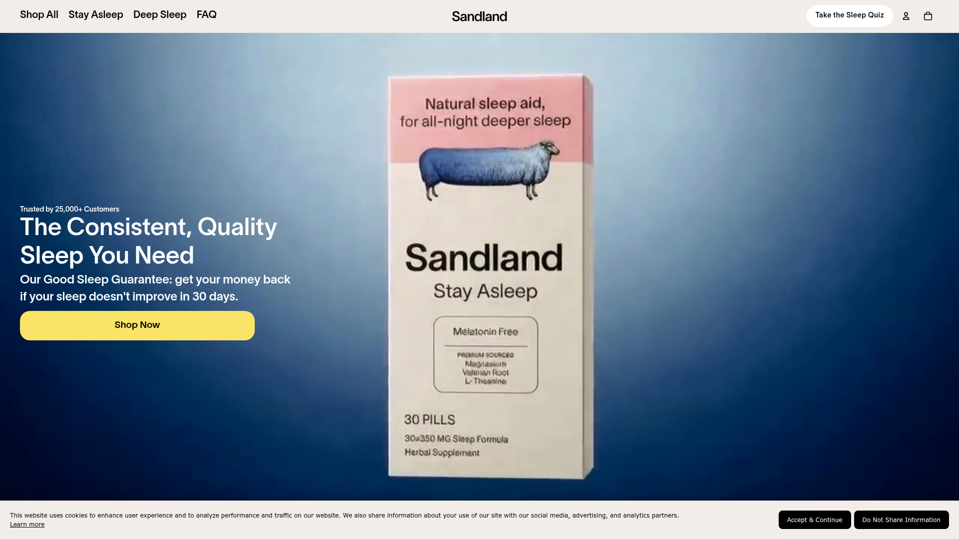
Sandland Sleep Product Landing Page
A high-conversion Shopify layout featuring split-video hero sections, logo-based social proof ribbons, and a testimonial slider integrated with biometric sleep tracker results.

Vibrants Wellbeing E-commerce Landing Page
A clean Shopify-style landing page featuring a full-width hero with overlaid product cards, a horizontal product slider, and interactive cart drawer with utility progress bars.
Minimalist Dark Designer Portfolio Grid
A clean, dark-themed portfolio featuring a bold typography hero section and a staggered two-column image grid with subtle entrance animations.
