Minimalist Typography Portfolio and Services Grid
A clean, serif-heavy layout featuring an A-Frame 3D hero animation, tiered service lists, and a modular multi-column text structure for design manifestos.
Overview
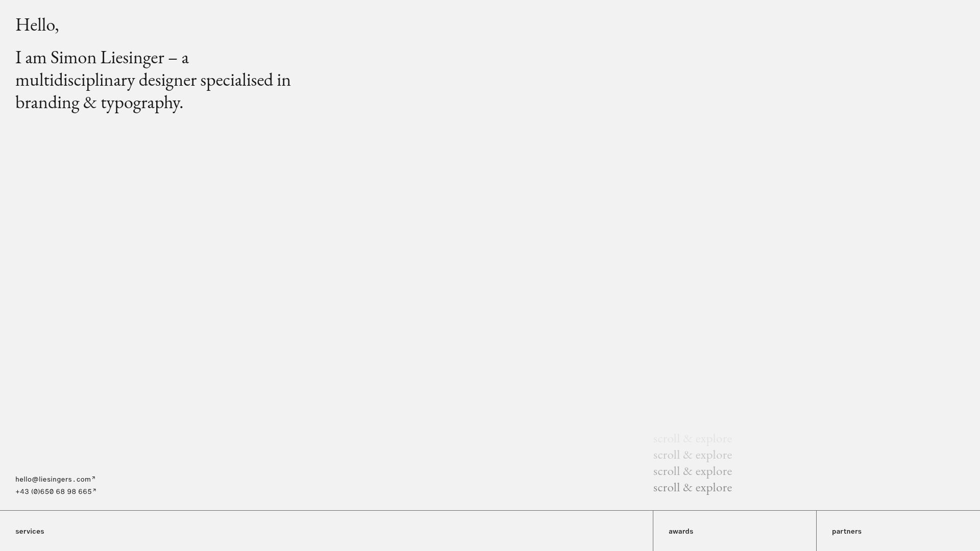
This portfolio for Simon Liesinger is a masterclass in minimalist typography and structured information design. It effectively balances large-scale editorial type with a technical 3D hero element using A-Frame, making it an excellent reference for creatives who want to blend classic Swiss-style design with modern web technologies.
Design System
- Color Palette & Visual Hierarchy: The site uses a high-contrast, monotone foundation with an off-white background (
#f0f0f0approximate) and black text. This neutral base allows for a clean visual hierarchy where font size and weight define sections rather than color. - Typography System: The design relies on a split-system approach. A sophisticated serif typeface is used for large introductory headers and body copy to convey elegance, while a functional sans-serif is used for utilitarian links, small subheadlines, and metadata to ensure legibility and a modern feel.
- Page Structure & Section Flow:
- Hero: A full-height section featuring a large-scale greeting and an embedded A-Frame canvas hosting a rotating 3D glTF model.
- Services Grid: A horizontal, multi-column strip with borders that separate "Services," "Awards," and "Partners."
- Manifesto: A sequence of rows where subheadlines are offset to the left, and block text is constrained to a narrow center-right column for readability.
- Reusable Components:
- Tiered Info Boxes: The modular grid with thin borders and multi-column list layouts is ideal for services or feature lists.
- Animated Scroll Cues: The repeated "scroll & explore" text clusters provide a unique vertical motion anchor.
- 3D Hero Wrapper: The
<a-scene>implementation provides a blueprint for embedding interactive 3D assets without overwhelming the minimalist aesthetic.
- Interaction & Motion: The site utilizes continuous CSS/JavaScript animations for the "scroll & explore" text and a linear rotation for the 3D glTF arrow. Hover states for links include custom superscript arrows to indicate external movement.
- Implementation Clues: Built on a WordPress foundation with a custom 2019 theme, it leverages Bootstrap's grid system (
col-xl-4,offset-lg-1) for structural alignment and A-Frame for WebGL rendering.
Use Cases
- Who should clone this pattern: Independent designers, architects, and copywriters who prioritize deep-read content and a refined, intellectual brand image over fast-paced visual eye candy.
- Product Remixes: This layout works exceptionally well for design agency "About" pages, digital manifestos, or technical product documentation that requires clear hierarchical categorization.
- Practical Remix Directions: Swap the glTF 3D model in the hero for a product-specific asset or a 3D logomark. The multi-column manifesto section can be adapted into a structured FAQ or a technical specification sheet by maintaining the offset subheadline layout.
- Suggested Clone Scope: A quick section clone of the "Services/Awards" grid is highly effective for any landing page footer or middle-of-page feature list. For a high-impact arrival, clone the full hero including the A-Frame integration.
Related Inspirations

Baubauwerk Minimal Agency Portfolio Homepage
A clean studio site featuring a centered text hero, scatter-plot filterable project gallery, and full-bleed image sections for case studies.
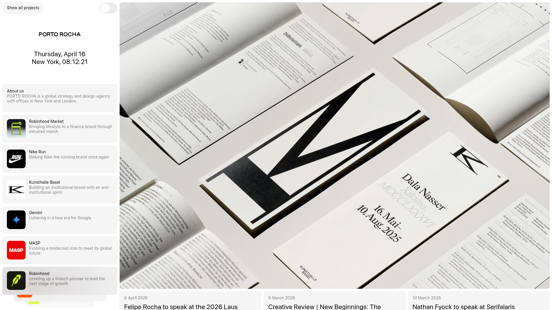
Porto Rocha Design Portfolio Mockup
A minimalist, side-bar navigation portfolio featuring a dual-column layout with a scrollable project feed and high-contrast typography.
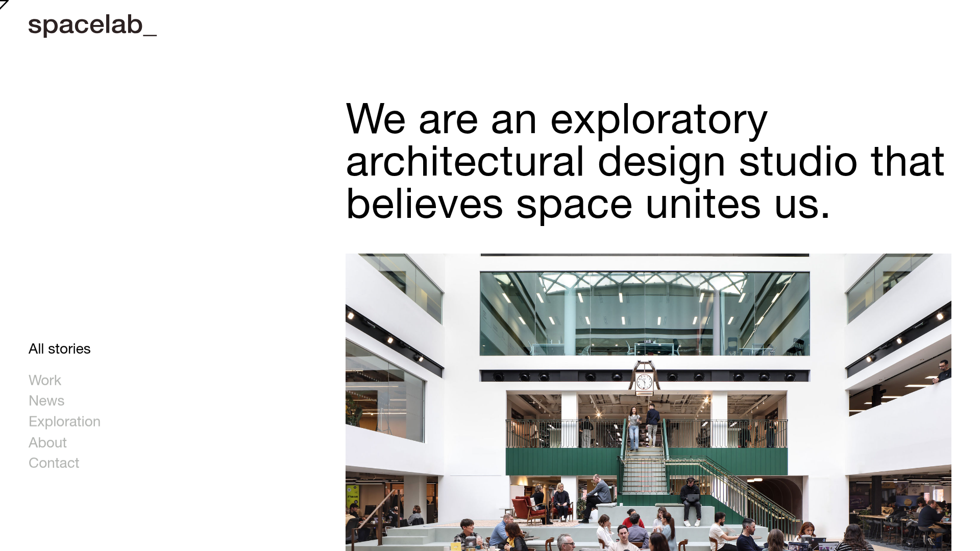
Spacelab Exploratory Architectural Portfolio
A minimalist studio website featuring a clean sidebar navigation and a high-impact asymmetric grid layout designed for visual storytelling.
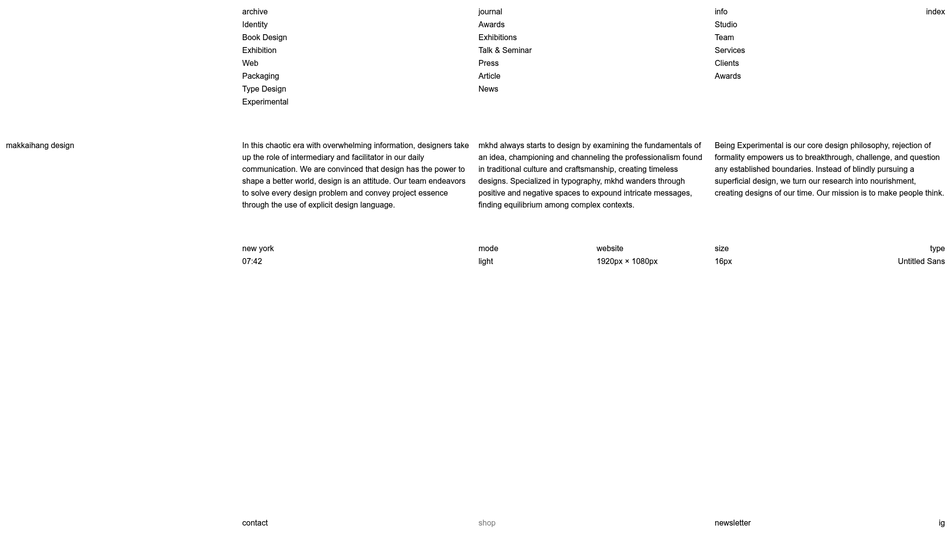
Makkaihang Design Studio Portfolio
A minimalist design agency landing page featuring a full-bleed video hero, a multi-column typographic layout, and a functional footer tracker for real-time local time and font details.
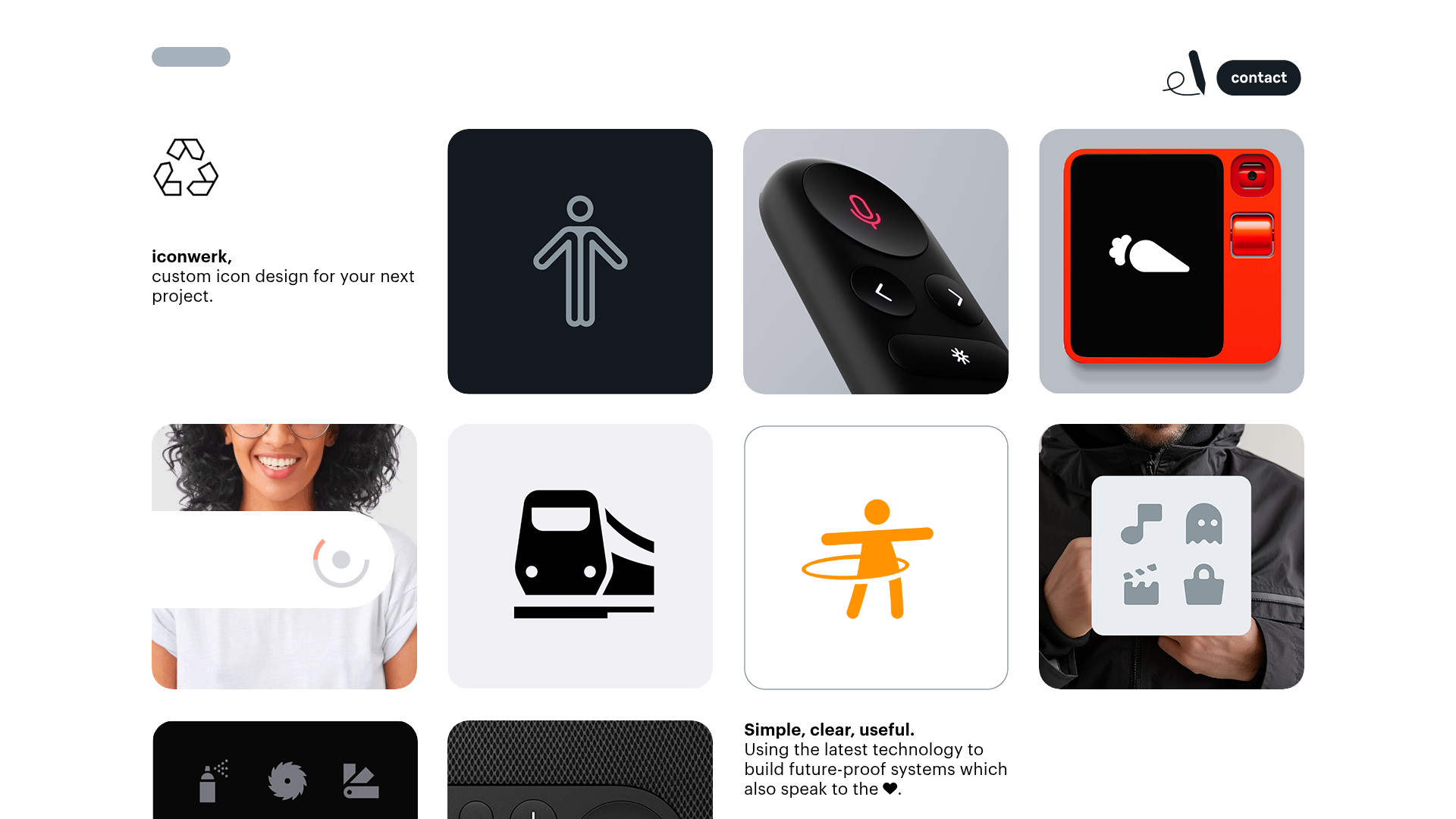
Iconwerk Design Portfolio Bento Layout
A minimalist bento grid portfolio featuring varying square tile sizes, clean iconography showcases, and a simple fixed navigation header for creative work.
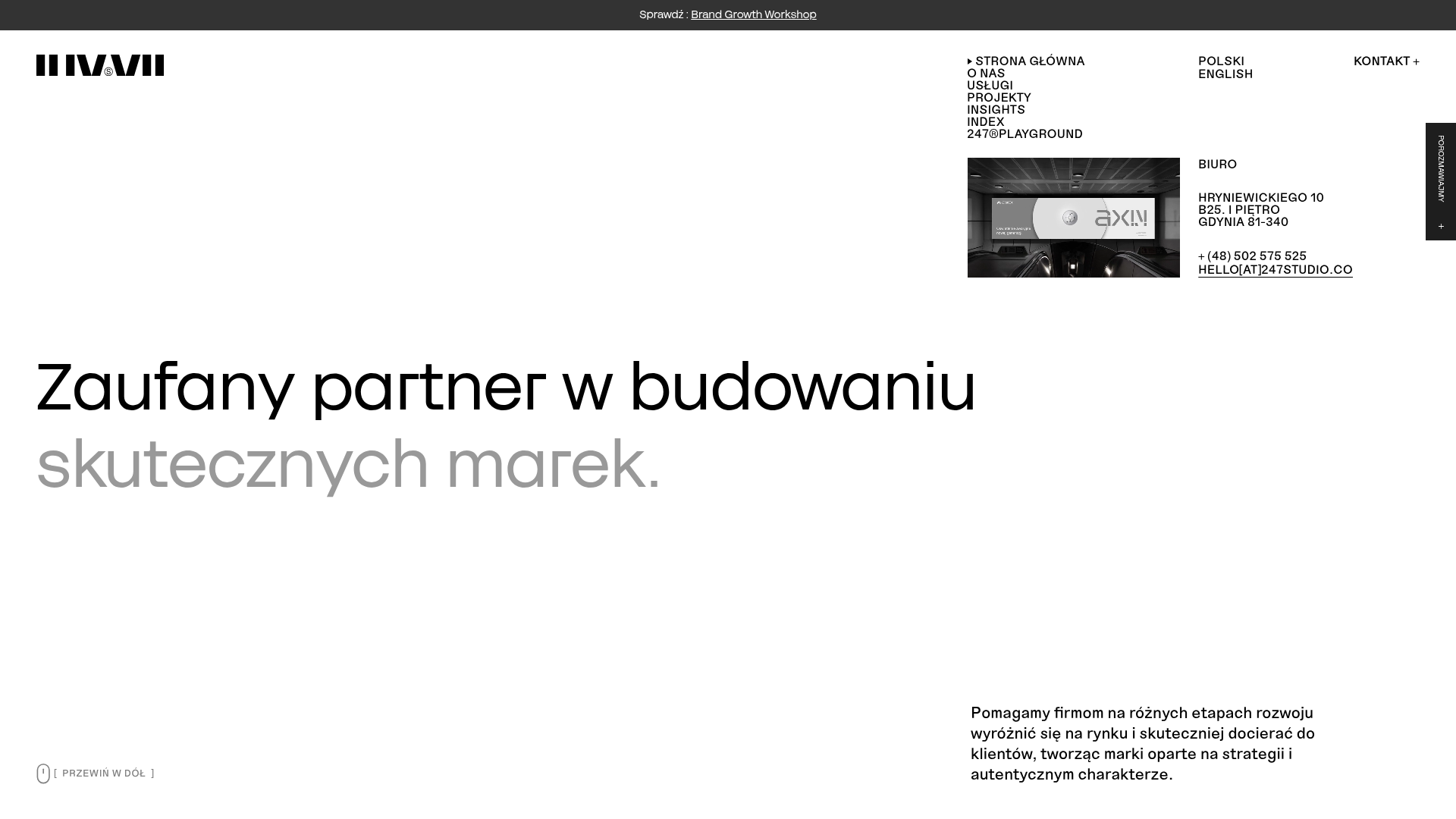
247 Studio Creative Agency Showcase
A minimalist agency landing page with a dynamic rotating headlines hero, numbered brand logo grid, and modern high-contrast service cards with timing labels.
