Spacelab Exploratory Architectural Portfolio
A minimalist studio website featuring a clean sidebar navigation and a high-impact asymmetric grid layout designed for visual storytelling.
Overview
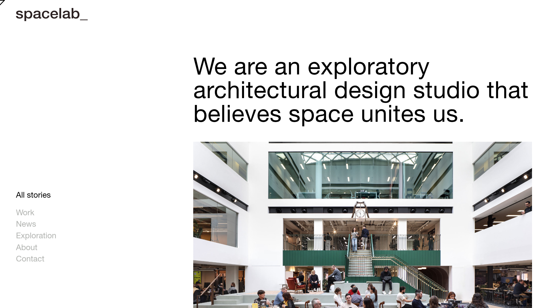
Spacelab is a minimalist architectural portfolio website that emphasizes spatial design through an asymmetric grid and wide-set typography. It serves as a strong reference for creative studios because it balances high-quality imagery with a functional, persistent side navigation that maximizes screen real estate for visual storytelling.
Design System
- Color Palette & Visual Hierarchy: The site uses a high-contrast monochromatic base (pure white background and black text) with subtle gray variations (#B2B2B2) for secondary navigation links. The focus is entirely on the vibrant colors within the architectural photography, creating a gallery-like atmosphere.
- Typography System: A clean, neo-grotesk sans-serif (resembling Helvetica or Inter) is used throughout. There is a clear weight-based hierarchy: large-scale bold headings for the mission statement, medium weight for active navigation items, and lighter weights for secondary links. The
spacelab_logo uses lower-case bolding for a modern, approachable brand identity. - Page Structure: The layout follows a classic sidebar-plus-content model. The left column (roughly 20% width) houses the branding and navigation, while the right column (80% width) displays the primary content, starting with a large typographical hook followed by a massive hero image.
- Reusable Components:
- Sidebar Navigation: A simple vertical list with a clear indicator for the active state ("All stories").
- Hero Text Block: A large-scale text container designed for impactful value propositions.
- Image Stage: A full-bleed or wide-margin image container adapted for architectural photography.
- Interaction Patterns: Based on the HTML structure, the site uses logical state management for navigation items, where hovered or inactive links drop in opacity to maintain focus on the current section.
- Responsive Behavior: The design is pre-configured for a fluid grid, likely collapsing into a top-down stack on mobile devices where the sidebar becomes a header or a hideable menu.
Use Cases
- Who should clone this pattern: Independent architects, interior design firms, UX design portfolios, and photography studios seeking a "work-first" presentation style.
- Effective Remixes:
- Creative Agency Portfolio: Adapt the asymmetric grid to showcase case study snapshots and client logos.
- Digital Publication: Reuse the persistent sidebar as a category filter for an online magazine or blog.
- Practical Remix Directions: To modernize the look, one could add a subtle entrance animation to the hero image or swap the monochromatic background for a dark mode theme (e.g., charcoal backgrounds with white text).
- Suggested Clone Scope: Start by cloning the Sidebar + Hero Section layout. The sidebar's spacing and the hero's typographical scale are the primary elements that define this aesthetic and provide the most value for a quick layout setup.
Related Inspirations

Baubauwerk Minimal Agency Portfolio Homepage
A clean studio site featuring a centered text hero, scatter-plot filterable project gallery, and full-bleed image sections for case studies.
Minimalist Typography Portfolio and Services Grid
A clean, serif-heavy layout featuring an A-Frame 3D hero animation, tiered service lists, and a modular multi-column text structure for design manifestos.
Porto Rocha Design Portfolio Mockup
A minimalist, side-bar navigation portfolio featuring a dual-column layout with a scrollable project feed and high-contrast typography.
Makkaihang Design Studio Portfolio
A minimalist design agency landing page featuring a full-bleed video hero, a multi-column typographic layout, and a functional footer tracker for real-time local time and font details.
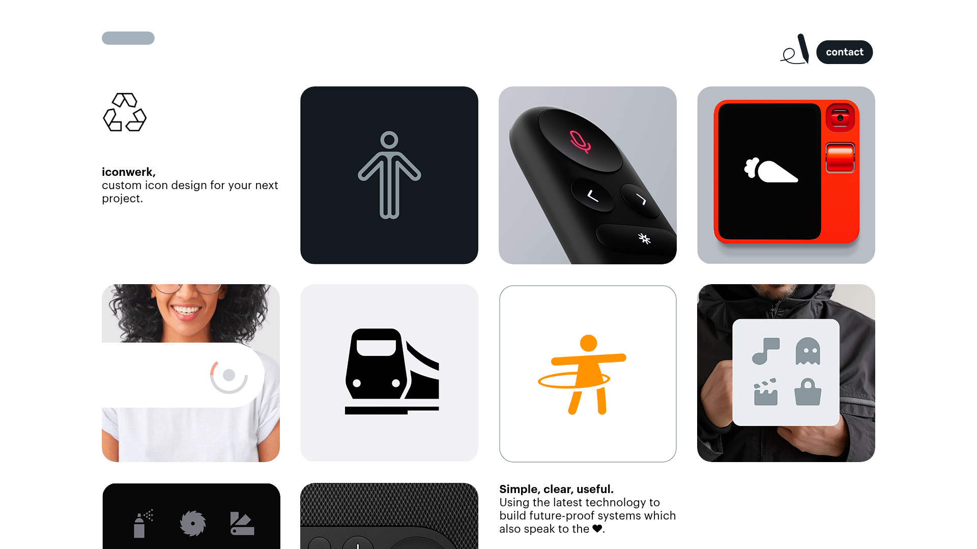
Iconwerk Design Portfolio Bento Layout
A minimalist bento grid portfolio featuring varying square tile sizes, clean iconography showcases, and a simple fixed navigation header for creative work.
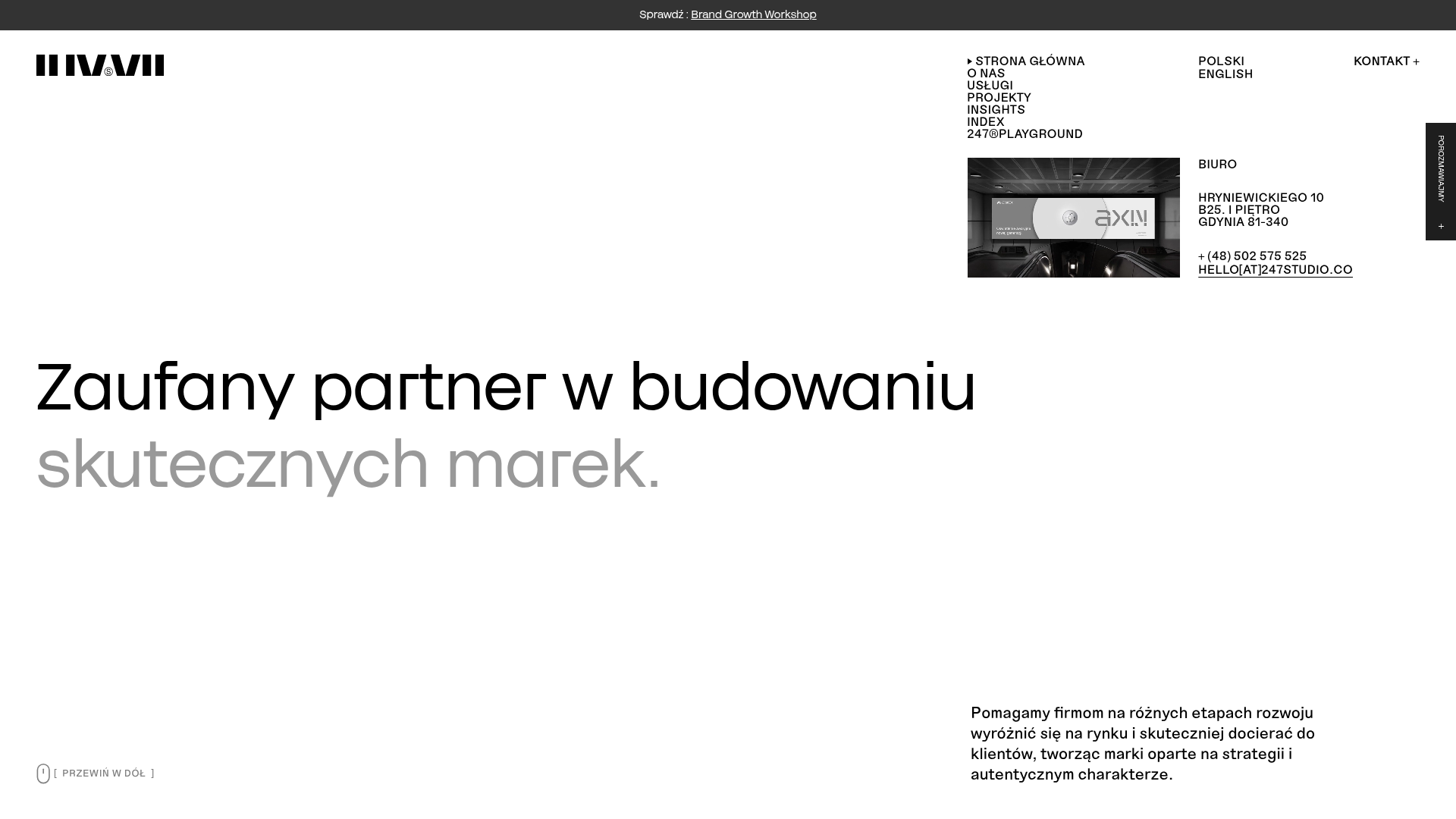
247 Studio Creative Agency Showcase
A minimalist agency landing page with a dynamic rotating headlines hero, numbered brand logo grid, and modern high-contrast service cards with timing labels.
