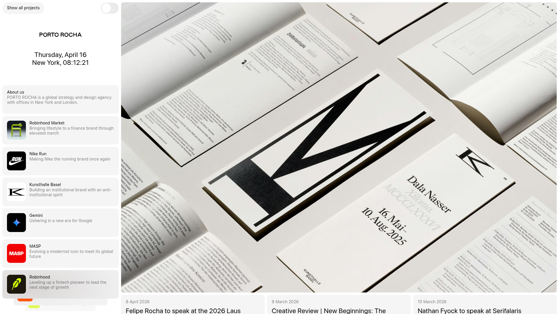
Porto Rocha Design Portfolio Mockup
A minimalist, side-bar navigation portfolio featuring a dual-column layout with a scrollable project feed and high-contrast typography.
Overview
This portfolio for Porto Rocha is a masterclass in brutalist minimalism and functional information density. It utilizes a fixed, high-utility sidebar for navigation and global information paired with a dynamic content grid, making it an excellent reference for high-end creative agencies and data-driven product portfolios.
Design System
- Color Palette & Visual Hierarchy: The site follows a strictly monochrome, high-contrast palette (white
bg-white, black text, and light grey#f0f0f0surfaces). Depth is created through flat layering and subtle borders rather than shadows, prioritizing a clean, architectural feel. - Typography System: The system uses a grotesque sans-serif (likely for UI elements) and a refined serif (for editorial content). Visual hierarchy is driven by weight and spacing: large, bold headers for project titles and metadata, contrasted with smaller, monochromatic secondary text for descriptions.
- Page Structure: A dual-column layout features a fixed-width left sidebar (containing the brand logo, a real-time clock, 'About' blurb, and a project list) and a scrollable main content area for case studies and news. Use of substantial whitespace allows the photography to stand out.
- Reusable Components:
- The Sidebar List: Project cards inside the sidebar use small square thumbnails (e.g., Nike, Gemini, Robinhood) with a title and brief subtitle—perfect for quick navigation.
- The Toggle: A clean pill-shaped toggle at the top left for 'Show all projects'.
- News Cards: Large cards at the bottom with date headers and bold headlines for announcements.
- Interaction Patterns: The layout suggests a 'master-detail' pattern where clicking sidebar projects updates the main view. Active states are indicated through text weight changes or subtle background shifts in the sidebar modules.
- Implementation Clues: The HTML structure uses semantic divisions (
<header>,<main>,<aside>) with utility-first styling. The project navigation is organized as a vertical stack of interactive list items, indicating a highly modular component architecture.
Use Cases
- Who should clone this pattern: Creative directors, design agencies, and senior engineers looking to build a professional identity that feels curated and authoritative.
- Effective Remixes: This layout works exceptionally well for architectural firms, art galleries, or technical documentation sites where a persistent 'Table of Contents' (the sidebar) is necessary for navigation.
- Practical Remix Directions:
- Brand Swap: Keep the layout but replace the monochrome palette with vibrant brand colors or a dark-mode-first aesthetic.
- Info Architecture Adaption: Convert the sidebar project list into a filtering system for a product catalog.
- Selective Reuse: Clone only the sidebar navigation for a dashboard project that requires high density and quick context switching.
- Suggested Clone Scope: A full-page clone is recommended to capture the interplay between the fixed navigation and the flexible grid, as the 'Sidebar-to-Main' relationship is the core value proposition.
Related Inspirations

Baubauwerk Minimal Agency Portfolio Homepage
A clean studio site featuring a centered text hero, scatter-plot filterable project gallery, and full-bleed image sections for case studies.
Minimalist Typography Portfolio and Services Grid
A clean, serif-heavy layout featuring an A-Frame 3D hero animation, tiered service lists, and a modular multi-column text structure for design manifestos.
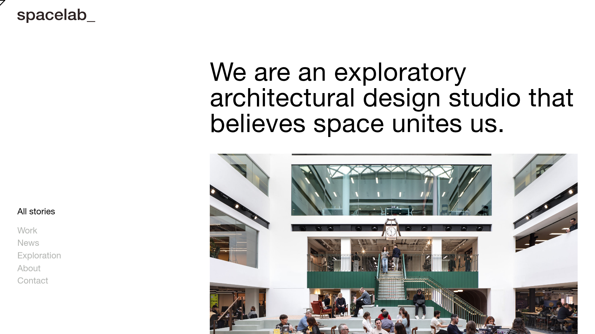
Spacelab Exploratory Architectural Portfolio
A minimalist studio website featuring a clean sidebar navigation and a high-impact asymmetric grid layout designed for visual storytelling.
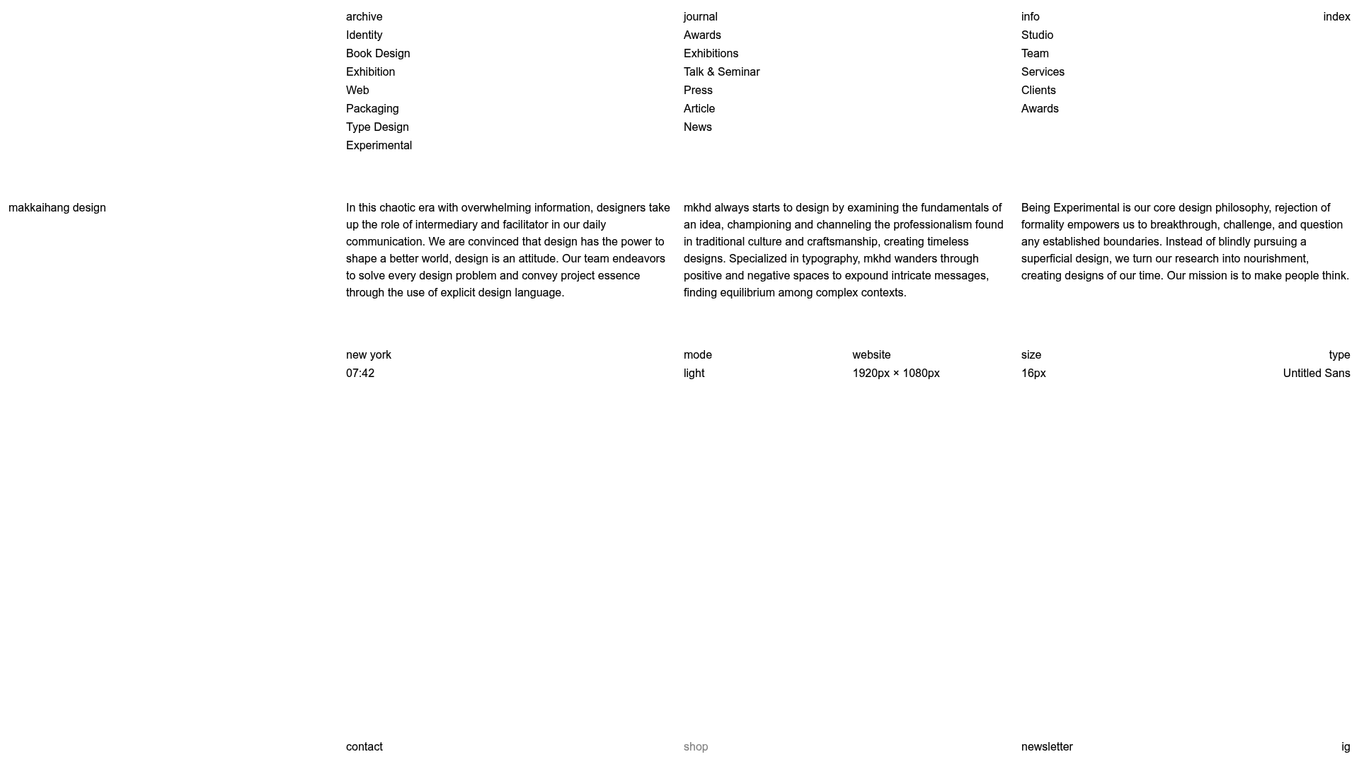
Makkaihang Design Studio Portfolio
A minimalist design agency landing page featuring a full-bleed video hero, a multi-column typographic layout, and a functional footer tracker for real-time local time and font details.
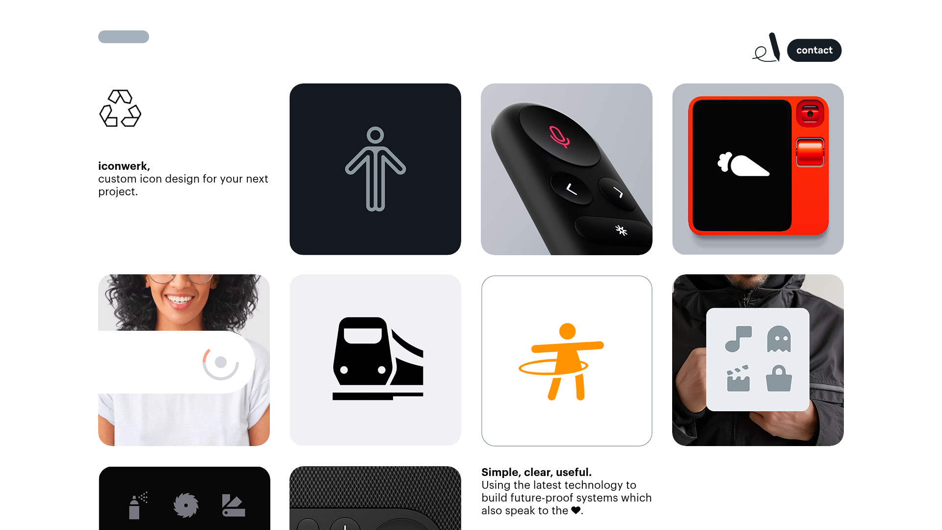
Iconwerk Design Portfolio Bento Layout
A minimalist bento grid portfolio featuring varying square tile sizes, clean iconography showcases, and a simple fixed navigation header for creative work.
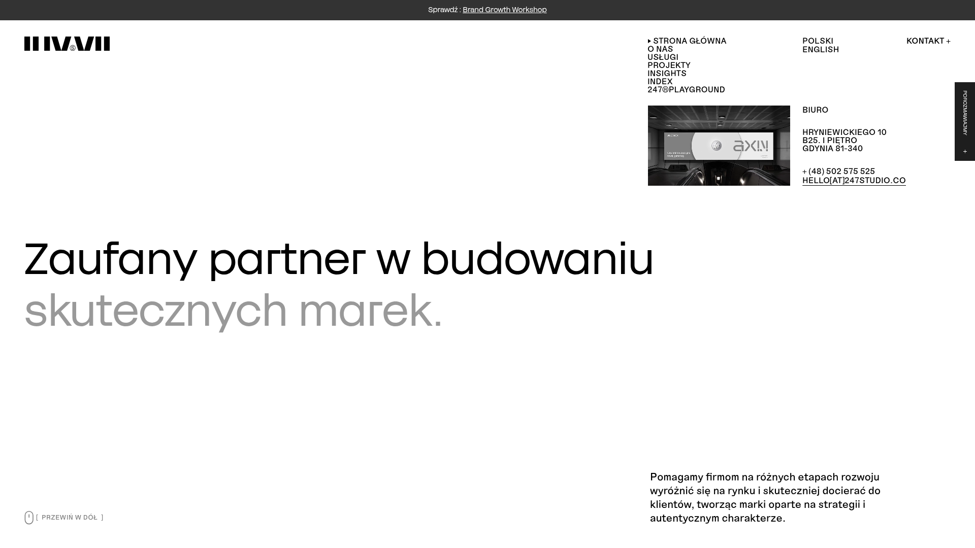
247 Studio Creative Agency Showcase
A minimalist agency landing page with a dynamic rotating headlines hero, numbered brand logo grid, and modern high-contrast service cards with timing labels.
