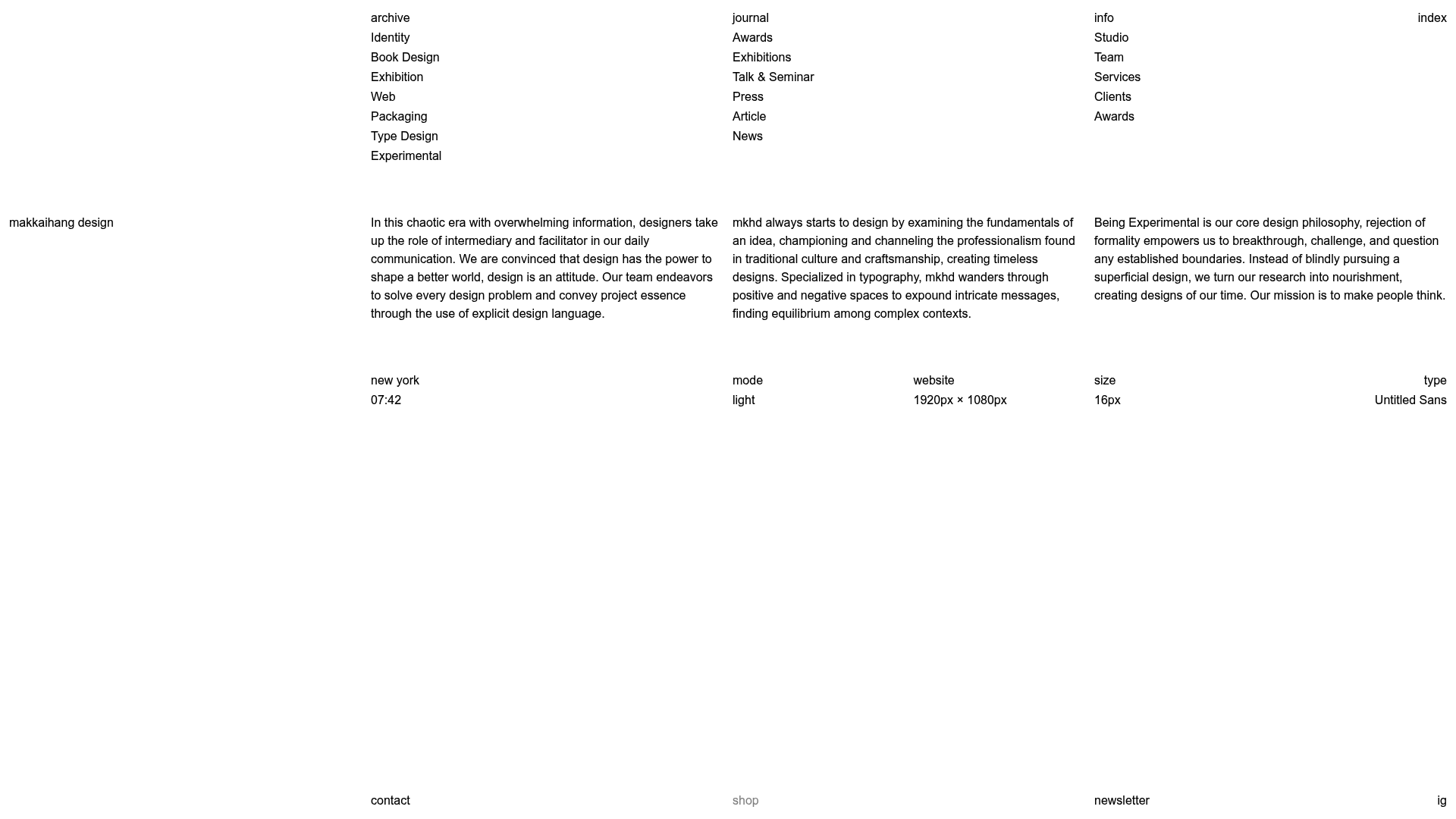
Makkaihang Design Studio Portfolio
A minimalist design agency landing page featuring a full-bleed video hero, a multi-column typographic layout, and a functional footer tracker for real-time local time and font details.
Overview
This portfolio for Makkaihang Design is a masterclass in minimalist, typography-driven UI design that prioritizes whitespace and functional metadata. It serves as an excellent reference for builders looking to create high-end boutique agency sites or professional portfolios that balance a "brutalist-lite" aesthetic with sophisticated interactive details.
Design System
- Color Palette & Visual Hierarchy: The primary theme is a high-contrast "Light" mode featuring absolute black text on a stark white background. Hierarchy is established purely through spatial distribution and typographic weight rather than color or shadow.
- Typography System: The site uses "Untitled Sans" as the primary typeface. The layout relies on a small, consistent font size (16px) across diverse blocks, using lowercase styling to maintain a modern, understated professional tone.
- Page Structure & Layout: The design follows a strict multi-column grid. The top section features a four-column navigation/index layout, followed by a wide-margin three-column intro paragraph block. The footer mirrors this grid, providing contextual data like location-based time, viewport dimensions, and active font name.
- Reusable Components:
- Metadata HUD: A bottom-aligned functional block that tracks real-time data (time, resolution, color mode).
- Multi-Column Text Blocks: Clean, readable article sections optimized for heavy text density.
- Full-Bleed Media Gallery: The background utilizes a z-indexed fixed video/image layer that changes as users navigate through portfolio items.
- Interaction & Motion: The UI features subtle
fadeInandfadeInWithDelayanimations (visible in the HTML classes). Interactive elements like themodeandtypebuttons suggest a theme-swapping capability directly within the interface. - Implementation Clues: The HTML structure uses styled-components (
sc-prefixed classes) and a React-based layout (id="root"). It utilizes adata-themeanddata-fontattribute on the layout wrapper to manage global styling states.
Use Cases
- Who should clone this: Independent designers, architects, and creative studios who want a site that feels like a physical gallery or architectural plan.
- Remixing for products: This pattern works effectively for technical documentation landing pages or high-end e-commerce brand lookbooks where the product photography needs to do the heavy lifting.
- Practical Remix Directions:
- Swap the monochrome palette for a high-saturation primary color theme while keeping the grid.
- Replace the live metadata HUD with dynamic project metrics (e.g., "Year Completed," "Client Type").
- Use the four-column index at the top as a structured site-wide search or filter menu.
- Suggested Scope: A full-page clone is recommended to capture the sophisticated interplay between the rigid typographic layout and the fluid background video hero.
Related Inspirations

Baubauwerk Minimal Agency Portfolio Homepage
A clean studio site featuring a centered text hero, scatter-plot filterable project gallery, and full-bleed image sections for case studies.
Minimalist Typography Portfolio and Services Grid
A clean, serif-heavy layout featuring an A-Frame 3D hero animation, tiered service lists, and a modular multi-column text structure for design manifestos.
Porto Rocha Design Portfolio Mockup
A minimalist, side-bar navigation portfolio featuring a dual-column layout with a scrollable project feed and high-contrast typography.
Spacelab Exploratory Architectural Portfolio
A minimalist studio website featuring a clean sidebar navigation and a high-impact asymmetric grid layout designed for visual storytelling.
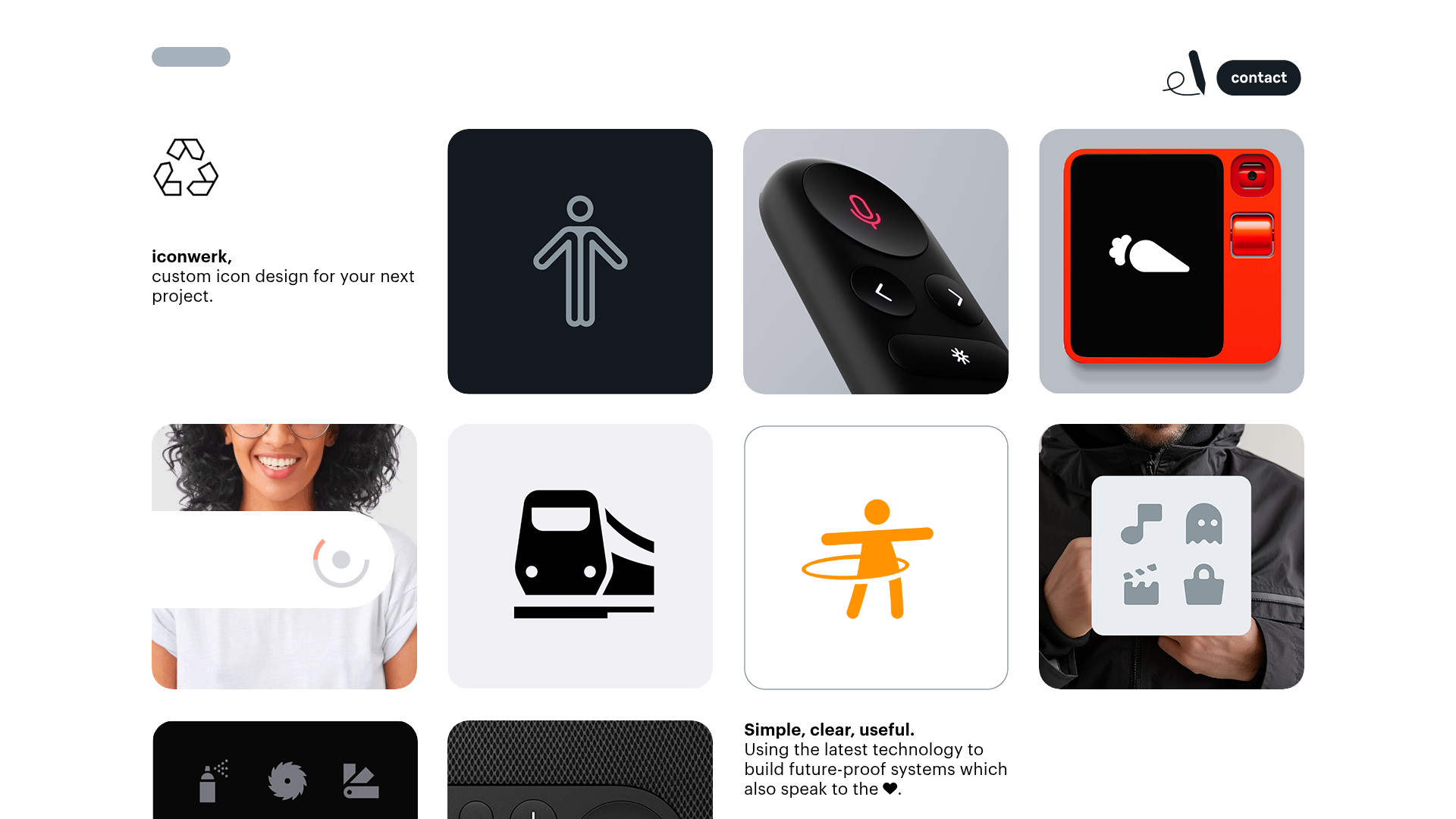
Iconwerk Design Portfolio Bento Layout
A minimalist bento grid portfolio featuring varying square tile sizes, clean iconography showcases, and a simple fixed navigation header for creative work.
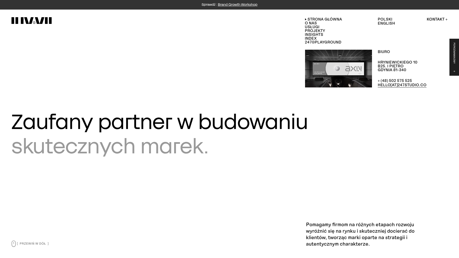
247 Studio Creative Agency Showcase
A minimalist agency landing page with a dynamic rotating headlines hero, numbered brand logo grid, and modern high-contrast service cards with timing labels.
