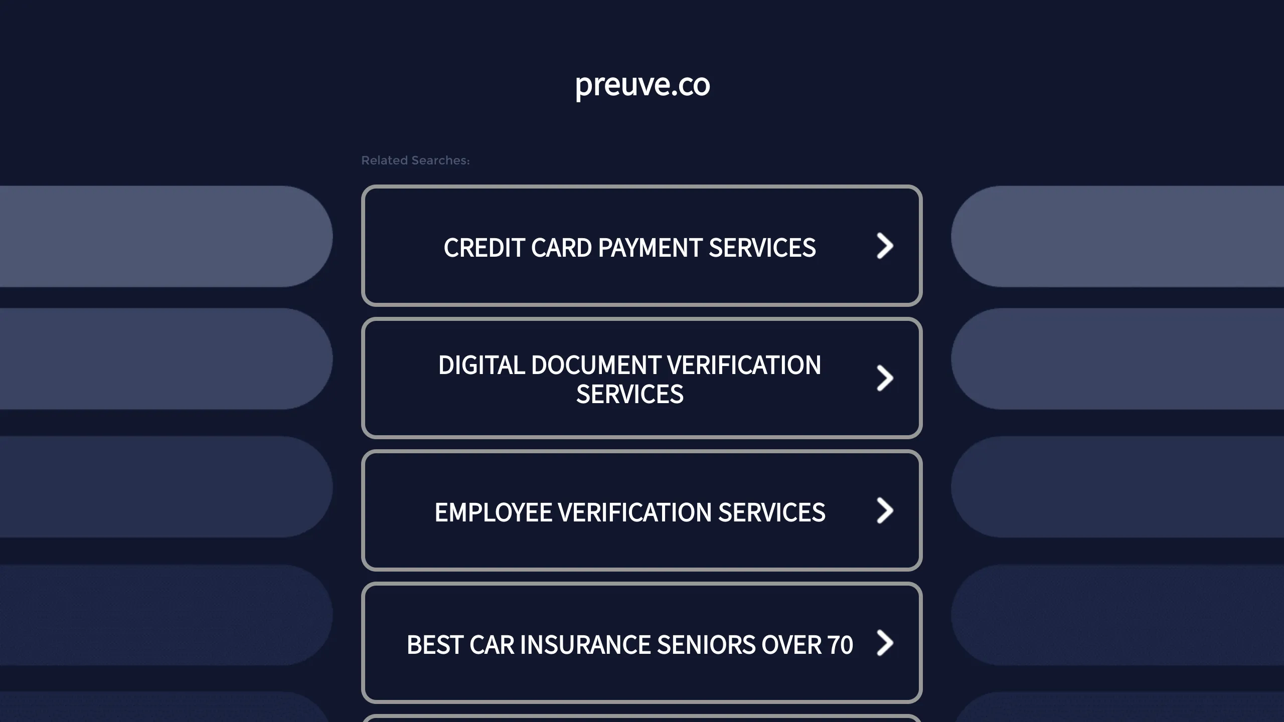
Preuve.co Search Index Landing Page
A dark-themed search directory layout featuring a centered brand header and vertically stacked rectangular navigation cards with chevron icons and hover effects.
Overview
Preuve.co is a clean, dark-mode search directory landing page designed for high-intent navigation. It serves as an excellent reference for builders creating link trees, directory indices, or simplified navigation hubs that require a focused visual hierarchy and modern aesthetic.
Design System
- Color Palette & Visual Hierarchy: The design utilizes a deep navy/charcoal background (#0a0e1c range) with high-contrast white typography. Secondary decorative elements include semi-transparent blue "pill" shapes flanking the central column to create a sense of depth and horizontal balance.
- Typography: A clean, sans-serif font is used throughout. The central brand header is lowercase and bold for a modern "tech" feel, while the navigation cards use uppercase text to establish a formal, clickable call-to-action (CTA).
- Page Structure: The layout follows a strict vertical center-alignment. It begins with a minimalist brand header, followed by a small "Related Searches" label, and concludes with a stack of uniform navigation cards.
- Reusable Components:
- Navigation Cards: Rectangular boxes with rounded corners, a subtle light-gray border, and a right-aligned chevron icon. These are designed for high touch-targets on mobile.
- Background Decorative Elements: Symmetrical, rounded-capsule shapes in varying shades of muted blue that frame the content.
- Interaction Patterns: The design is built for clickability; each card acts as a large button with a chevron indicating the next step. Although the static view is minimal, the structure suggests a hover state where the border or background of the card may brighten.
- Implementation Clues: The UI is container-based, centered horizontally. The flanking decorative shapes suggest a CSS Grid or Flexbox layout where the side columns are used for aesthetic padding.
Use Cases
- Who should clone this: Developers building directory sites, domain parking pages, or link-in-bio style portfolio hubs.
- Effective Remixes: This pattern works well for FAQ indices, resource libraries, or any "choose your path" onboarding screens for SaaS applications.
- Practical Directions: Remixers can swap the dark theme for a high-energy brand color (e.g., vibrant purple or green) or replace the text-only cards with icon-and-text combinations for more visual nuance.
- Scope: This is ideal for a full-page clone as its strength lies in its minimalist composition and the specific spacing between the header and the primary action cards.
Related Inspirations

GoCardless Payments Platform Landing Page
A dark-themed fintech landing page featuring a split-screen video hero, bento-style feature cards, a horizontal logo slider, and step-by-step accordion guides.
Dynadot Domain Parking Page
A minimalist domain registration placeholder featuring a branded sticky header banner and a full-height dark background layout.
Cosmos Network Enterprise Landing Page
A dark-themed blockchain hero section featuring a minimalist navigation header, high-contrast typography, a stylized digital globe graphic, and a statistics-based footer ribbon.
GoDaddy Corporate Domain Protection Page
A minimalist domain verification layout featuring a centered card, large serif typography, and a logo header on a dark background.
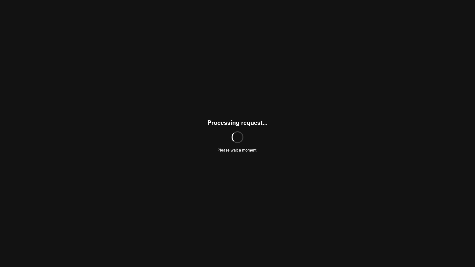
Minimalist Dark Mode Loading Screen
A clean, dark-themed redirection page featuring a centered typography layout and a CSS circular loading spinner for asynchronous processing states.
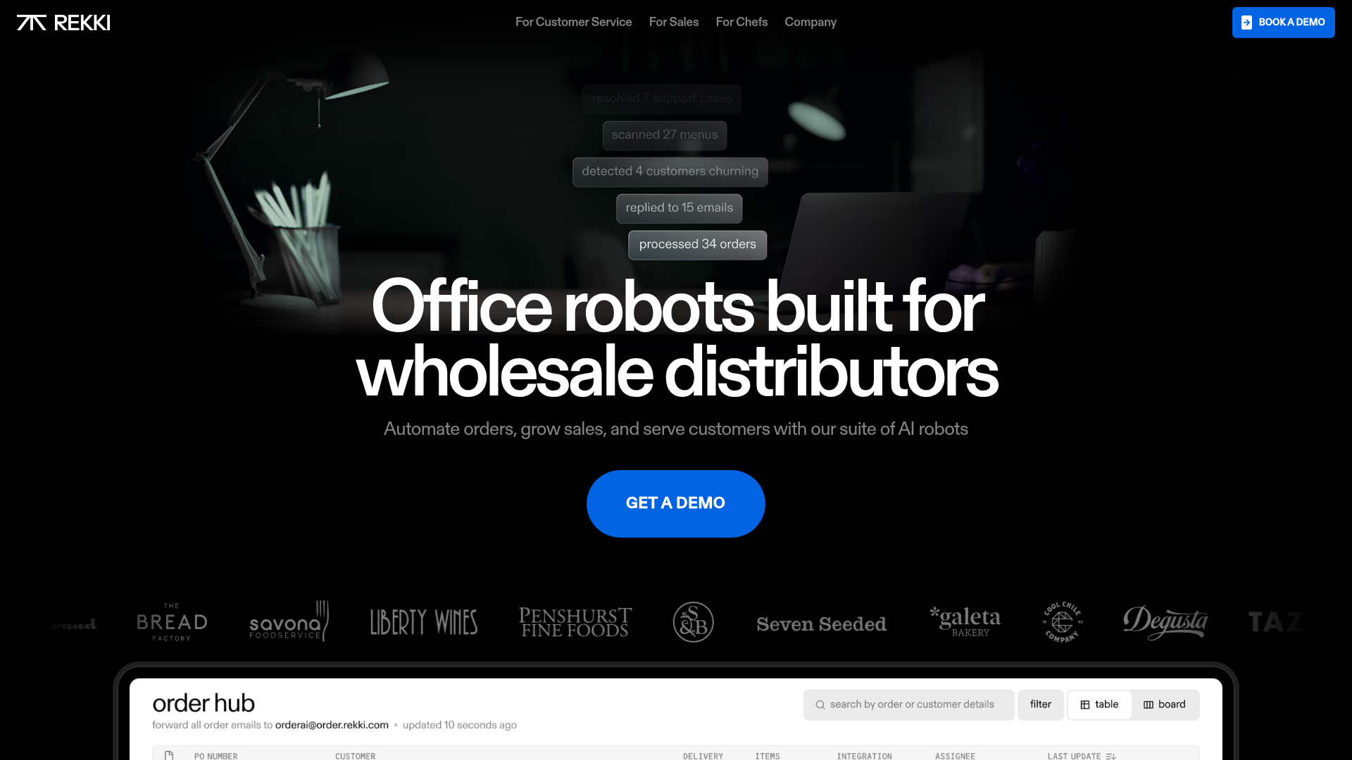
REKKI AI Automation SaaS Landing Page
A high-impact dark-mode landing page featuring a floating label hero section, marquee brand logos, an interactive dashboard UI preview, and card-based testimonial grids.
