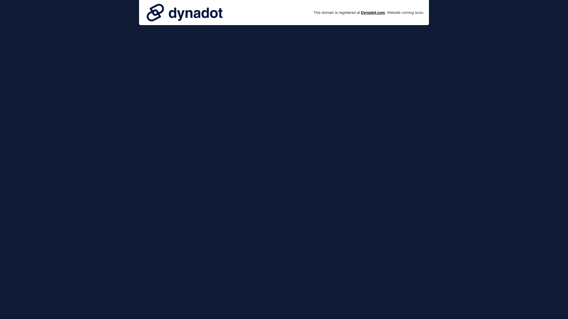
Dynadot Domain Parking Page
A minimalist domain registration placeholder featuring a branded sticky header banner and a full-height dark background layout.
Overview
This Dynadot domain parking page is a clean, hyper-minimalist placeholder designed to balance branding with utility. It serves as an excellent reference for builders creating "Coming Soon" pages, maintenance mode screens, or domain auction landing pages where a persistent header must coexist with a full-screen background.
Design System
- Color Palette & Hierarchy: The design uses a deep navy or dark charcoal (#0b162e style) full-height background that fills the entire viewport below the header. The header features a high-contrast white background, creating a sharp "sticky" visual boundary that separates the provider's branding from the user's content area.
- Typography: The layout employs a clean sans-serif system. The header uses a combination of bold branding (logo) and small, gray utility text. The primary messaging uses a hierarchical approach: bold weights for the domain name ("Dynadot.com") and standard weights for status updates ("Website coming soon").
- Page Structure: The layout follows a top-down vertical flow:
- Branded Sticky Banner: A fixed-height container (#reg-banner) containing the logo on the left and registration details/status text on the right.
- Main Content Container: A full-bleed empty div area meant for containing frames or dynamic text, positioned relative to the header height (top: 73px).
- Reusable Components: The
reg-banneris the standout component—a low-profile, responsive navigation bar that manages site info without cluttering the screen. - Implementation Clues: The HTML uses a straightforward div-based structure with absolute positioning for the main content. The layout relies on standard web safe fonts and a fixed-height header (73px) to ensure content never overlaps the branding.
Use Cases
- Who should clone this: Developers setting up registration placeholders, domain registrars, or SaaS startups deploying "Stealth Mode" landing pages.
- Remix Directions: Replace the dark background with a gradient or high-resolution hero image while maintaining the white sticky header. The information architecture can be adapted by placing a waitlist sign-up form or social media links in the center of the dark space.
- Clone Scope: For a quick placeholder, clone exactly as-is. For a more robust landing page, reuse the
reg-bannerlogic and header height offset to ensure a consistent experience across various browser sizes.
Related Inspirations

GoCardless Payments Platform Landing Page
A dark-themed fintech landing page featuring a split-screen video hero, bento-style feature cards, a horizontal logo slider, and step-by-step accordion guides.
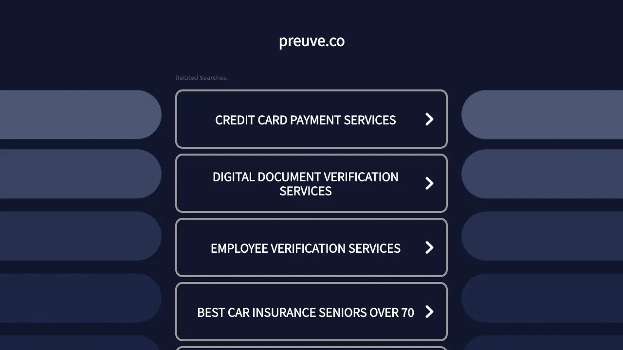
Preuve.co Search Index Landing Page
A dark-themed search directory layout featuring a centered brand header and vertically stacked rectangular navigation cards with chevron icons and hover effects.
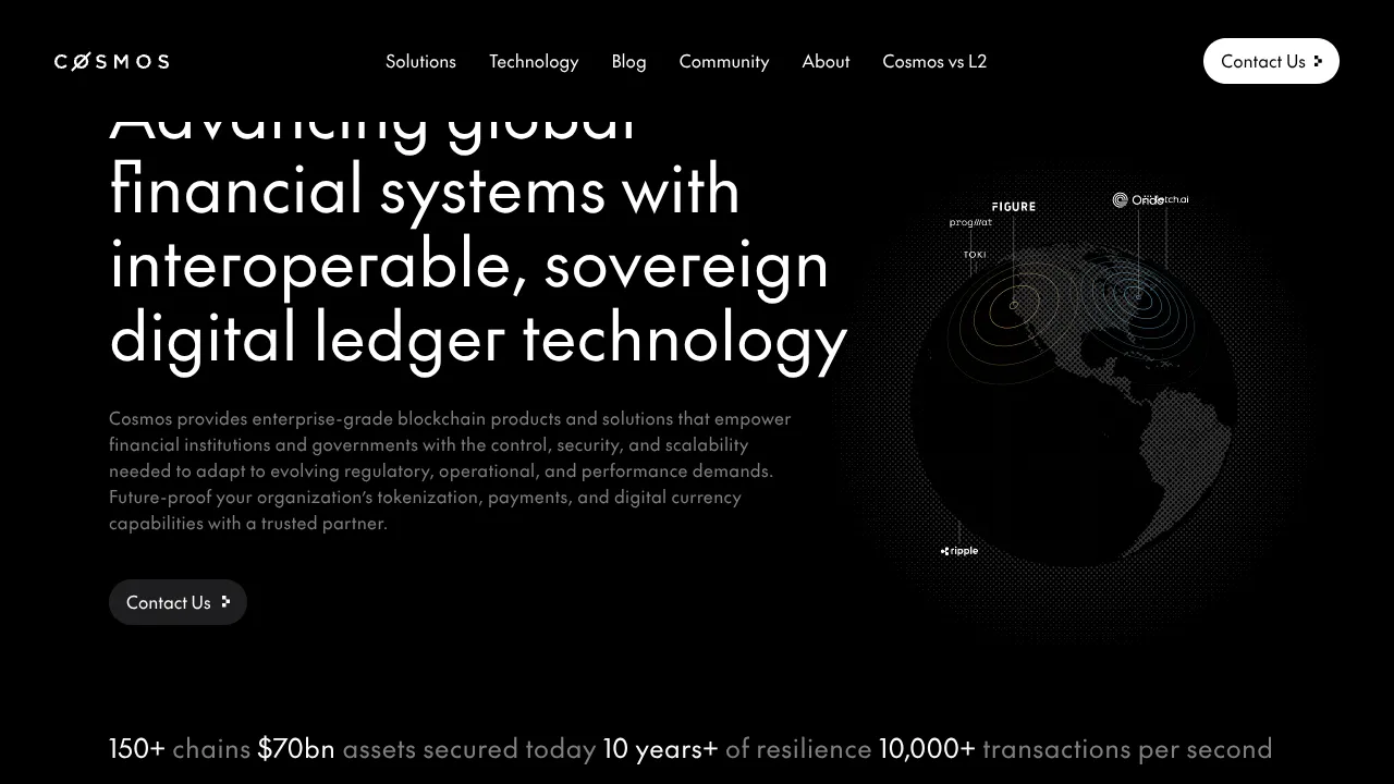
Cosmos Network Enterprise Landing Page
A dark-themed blockchain hero section featuring a minimalist navigation header, high-contrast typography, a stylized digital globe graphic, and a statistics-based footer ribbon.
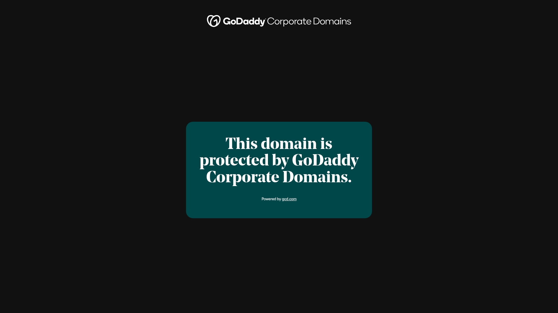
GoDaddy Corporate Domain Protection Page
A minimalist domain verification layout featuring a centered card, large serif typography, and a logo header on a dark background.
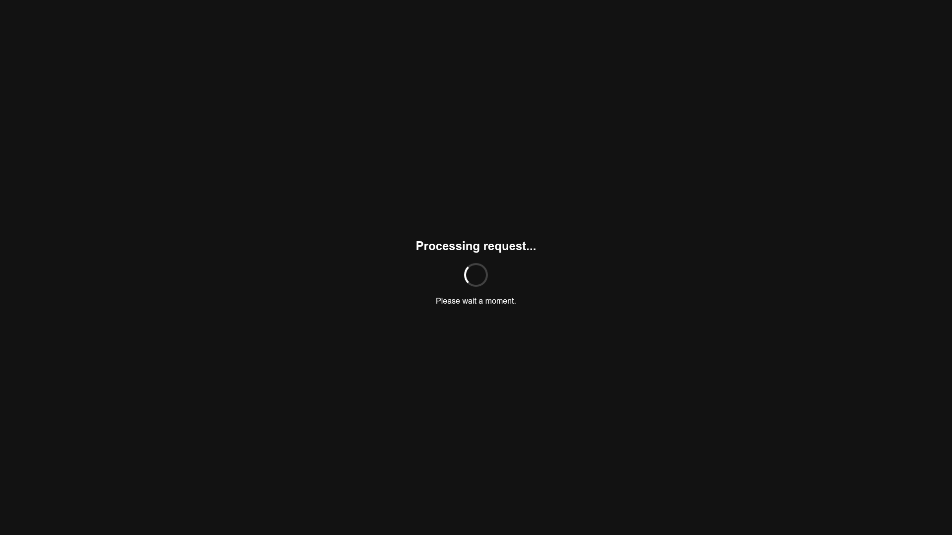
Minimalist Dark Mode Loading Screen
A clean, dark-themed redirection page featuring a centered typography layout and a CSS circular loading spinner for asynchronous processing states.
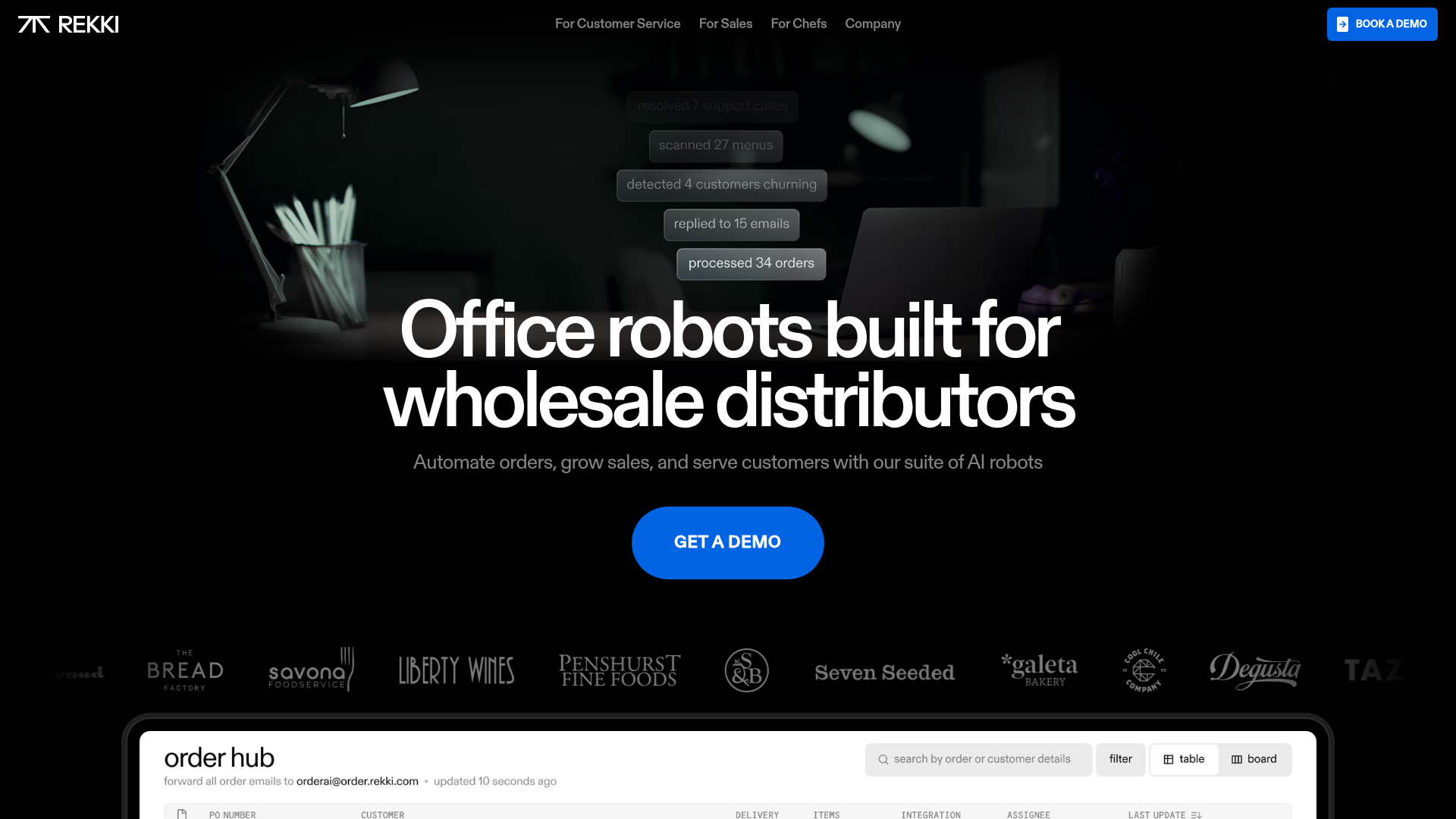
REKKI AI Automation SaaS Landing Page
A high-impact dark-mode landing page featuring a floating label hero section, marquee brand logos, an interactive dashboard UI preview, and card-based testimonial grids.
