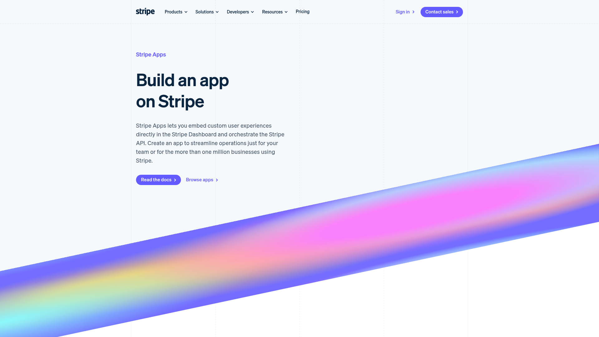
Stripe Apps Developer Portal Landing
A developer-focused landing page featuring a geometric animated gradient hero, multi-column feature sections, carousel components with code editors, and testimonial sliders.
Overview
This page serves as the developer gateway for Stripe Apps, blending a clean SaaS aesthetic with interactive developer-centric visuals. It is a premier reference for cloning because it successfully balances high-level marketing value propositions with technical substance through integrated code samples and UI mockups.
Design System
- Color Palette & Visual Hierarchy: The site uses a sophisticated light-mode foundation (whites and off-whites) contrasted with a vibrant, animated mesh gradient in the hero section. High-impact colors (Blurple, Cyan, and Pink) are used for technical highlights and CTAs to draw the eye toward actions.
- Typography: The system uses a clean, geometric sans-serif (Stripe's proprietary 'Sohne' or similar) with a clear scale. Large, bold headers (
variant--Hero) command attention, while descriptive body text (variant--Detail) maintains high legibility with generous line heights. - Page Structure: The layout follows a logical funnel: Hero with visual punch -> 4-column feature grid -> 'Stacked Carousel' containing code vs. logic visuals -> 'Side-By-Side' case study modules -> Testimonial slider -> Multi-link footer CTA.
- Reusable Components:
- Stacked Carousel: A robust component for switching between logic descriptions and corresponding code editors.
- App Cards: Simple, shadowed surface containers (
Card--shadowSmall) featuring logos and brief descriptions. - DomGraphic: A container system for maintaining aspect ratios of complex SVG/Image mockups across screen sizes.
- Interaction & Motion: The page features an animated
<canvas>mesh gradient in the background. Elements utilize subtle vertical translations and opacity shifts on scroll. The code editor component includes a 'typing' simulation effect indicated by theCodeEditorAsciiLoaderclass. - Implementation Clues: The HTML reveals a custom grid system using
ColumnLayoutwith data attributes (e.g.,data-columns="2,2") for responsive control. It utilizes a modular section architecture (Section--angleBottom,Section--paddingNormal) to manage consistent vertical spacing and unique angled background transitions.
Use Cases
- Who should clone this: Developers building SaaS platforms, API dokumentation, or developer-tooling marketplaces that need to show code alongside business value.
- Effective Remixes: This pattern works perfectly for "How it Works" sections where one side explains a step and the other shows the JSON/code result. It can also be adapted for plugin directories or app stores.
- Remix Directions: Swap the animated mesh gradient for a static branded image to reduce performance overhead; reuse the 'Side-By-Side' layout to compare free vs. pro features; adapt the vertical carousel for step-by-step onboarding flows.
- Clone Scope: A quick section clone of the 'Stacked Carousel' is ideal for technical blogs. A full-page clone is recommended for companies launching a new SDK or integration partner ecosystem.
Related Inspirations
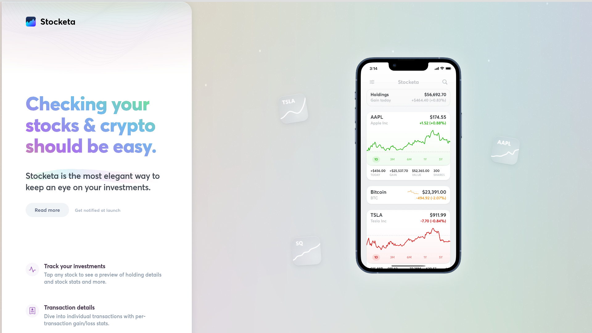
Stocketa Portfolio Tracker Landing Page
A split-screen landing page featuring a text-gradient hero, a sticky mobile app frame with parallax floating elements, and a feature grid with custom icons.
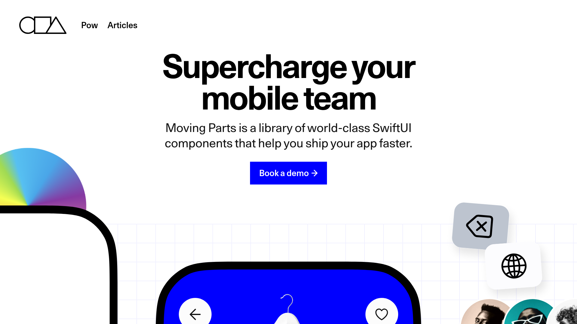
Moving Parts SwiftUI Component Library
A high-performance landing page featuring a interactive code comparison toggle, animated mobile UI previews, and a clean minimalist aesthetic for developer tools.
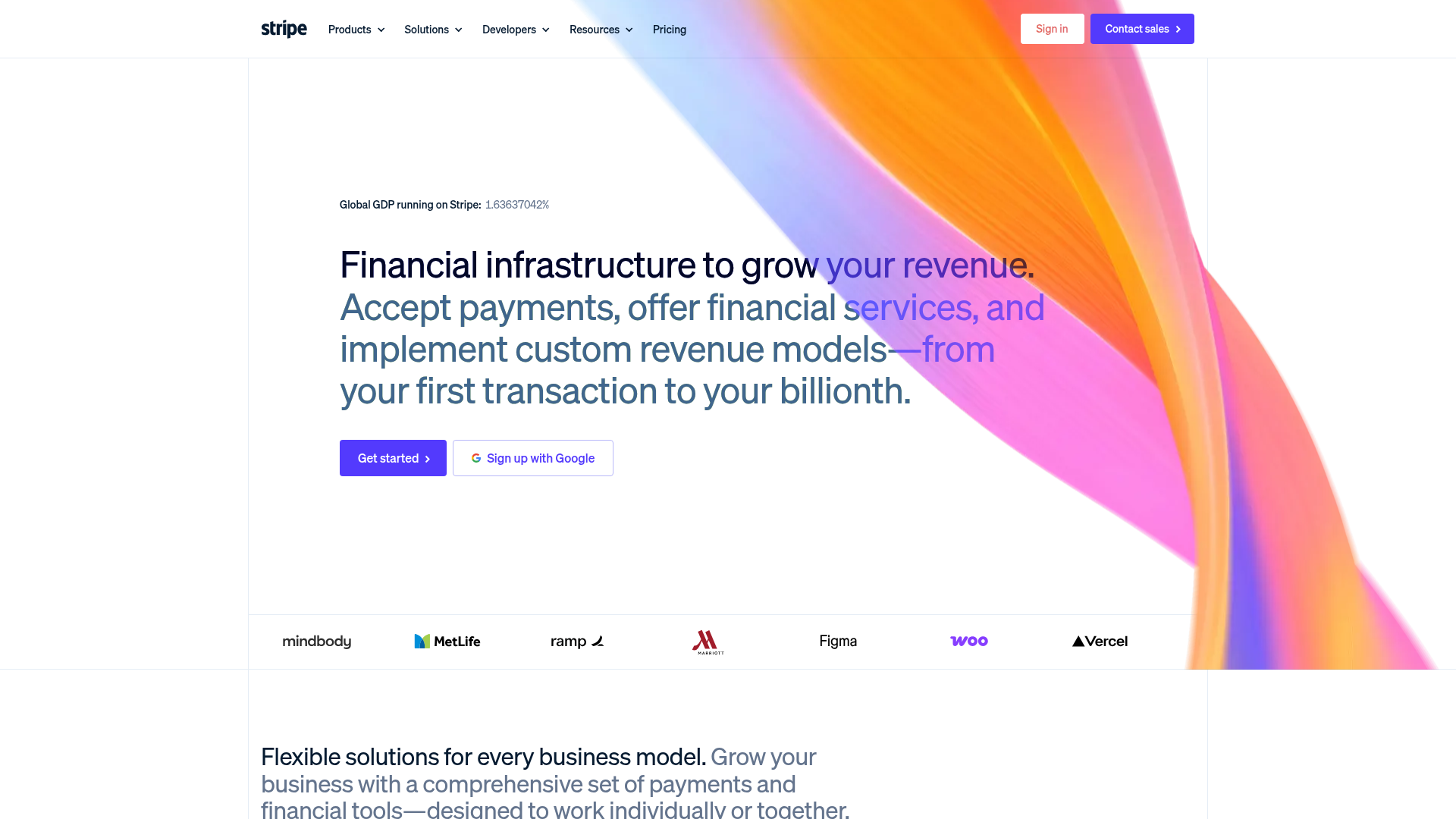
Stripe Modern SaaS Landing Page
A high-conversion landing page featuring a complex mesh-gradient hero, sticky navigation, and a horizontal logo wall for brand social proof.
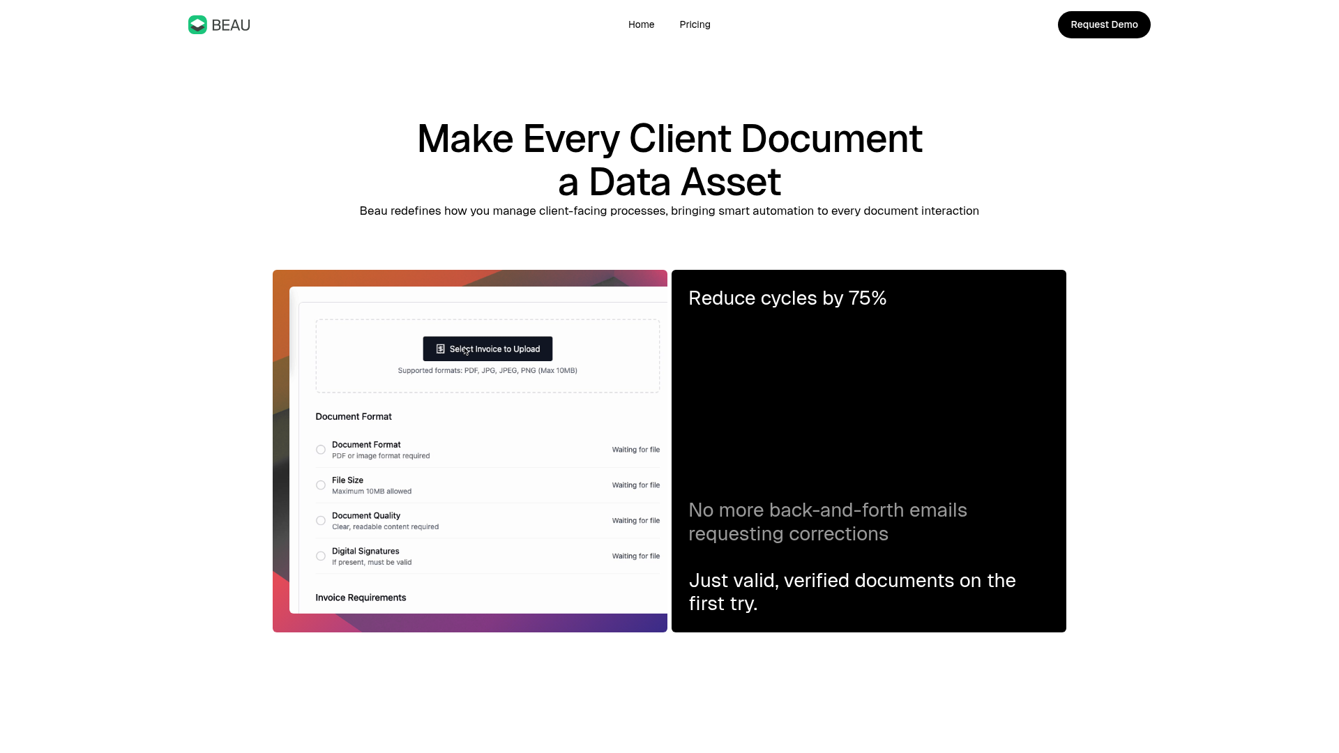
Beau Document Automation Landing Page
A modern software landing page featuring a bento-grid layout, split-screen hero assets with animated checkmarks, a step-by-step process guide, and a clean two-tier pricing table.
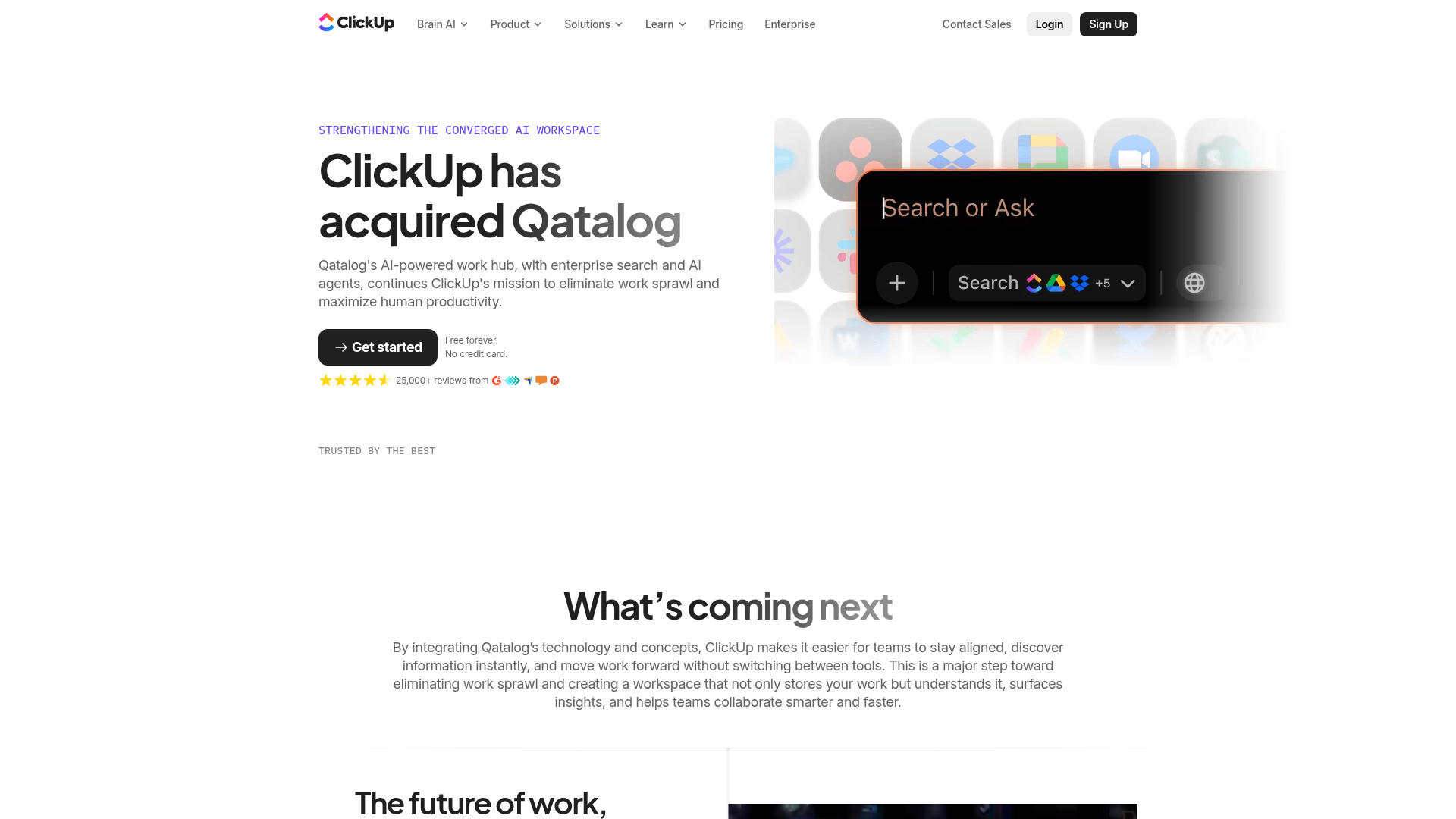
ClickUp Acquisition Hero Landing Page
Features a modern dark-themed hero section with a search UI graphic, bento-style feature grid, and a high-contrast CTA section with decorative gradients.
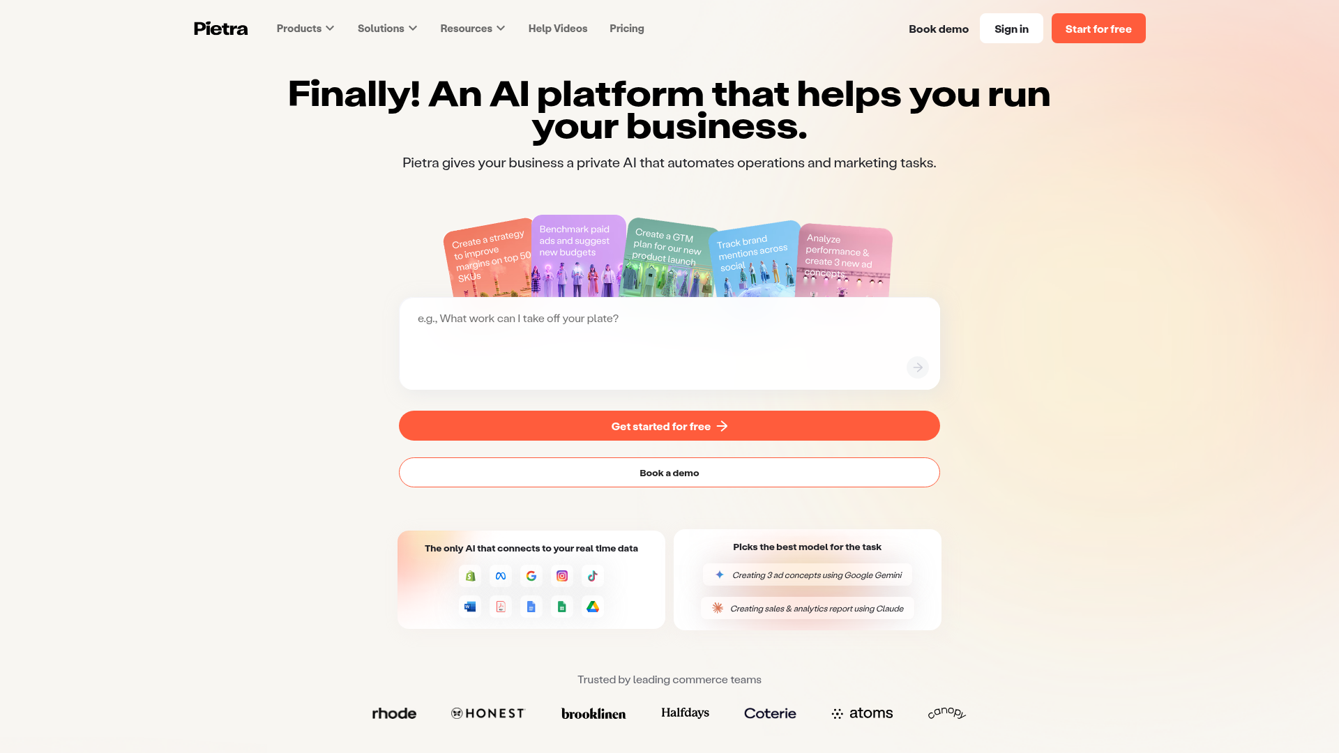
Pietra AI Platform Landing Page
A commerce-focused landing page featuring a centralized AI input hero, colorful floating value-prop cards, a bento-style integration showcase, and tabbed feature sections with side-by-side comparisons.
