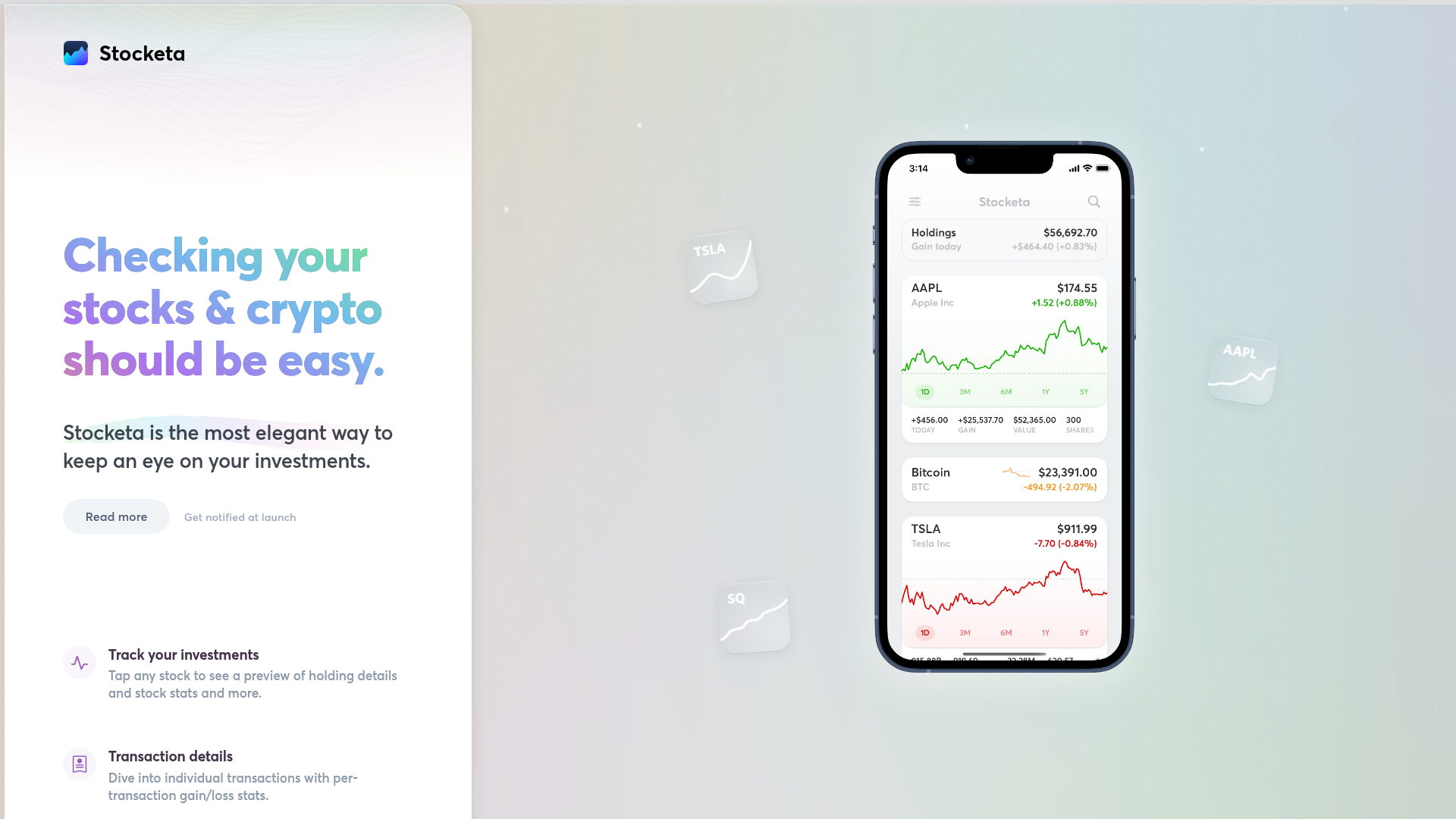
Stocketa Portfolio Tracker Landing Page
A split-screen landing page featuring a text-gradient hero, a sticky mobile app frame with parallax floating elements, and a feature grid with custom icons.
Overview
This landing page is a masterclass in the "Product-First" design pattern, using a split-screen layout to maintain a persistent mobile app preview alongside feature descriptions. It is a strong reference for developers who want to showcase a mobile interface while providing a high-quality, desktop-optimized narrative flow.
Design System
- Color Palette & Visual Hierarchy: The site uses a clean, light-mode foundation with a sophisticated multi-color text gradient (
linear-gradient(-333deg, ...)). This gradient transitions from green to yellow, orange, purple, and blue, serving as the primary visual anchor. Hierarchy is established through large, bold serif-like headings and subtle secondary text in a dark charcoal gray. - Typography System: The design features a modern sans-serif stack. Headers use a tight tracking and heavy weight to emphasize the gradient treatment, while body text uses a generous line-height for readability. Small uppercase labels are used within the app frame for data categorization.
- Page Structure: The layout is divided into two main vertical containers. The left side holds the marketing copy: a hero section followed by a dense feature grid. The right side is a fixed-position container featuring a realistic iPhone mockup with floating, parallax-animated "stock cards" (TSLA, AAPL, SQ) that drift behind and in front of the device.
- Reusable Components:
- Feature Grid: A two-column list of icon-led items with high-contrast glyphs against a soft
hsla(280,40%,88%, 0.22)background. - Hero Text: The
hero-textclass with its complex CSS gradient is a high-value cloneable element for brand identity. - Device Frame: A containerized mobile UI that uses real HTML/CSS rather than a static image, allowing for dynamic content updates.
- Feature Grid: A two-column list of icon-led items with high-contrast glyphs against a soft
- Interaction & Motion: The page utilizes a "stonkscroll" parallax effect (controlled via custom
data-stocketa-speedattributes in the HTML) where elements move at different speeds relative to the scroll position. The floating stock cards and the phone mockup transition states as the user navigates. - Implementation Clues: The structure uses a standard semantic
<main>wrapper with a#primarycontent area. It utilizes CSS variables for icon colors (--icon-bg,--icon) and a<canvas>element (#canvasbg) for the animated background waves.
Use Cases
- Who should clone this: Mobile app developers seeking a high-conversion landing page that demonstrates the app's UI immediately without requiring a video or interaction.
- Effective Remixes: Fintech dashboards, productivity apps, or crypto wallets where visualizing the internal UI is the primary selling point.
- Remix Directions: Swap the light theme for a dark mode by inverting the background and adjusting the gradient to neon tones; adapt the split-screen for a 60/40 ratio to give more room to the feature grid; or replace the static stock cards with dynamic price-feed components.
- Clone Scope: A full-page clone is recommended to capture the responsive split-screen logic, though the feature grid is a perfect candidate for a quick standalone section clone.
Related Inspirations
Stripe Apps Developer Portal Landing
A developer-focused landing page featuring a geometric animated gradient hero, multi-column feature sections, carousel components with code editors, and testimonial sliders.
Moving Parts SwiftUI Component Library
A high-performance landing page featuring a interactive code comparison toggle, animated mobile UI previews, and a clean minimalist aesthetic for developer tools.
Stripe Modern SaaS Landing Page
A high-conversion landing page featuring a complex mesh-gradient hero, sticky navigation, and a horizontal logo wall for brand social proof.
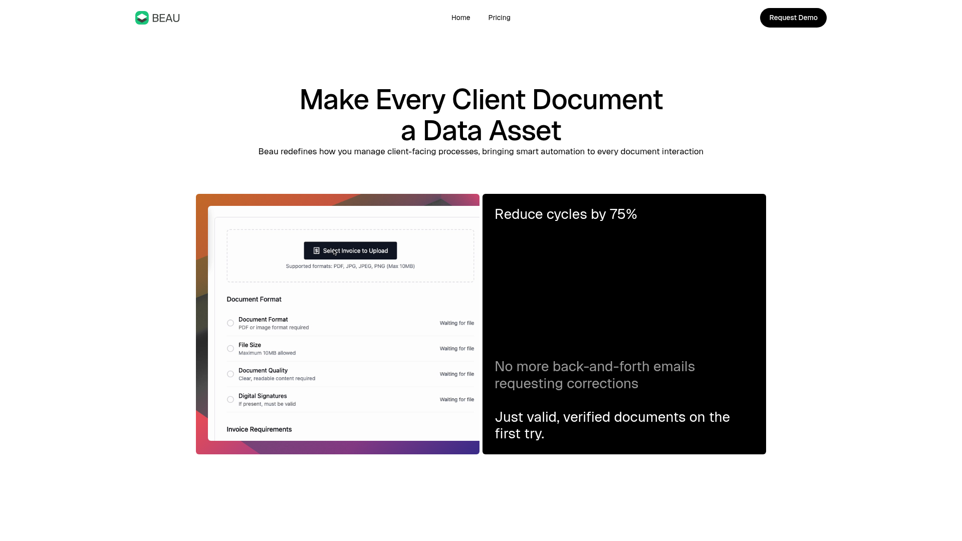
Beau Document Automation Landing Page
A modern software landing page featuring a bento-grid layout, split-screen hero assets with animated checkmarks, a step-by-step process guide, and a clean two-tier pricing table.
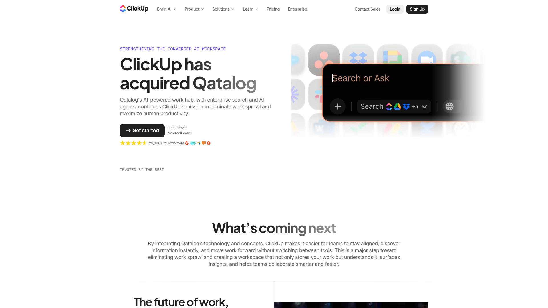
ClickUp Acquisition Hero Landing Page
Features a modern dark-themed hero section with a search UI graphic, bento-style feature grid, and a high-contrast CTA section with decorative gradients.
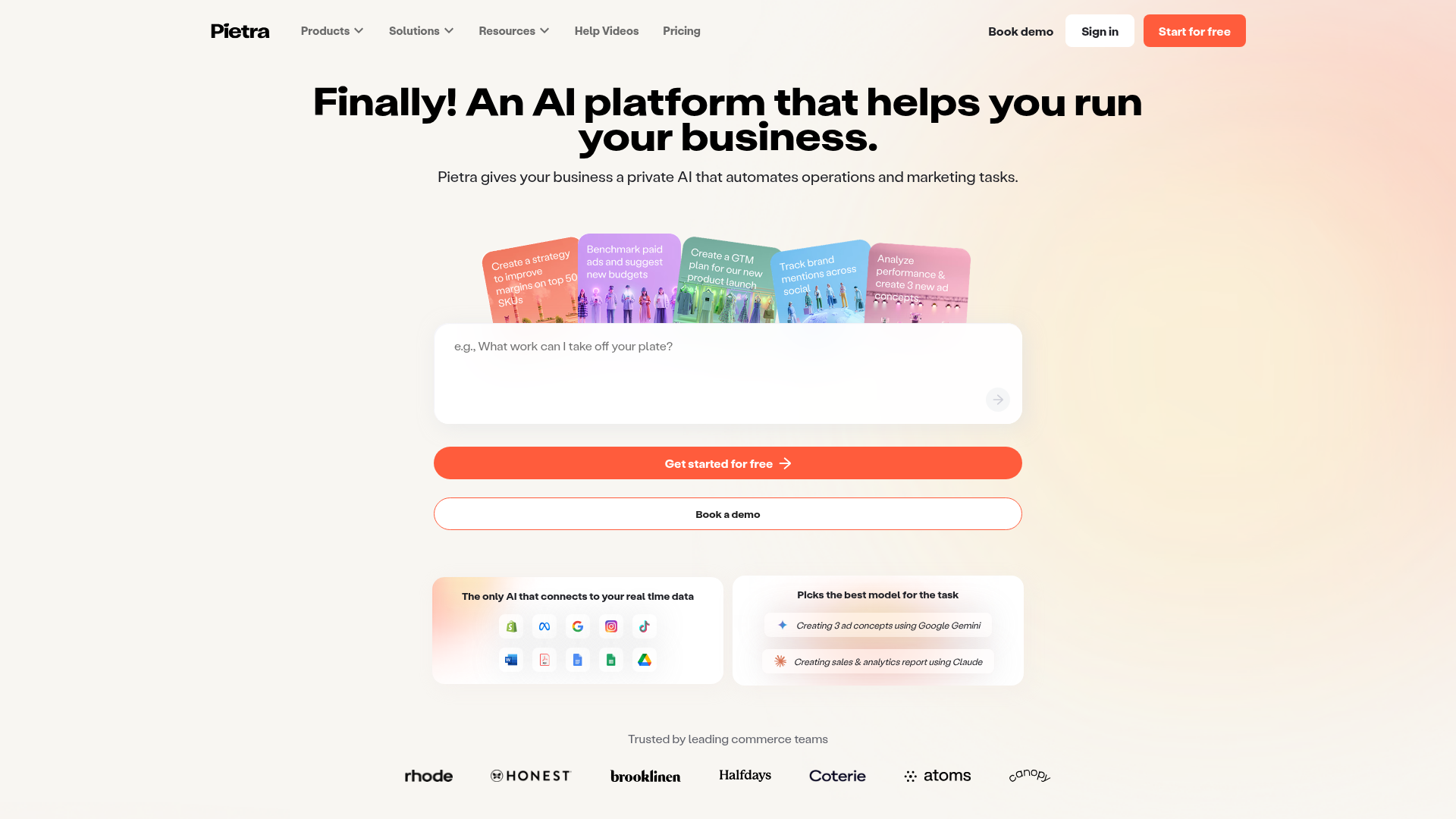
Pietra AI Platform Landing Page
A commerce-focused landing page featuring a centralized AI input hero, colorful floating value-prop cards, a bento-style integration showcase, and tabbed feature sections with side-by-side comparisons.
