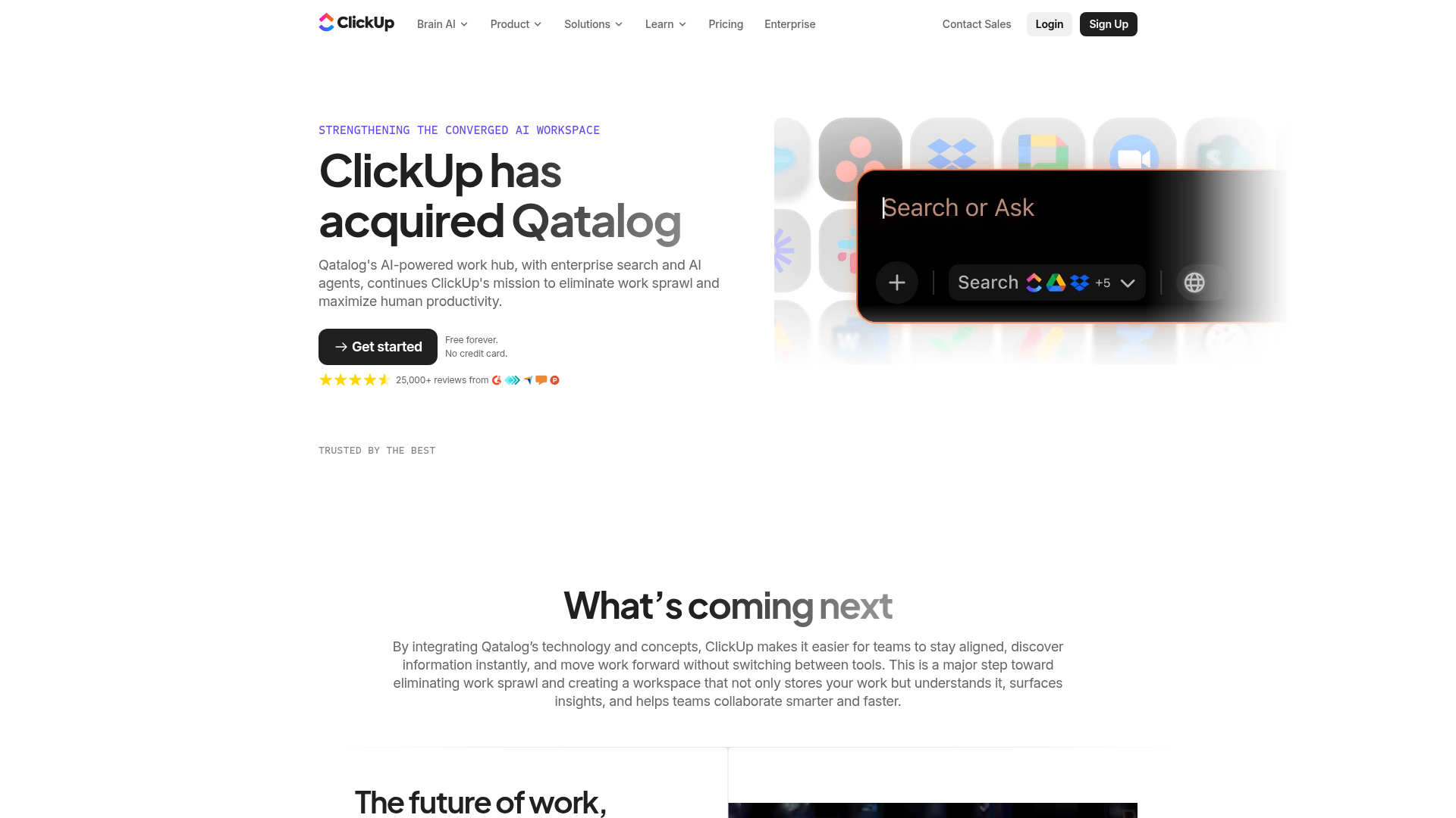
ClickUp Acquisition Hero Landing Page
Features a modern dark-themed hero section with a search UI graphic, bento-style feature grid, and a high-contrast CTA section with decorative gradients.
Overview
This landing page announces ClickUp's acquisition of Qatalog, serving as a high-intent transition page that blends news with product feature promotion. It is an excellent reference for cloning due to its sophisticated "AI-modern" aesthetic, leveraging dark-themed glassmorphism and clear visual hierarchies to communicate complex product integrations simply.
Design System
- Color Palette & Visual Hierarchy: The design uses a clean white background for the primary content, shifting to deep charcoal and black for the final CTA section. Accent colors include a signature purple-to-indigo gradient for the hero title and warm orange-red highlights within the integrated UI mockups. Hierarchy is established through large bold headings and a high-contrast "Get Started" button that stands out against the minimal surroundings.
- Typography: The system uses a clean sans-serif (likely a custom variation of Inter or similar) with a scale focused on readability. Major announcements use a
display-2xlweight, while eyebrows use acaption-regularmono-spaced style in all-caps to denote technical sophistication. - Page Structure:
- Two-Column Hero: Text content on the left, high-fidelity UI visual on the right.
- Social Proof: A "Trusted by the best" logo salad with monochrome logos.
- Impact Statement: A centered text section explaining the integration value.
- Feature Grid: A 2x2 "quadrant" layout describing specific AI features matched with a large media visual.
- Final CTA: A dark-themed "bento card" style section with decorative light leaks and gradients.
- Reusable Components:
- Primary CTA Button: The
button-largeclass features an arrow transition and high-contrast dark background. - The Quadrant Feature Grid: A versatile 2x2 layout perfect for technical product benefits.
- The Dark CTA Card: Uses
glow-vectorandwarm-vectorimage overlays with an SVG noise filter for a textured, premium look.
- Primary CTA Button: The
- Implementation Clues: The site is built using Next.js (
#___next) with highly modularized classes (e.g.,CuHeroV5_wrapper__1hWS5). It utilizes internal layout utilities likestack--v5Layoutfor consistent vertical spacing andCuTitle_gradientfor the text styling.
Use Cases
- Who should clone this pattern: B2B SaaS companies announcing major product updates, acquisitions, or pivoting toward AI-centric features.
- What products can remix it effectively: Productivity tools, developer platforms, or any software suite that needs to show how multiple disparate features have "converged" into a single workflow.
- Practical remix directions: Builders can reuse the hero section for a clean product launch page by swapping the acquisition text for a value proposition. The bento-style bottom CTA is highly effective for converting users on pricing or sign-up pages. The "quadrant" layout in the body is an ideal pattern for a "Features" section on a homepage.
- Suggested clone scope: A quick section clone of the bottom dark-themed CTA card is recommended for its high-impact visual style. A full-page clone is ideal for those needing a professional, enterprise-ready announcement template.
Related Inspirations
Stripe Modern SaaS Landing Page
A high-conversion landing page featuring a complex mesh-gradient hero, sticky navigation, and a horizontal logo wall for brand social proof.
GoCardless Payments Platform Landing Page
A dark-themed fintech landing page featuring a split-screen video hero, bento-style feature cards, a horizontal logo slider, and step-by-step accordion guides.
Beau Document Automation Landing Page
A modern software landing page featuring a bento-grid layout, split-screen hero assets with animated checkmarks, a step-by-step process guide, and a clean two-tier pricing table.
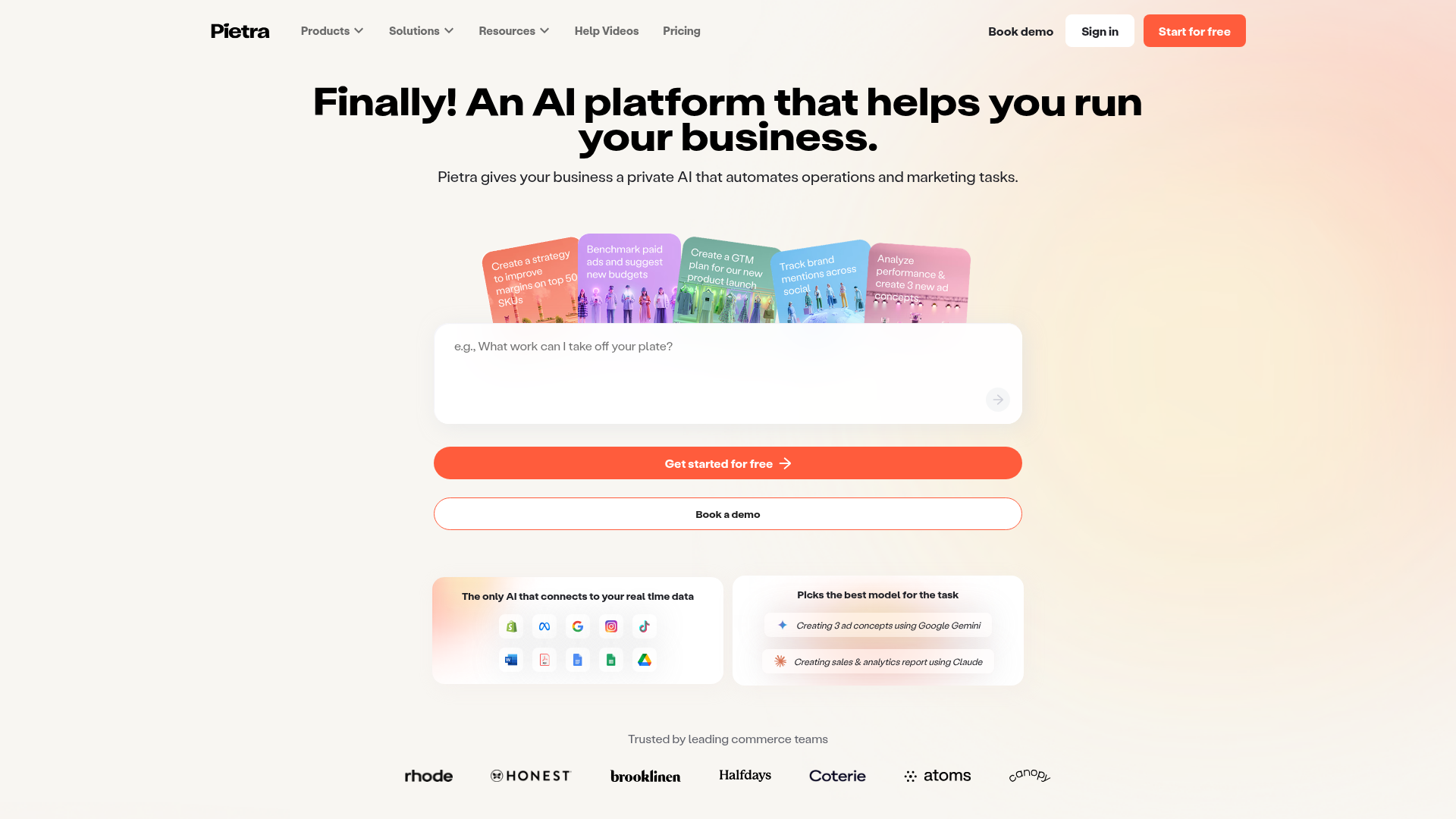
Pietra AI Platform Landing Page
A commerce-focused landing page featuring a centralized AI input hero, colorful floating value-prop cards, a bento-style integration showcase, and tabbed feature sections with side-by-side comparisons.
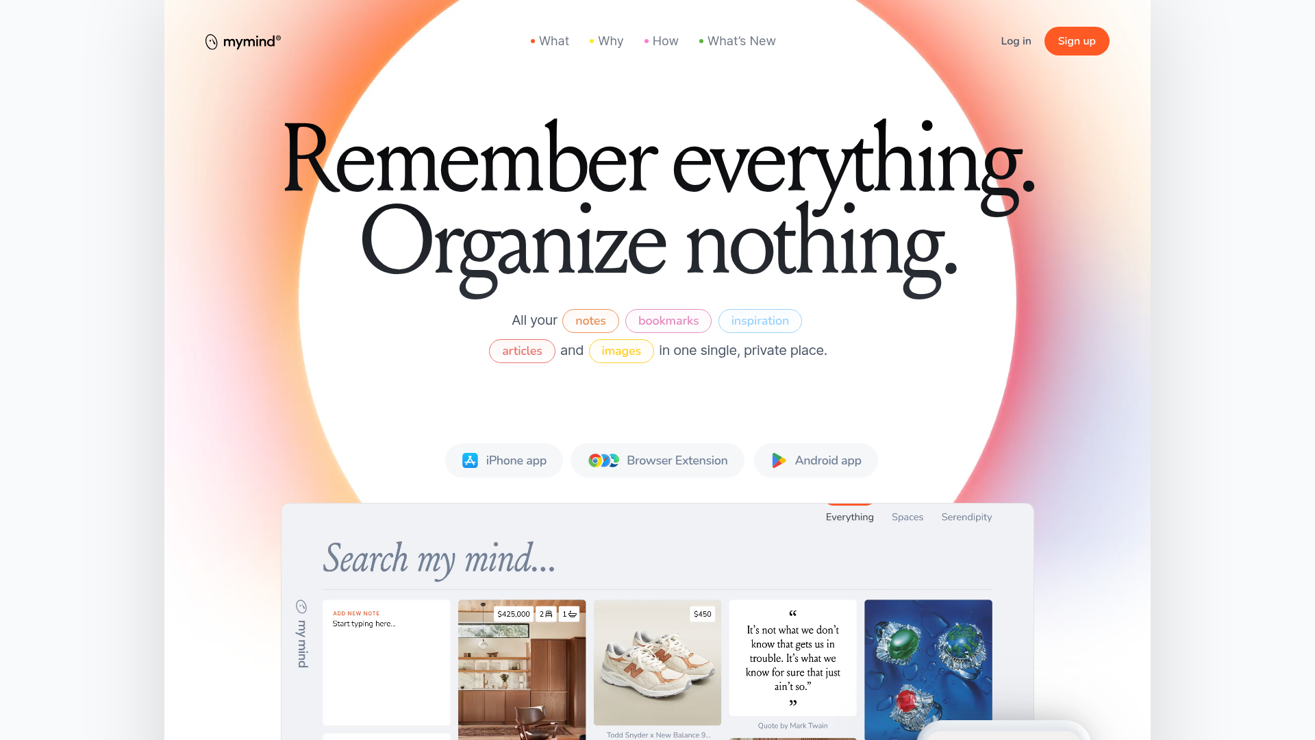
Mymind AI Tool Landing Page
A minimalist SaaS landing page featuring a soft-gradient hero section, custom pill-shaped text badges, and a dynamic bento-style search result preview grid.
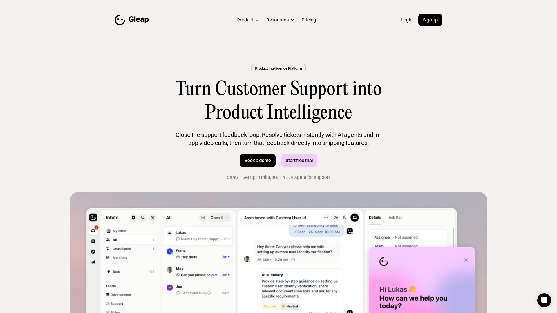
Gleap Product Intelligence Platform Landing
A SaaS template featuring a central video hero, comparison pricing tables, tabbed feature navigation, and a testimonial grid with major brand logos.
