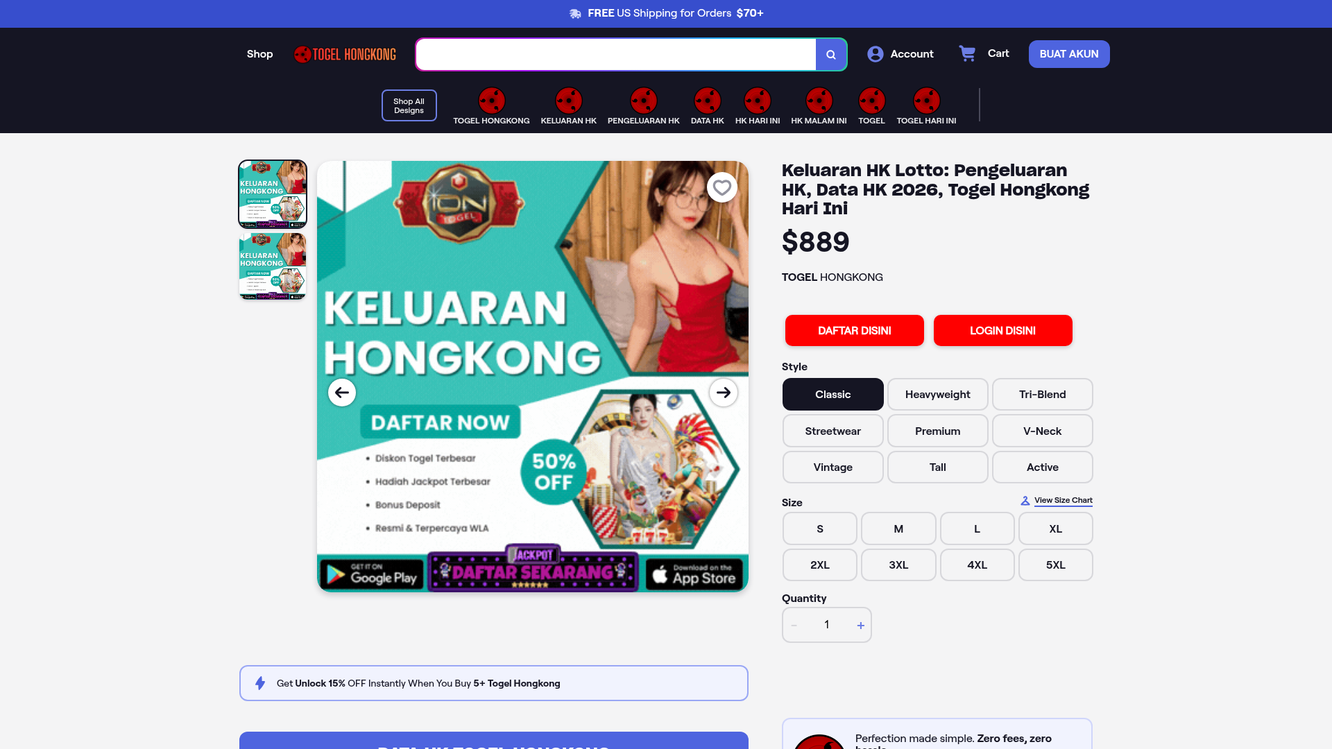
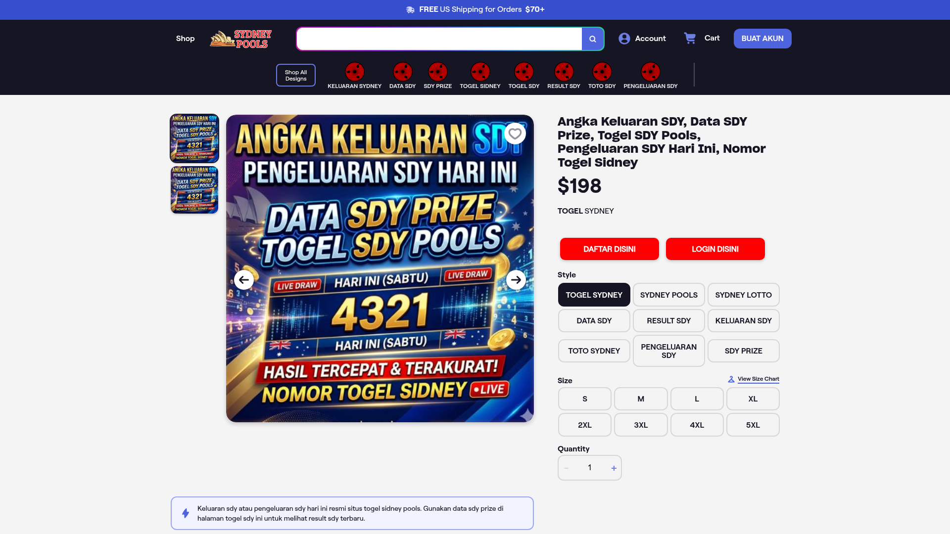
E-commerce Product Detail Page Layout
A comprehensive product page featuring a two-column layout with a multi-image gallery, interactive size/style selectors, tiered discounts, and integrated customer trust badges.
Overview
This e-commerce product detail page (PDP) layout is a robust reference for high-conversion retail interfaces. It effectively manages complex attribute selection (size, style, quantity) alongside high-visibility trust signals, tiered discount alerts, and a comprehensive information architecture including FAQs and customer service badges.
Design System
- Color Palette & Visual Hierarchy: The design uses a dark-themed naval blue header (
#1a1b2eapproximation) contrasted with a clean white content area. Primary actions use high-saturation red (#ff0000) and blue (#4a6cf7) to drive conversions. Secondary selectors utilize a neutral grayscale palette for clarity. - Typography: The system relies on a clean sans-serif stack (likely System UI or Roboto-based) with a strong weight scale. H1 headers use a condensed bold style, while interface labels (Size, Style) use a slightly lighter medium weight to differentiate from interactive values.
- Page Structure:
- Global 'Free Shipping' banner.
- Horizontal icon-based category navigation.
- Two-column product section (Gallery Left, Configuration Right).
- Sticky 'Unlock Discount' promotional banner.
- Trust clusters (Ratings, Satisfaction scores).
- SEO-rich content block with accordions and text-heavy quality descriptions.
- Multi-column footer with deep sitemap links.
- Reusable Components:
- Segmented Radio Selectors: Found in the 'Style' and 'Size' sections; excellent for touch-friendly attribute picking.
- Quantity Stepper: A clean horizontal counter with disabled states for minimum values.
- Trust Accordions: Minimalist collapsible sections used for FAQs.
- Tiered Badge Footer: A structured area for payment icons and security certifications.
- Interaction Patterns: The interface includes a multi-slide image gallery with thumbnail navigation and side arrows. Buttons and selectors use subtle background-color transitions on hover. The 'View Size Chart' link triggers a contextual overlay.
- Implementation Clues: The HTML reveals a modular approach using utility classes and the Stimulus.js controller pattern (evident from
data-controller="utilities--tab"). The gallery is powered by theglide.jslibrary.
Use Cases
- Who should clone this: Developers building apparel stores, customizable merchandise platforms, or any high-SKU retail site requiring granular attribute selection.
- Effective Remixes: This pattern is ideal for switching to a luxury brand by increasing whitespace and shifting to serif typography, or for a tech-focused site by adopting a dark-mode content area and neon accent colors.
- Remix Directions: Replace the gambling-themed content with technical specifications for hardware or ingredients for beauty products. The 'Style' grid can be repurposed for color swatches or material types.
- Clone Scope: For a fast win, clone the configuration column (right side) and the trust-building footer components. A full-page clone is recommended for high-volume catalogs that need to move users through the funnel quickly using established UX patterns.
Related Inspirations
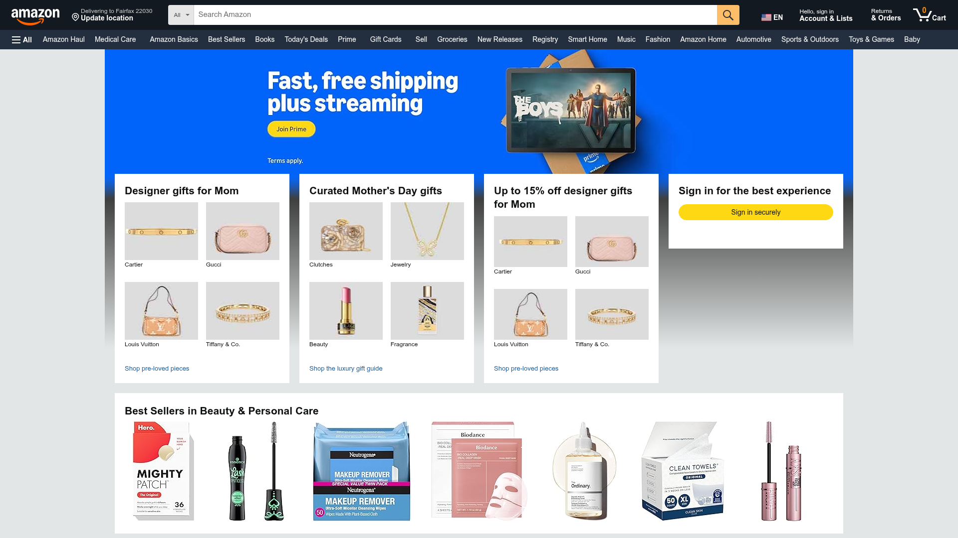
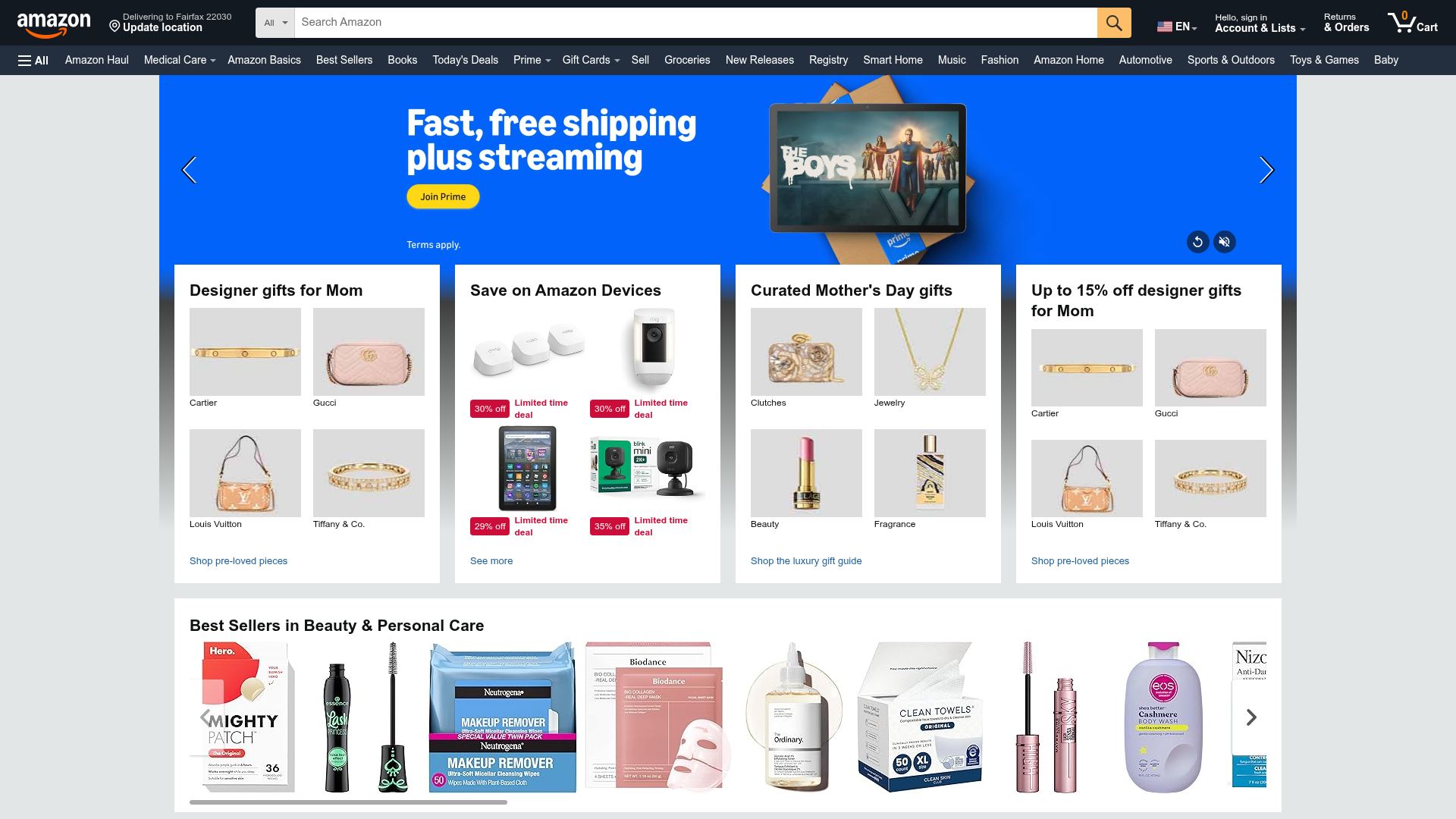
Amazon Marketplace E-commerce Homepage
A complex dashboard layout featuring a carousel hero banner, multi-column bento grids for categorized promotions, and a horizontal product recommendation slider.
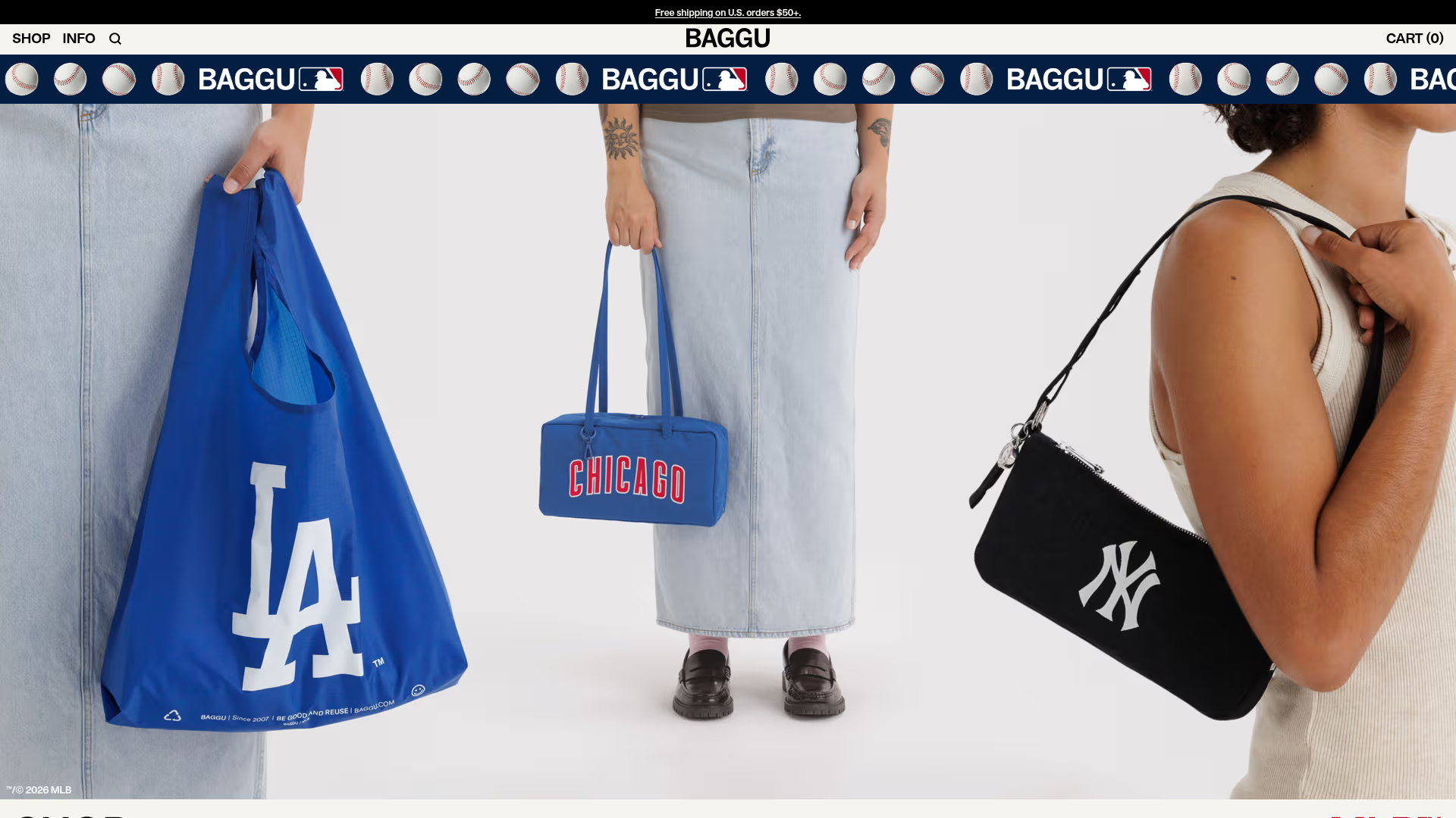
BAGGU Minimalist E-commerce Hero Template
A clean retail landing page layout featuring a full-width high-impact hero section, a sticky integrated banner, and a minimalist navigation header optimized for product launches.
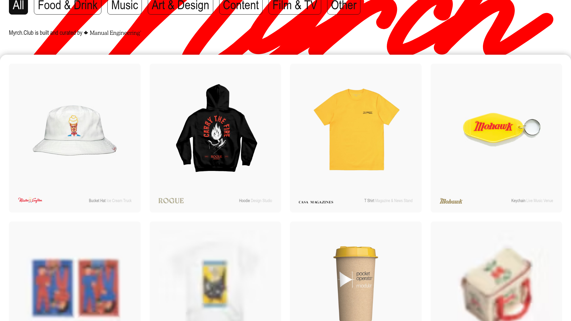
Myrch Club Merch Portfolio Gallery
A minimalist product display grid featuring category filtering buttons, clean hover-state cards, and a large-scale decorative background typography header.
E-Commerce Product Detail Page Template
A feature-rich retail layout featuring a multi-image carousel, customizable product options with size/style selectors, tiered pricing displays, and an accordion-style FAQ section.
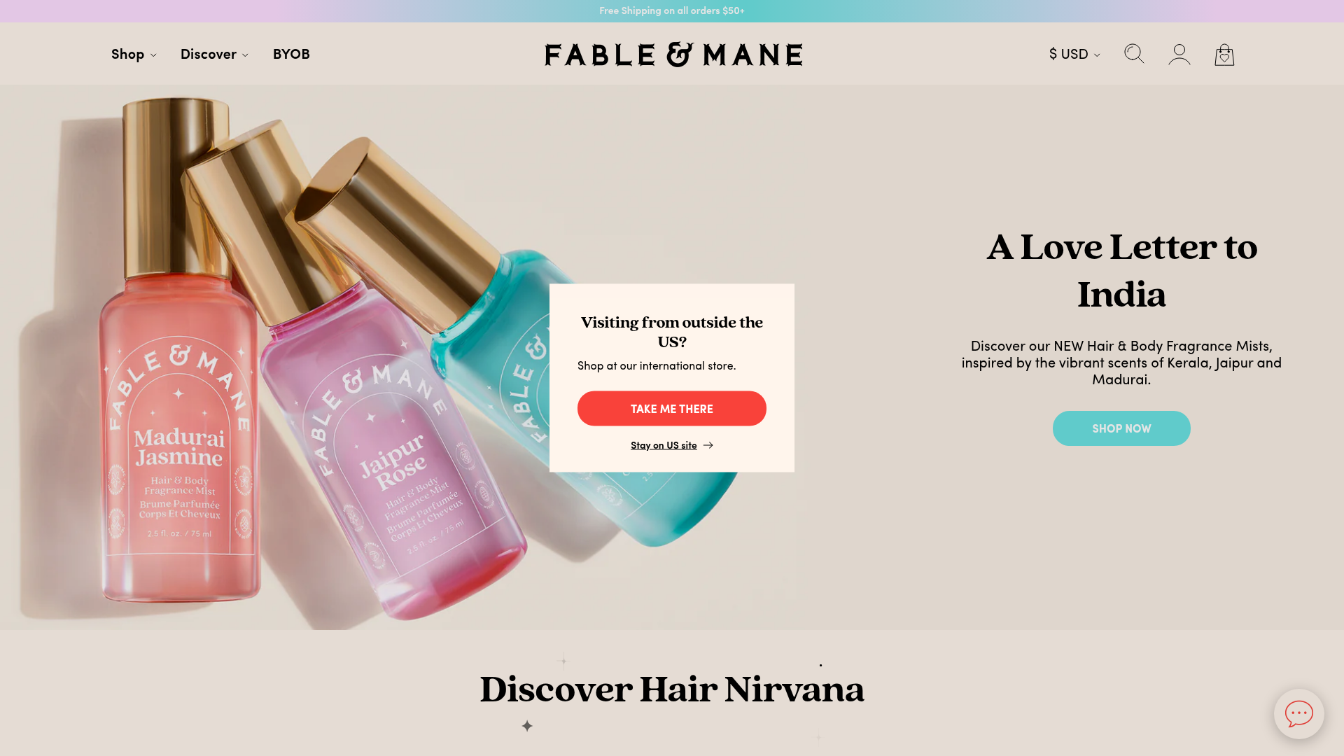
Fable & Mane Beauty Storefront
A clean e-commerce layout featuring a high-impact hero slider with localized entry popups and a product carousel with hover-triggered secondary images.
Amazon E-commerce Gateway Page
A dense retail layout featuring a video-enabled herotator, a quad-image bento grid for categories, and a horizontal product carousel for best sellers.
