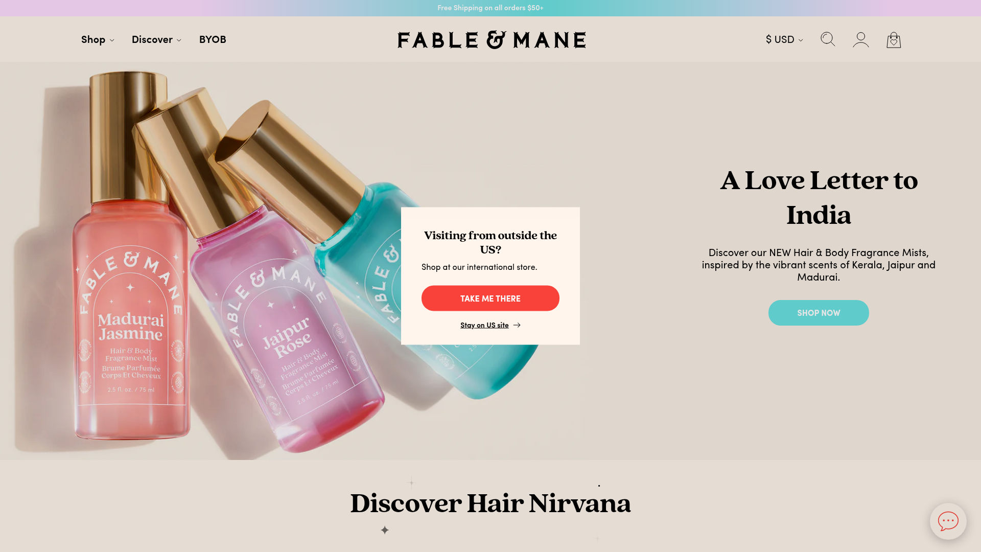
Fable & Mane Beauty Storefront
A clean e-commerce layout featuring a high-impact hero slider with localized entry popups and a product carousel with hover-triggered secondary images.
Overview
Fable & Mane is a premium e-commerce storefront for beauty products, utilizing a sophisticated layout that balances high-impact lifestyle photography with a minimal, product-focused design system. It is an excellent clone reference for its clean integration of localized modals, a seamless hero-to-carousel transition, and a clear visual hierarchy that emphasizes brand storytelling alongside conversion.
Design System
- Color Palette & Visual Hierarchy: The site uses a soft, neutral cream background (
#F4F1E9vibe) to make vibrant product packaging (pinks, oranges, cyans) pop. Call-to-action buttons use high-contrast colors like coral red (#FF4B3E) for redirect prompts and a soft teal for the main shop buttons, ensuring clear navigation paths. - Typography: The typography features a bold, high-contrast serif for headings (e.g., "A Love Letter to India") to convey a luxury feel, paired with a clean, accessible sans-serif for body text, price points, and button labels. Hierarchy is established through extreme font weight differences and tracking.
- Page Structure: The layout flows from a full-width promotional bar into a transparent-header hero section, followed immediately by a "Hair Nirvana" product carousel. This prioritized flow moves users from brand inspiration directly into the product catalog.
- Reusable Components:
- Localized Modal: A centered popup for site redirection with a primary coral button and secondary text link.
- Product Cards: A robust card system featuring secondary image hovers (revealing packaging boxes or lifestyle shots), star ratings, and "Add to Bag" buttons with outline styling.
- Promobar: A multi-message gradient bar at the very top for shipping alerts.
- Interactions: The product carousel uses a custom scrollbar and swipe functionality. The product cards features a
collection-item__secondary-imageclass that replaces the primary image on hover, providing a dynamic preview without extra clicks. - Technical Implementation: The HTML reveals a Shopify-based structure using a
swiper-containerfor both the hero and product carousels. Responsive images utilize<picture>tags with multiple source sets to ensure high performance across device sizes.
Use Cases
- Target Audience: Mid-to-high-end DTC brands in the beauty, skincare, or wellness space that need to balance editorial content with high conversion rates.
- Effective Remixes: Brands with strong visual assets can swap the cream background for brand-specific tones while maintaining the serif/sans-serif typography pairing. The localized redirect modal is a perfect pattern for businesses expanding into international markets.
- Remix Directions: Adapt the product carousel to include "Quick View" functionality or toggle between color variants. The hero section can be modified from a single image to a video background for a more immersive experience.
- Clone Scope: A full-page clone is recommended for the header and hero transition. For a lighter effort, the product card component with its hover-state image swap is highly reusable for any collection page.
Related Inspirations
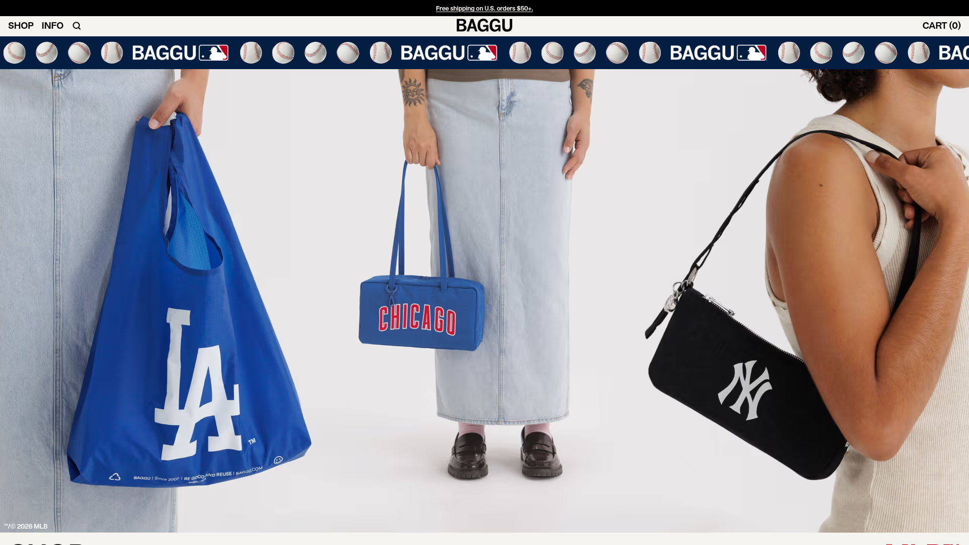
BAGGU Minimalist E-commerce Hero Template
A clean retail landing page layout featuring a full-width high-impact hero section, a sticky integrated banner, and a minimalist navigation header optimized for product launches.

Context Gallery High-End Furniture Landing Page
A minimal editorial layout featuring a multi-column product carousel, designer biographies with image-text pairings, and a magazine-style content grid for curated design stories.

Glein Minimalistic Bento Grid eCommerce
A clean, modular layout using a bento-style responsive grid of text teasers and large-scale product imagery for lookbooks and collection browsing.

Isla Beauty Skincare E-commerce Store
A clean Shopify-based storefront featuring a split-hero landing page, a step-by-step product system carousel, and a split-screen testimonial section with localized product image sidebars.

Stojo Collapsible E-commerce Storefront
A Shopify layout featuring a prominent discount modal, mosaic grid hero sections, and clean product cards with integrated color swatches and quick-buy functionality.

Basic.Space E-commerce Gallery Clone
A minimalist product marketplace featuring a clean sticky navigation bar, nested flyout menus, and a horizontally scrollable product carousel with hover-state image switching.
