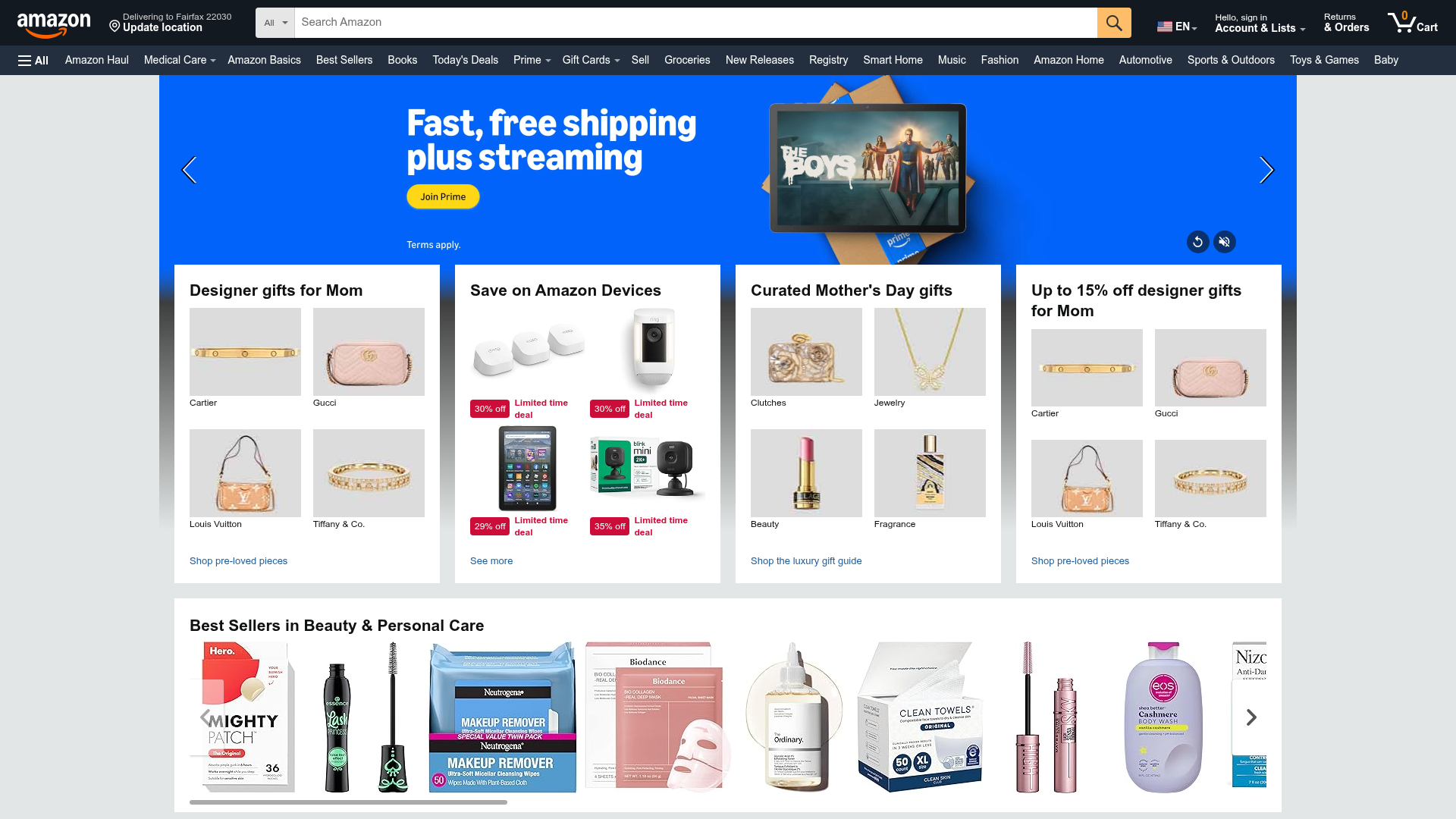
Amazon E-commerce Gateway Page
A dense retail layout featuring a video-enabled herotator, a quad-image bento grid for categories, and a horizontal product carousel for best sellers.
Overview
This website is a classic high-density e-commerce gateway designed to maximize product discovery and promotional conversion through a tiered content hierarchy. It serves as a premier reference for cloning complex retail layouts that need to balance atmospheric brand video with granular, logic-driven product grids and carousels.
Design System
- Color Palette and Visual Hierarchy: The system uses a high-contrast 'Amazon' palette: white (#FFFFFF) backgrounds for content cards to pop against a light gray (#EAEDED) page background. A vibrant blue (#007185) is used for links, while a signature yellow (#FFD814) is reserved for primary Call-to-Action buttons (e.g., 'Join Prime') to drive immediate attention. Urgent status indicators like 'Limited time deal' use a bold red (#CC0C39).
- Typography System: The interface relies on a clean sans-serif stack focused on legibility. Hierarchy is established through weight and scale: large bold headlines for hero offers, medium bold (approx. 21px) for card titles, and small (approx. 12-14px) muted gray text for secondary labels and footers.
- Page Structure and Section Flow: The layout follows a vertical-to-horizontal flow. It starts with a full-width 'Tall Hero' video rotator that bleeds into the background. This is immediately followed by a 'Bento Grid' of quad-image category cards that overlap the hero transition. The bottom section features a 'Best Sellers' horizontal overflow carousel for high-density SKUs.
- Reusable Components:
- Quad-Image Bento Cards: A 2x2 grid container with a title and footer link, ideal for categorical navigation.
- Video Herotator: A complex carousel supporting auto-playing mp4 assets with localized overlay text and navigation arrows.
- Product Shoveler (Carousel): A horizontal scroll component with lazy-loading images and 'Previous/Next' edge controls.
- Interaction and Motion Patterns: The herotator uses a circular slide transition with a 4000ms delay. Product cards exhibit subtle hover states (deepening shadows or underlining text). The 'Best Sellers' carousel includes a visible progress bar at the bottom to indicate scroll depth.
- Implementation Clues: The HTML reveals a custom layout engine (
gw-card-layout) utilizing data attributes likedata-grid-breakpoint="ws"anddata-flow-dir="h"to manage responsive column spans. It uses a BEM-like naming convention for internal styles (e.g.,_Zmx1a_fluidQuadImageLabel).
Use Cases
- Who should clone this pattern: Developers building large-scale retail marketplaces, digital storefronts with diverse product categories, or subscription service landing pages requiring a mix of media and quick-links.
- Effective Remixes: A boutique fashion brand could swap the dense white cards for dark-themed, minimal borderless grids. A SaaS platform could use the quad-image card pattern to display different tool feature sets or pricing tiers.
- Practical Remix Directions: Retain the quad-image grid for 'Top Categories' but replace the video hero with a static high-resolution lifestyle image for faster load times. Reuse the best-seller carousel exclusively for 'Related Products' on individual item pages.
- Suggested Clone Scope: Start with a section clone of the Quad-Image Card (Bento Grid), as it is the most versatile component for organizing navigation. A full-page clone is recommended only for high-inventory businesses requiring complex layout logic.
Related Inspirations
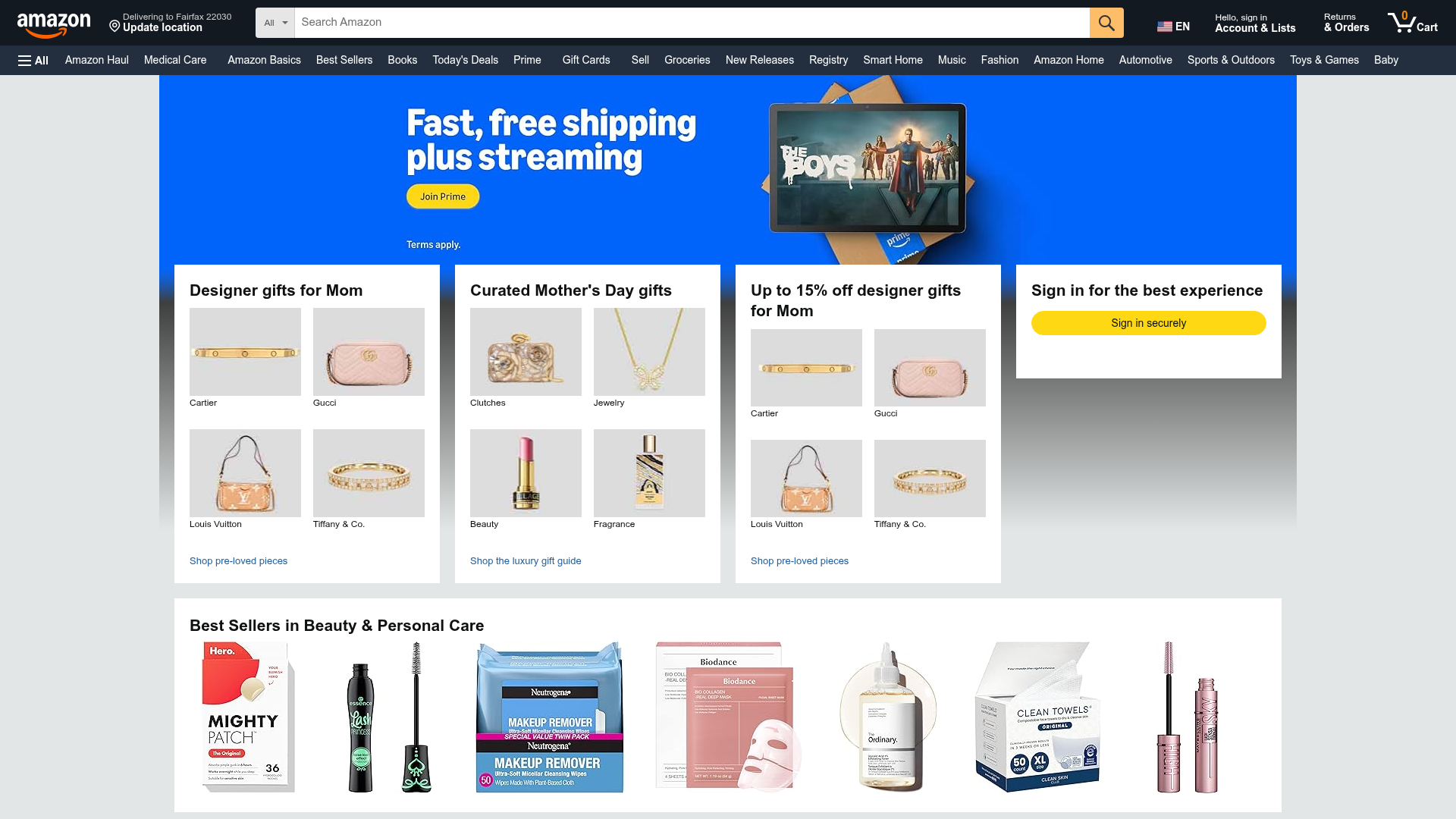
Amazon Marketplace E-commerce Homepage
A complex dashboard layout featuring a carousel hero banner, multi-column bento grids for categorized promotions, and a horizontal product recommendation slider.
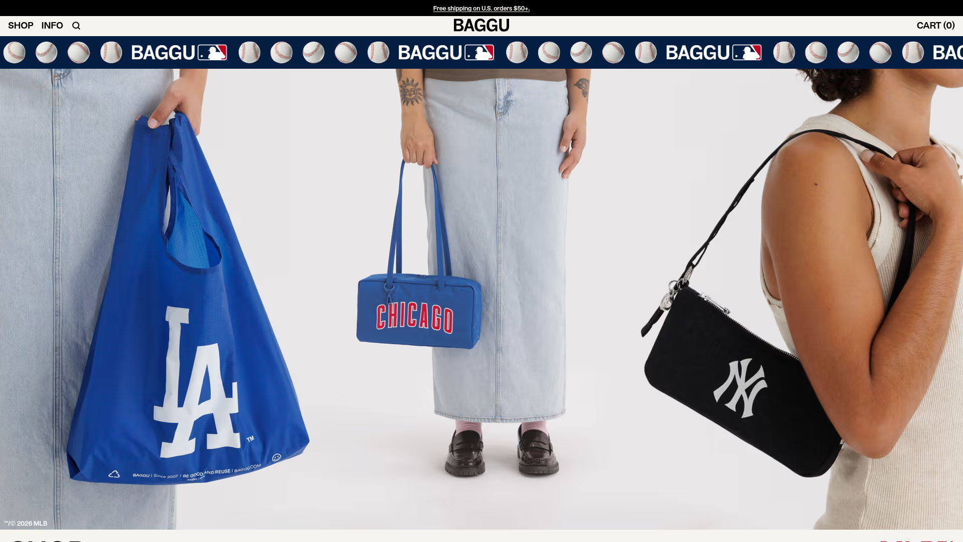
BAGGU Minimalist E-commerce Hero Template
A clean retail landing page layout featuring a full-width high-impact hero section, a sticky integrated banner, and a minimalist navigation header optimized for product launches.
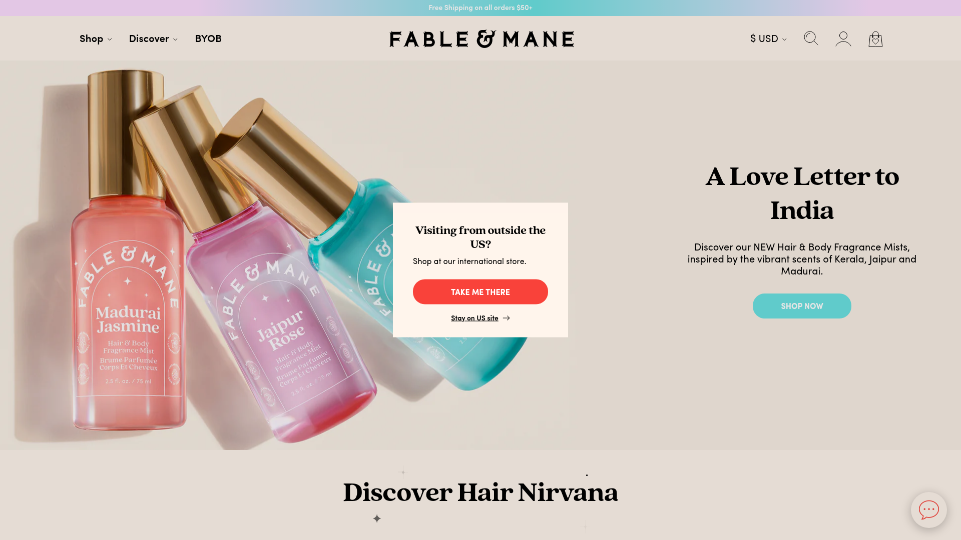
Fable & Mane Beauty Storefront
A clean e-commerce layout featuring a high-impact hero slider with localized entry popups and a product carousel with hover-triggered secondary images.

Context Gallery High-End Furniture Landing Page
A minimal editorial layout featuring a multi-column product carousel, designer biographies with image-text pairings, and a magazine-style content grid for curated design stories.

Glein Minimalistic Bento Grid eCommerce
A clean, modular layout using a bento-style responsive grid of text teasers and large-scale product imagery for lookbooks and collection browsing.

Isla Beauty Skincare E-commerce Store
A clean Shopify-based storefront featuring a split-hero landing page, a step-by-step product system carousel, and a split-screen testimonial section with localized product image sidebars.
