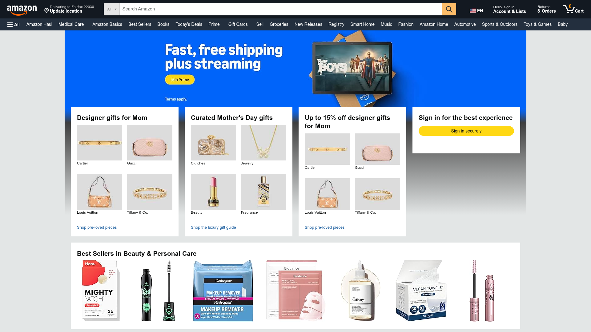
Amazon Marketplace E-commerce Homepage
A complex dashboard layout featuring a carousel hero banner, multi-column bento grids for categorized promotions, and a horizontal product recommendation slider.
Overview
This website is a prime example of a data-dense, multi-category e-commerce marketplace homepage designed to maximize conversion and engagement. It utilizes a grid-based dashboard approach to surface diverse product departments, seasonal promotions, and personalized user account actions simultaneously. As a clone reference, it demonstrates high-level information architecture for sites managing large product catalogs.
Design System
- Color Palette & Visual Hierarchy: The design uses a signature #232f3e dark navy for the global header and a neutral #e3e6e6 light gray background to create physical separation between white content cards. A vibrant #FFD814 (primary yellow) is reserved for high-priority CTA buttons, creating an immediate focal point against the muted surroundings.
- Typography System: The system relies on a clean sans-serif stack (Amazon Ember/Arial) with a strict scale. Headings use strong weights at approximately 21px for card titles, while product labels utilize 12-14px sizes to maintain legibility in compressed 2x2 grids.
- Page Structure & Section Flow: The layout follows a top-down hierarchy: Global Nav Bar > Full-bleed Video/Image Hero Slider > Multi-column Bento Grid (ATF promos) > Horizontal Productivity Strips (Best Sellers/Recommendations).
- Reusable Components:
- Bento Grid Cards: White containers with defined headers and a 2x2 internal product image layout.
- Product Shoveler: A horizontal scrollable row with integrated navigation buttons for category browsing.
- Sign-in Widget: A high-impact sidebar block for user authentication.
- Interaction & Motion: The hero involves a
slideCircularanimation (6000ms speed based on HTML data-attributes). Hover states on grid images include subtle opacity or border changes to indicate clickability. - Responsive Behavior: The HTML indicates a flex-based grid using classes like
gw-colandgw-card-layout, which adapt from 4 columns on wide screens down to single-column stacking for mobile devices. - Implementation Clues: The structure uses a proprietary widget system (
celwidget) and utility classes for spacing (a-spacing-none,a-section). It relies heavily on image-based promotion combined with metadata attributes for tracking.
Use Cases
- Who should clone this pattern: Developers building multi-vendor marketplaces, comprehensive affiliate portals, or large-scale retail dashboards.
- What products can remix it effectively: Electronics stores, subscription box services, or digital content platforms (e.g., streaming services) that need to categorize vastly different offerings on one landing page.
- Practical remix directions:
- Brand Swap: Replace the technical navy and yellow with a boutique aesthetic (e.g., pastel colors, serif fonts) while keeping the efficient bento grid structure.
- Information Pivot: Use the 2x2 grid cards for "Latest Blog Posts" or "Top Services" instead of specific products.
- Modular Approach: Extract only the horizontal "Best Sellers" slider as an add-on for a more minimalist landing page.
- Suggested Clone Scope: A full-page clone is best for studying complex layout management, while a section clone focusing on the 4-column promo grid is ideal for quick UI pattern reuse.
Related Inspirations
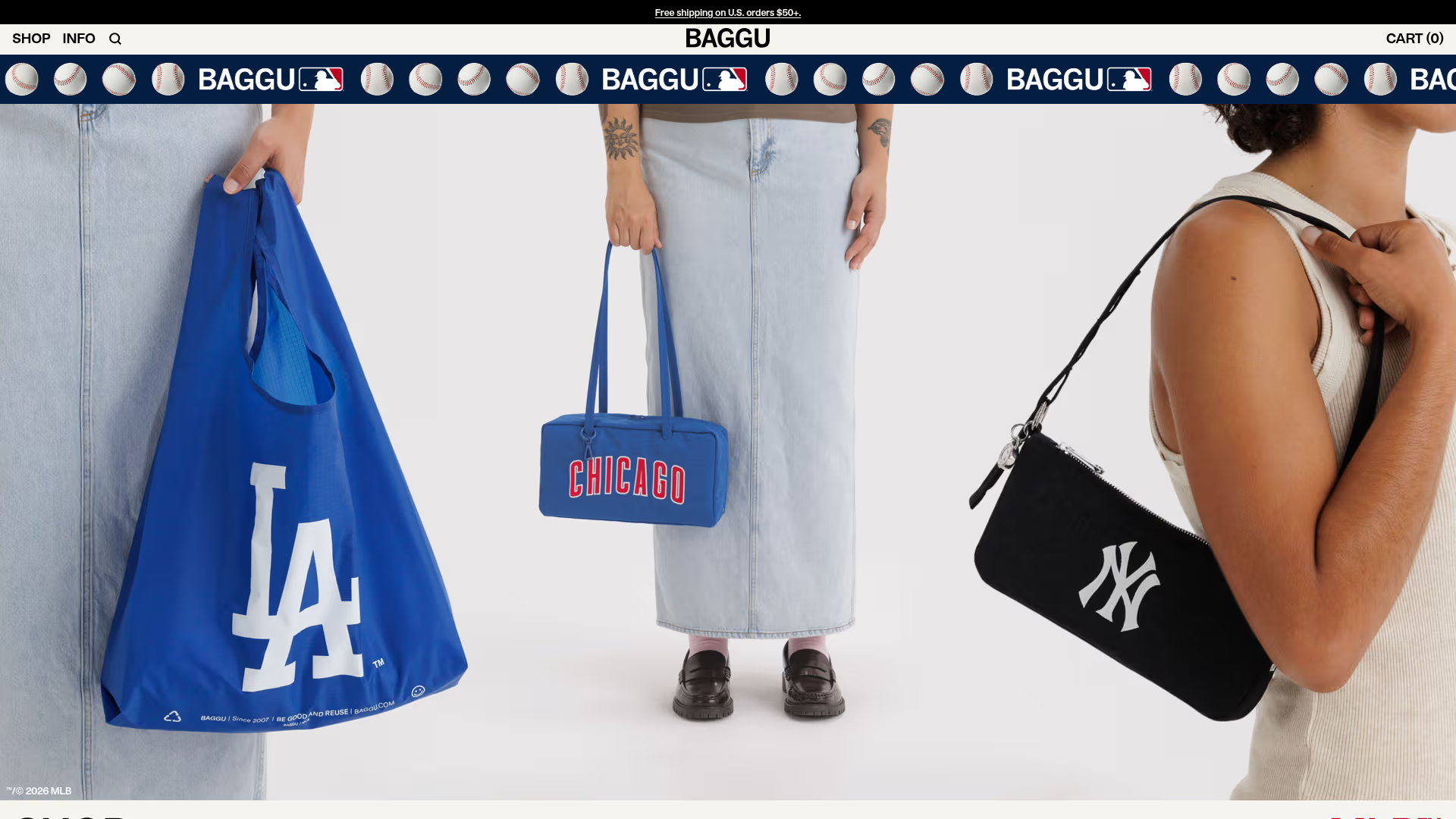
BAGGU Minimalist E-commerce Hero Template
A clean retail landing page layout featuring a full-width high-impact hero section, a sticky integrated banner, and a minimalist navigation header optimized for product launches.
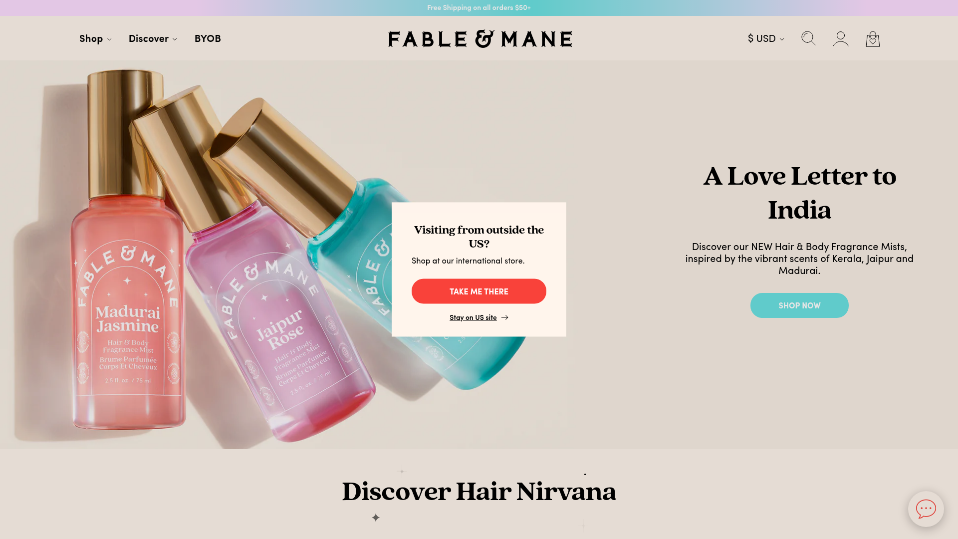
Fable & Mane Beauty Storefront
A clean e-commerce layout featuring a high-impact hero slider with localized entry popups and a product carousel with hover-triggered secondary images.
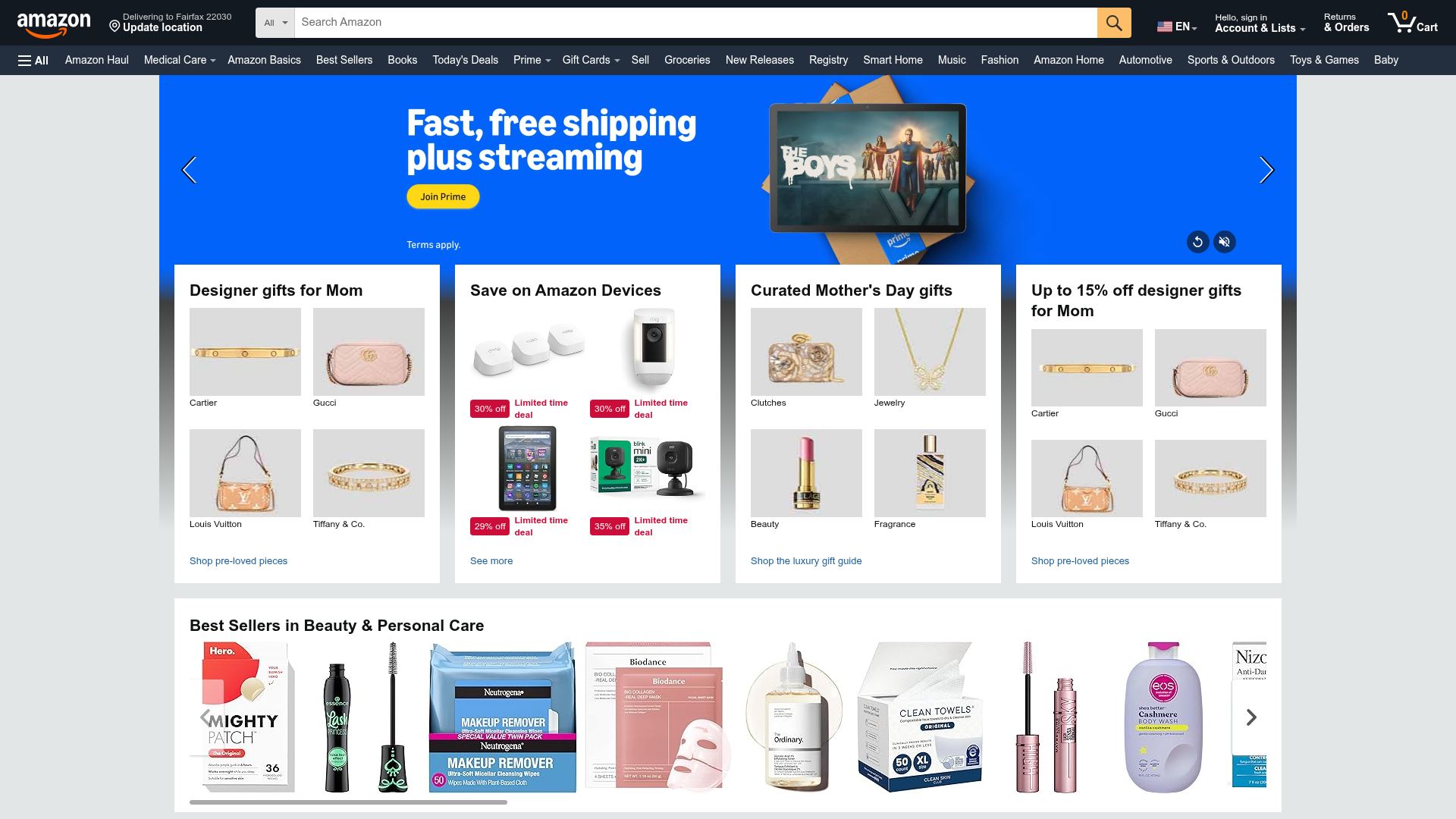
Amazon E-commerce Gateway Page
A dense retail layout featuring a video-enabled herotator, a quad-image bento grid for categories, and a horizontal product carousel for best sellers.

Context Gallery High-End Furniture Landing Page
A minimal editorial layout featuring a multi-column product carousel, designer biographies with image-text pairings, and a magazine-style content grid for curated design stories.

Glein Minimalistic Bento Grid eCommerce
A clean, modular layout using a bento-style responsive grid of text teasers and large-scale product imagery for lookbooks and collection browsing.

Isla Beauty Skincare E-commerce Store
A clean Shopify-based storefront featuring a split-hero landing page, a step-by-step product system carousel, and a split-screen testimonial section with localized product image sidebars.
