Lazy.so Application Error Page
A minimal, centered error page layout suitable for displaying client-side exception messages and fallback states in Next.js applications.
Overview
This page represents a clean, functional application error state commonly found in Next.js applications during a runtime crash. It is a valuable reference for builders looking to implement a minimalist, centralized fallback UI that maintains professional integrity even when a system failure occurs.
Design System
- Color Palette & Visual Hierarchy: The design is monochromatic and high-contrast, utilizing a clean white background with black text. The visual hierarchy is extremely flat, focusing the user's entire attention on a single, centered string of information.
- Typography: The system utilizes a native sans-serif stack (
-apple-system,BlinkMacSystemFont,Roboto,Segoe UI, etc.) to ensure the message remains readable even if external font assets fail to load. The text size is small (14px) with a normal font weight, suggesting a technical notification rather than a consumer-facing marketing message. - Page Structure: The layout uses a 100vh flexbox container with
align-items: centerandjustify-content: center. This ensures the error message is perfectly middle-aligned regardless of screen resolution. - Reusable Components: The core component to clone is the global error wrapper—a robust, vertical-centering utility that can be used for loading states, maintenance modes, or 404 pages.
- Implementation Clues: The HTML confirms a Next.js implementation using inline styles for layout and a
next-route-announcerfor accessibility. This is a standard "Error Boundary" visualization.
Use Cases
- Who should clone this: Developers building SaaS dashboards or internal tools who need a "failsafe" UI that looks intentional rather than broken.
- Effective Remixes: This pattern can be effectively remixed into a "Coming Soon" splash, a maintenance mode notification, or a simplified login gate.
- Remix Directions: Replace the technical error text with a brand-aligned message, add a single "Back to Home" button, or include a small illustrative SVG above the text to soften the user experience.
- Suggested Scope: Quick section clone. Reuse the flexbox centering logic and the native font stack to create a reliable global error boundary component.
Related Inspirations
Google Holiday 100 Curator Landing Page
A minimalist e-commerce showcase featuring a wide hero section, clean search integration, and a bold typography-driven header designed for trending product collections.

Finn Pet Supplements Landing Page
An e-commerce landing page featuring high-contrast typography, a sticky brand logo banner, parallax scroll effects on product headers, and a clean product grid.
Playspace Acquisition Announcement Minimalist Layout
A clean, center-aligned announcement template featuring a vertical stack of rich text content and linked text elements on a neutral background.
Oku Minimalist Book Tracking Landing Page
A clean, typography-focused landing page featuring a minimalist header, illustrated hero section, and clear call-to-action buttons for app downloads.
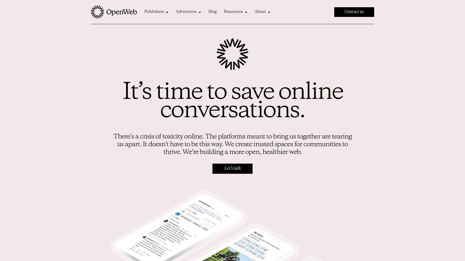
OpenWeb B2B Service Landing Page
A professional landing page layout featuring a central animated hero area, data visualization counters, a client logo grid, testimonial slider, and tabbed lead generation forms.

Slite SaaS Knowledge Base Landing Page
A clean SaaS hero section with a conversational headline, secondary call-to-action buttons, and a structured software interface preview featuring user testimonials.
