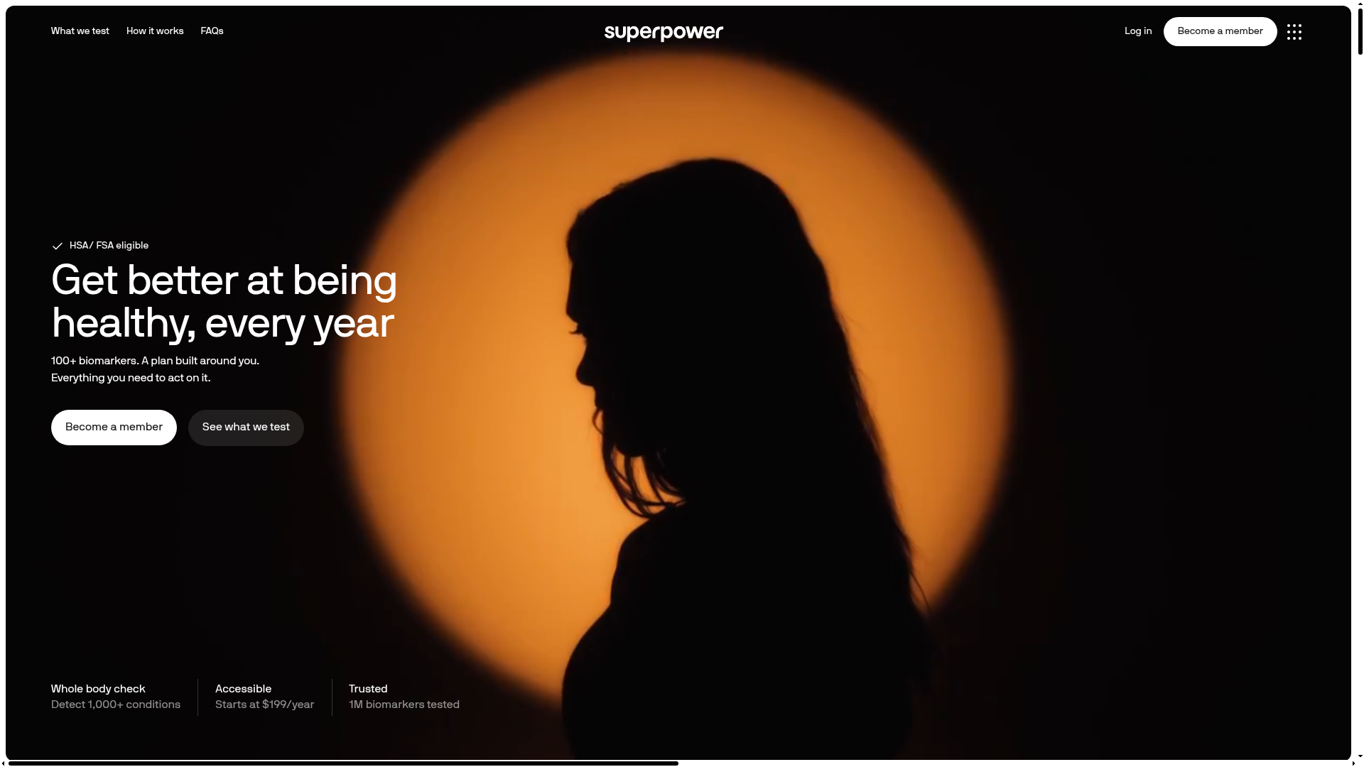
Superpower Health Tech Hero Page
A high-impact landing page featuring a dark theme with a centered silhouette hero image, minimalist navigation, and clean typography for service descriptions.
Overview
Superpower is a modern health-tech landing page that utilizes a high-contrast dark mode aesthetic to establish a premium, professional presence. It is a strong remix reference because of its mastery of negative space, elegant typography treatment, and the way it balances clinical information with a lifestyle-focused visual narrative.
Design System
- Color Palette & Visual Hierarchy: The palette is dominated by deep blacks and dark grays, punctuated by a large, warm amber/orange circular highlight that serves as a backdrop for a silhouette. Navigation and secondary buttons use semi-transparent white/gray overlays to maintain a minimalist look.
- Typography System: The site uses a clean, sans-serif typeface (likely a variant of Inter or a custom grotesk). The primary headline uses a medium-weight font with tight leading, while the sub-headlines and body text use a significantly smaller, lighter scale to create clear information hierarchy.
- Page Structure & Section Flow: The layout follows a classic hero pattern: top navigation bar, center-left headline and CTA block, a centerpiece visual, and a bottom row of 'trust' signals or feature highlights (Whole body check, Accessible, Trusted).
- Reusable Components:
- Pill Buttons: A stark white primary CTA button with rounded corners and a ghost-style secondary button with a subtle dark background.
- Minimalist Nav: A sleek top bar with low-contrast links and a high-visibility 'Become a member' button.
- Feature Footers: Bottom-aligned informational columns that use a bold weight for titles and a light weight for supporting metrics.
- Interaction Patterns: The design suggests a static, high-resolution hero with discrete hover states on the CTA buttons that likely toggle opacity or background color. The layout is optimized for high-impact visual first impression.
- Implementation Clues: Based on the layout, the page is likely built using structural flexbox or grid to align the bottom feature row and the split-content in the hero container.
Use Cases
- Who should clone this pattern: SaaS startups in the health, longevity, or premium wellness space seeking a "dark mode" aesthetic that feels professional rather than "gamer."
- Remix Directions: Swap the amber light for a brand-relevant color (e.g., medical blue or biotech green). The silhouette technique can be remixed by placing product hardware or a 3D glassmorphic icon within the glowing circle.
- Practical Adaptations: This layout is ideal for products with high technical complexity that want to lead with a simple value proposition. The bottom feature row is perfect for displaying "as seen in" logos or key performance metrics.
- Suggested Clone Scope: The top hero section alone is worth cloning for its layout architecture. Builders should focus on the typographic spacing and the pill-button component library for a quick, effective UI lift.
Related Inspirations
Tilt Financial Services Landing Page
A high-contrast dark mode fintech site featuring an absolute-positioned image collage hero, horizontal scrolling product panels, and bento-style application benefits.
Design Full-Time Course Landing Page
A dark-themed educational site featuring a promotional banner, vertically stacked course cards with gradient borders, a video lesson grid, and integrated pricing buttons.
Bou Brand Agency Hero Landing
A minimalist full-screen video background hero section with a centered typography overlay, subtle navigation bar, and integrated location-based contact buttons.
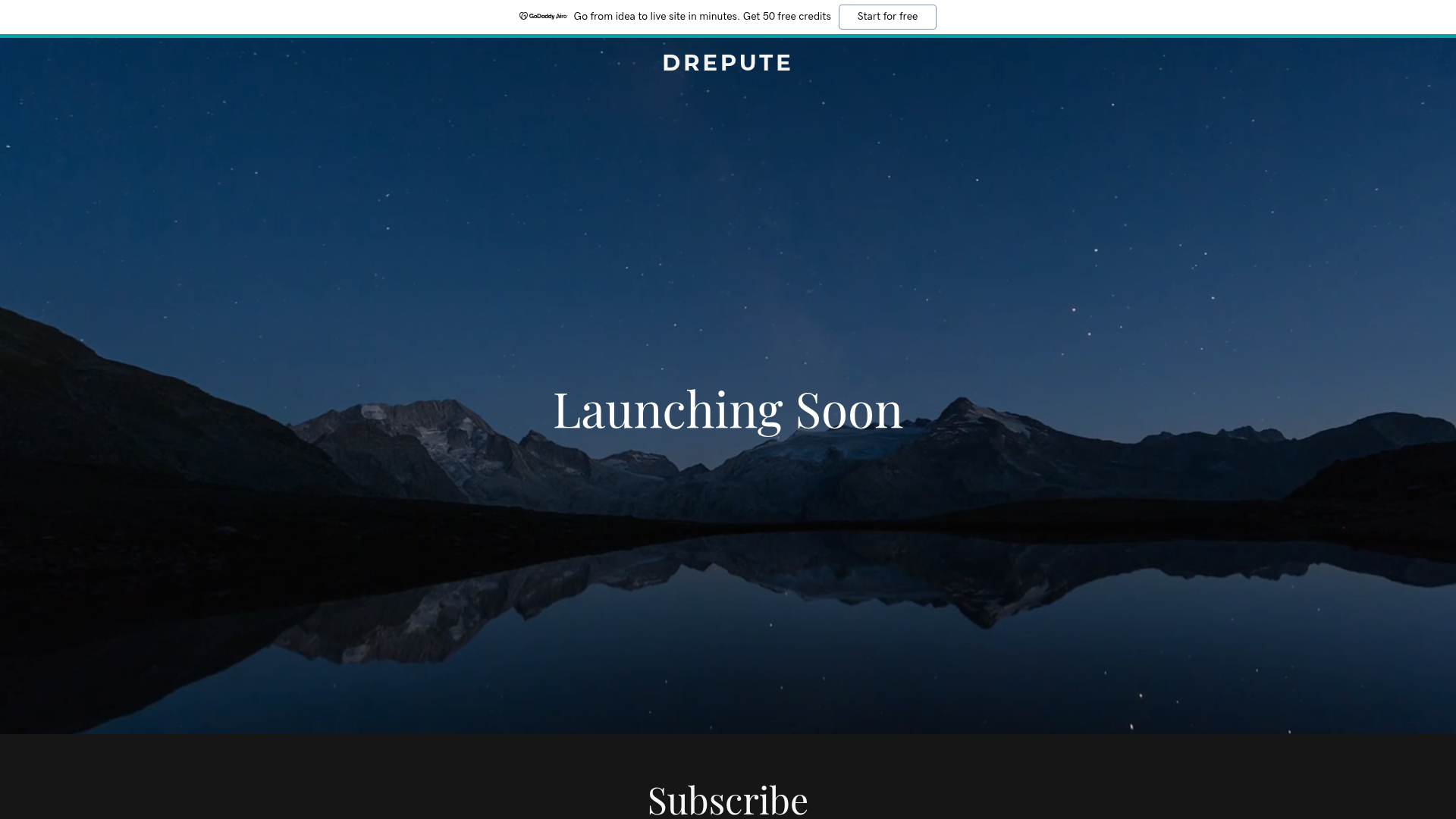
Drepute Coming Soon Landing Page
A minimalist 'launching soon' template featuring a full-width video background hero section, centered typography, and a simple newsletter subscription form.
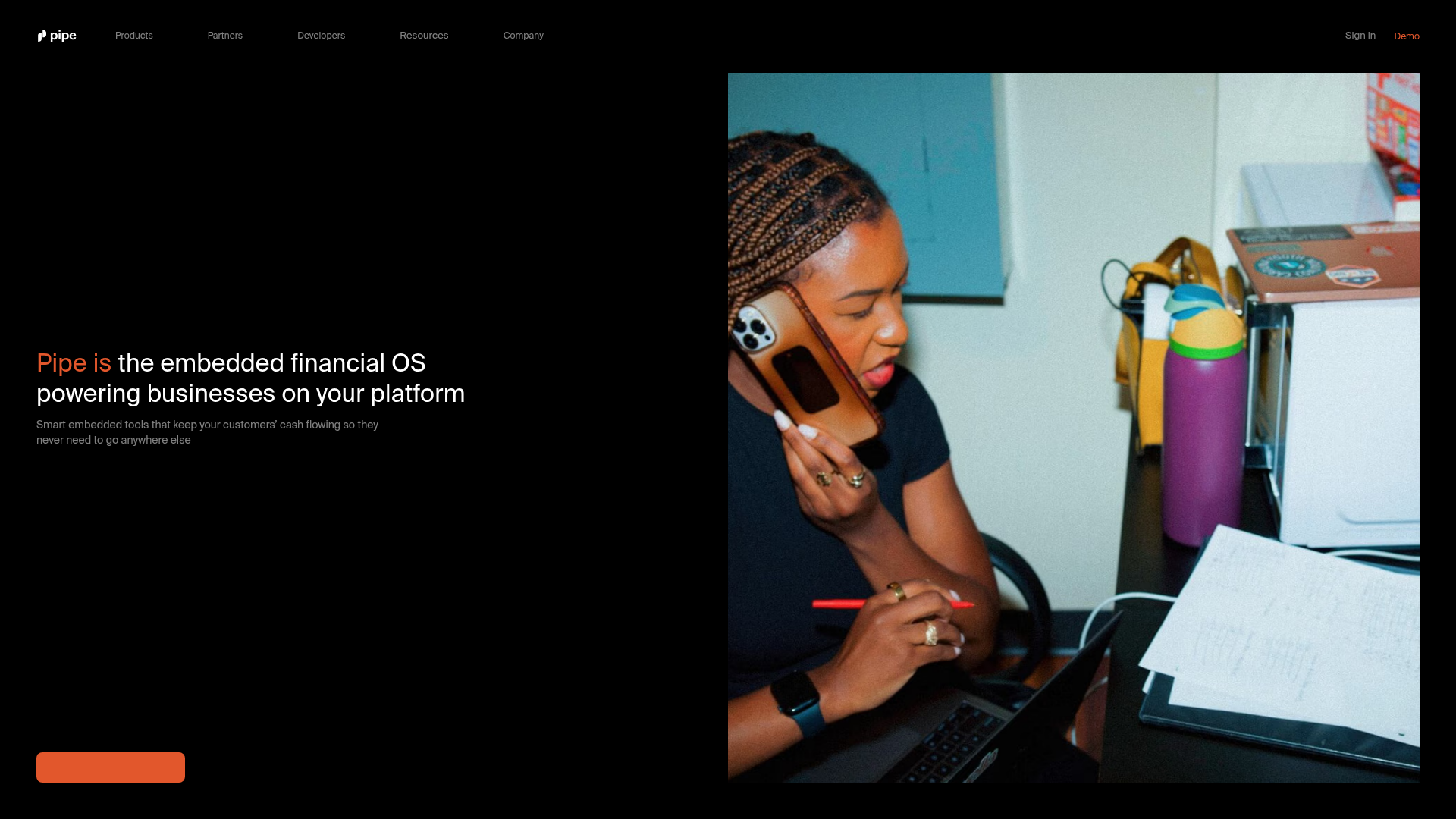
Pipe Fintech SaaS Landing Page
A minimalist dark-themed hero section featuring a split-screen layout with a high-contrast typography block and an integrated media gallery.
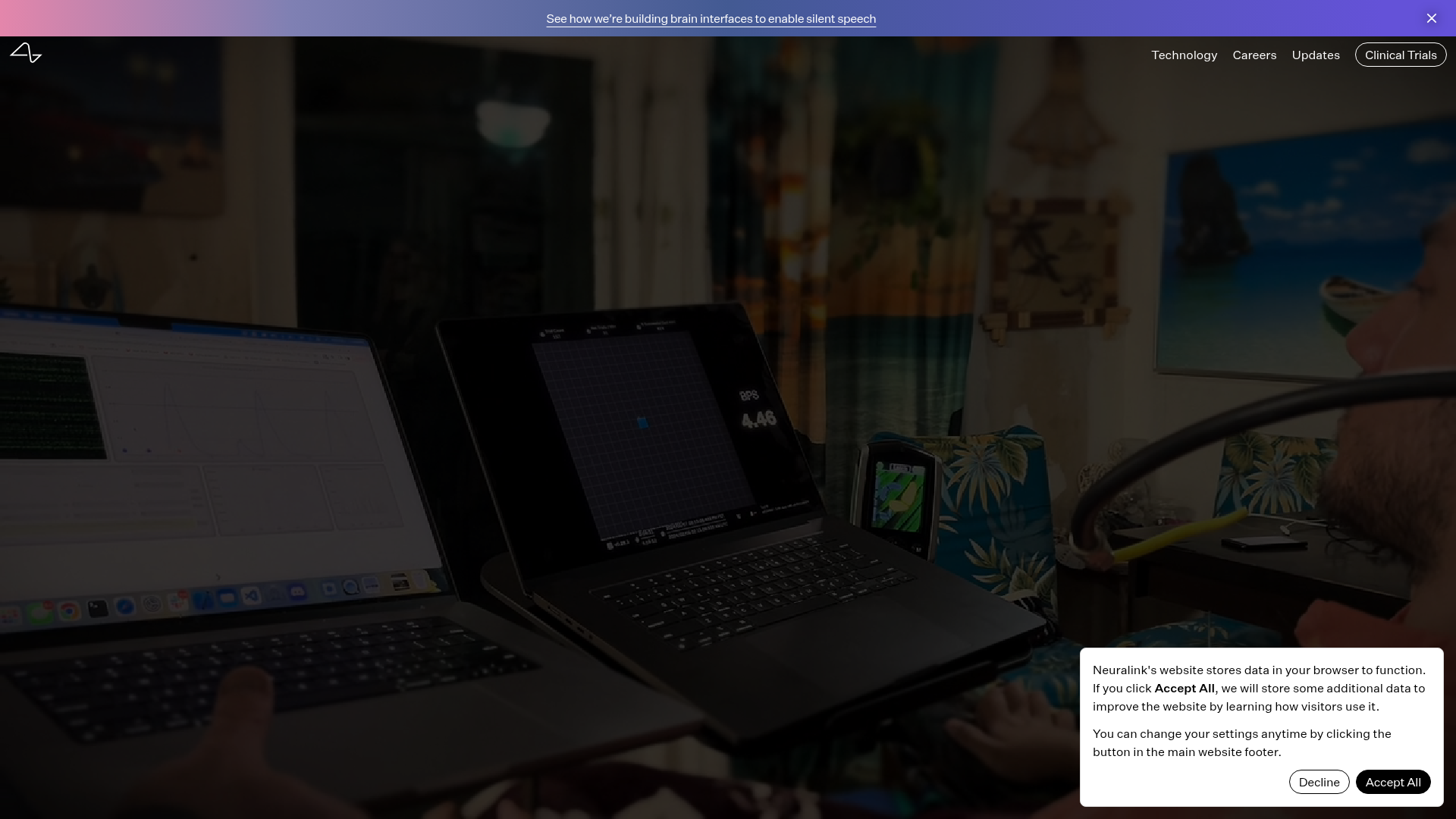
Neuralink Brain Technology Landing Page
A high-tech medical landing page featuring an immersive video hero section, typewriter animation effects, and a custom swiper carousel with integrated video testimonials.
