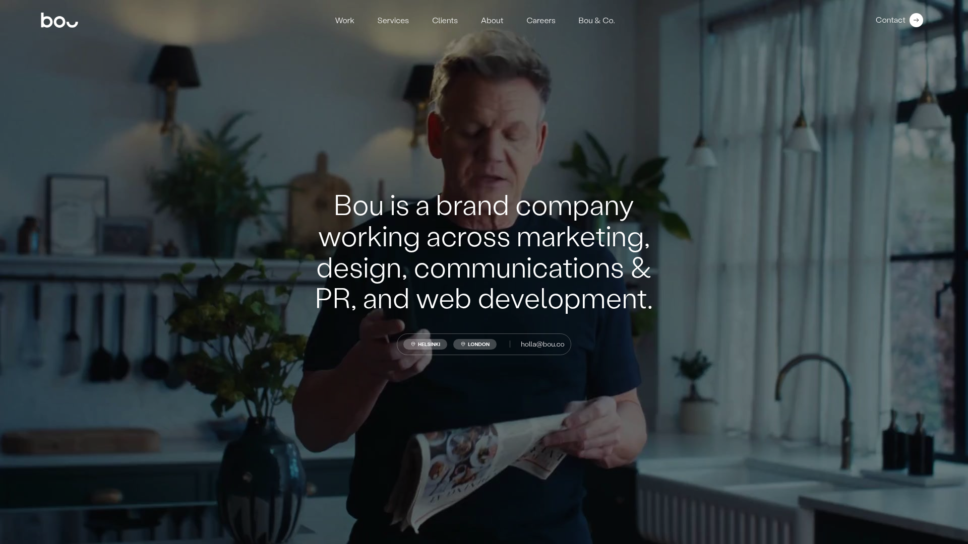
Bou Brand Agency Hero Landing
A minimalist full-screen video background hero section with a centered typography overlay, subtle navigation bar, and integrated location-based contact buttons.
Overview
This landing page is a high-impact, minimalist hero section for a creative agency, featuring a full-screen video background that instantly communicates brand personality. It serves as a masterclass in using centered typography and translucent overlays to maintain legibility over complex visual media. Builders should clone this to master the balance between immersive background video and functional UI elements.
Design System
- Color Palette & Visual Hierarchy: The design uses a dark cinematic palette with a heavy black overlay (opacity roughly 50-60%) applied to the background video to prioritize high-contrast white text. A monochromatic scheme is maintained, with white used for primary copy and subtle grey icons for utility elements.
- Typography System: A clean, geometric Sans-Serif (reminiscent of Helvetica or Inter) is utilized. The hero text uses a large scale with tight leading (line spacing) to create a centered block of core messaging. Navigation links use a much smaller, uppercase or title-case scale to minimize distraction.
- Page Structure: The layout is built on a single-viewport hero frame. A sticky or absolute-positioned header contains the logo (left), navigation (center), and action button (right). The center-of-screen area is dedicated to the value proposition, while the bottom-center contains location and contact capsules.
- Reusable Components:
- Navigation Bar: A modular, distributed nav header that works well for branding sites.
- Contact Capsules: Integrated pill-shaped buttons at the bottom that combine location tags (Helsinki, London) and an email link in a single horizontal cluster.
- Iconized Call-to-Action: The "Contact" button in the top right features a circular arrow icon, a standard but effective pattern for directing user flow.
- Implementation Clues: The HTML structure reveals a clean
headerandmainsection. The use of a background video requires a container withobject-fit: coverand a high-z-index overlay div to ensure the text remains the primary focal point regardless of video brightness.
Use Cases
- Who should clone this: Small to mid-sized creative agencies, architectural firms, or solo consultants who want a punchy, low-content architectural layout that relies on high-quality video or photography.
- Effective Remixes: High-end hospitality (hotels/restaurants), luxury product launches, or digital portfolios where visual storytelling is more important than dense data.
- Remix Directions:
- Swap Style: Replace the background video with a high-resolution static image or a CSS gradient for a different aesthetic.
- Information Architecture: Adapt the location capsules to serve as filter buttons or project categories.
- Component Selection: Reuse only the "centered text over video" section for a sub-page header while keeping a more traditional layout for the rest of the site.
- Suggested Clone Scope: A quick section clone of the hero area is highly recommended. The layout is optimized for a visual-first "wow factor" and can be integrated into any existing site as a landing splash page.
Related Inspirations
Tilt Financial Services Landing Page
A high-contrast dark mode fintech site featuring an absolute-positioned image collage hero, horizontal scrolling product panels, and bento-style application benefits.
Atlantis Tech Engineering Services Landing Page
A dark-themed professional services layout featuring a custom SVG mountain hero, logo cloud, benefits grid, process timeline, and a dual-column 'fit' comparison section.
Design Full-Time Course Landing Page
A dark-themed educational site featuring a promotional banner, vertically stacked course cards with gradient borders, a video lesson grid, and integrated pricing buttons.
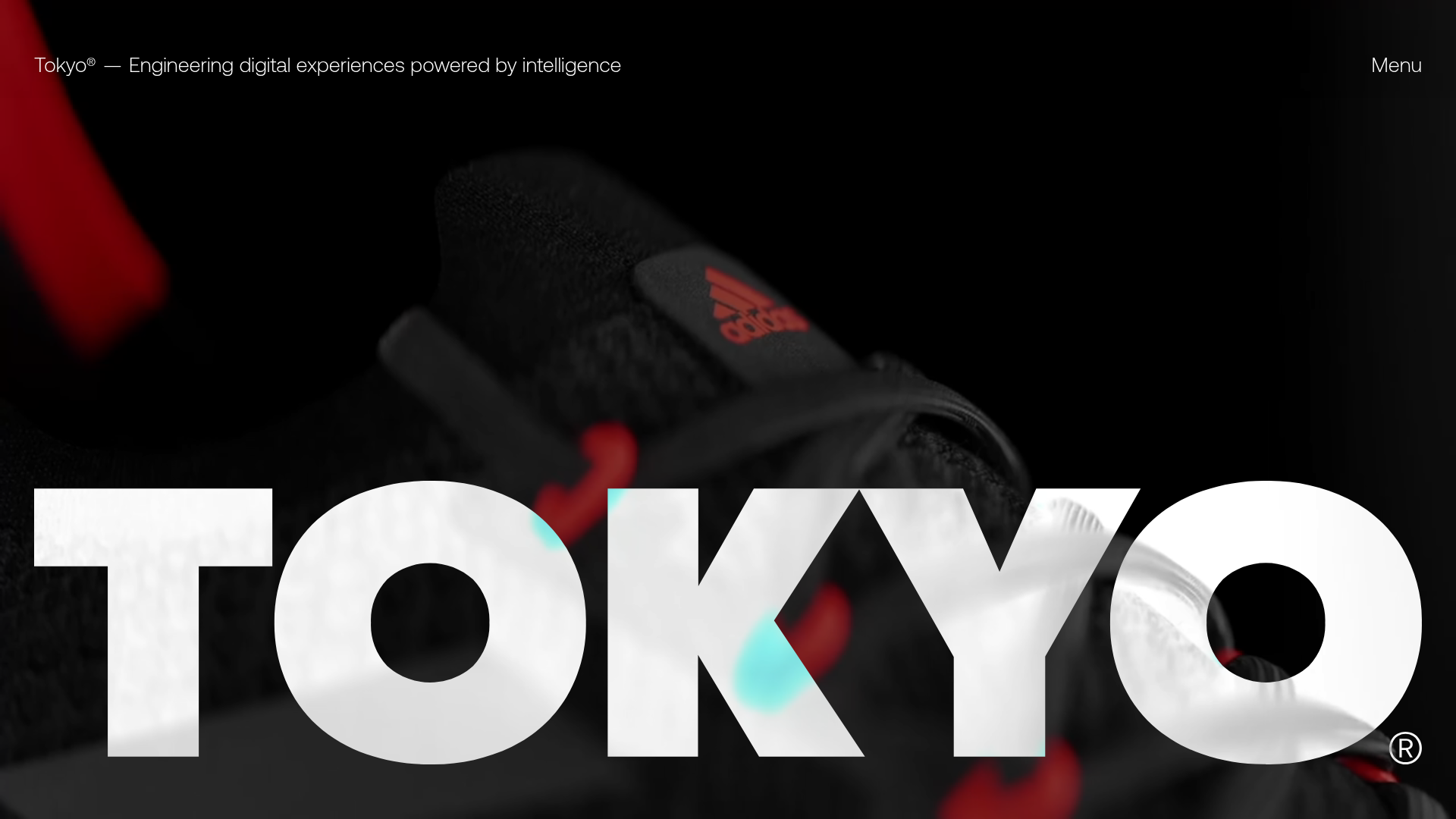
Tokyo Digital Agency Showcase Site
A high-impact agency landing page featuring an animated video hero with oversized typography, logo ticker, and a multi-column project grid with integrated media sliders.
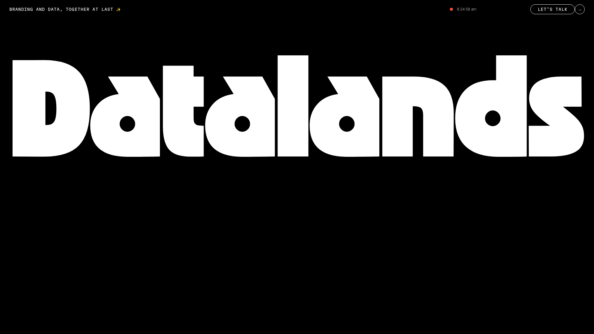
Datalands Branding Agency Landing Page
A minimalist dark-themed hero section featuring bold oversized typography, a fixed navigation bar with a live clock, and a call-to-action button.
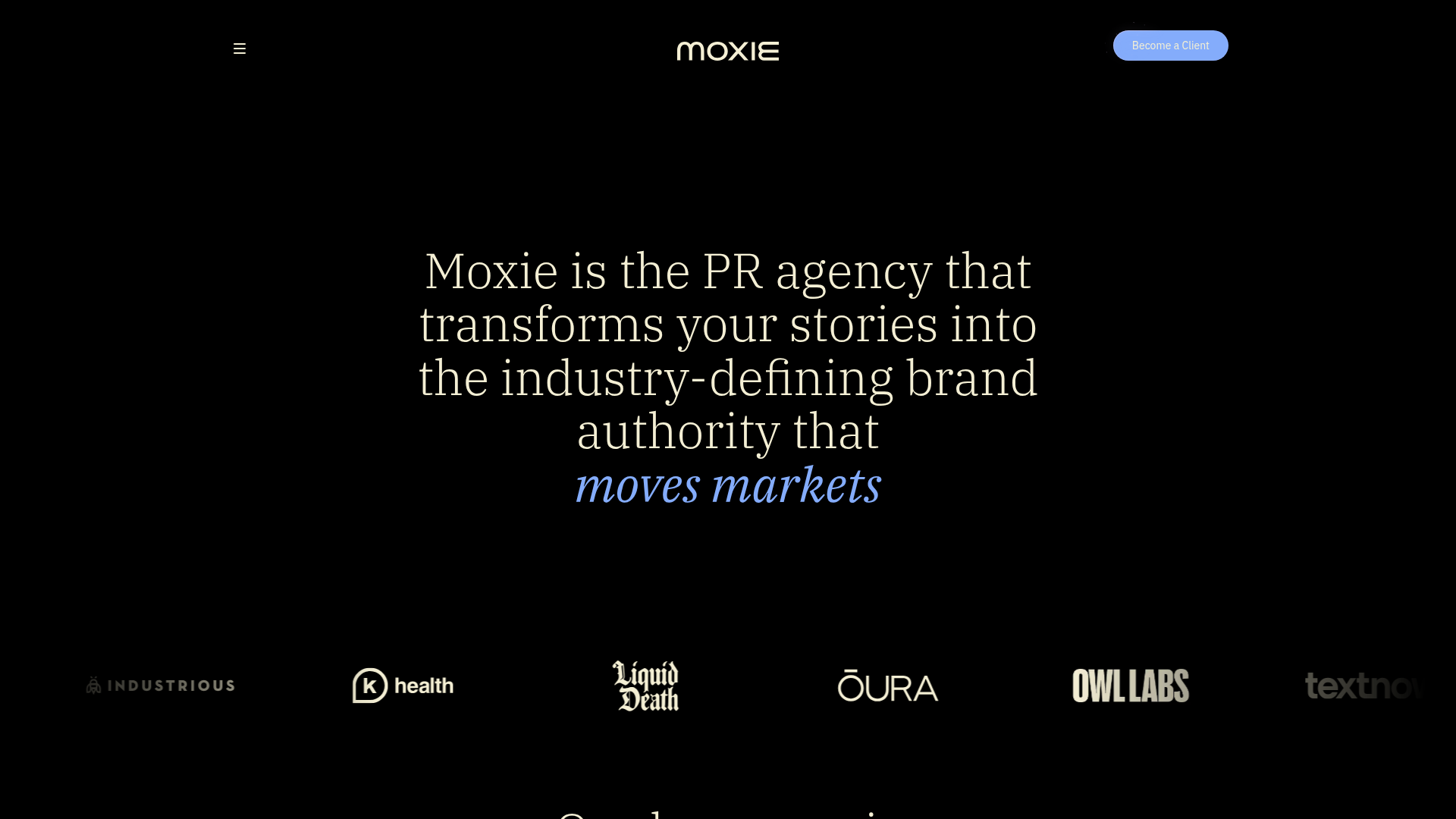
Moxie PR Agency Landing Page
A dark-themed agency site featuring an animated typewriter hero, ticker-style marquee, interactive case study cards with video backgrounds, and a vertical sticky services section.
