Tilt Financial Services Landing Page
A high-contrast dark mode fintech site featuring an absolute-positioned image collage hero, horizontal scrolling product panels, and bento-style application benefits.
Overview
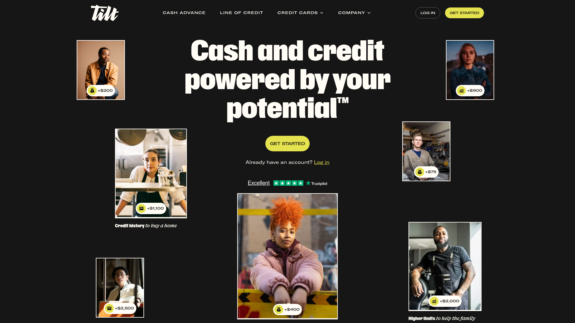
Tilt is a fintech landing page designed with a bold, high-contrast aesthetic that successfully blends lifestyle photography with financial data. This project is a strong clone reference because of its unique hero section layout, which uses absolute positioning to create a balanced image collage, and its fluid transition between dark, tan, and light themed sections.
Design System
- Color Palette & Visual Hierarchy: The site uses a sophisticated dark mode foundation (
bg-shades-800) punctuated by a high-visibility "Chartreuse" accent (#C9FF40, roughly) for primary CTA buttons and status indicators. Neutral backgrounds likeshades-200(tan) and pure white are used to differentiate product and testimonial sections. - Typography: It employs a multi-font system: a heavy geometric sans-serif for mega-headers (heading sizes ranging from 48px to 96px), a refined serif for italicized emphasis and personality, and a monospaced-style font for secondary labels and data points. This creates a clear hierarchy where numbers and values are the secondary visual focus.
- Page Structure:
- Gallery Hero: Impactful headline surrounded by floating, absolute-positioned images with data overlays.
- Product Slider: A tabbed horizontal scroller (GSAP/Framer style) showcasing different credit products.
- Process Bento: Three-column layout showing the "Yes" moments of the application flow.
- Value Prop Grid: Icon-based feature highlights (Budgeting, Monitoring, Savings).
- Text-Heavy Social Proof: Large-scale quote block followed by a carousel.
- Visual Outro: An artistic footer section with overlapping typography ("Funding future you") behind lifestyle imagery.
- Reusable Components:
- Data-Infused Image Cards: Stock photos with pill-shaped badges showing numerical values (e.g., "+$1,100").
- Rounded-Full Buttons: Large, pill-shaped buttons with significant horizontal padding.
- Dual-Style Navigation: A sticky top bar with transparent backgrounds and clean link groups.
- Implementation Clues: The site is built using Astro and React components (visible via
astro-islandtags) and utilizes Tailwind CSS for styling (flex,grid-cols-2,rounded-full).
Use Cases
- Who should clone this: Small to medium fintech startups, credit builders, or personalized service brands that want to feel high-end and modern rather than "corporate."
- Effective Remixes: This pattern works well for insurance products (swapping credit limits for coverage amounts) or fitness apps (swapping dollar values for workout stats).
- Remix Directions: Builders could extract the "Gallery Hero" for a unique landing page top, or reuse the "Product Slider" logic to manage complex offerings that need to stay on one screen.
- Clone Scope: A quick section clone of the Hero and Product Paneling is highly recommended for immediate visual impact with minimal content heavy-lifting.
Related Inspirations
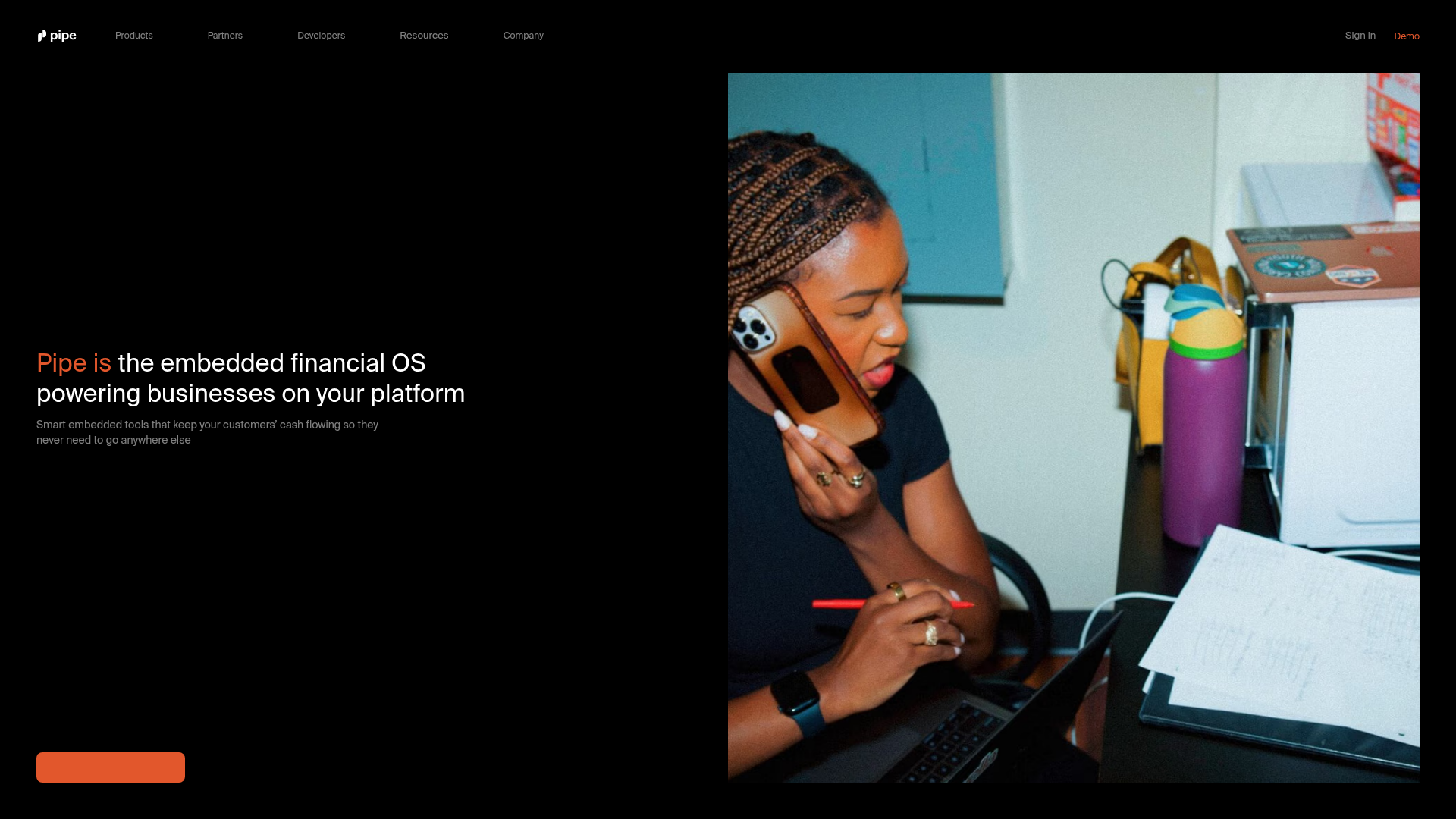
Pipe Fintech SaaS Landing Page
A minimalist dark-themed hero section featuring a split-screen layout with a high-contrast typography block and an integrated media gallery.
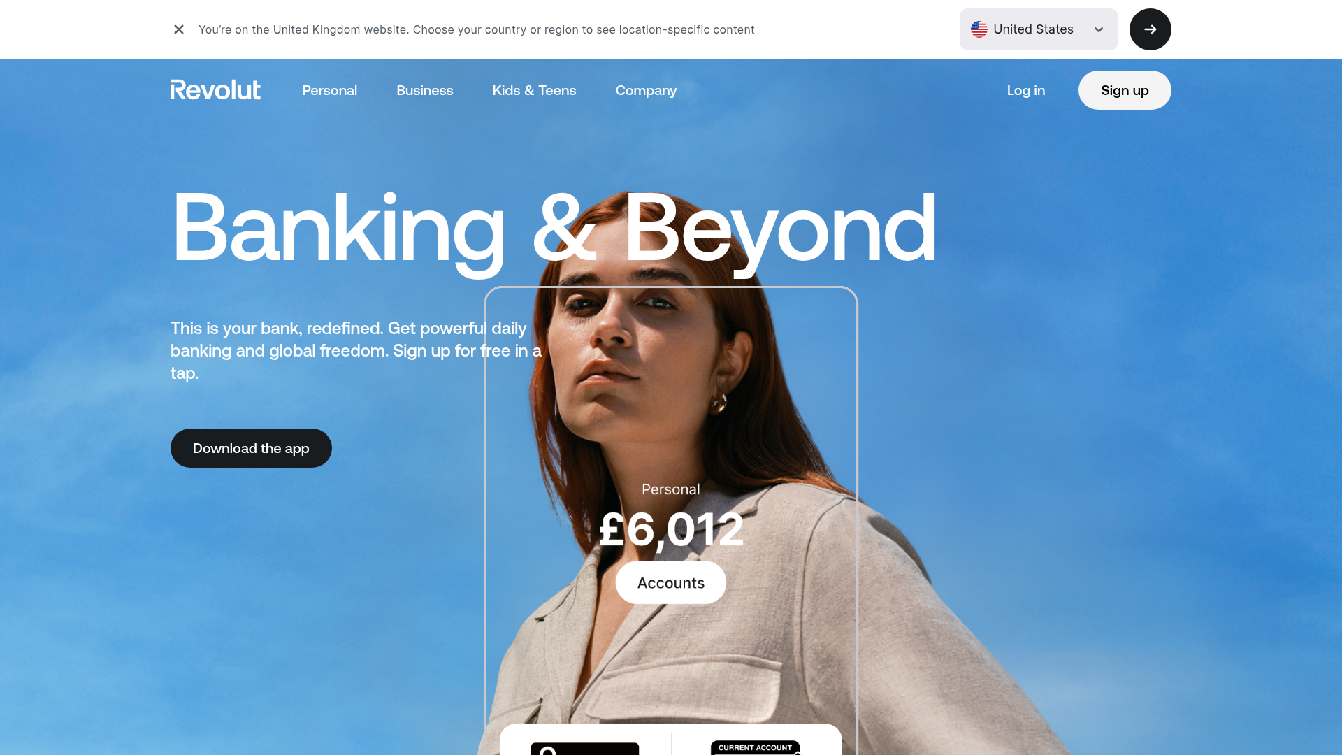
Revolut Banking Hero Landing Page
A high-impact landing page featuring an animated hero with layered image silhouettes, custom currency displays, and a tabbed interactive product showcase.
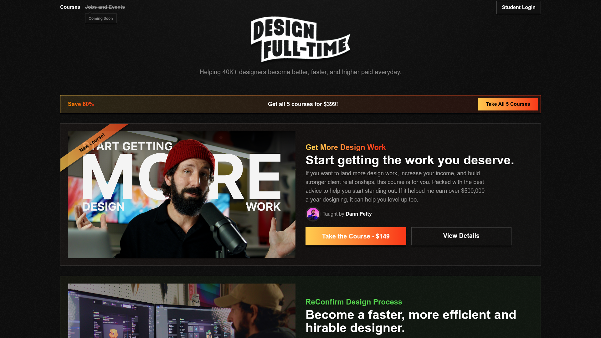
Design Full-Time Course Landing Page
A dark-themed educational site featuring a promotional banner, vertically stacked course cards with gradient borders, a video lesson grid, and integrated pricing buttons.
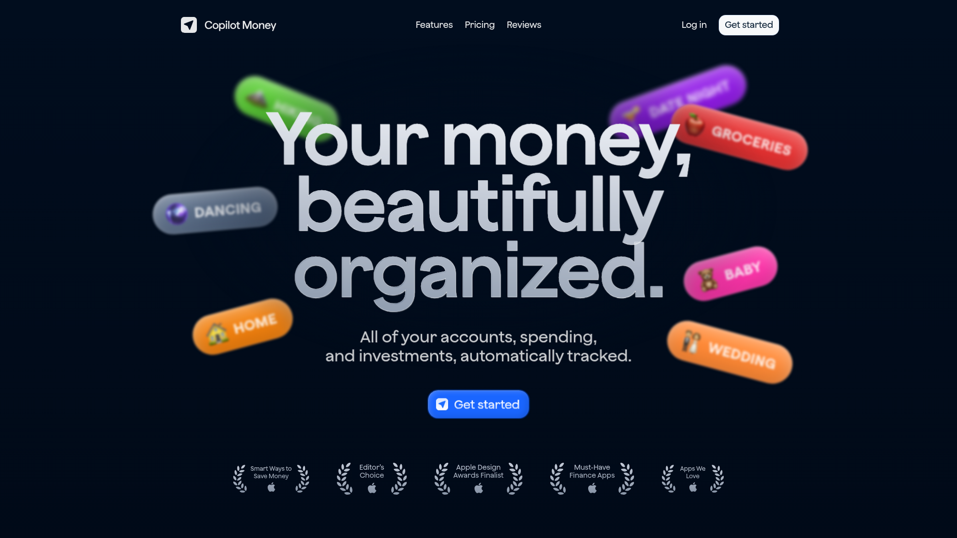
Copilot Money Finance Landing Page
A dark-themed finance landing page featuring a centered animated hero section with floating category badges, integrated trust badges, and a clean minimalist navigation bar.
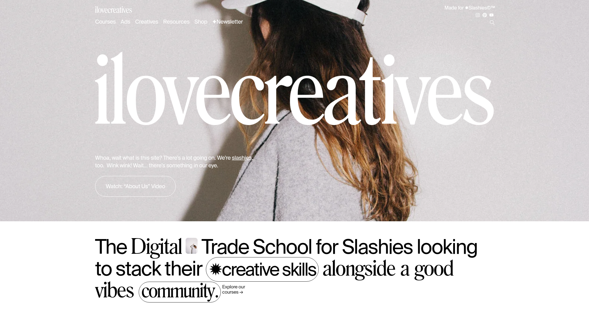
ilovecreatives Edu-Commerce Landing Page
A high-impact educational landing page featuring a parallax image hero, elegant serif typography, inline-image text treatments, and a horizontal carousel for course listings.
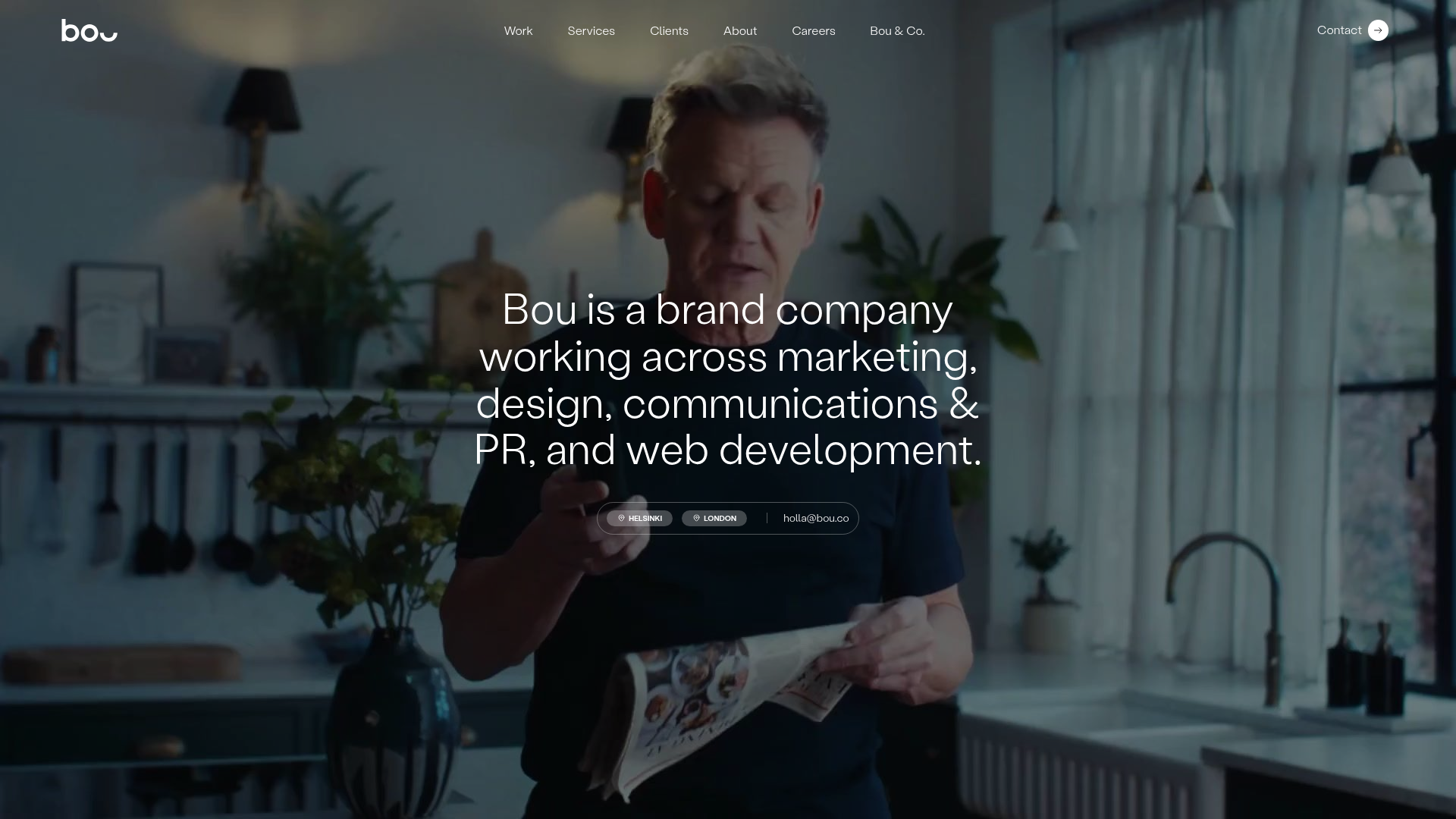
Bou Brand Agency Hero Landing
A minimalist full-screen video background hero section with a centered typography overlay, subtle navigation bar, and integrated location-based contact buttons.
