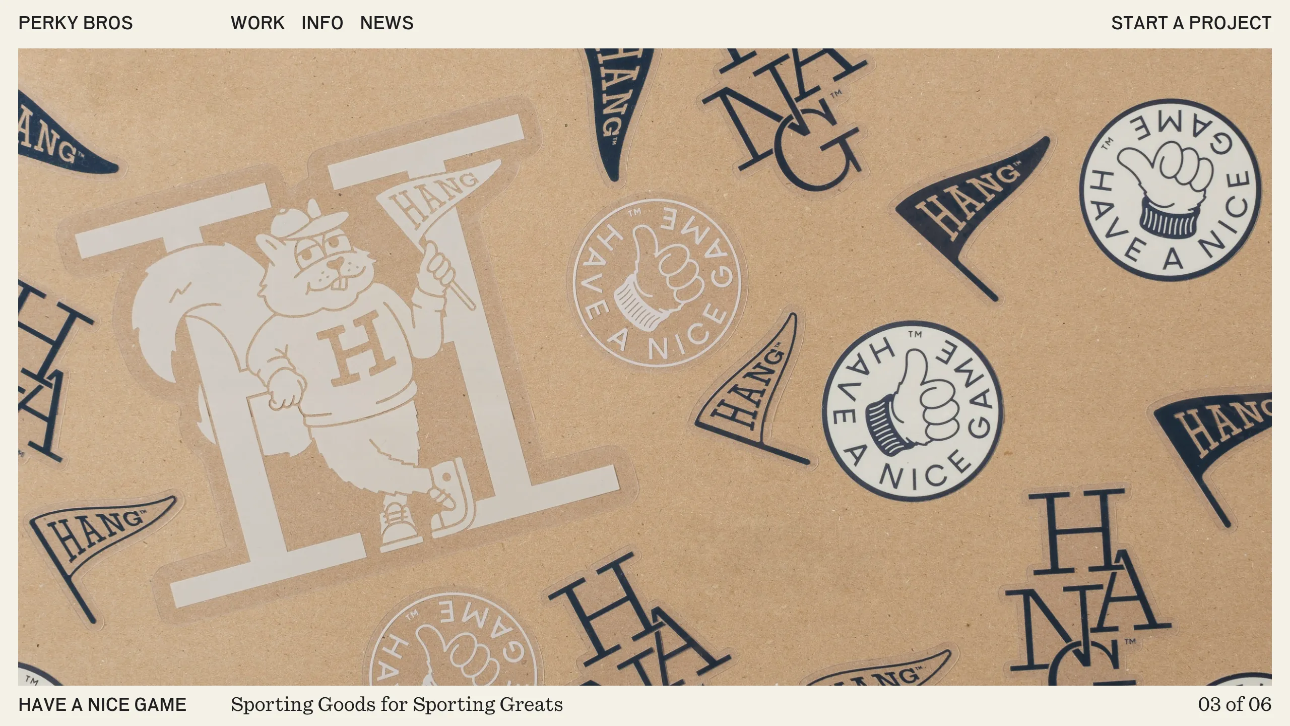
Perky Bros Creative Agency Portfolio
A minimalist studio portfolio featuring a fading image carousel with sticky captions, a staggered bento-style masonry grid, and character-separated hover animations on typography.
Overview
Perky Bros is a sophisticated creative agency portfolio that balances high-end minimalism with playful typography and high-contrast imagery. It is an excellent clone reference for its seamless integration of a fading media carousel with sticky text overlays and a masonry grid that uses varied aspect ratios to create visual rhythm. Builders will find it valuable for its refined use of white space and custom character-split animations.
Design System
- Color Palette & Visual Hierarchy: The site uses a muted, off-white background with deep navy or black text, creating a premium, gallery-like aesthetic. Project thumbnails often bring in vibrant, brand-specific background colors (e.g.,
#fed925for Foxtrot or#6446eefor Patagonia), allowing the work to define the palette of each section. - Typography: A clean, technical sans-serif is used throughout. Hierarchy is established through character spacing and case transformation:
text-uppercaseandtype--label(small, wide-tracked) for metadata, while larger, tighter-set sans-serifs handle the body and headers. The logo and many links use a unique character-separated<span>structure for individual letter animations. - Page Structure & Section Flow: The layout follows a classic vertical stack: a fixed-height page header, a hero-style
media-carouselwith asticky-captionbar, a centeredwysiwyg-contentstatement for the agency bio, a masonrygridfor the work library, and a detailed multi-column footer. - Notable Components:
- Media Carousel: A Flickity-enabled slider using a cross-fade transition (
is-fade) rather than a slide motion. - Sticky Caption Bar: A bottom-aligned bar that stays fixed as the user scrolls through the hero images, updating the project title and slide count.
- Masonry Grid Blocks: Container units that use Bootstrap-style column classes (
col-lg-6,col-lg-8) and custom aspect ratios (landscape vs. portrait) to create a staggered, editorial feel.
- Media Carousel: A Flickity-enabled slider using a cross-fade transition (
- Interaction & Motion Patterns: The
will-bounceclass applied to spans suggests a character-by-character hover state. Images feature a subtle overlay on hover to reveal "View Project" text. The primary carousel utilizes a synchronized text update and slide-count transition. - Implementation Clues: The HTML reveals a Bootstrap-based grid system (
container-fluid,row,col-) combined with Flickity for the carousel and lazy-loading for image optimization.
Use Cases
- Who should clone this: Design studios, high-end photographers, or boutique agencies looking for a portfolio that values imagery over dense copy.
- Effective remixes: Architecture firms can reuse the staggered masonry grid to showcase project builds of various scales; fashion brands could adapt the fading hero carousel for seasonal lookbooks.
- Practical directions:
- Quick Clone: Extract the
sticky-captionandmedia-carousellogic to create a high-impact landing page hero. - Full Clone: Replicate the entire scroll flow for a complete personal or agency portfolio, swapping the serif-like spacing for a more standard sans-serif spacing if a less technical look is desired.
- UI Remix: Maintain the grid structure but replace the off-white background with a dark theme, utilizing the
data-theme="dark"attributes seen in the code to toggle text colors dynamically.
- Quick Clone: Extract the
Related Inspirations

Clase Agency Branding Portfolio
A minimalist design agency portfolio featuring a typographic hero section, full-width image articles, sticky title bars, and integrated scrolling text marquees for a clean editorial layout.

Lundqvist & Dallyn Studio Portfolio
Minimalist design studio portfolio featuring a custom video loader, world clock navigation, and a fluid masonry-style grid for high-quality photography and type design showcases.

AcolorBright Design Agency Portfolio
Minimalist bento-style portfolio layout featuring numerical section headers, horizontally scrolling project teasers, and a clean grayscale client logo grid.
Manna Architects Minimalist Portfolio Grid
A clean, single-page architecture portfolio featuring a centered intro, a varied multi-column image gallery with captions, and a detailed project service breakdown.
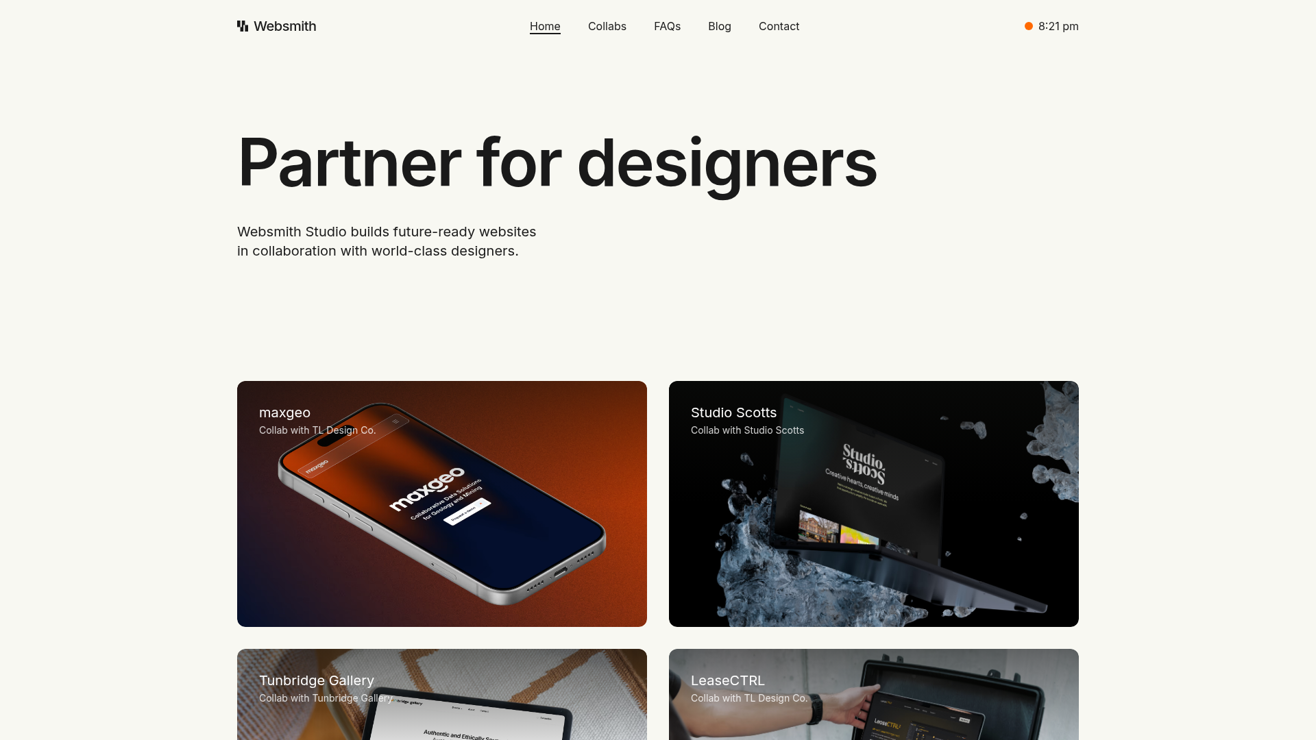
Websmith Studio Portfolio Site Template
A clean studio portfolio featuring a responsive bento-style project grid, interactive process cards, and a split-screen testimonial section built with Tailwind CSS.
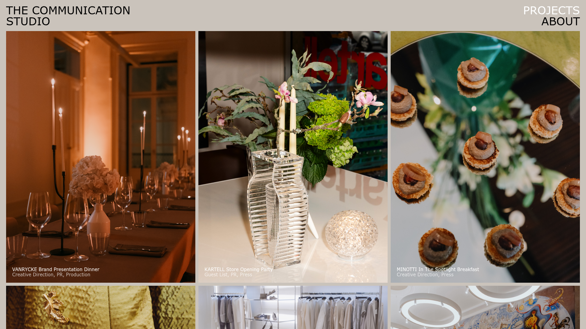
The Communication Studio Portfolio Grid
A minimalist creative agency portfolio featuring a gapless image grid with image-swap hover effects and Tailwind-based reveal animations.
