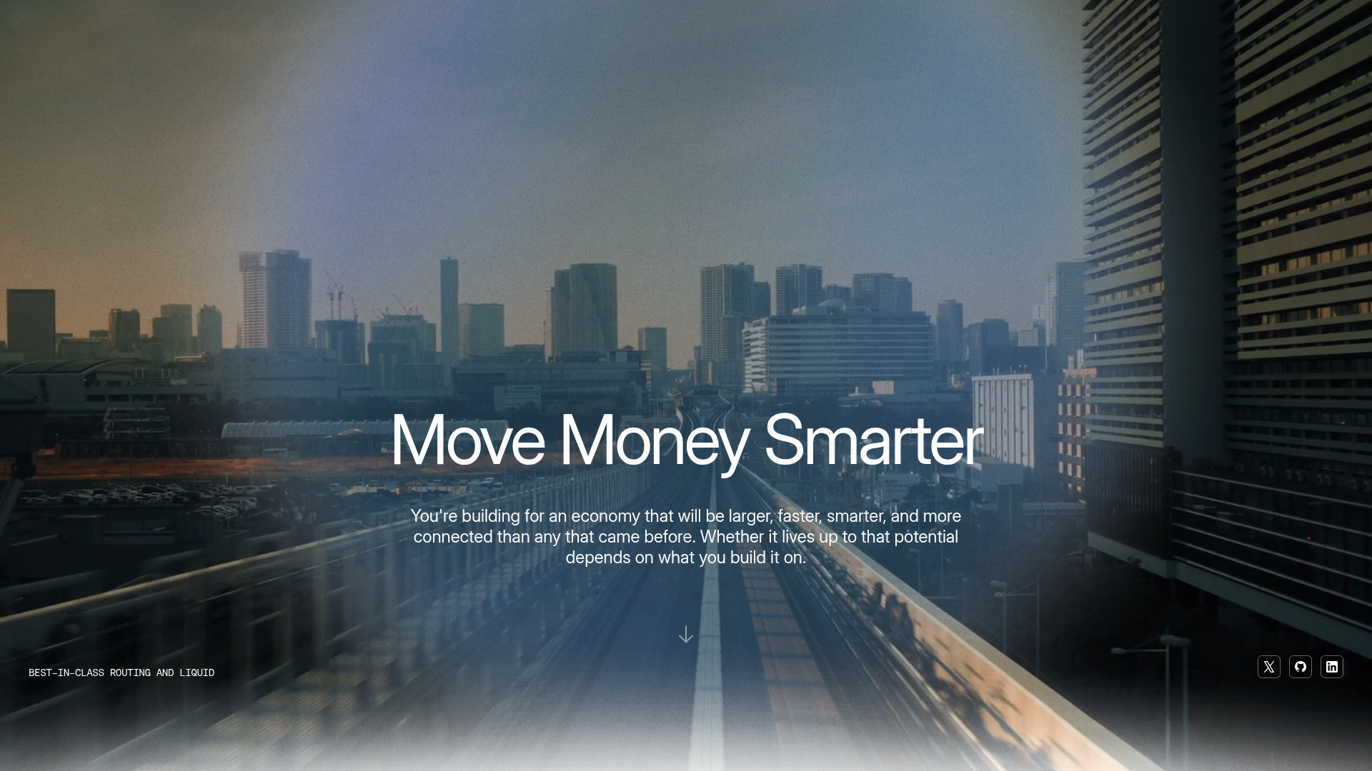
Auros Crypto Liquidity Firm Landing Page
A high-end dark mode site featuring a WebGL gradient background, horizontal text scrolls, bento grid statistics, and interactive video-integrated vertical tabs for service exploration.
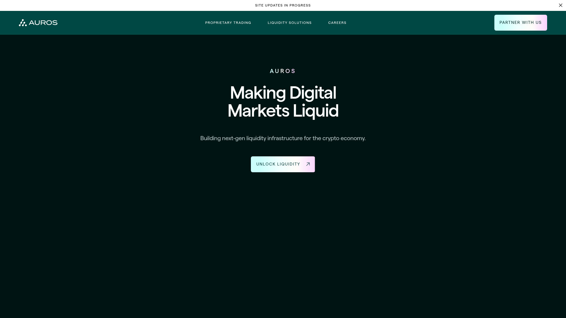
Overview
Auros is a sophisticated fintech landing page designed for the crypto-economic infrastructure space, characterized by a high-end dark aesthetic and high-performance visual effects. It serves as an excellent reference for high-trust institutional brands, utilizing WebGL backgrounds, large-scale typography, and fluid layout transitions to convey scale and technical precision.
Design System
- Color Palette & Visual Hierarchy: The site uses a deep matte black (
#000000) background combined with forest green and teal accents. High-contrast white is used for primary headings, while silver-gray (#C0C0C0) provides hierarchical depth for descriptions. A distinct pink-to-cyan gradient is reserved for primary CTAs and hover states (e.g., the "Partner With Us" button). - Typography System: A clean, geometric sans-serif (Inter or similar) is used throughout. It features a bold scale for display headings (
heading-style-display) and all-caps styling for eyebrows. Large paragraph text is used to ensure readability against the dark background. - Page Structure & Section Flow: The flow begins with a minimal HERO section featuring a centered CTA, followed by horizontal "Text Scroll" marquees for brand movement. Service discovery is handled via interactive vertical tabs ("Explore Auros"), leading into a quantitative "Bento Grid" for statistics, and a horizontal testimonial slider for institutional social proof.
- Reusable Components:
- Bento Grid Stats: Adaptive cards with floating canvases for data visualization.
- Vertical Tabs: An integrated video/text module where clicking a service swaps a large-format background video.
- Gradient Buttons: High-contrast interactive buttons with distinct corner radius and gradient fills.
- Interaction & Motion Patterns: Motion is a core feature, including horizontal text scrolling (
section_text-scroll), WebGL gradient backdrops (#gradient-canvas), and text-reveal animations that use CSS variables (--to: #CBFFFC; --from: #00827C) to color text as it appears during scroll. - Implementation Clues: The code structure suggests a Webflow-based build utilizing the Lenis library for smooth scrolling, Swiper.js for testimonial carousels, and HTML5 video backgrounds for high-impact visual sections.
Use Cases
- Who should clone this: Web3 protocols, venture capital firms, or institutional FinTech providers looking for a professional yet cutting-edge presence.
- Remixing the Design: The section-based structure allows for modular reuse. For example, a developer could clone only the Bento Grid Statistics section to showcase product performance, or the Horizontal Marquee for logo lists.
- Practical Directions: Swap the dark-teal color scheme for a deep navy or dark purple to align with different brand identities. Use the "Explore" vertical tabs to showcase a SaaS platform's key features instead of service types.
- Suggested Scope: A full-page clone is ideal for those needing a complete professional site overhaul, while the testimonial and bento-grid sections are easy to extract for smaller landings.
Related Inspirations
Eco Stablecoin Infrastructure Product Site
A sophisticated Web3 site featuring a video hero section, vertical scrolling accordion for product features, and a dark-to-light theme transition.
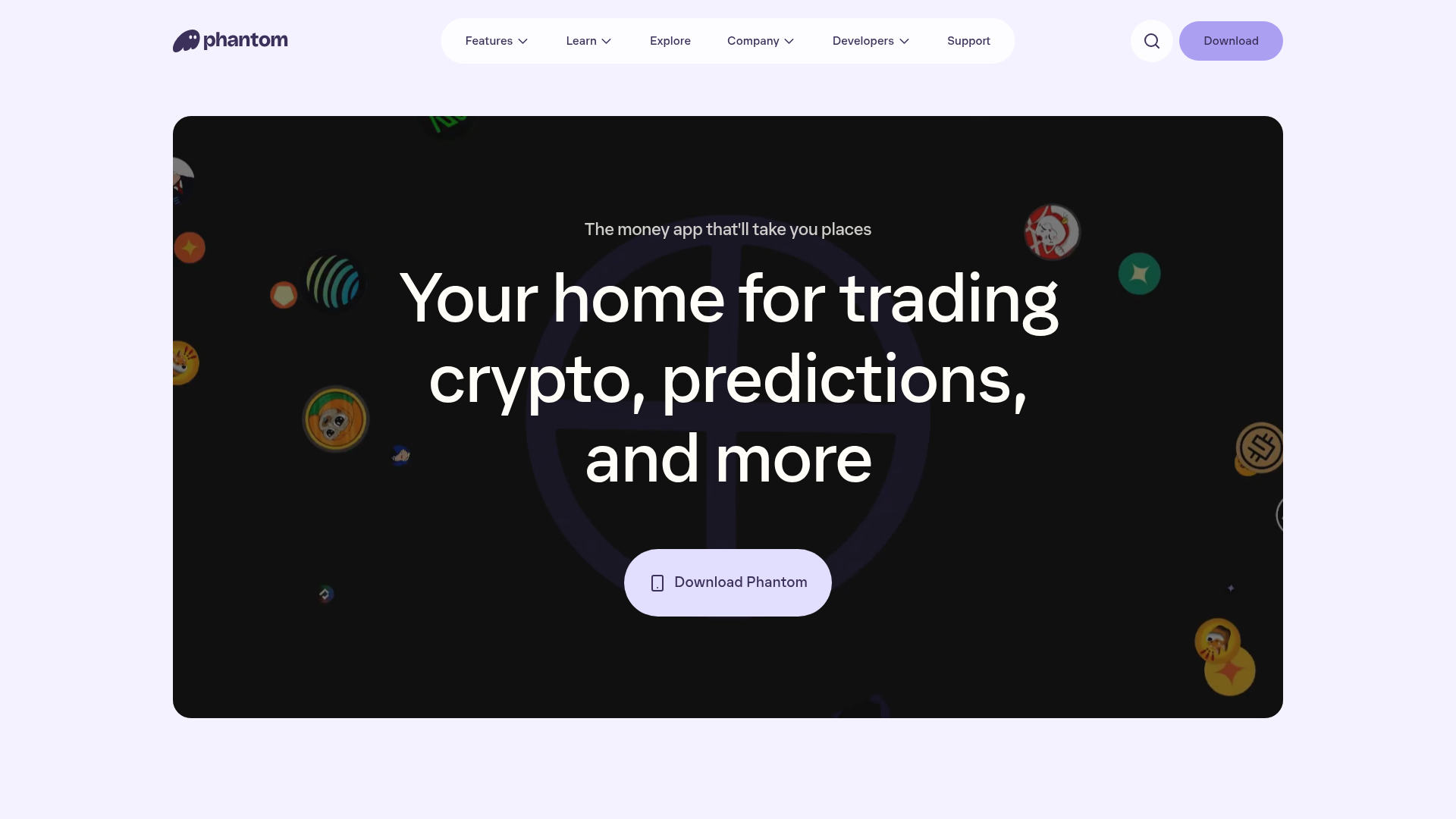
Phantom Crypto Wallet Landing Page
A dark-themed landing page featuring an animated hero section, a clean sticky navigation bar, and interactive product carousels for showcasing app features.
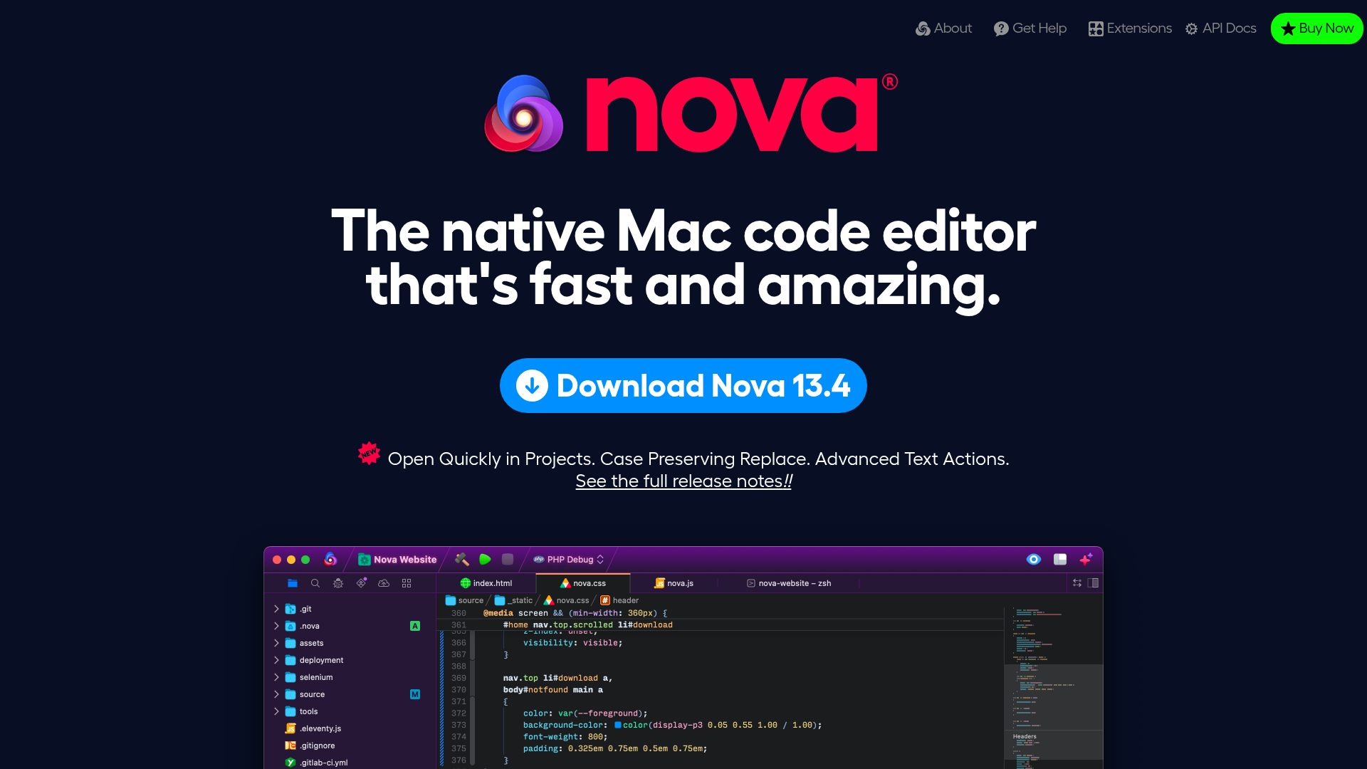
Nova Code Editor Product Landing Page
Dark-themed landing page featuring a starfield background, a flexible feature grid, interactive tabbed preference menus, and stylized product screenshot showcases with hoverable hotspots.
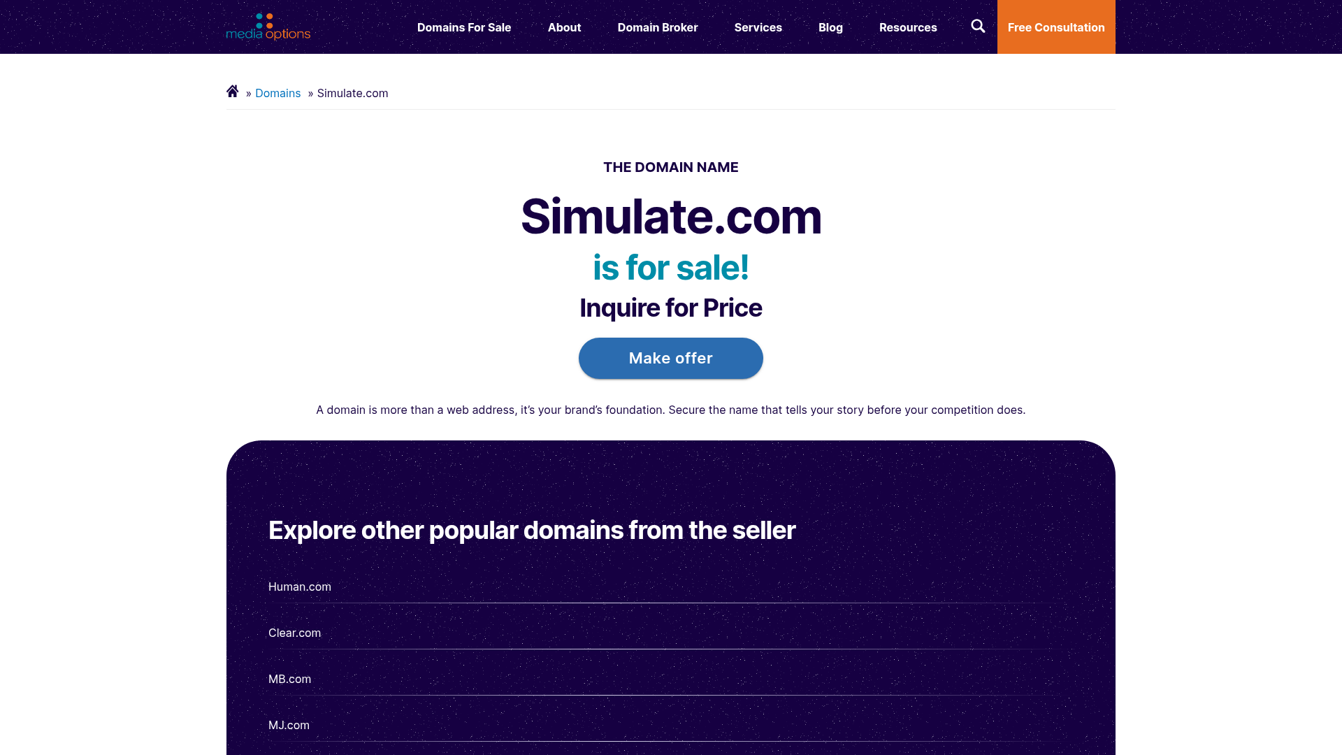
Domain For Sale Landing Page
A clean, centered landing page layout featuring a hero section for asset sales, a prominent CTA button, and a list-based showcase of related items.
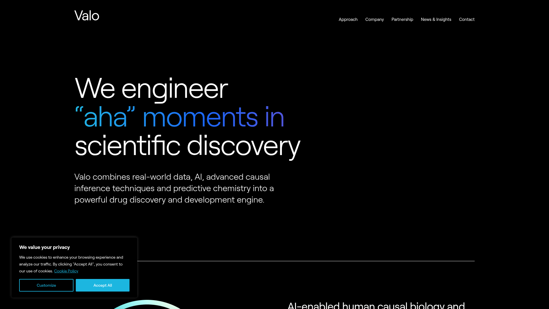
Valo Health AI Biotech Landing Page
A dark-themed high-tech landing page featuring an animated gradient text hero, modular content sections with glassmorphism effects, and distinct typography scales for bold storytelling.
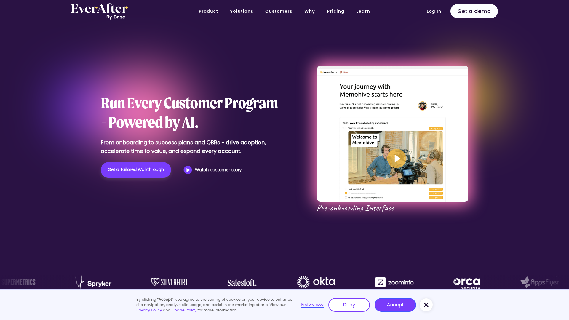
EverAfter AI Customer Portal Hero
A SaaS landing page template featuring a glowing product carousel, auto-scrolling logo marquee, accordion-based feature reveals, and an embedded scheduling widget.
