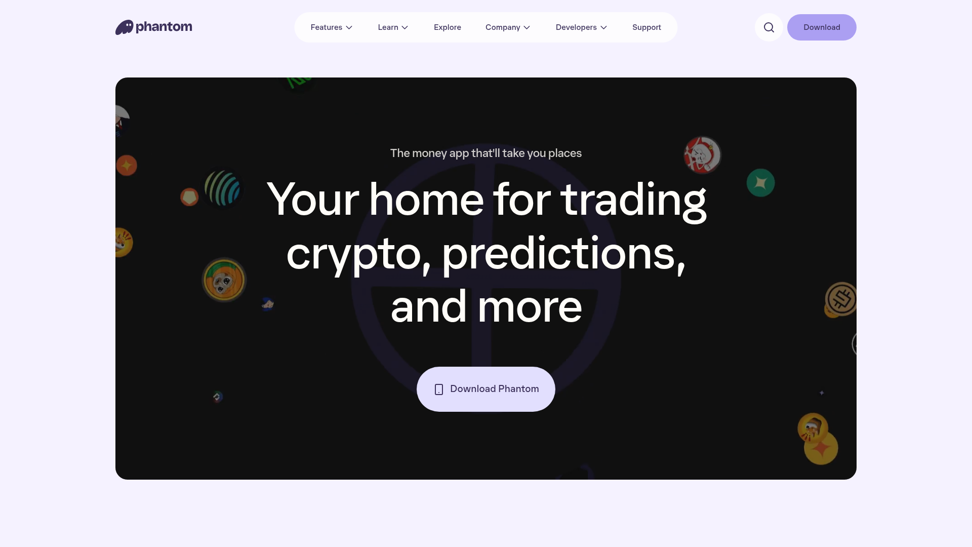
Phantom Crypto Wallet Landing Page
A dark-themed landing page featuring an animated hero section, a clean sticky navigation bar, and interactive product carousels for showcasing app features.
Overview
Phantom’s landing page is a masterclass in high-end, dark-mode product storytelling for web3 and fintech. It combines a minimalist aesthetic with sophisticated motion design, using a layered scroll approach to guide users through its core features: trading, money movement, and security. It is a strong reference for builders looking to create a premium, trust-oriented brand presence that feels modern and fluid.
Design System
- Color Palette & Visual Hierarchy: The site uses a deep, off-black/near-black background (
#000000to dark charcoal) to make content pop. It features high-contrast white typography and a soft lavender accent used for primary CTAs (Downloadbuttons). Vibrant, saturated gradients and floating 3D-style icons are used sparingly to draw attention to specific product areas. - Typography System: A bold, modern sans-serif (resembling Inter or a custom variant) is used throughout. The hierarchy is established with very large, centered display headings (
h1andh2) for impact, paired with smaller, high-readability body text for feature descriptions. - Page Structure & Flow: The layout follows a single-page scrolling narrative:
- Hero Section: Large centered text with a background video loop of floating assets.
- Feature Blocks: A series of vertically stacked sections, each introduced with a large heading and followed by a horizontal, card-based carousel.
- Final CTA: A "Get Started" section that mirrors the hero's simplicity with a large lavender button.
- Reusable Components:
- Sticky Nav: A pill-shaped navigation bar that houses dropdown menus and the primary download button.
- Interactive Carousels: Built using
<ul>and<li>elements, these feature auto-playing video previews within rounded-corner cards. - Iconic CTAs: Large, pill-shaped buttons with subtle hover states and clear "Download" labeling.
- Interaction & Motion: The HTML reveals the use of
<canvas>and<video>tags for background effects and product demonstrations. Scroll-triggered opacity transitions on text and horizontal transform shifts on carousel slides create a sense of depth and activity as the user moves down the page. - Implementation Clues: The code structure suggests a component-based framework (likely React) with highly atomic CSS classes (e.g.,
_1vlvc8w1,uwwrrn8), indicating a utility-first or styled-components approach for layout consistency.
Use Cases
- Who should clone this: Web3 startups, fintech apps, and SaaS developers who want a "premium-feel" site that relies on visual motion rather than dense text to explain value.
- Remix Directions:
- Brand Swap: Keep the layout but swap the lavender accent for a brand-specific primary color (e.g., electric green for energy tech or cobalt blue for security software).
- Information Architecture: Use the carousel component to showcase product screenshots instead of crypto assets, or adapt the "Security" section to showcase "Compliance" for an enterprise tool.
- Selective Clone: The sticky navigation and the video-driven hero section are excellent standalone components to lift for smaller landing pages.
- Clone Scope: A full-page clone is best for those wanting to mimic the specific "scroll-and-reveal" storytelling rhythm, while a quick section clone of the carousel is highly effective for any product gallery.
Related Inspirations
Auros Crypto Liquidity Firm Landing Page
A high-end dark mode site featuring a WebGL gradient background, horizontal text scrolls, bento grid statistics, and interactive video-integrated vertical tabs for service exploration.
Eco Stablecoin Infrastructure Product Site
A sophisticated Web3 site featuring a video hero section, vertical scrolling accordion for product features, and a dark-to-light theme transition.
Nova Code Editor Product Landing Page
Dark-themed landing page featuring a starfield background, a flexible feature grid, interactive tabbed preference menus, and stylized product screenshot showcases with hoverable hotspots.
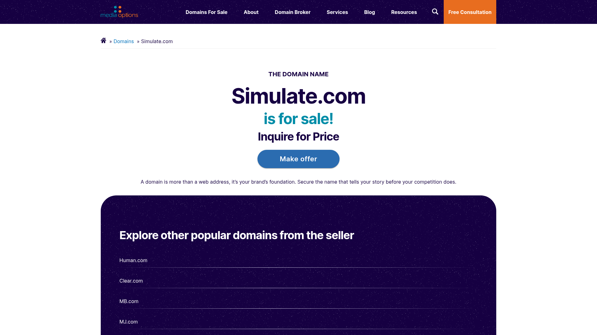
Domain For Sale Landing Page
A clean, centered landing page layout featuring a hero section for asset sales, a prominent CTA button, and a list-based showcase of related items.
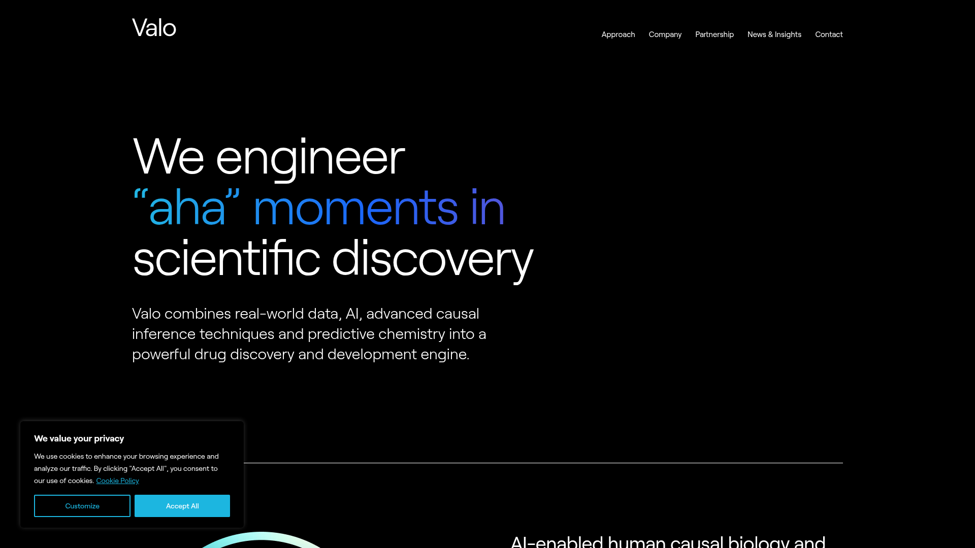
Valo Health AI Biotech Landing Page
A dark-themed high-tech landing page featuring an animated gradient text hero, modular content sections with glassmorphism effects, and distinct typography scales for bold storytelling.
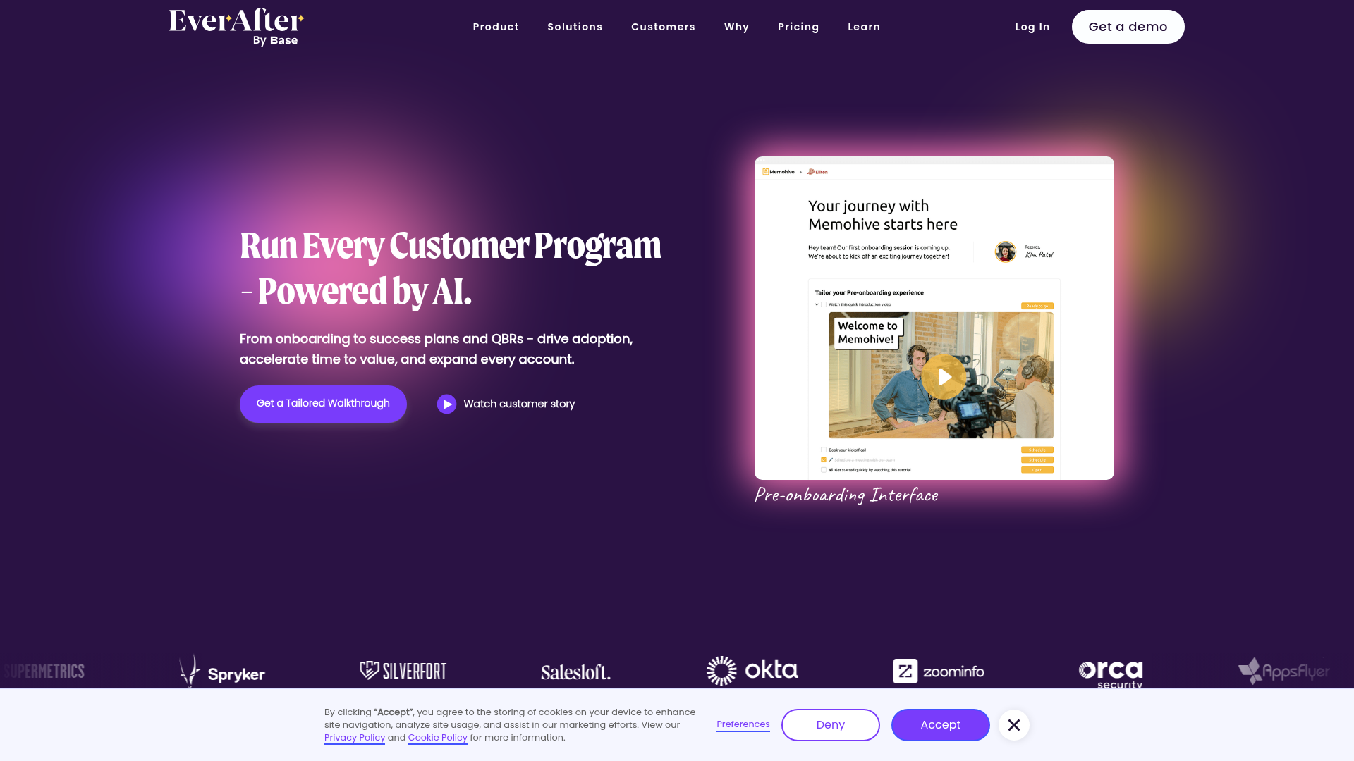
EverAfter AI Customer Portal Hero
A SaaS landing page template featuring a glowing product carousel, auto-scrolling logo marquee, accordion-based feature reveals, and an embedded scheduling widget.
