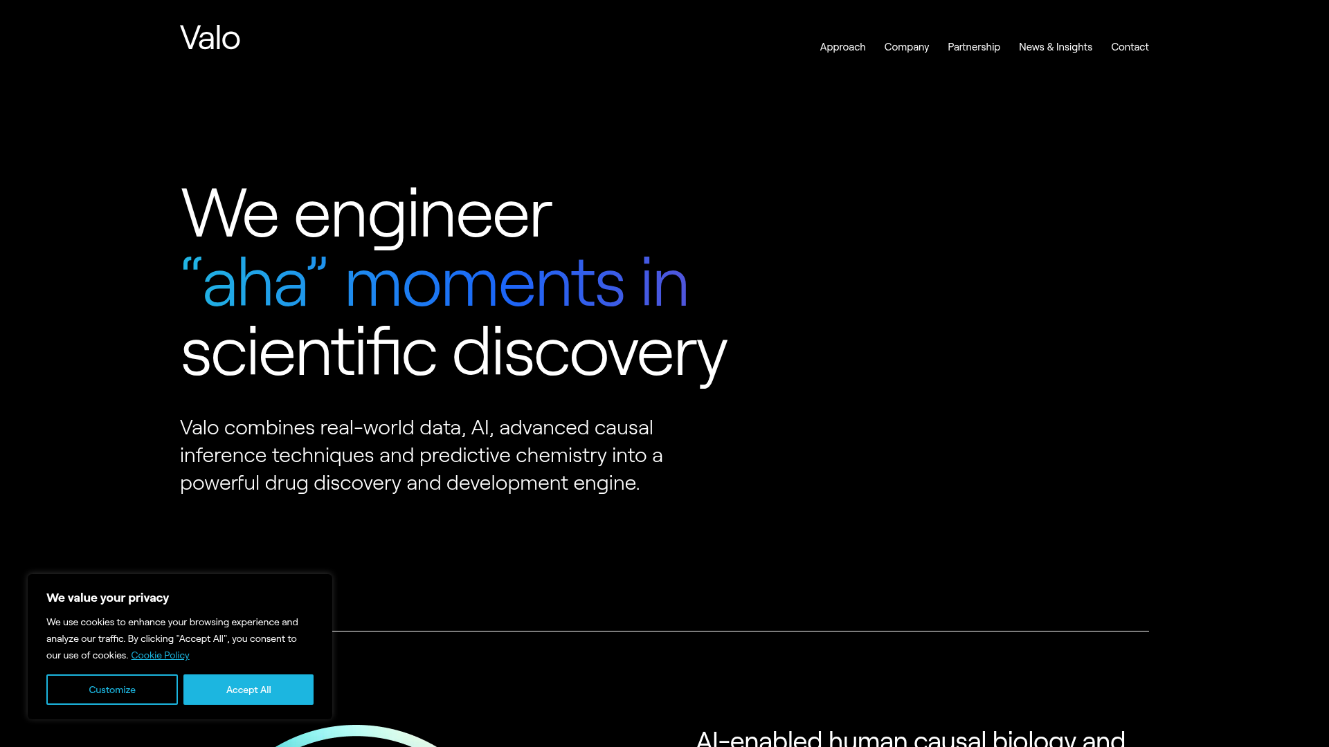
Valo Health AI Biotech Landing Page
A dark-themed high-tech landing page featuring an animated gradient text hero, modular content sections with glassmorphism effects, and distinct typography scales for bold storytelling.
Overview
Valo Health’s landing page is a premier example of a high-tech, dark-mode “SaaS-meets-Biotech” aesthetic. It leverages a sophisticated "moving glass" background and animated typography to communicate complex scientific innovation with premium, modern authority. It is an excellent reference for builders looking to create data-driven landing pages that need to feel both clinical and cutting-edge.
Design System
- Color Palette & Visual Hierarchy: The site uses a deep black base (
#000000) with a primary action color in bright cyan (#1cb6e0). Visual interest is driven by high-contrast white text and a specific blue-to-purple linear gradient used for emphasis on keywords. - Typography: The system uses a clean, sans-serif font (likely a custom branding face or a variation of Inter/Geist). It features a distinct scale:
type-gigafor massive hero headlines,type-xlfor section headers, and a smallertype-eyebrowin all caps for navigational context. - Page Structure: The flow follows a "Vision to Execution" sequence: a high-impact animated hero, followed by alternating data/image blocks (Approach), a centered high-concept quote block, a 4-panel image grid for company culture, and tiered modular benefits sections.
- Reusable Components:
- Animated Hero Text: The "TextChanger" component is a standout for cloning, using Alpine.js logic to cycle through key phrases with vertical transitions.
- Gradient Pill Buttons: Buttons feature a unique design with a separate circular icon container and a rounded-pill text span.
- Glassmorphism Privacy Modal: High-quality implementation of a cookie consent bar that feels integrated into the dark UI rather than a standard plugin.
- Modular Grid Sections: Clean, two-column layouts that alternate between imagery and bulleted lists.
- Interaction & Motion: The site uses a heavy reliance on
x-transition(Alpine.js) for entrance animations. The hero section features a canvas-based background animation and a subtle 3D "lens" mouse-follow effect hinted at by thelens-ringclass in the HTML. - Implementation Clues: The site is built with Tailwind CSS (utility classes like
pt-header-spacing-small,lg:pb-24) and uses Alpine.js for state management and text-swapping logic.
Use Cases
- Who should clone this: AI research startups, biotech firms, deep-tech infrastructure providers, and high-end consultancies wanting a "future-forward" brand identity.
- Effective Remixes: Adapt the linear gradient colors to match a different brand set (e.g., emerald to lime for Green Tech) while keeping the large-scale typography and black background.
- Practical Directions: Reuse the alternating section patterns for a portfolio or product feature page. The 4-panel image grid is perfect for showing off a product gallery or team members.
- Clone Scope: A quick section clone of the hero is highly recommended for developers needing an impactful entrance. A full-page clone is ideal for brands that prioritize “storytelling through scrolling” over dense information grids.
Related Inspirations
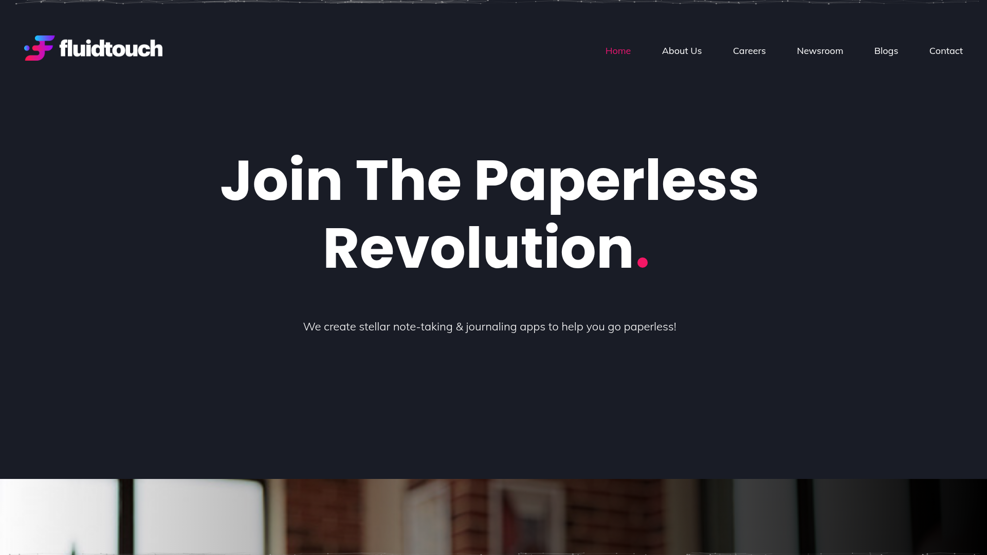
Fluid Touch Software Landing Page
A dark-themed product portfolio featuring a particle hero background, animated counter statistics, award badge carousel, and a featured media/news grid.
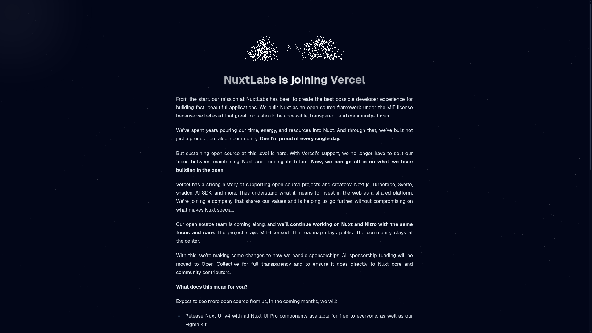
NuxtLabs Company Announcement Landing Page
A dark-themed typography layout featuring a starry background effect, grain texture gradients, and a centered long-form text section ideal for letters or press releases.
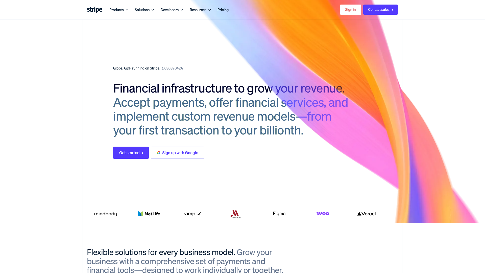
Stripe Modern SaaS Landing Page
A high-conversion landing page featuring a complex mesh-gradient hero, sticky navigation, and a horizontal logo wall for brand social proof.

GoCardless Payments Platform Landing Page
A dark-themed fintech landing page featuring a split-screen video hero, bento-style feature cards, a horizontal logo slider, and step-by-step accordion guides.
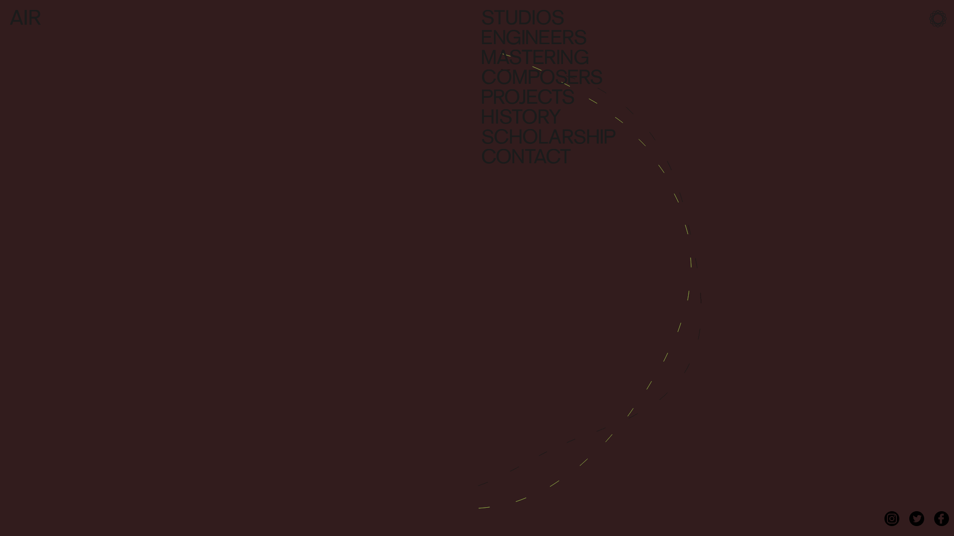
AIR Studios Minimalist Navigation Landing
A dark, minimalist layout featuring a vertical text-based navigation menu, a full-screen background video wrapper, and a dynamic canvas-based interactive drawing layer.
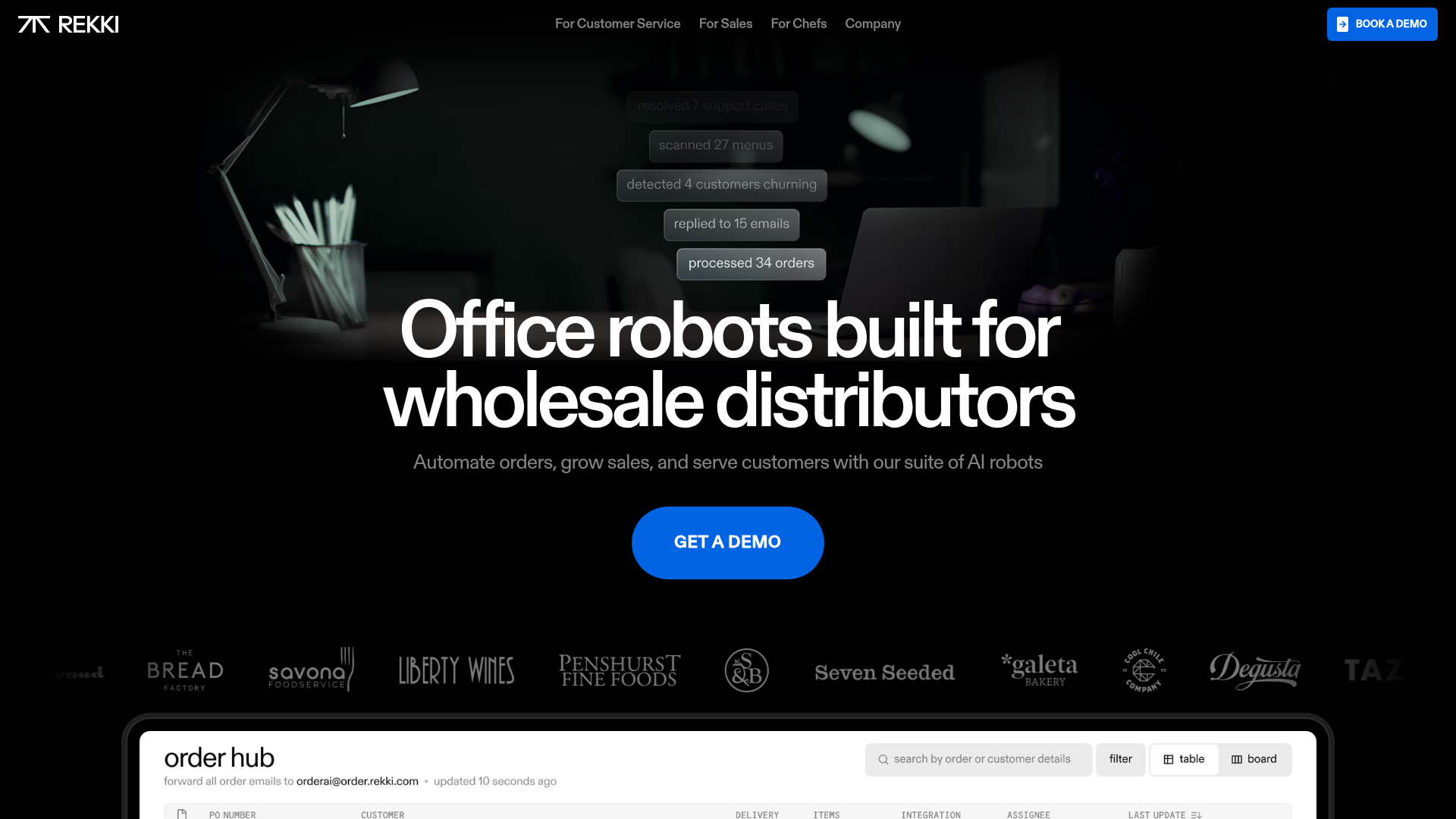
REKKI AI Automation SaaS Landing Page
A high-impact dark-mode landing page featuring a floating label hero section, marquee brand logos, an interactive dashboard UI preview, and card-based testimonial grids.
